
In this Photoshop tutorial you’re going to learn how to make colors pop in Photoshop along with some really easy tricks on managing any Photoshop document.
If you want the files used in this tutorial to follow along, click below.
You can also watch the video by clicking here or just follow the steps outlined below.
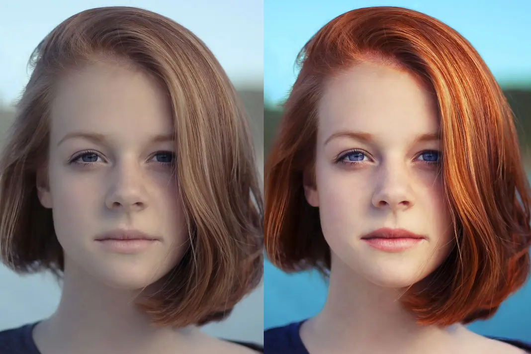
Now let me show you how to make colors pop in Photoshop. In order to see what we are going for take a look at the before image on the left and the after image on the right.
Let’s get started on How To Make Colors Pop
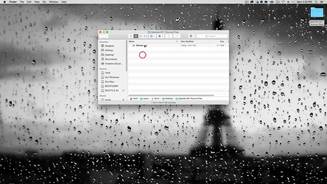
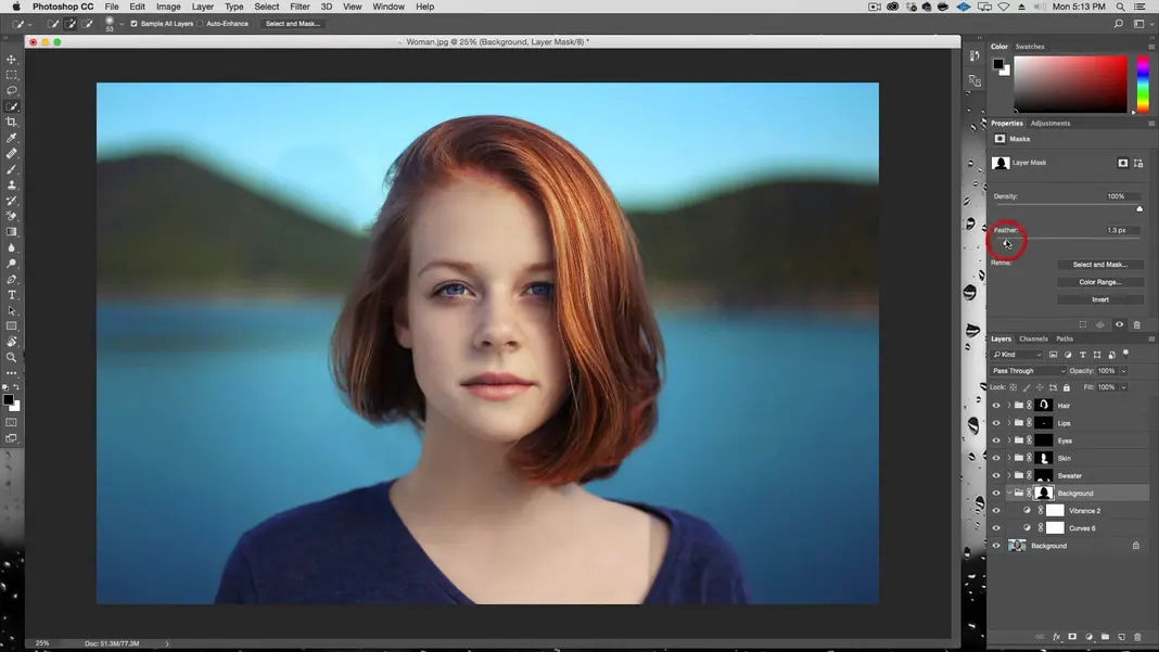
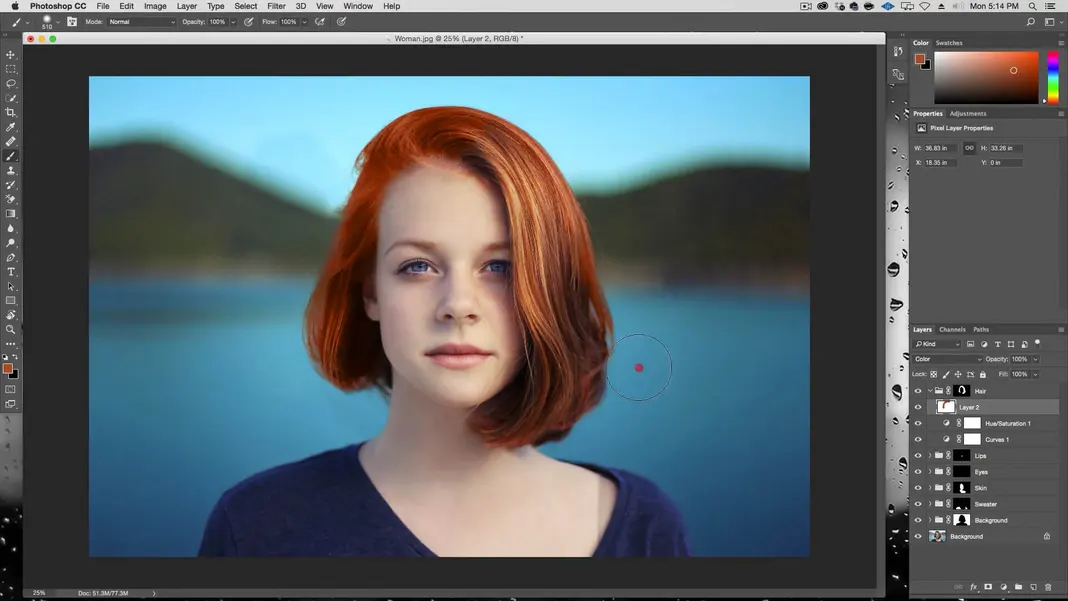
First, download the source file we will be working with today, once downloaded and unzipped you can navigate to the “Episode-027-Source-Files” folder and open the “Woman.jpg” file in Photoshop.
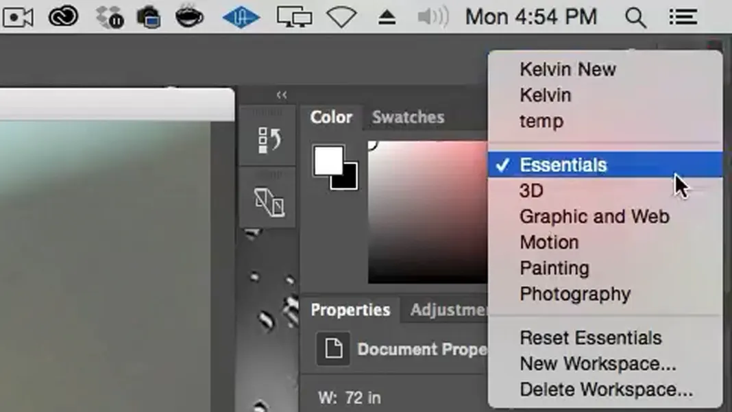
I am working in the Essentials Workspace, so if you want your screen to look the same as mine, you can select Essentials from the Workspace icon in the upper right corner.
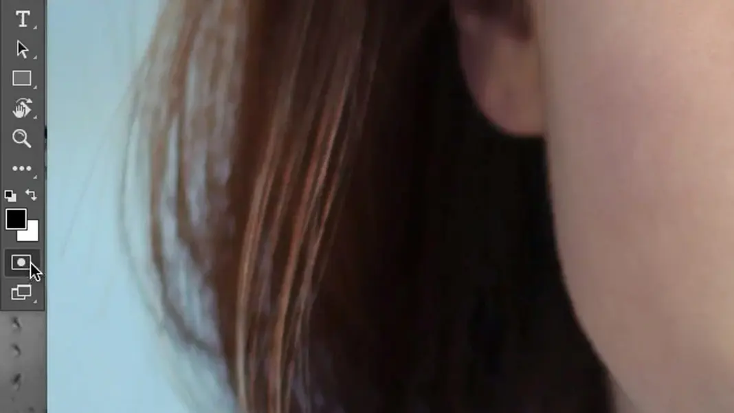
How to Make Hair Pop in Photoshop
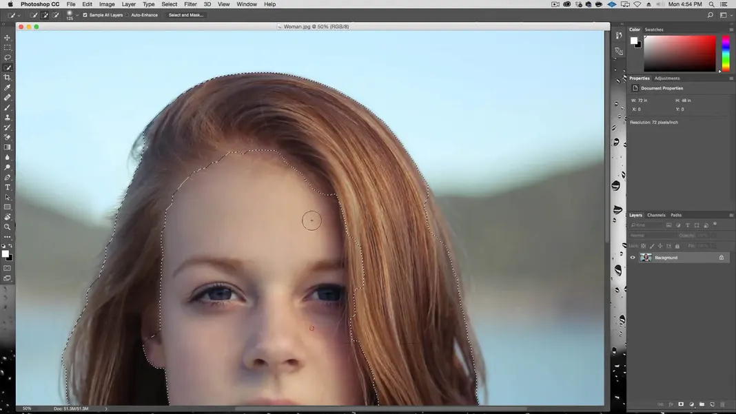
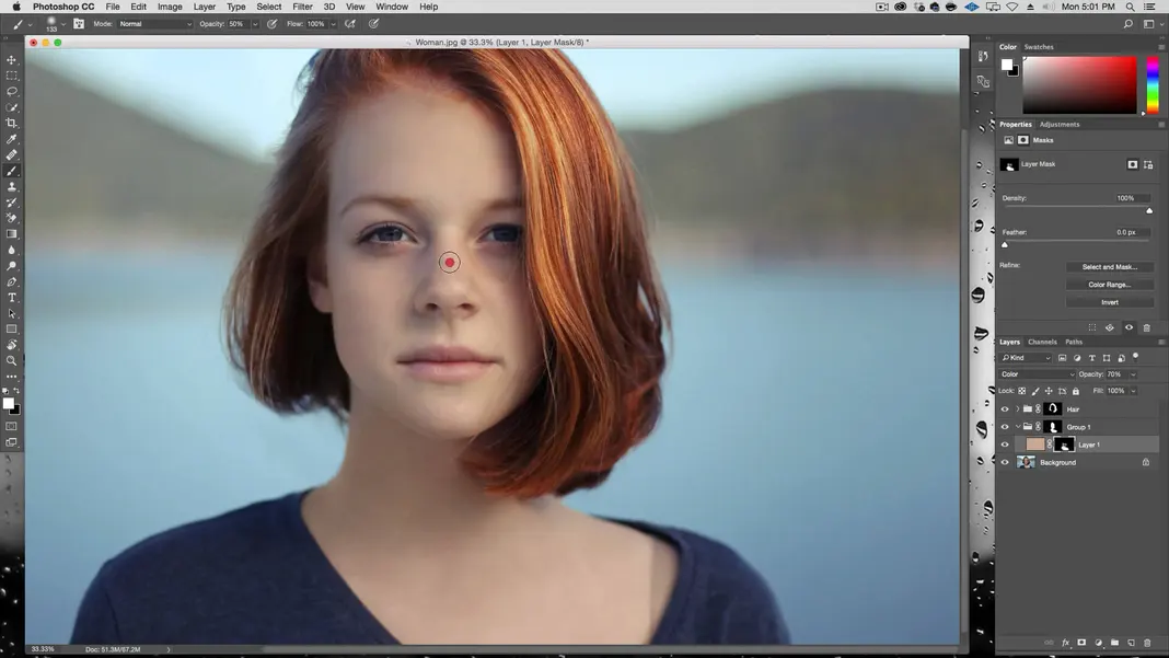
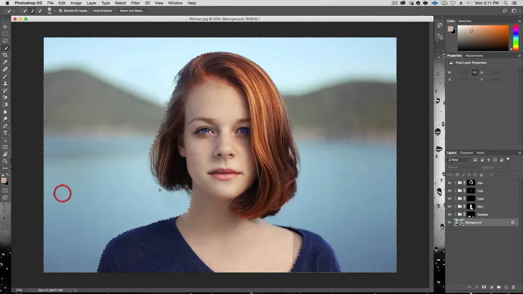
The first thing we’re going to do is make a selection of the woman’s hair. I have a separate in-depth tutorial on how to select hair properly that can be found here, which I recommend watching for a detailed explanation. For the purposes of this tutorial, I’ll just give a quick overview so that we can start making our colors pop in Photoshop sooner.
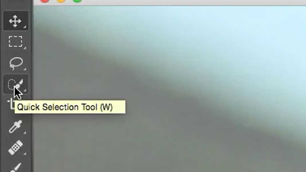
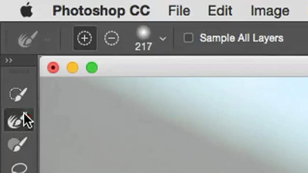
To select the hair, we can use the Quick Selection Tool.
With this tool selected, you click and drag over the hair. If any unwanted areas are added to the selection, like the background or the woman’s face or neck, you can hold the Alt key and click and drag over the areas you want to subtract from the selection. In the end, your selection should look something like this.
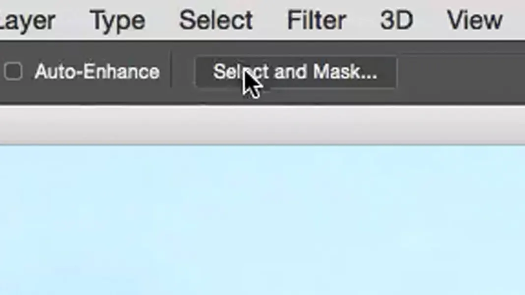
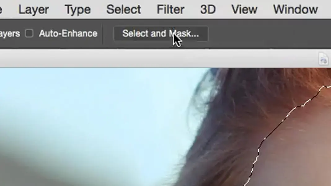
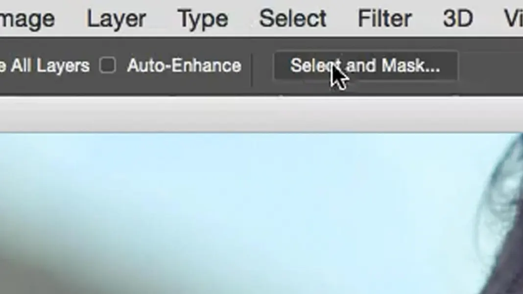
Next, click the Select and Mask button at the top of the screen.
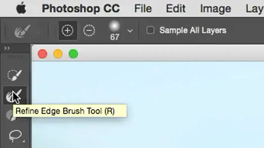
Select the Refine Edge Brush Tool (R).
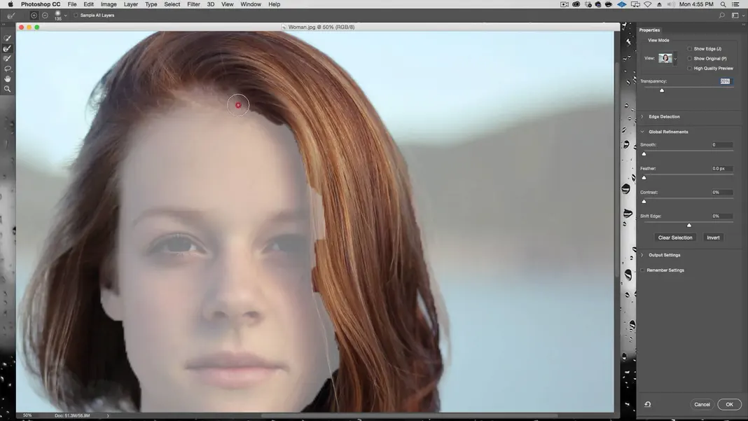
Set the brush size so that it’s a little wider than the edge you are trying to refine (in this case, the hairline), and brush over the border area where you want it to perform the edge detection. It should automatically refine the edges of your selection so that the hair is selected and the skin is not. In cases where the edge is a little bigger—such as at the ends of the hair where the background and the hair have a lot of overlap—you can make the brush a little bigger and follow the same process.
If there are any rough details that still need some cleaning up at this point, you can select the Brush Tool and use it to add or subtract areas and finalize the selection.
It’s okay if the edges still aren’t completely perfect. Remember, we’re only doing basic color correction on this image, so having a clean selection is great, but any discrepancies won’t be as visible as if we were making a more dramatic change like switching the background.
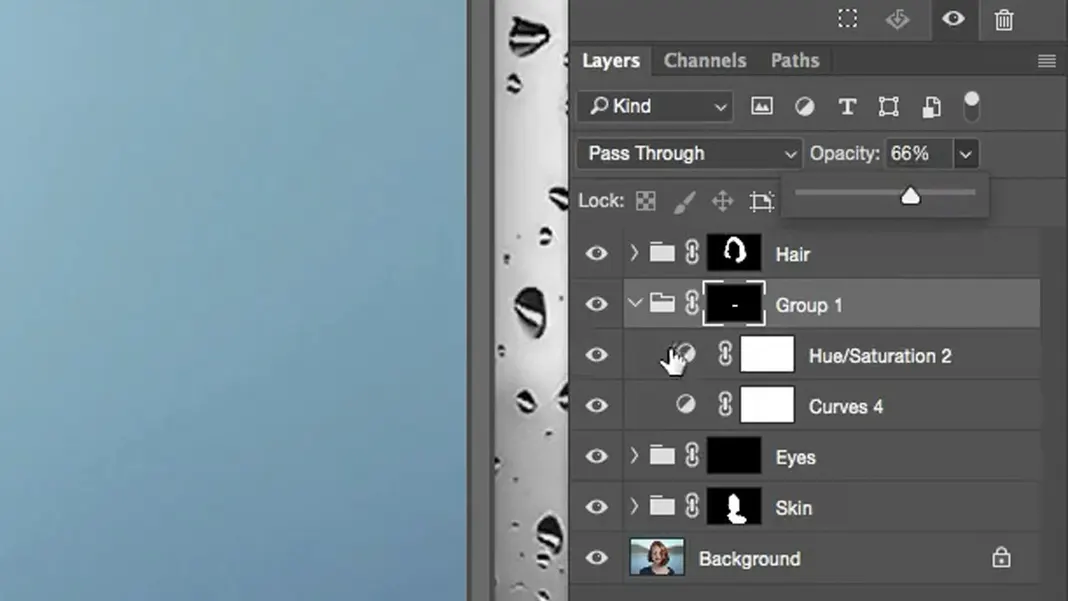
Now we have our selection, and the first thing I do when I have a selection is create a group.
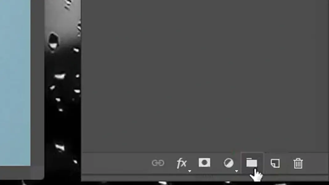
Then we can turn the selection into a mask of this group.
Let’s rename the “Group 1” that is created to “Hair” so we can keep our layers organized.
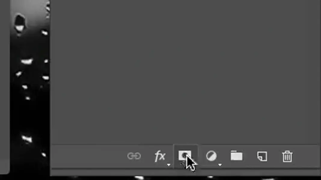
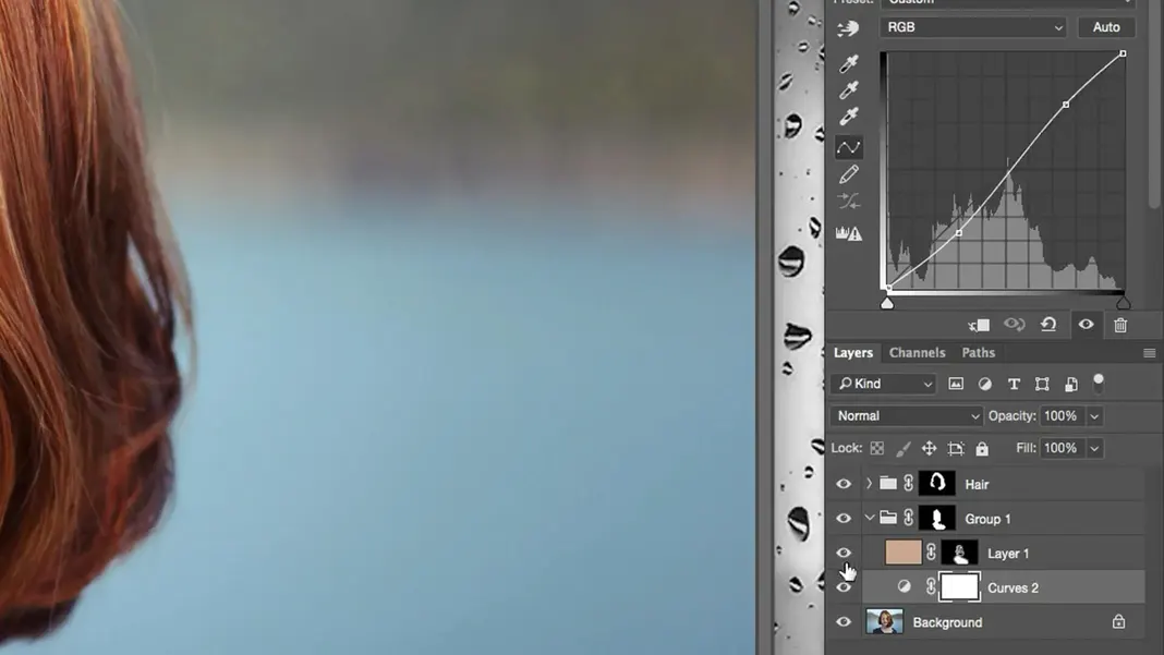
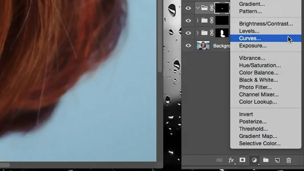
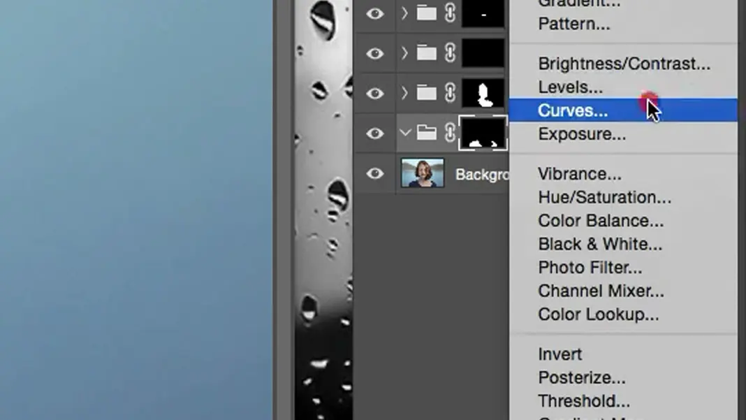
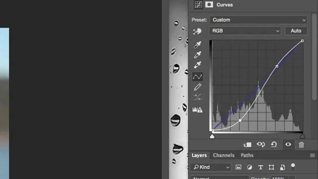
Now, in this group we’re going to add a curves adjustment layer.
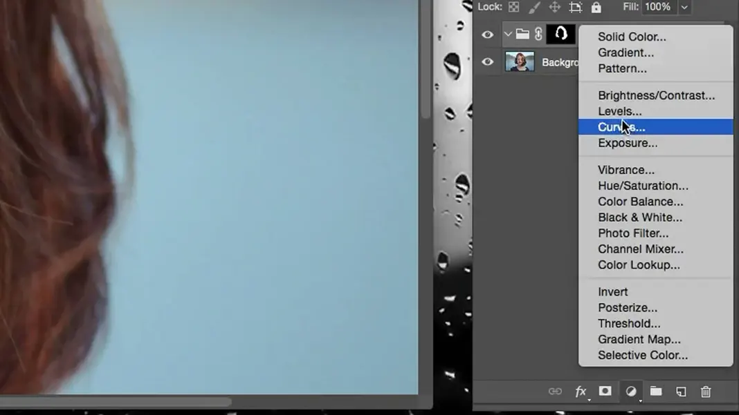
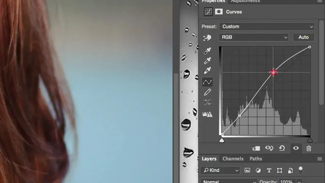
Using Photoshop curves to change the color and pop
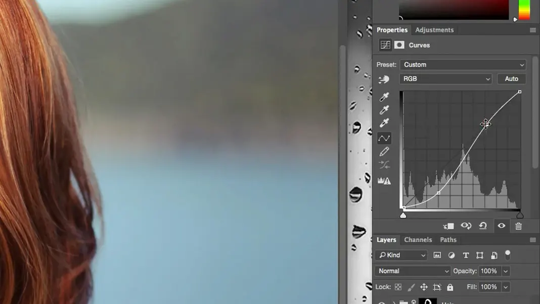
We can modify the curve to increase the contrast by creating an S-curve, which will make the darks darker and the lights lighter.
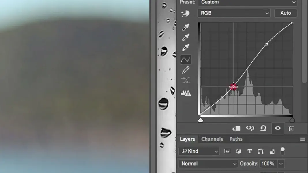
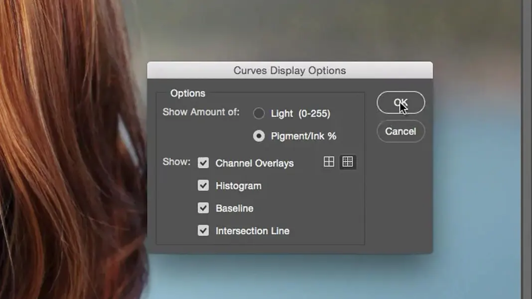
Note: my curves are inverted from the default setting, so they may be reversed from what you have. This is because of how I have my Curves Display Options set.
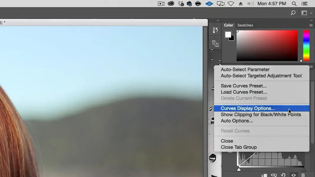
I come from a print background, so I have my Curves Display Options set to “Pigment and Ink” instead of the default “Light (0-255)”.
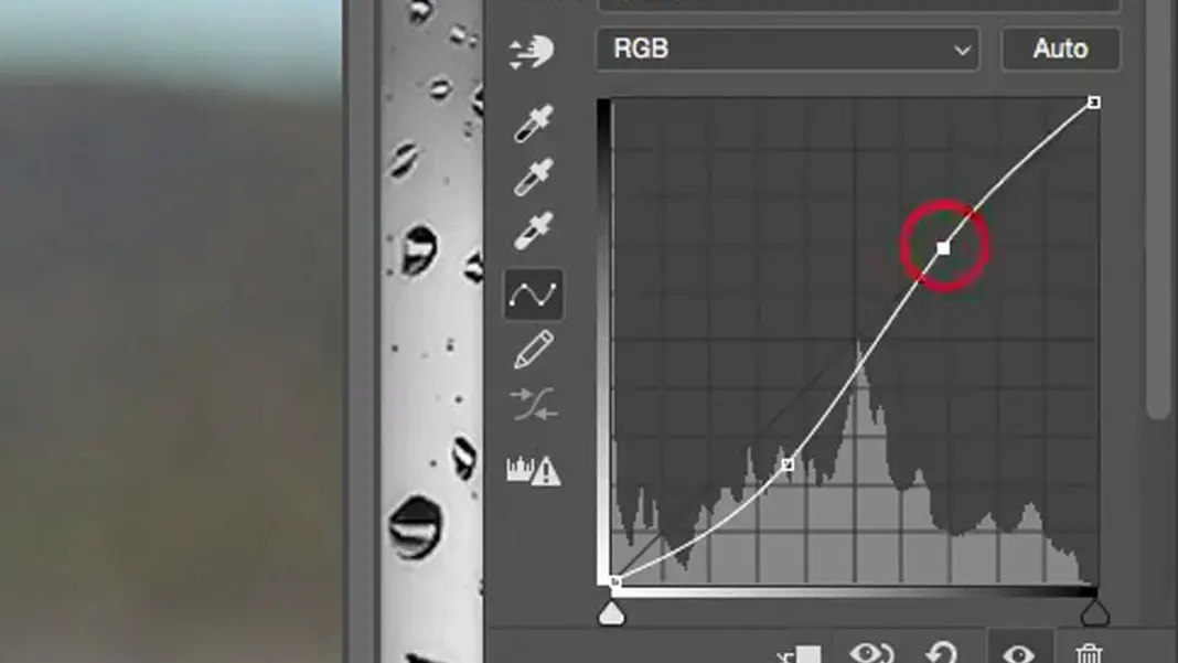
So if your whites are in the upper right corner and your darks are in the lower left, that’s normal. You will still create an S-curve to increase the contrast. To keep the image from getting too dark, I want to brighten up my highlights and mid-tones more than I darken the darks. In the end, a curve like this is what looks best to me.
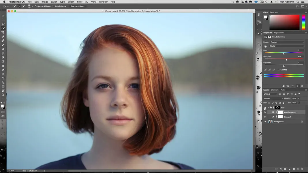
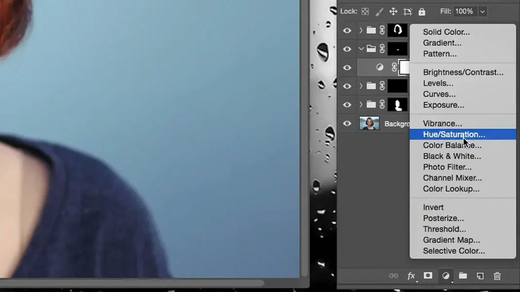
Adding a saturation adjustment layer
Let’s go ahead and add some saturation now with a hue/saturation adjustment layer.
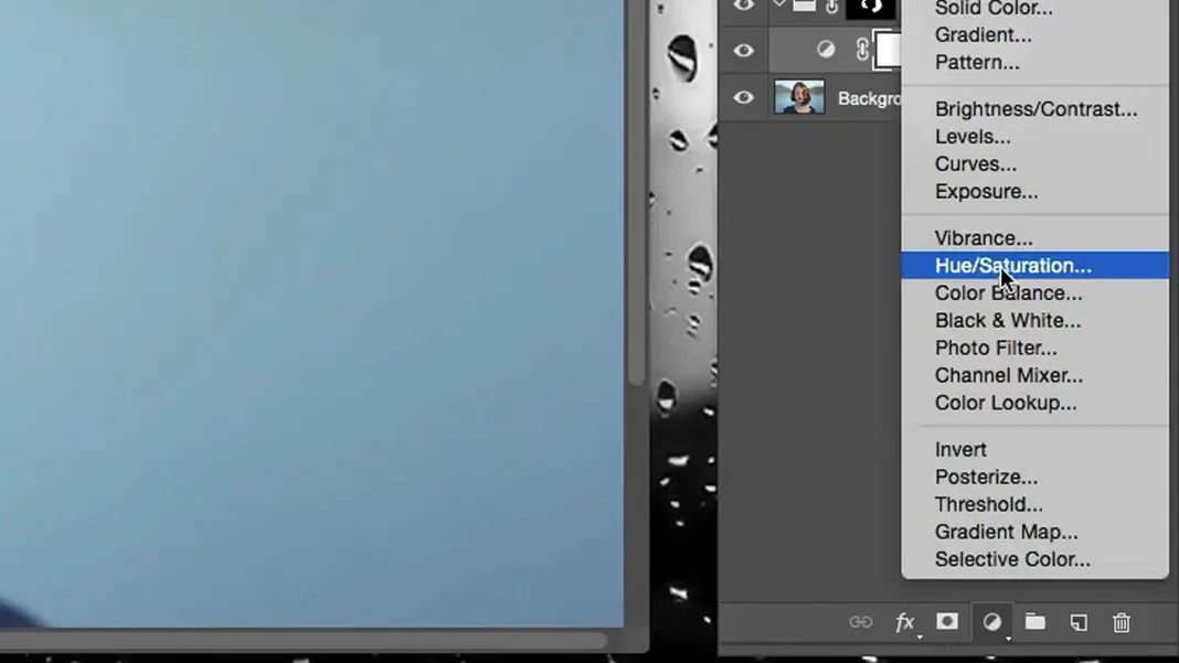
We can increase our saturation to around +14, which makes it considerably stronger. We can make more changes later on if we want, but I like how this is looking, so for now, let’s say this is our hair color correction.
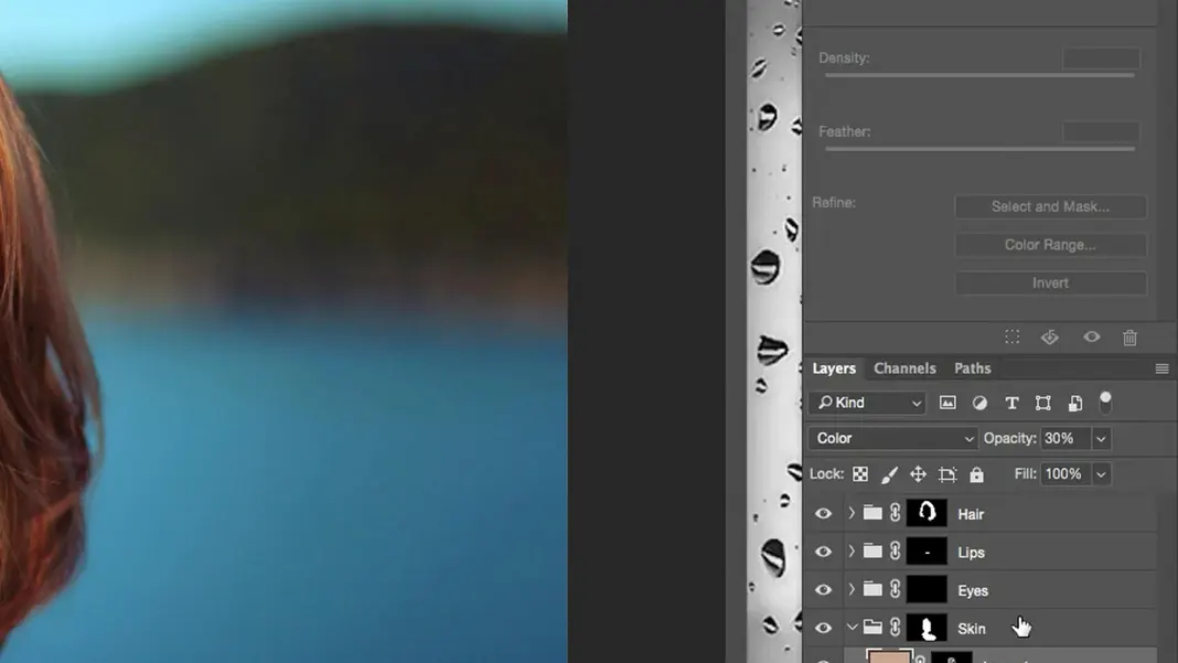
How to Make the Skin Tone Pop in Photoshop
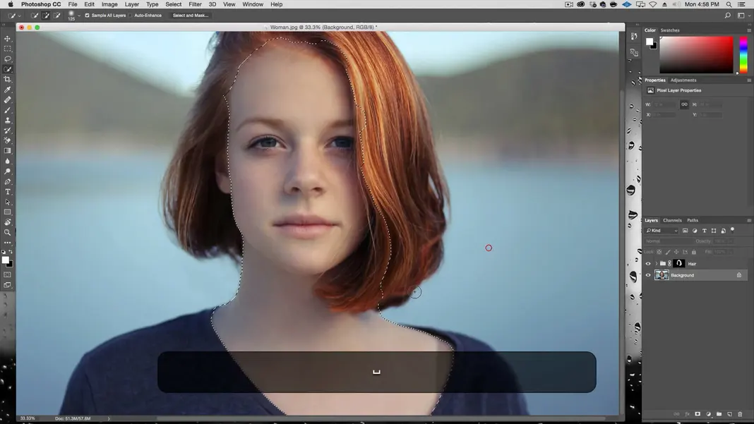
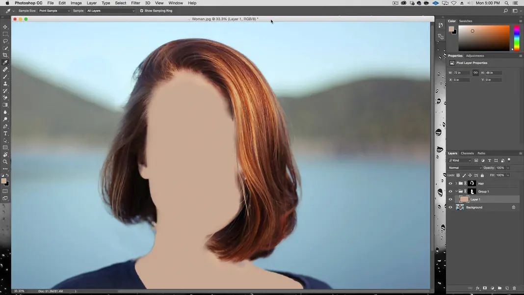
The next thing we’re going to work on is the skin tone. Let’s go back to the Background layer and use the Quick Selection Tool to select the skin tones, just like we did with the hair. My skin tone selection looks like this.
Once again, we click Select and Mask.
Select the Refine Edge Brush Tool.
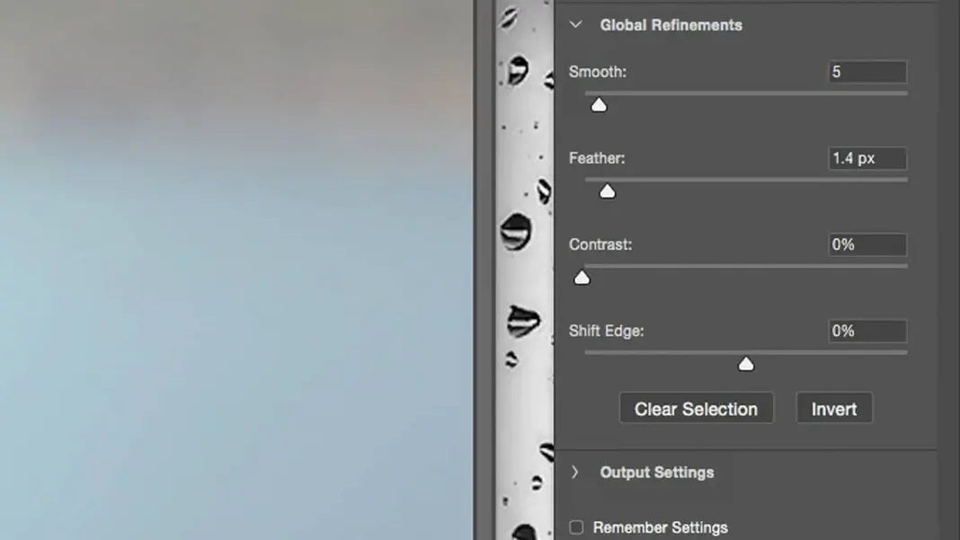
Now let’s go ahead and set the Global Refinements so that the edge is smoothed and feathered a little bit. In my case I’ve set Smooth to 5 and Feather to 1.4 px.
Set the brush size so that it covers the border area of the selection, and brush over the edge to perform the edge detection and find the edges of the skin.
Once you’re done, click OK and then create a group.
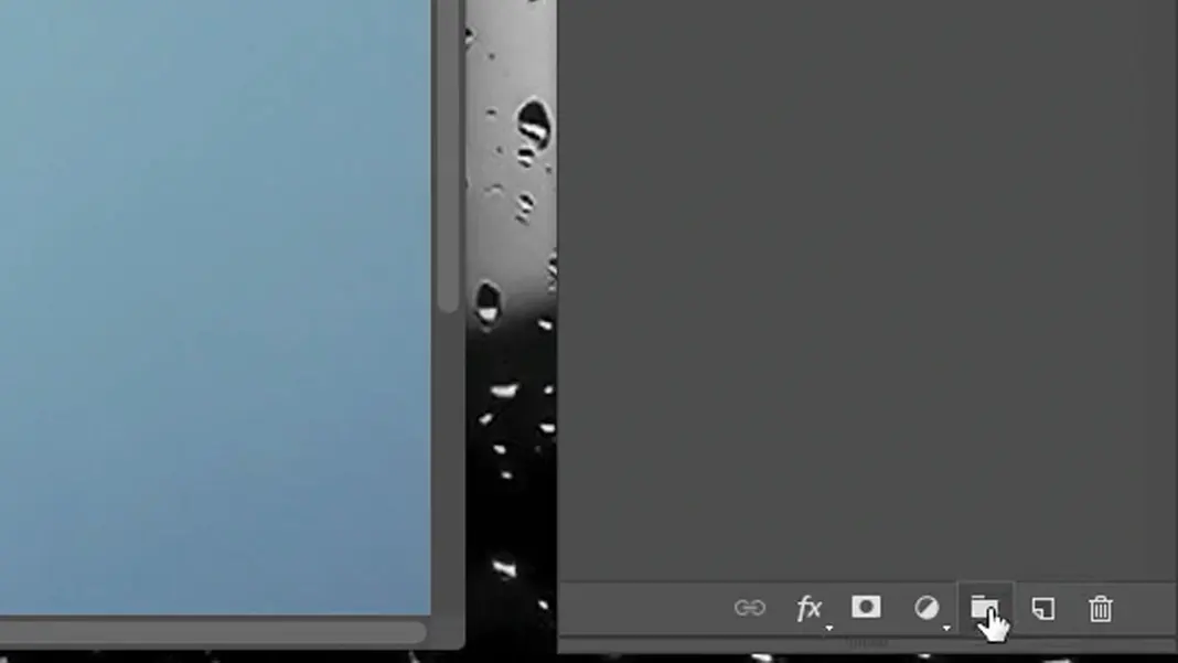
Turn the selection into a mask of this group.
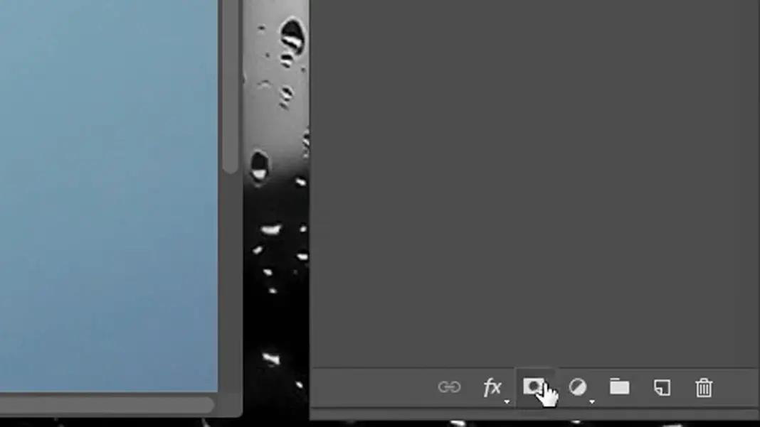
Create a new layer in this new group.
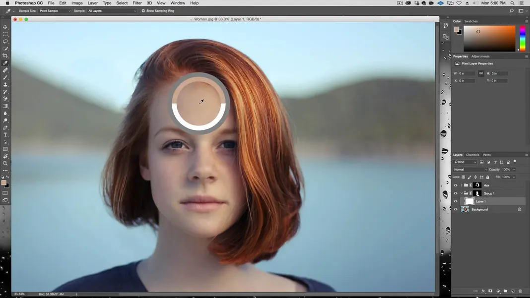
Select the eyedropper tool.
Now, I want to pick a part of her skin tone. Something not too dark and not too saturated, so that the color is representative of her overall skin color. Something like this should work great.
Then I’m going to fill the layer with this color. You can do that by either using Shift + F5 or by going to the Edit menu in the toolbar and selecting Fill.
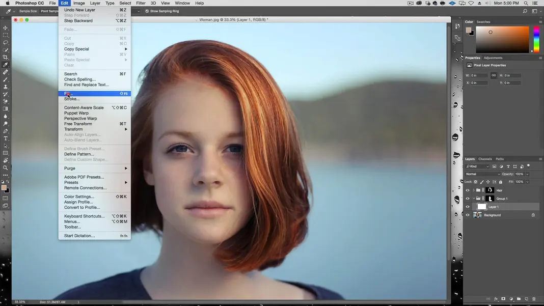
Make sure the settings in the pop-up Fill menu have the Contents set to Foreground Color and the Mode set to Normal, and then select OK. You should see the layer flattened to just this color everywhere, like this.
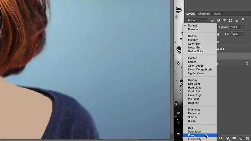
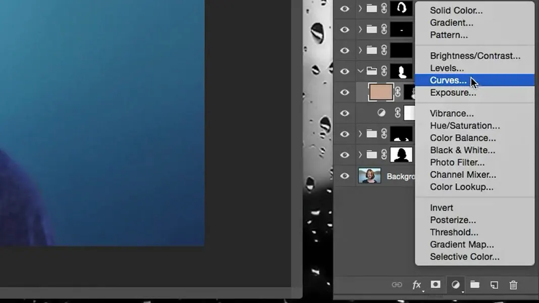
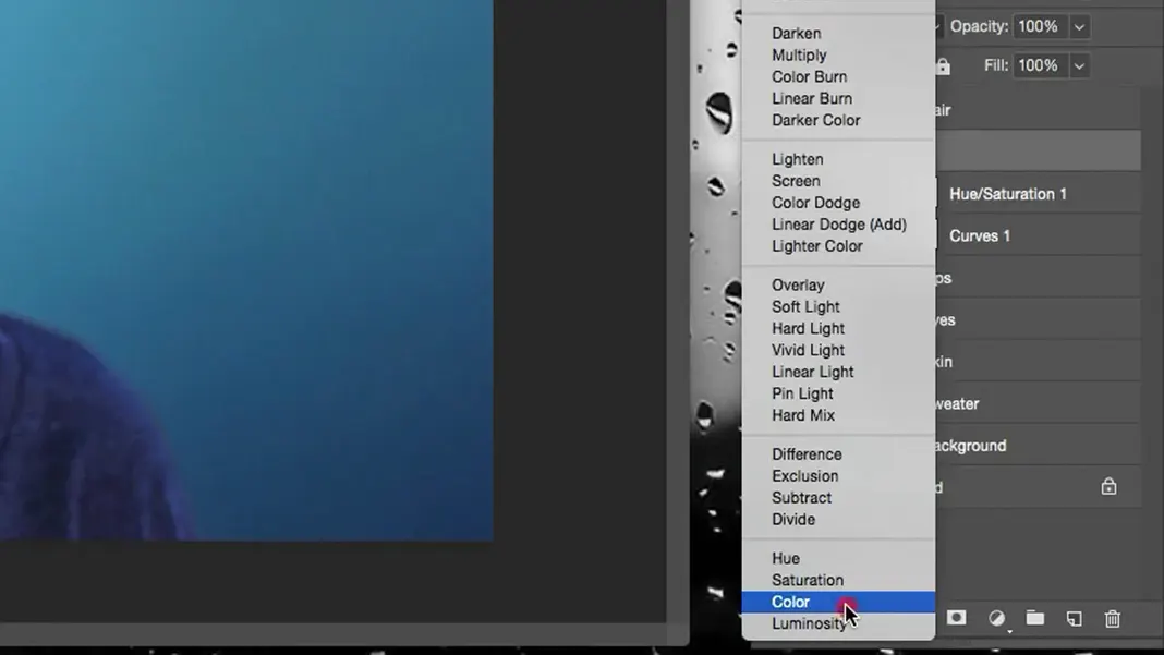
Take this layer and turn it into a color adjustment layer.
So now all the color has been completely taken out and this one color has been applied, which is not exactly what we want to do, but it’s a good start. There’re a few too many color aberrations in the original skin tone in my opinion, including the blue from the environment and some blotchiness in her skin, so that’s what we’re hoping to address with this fill layer.
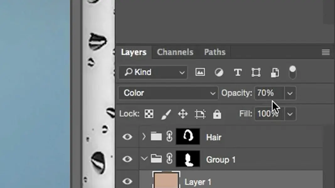
We can turn the opacity down on this layer to 70%.
Now that the opacity is down to 70%, I’m going to hold down the Alt key and select the Mask button. This adds a concealing mask that’s totally black over this flat skin tone layer we created.
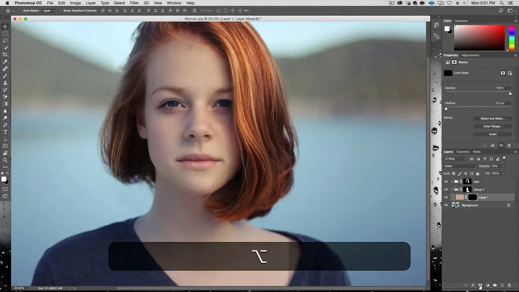
This means I can now basically brush whites on the mask and partially reveal the skin tone layer. I’ll select the Brush Tool, make sure it’s at 100% opacity, and brush the neck area to bring the skin tone back in and warm the color in that section up. Then I’ll set the brush opacity to 50% and correct some of the areas in the face where I see a little blotchiness. The 50% opacity allows us to partially bring in the skin tone layer we created without fully covering the original image, which lets us even out the skin a bit while still preserving some of the color variation.
We can also add a little bit of contrast now to the skin tone the same way we did before to the hair color. We’ll add a curves adjustment layer and then make the darks darker and the lights lighter by a bit.
Finally, we’ll bring this contrast layer below the color layer so that the color will be in the highlights.
Let’s make sure to name this whole group “Skin” so that we can keep track of it.
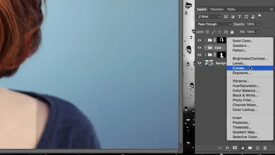
How to Make Eyes Pop in Photoshop
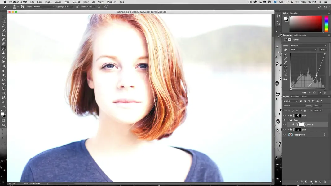
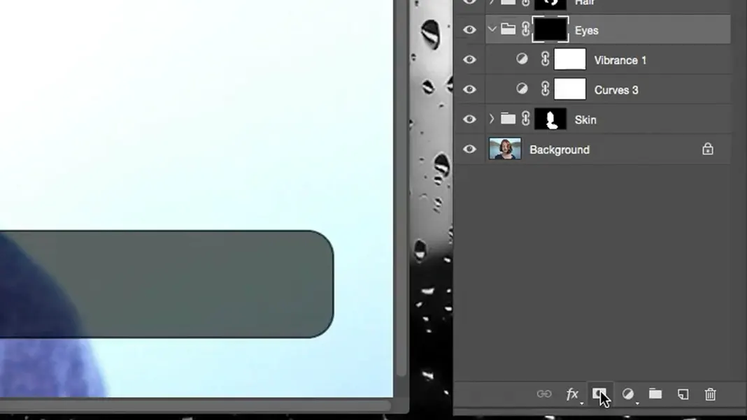
Next up, we’re going to do the eyes. I will process the eyes a little differently from what we’ve done so far. Let’s create a group and call it “Eyes”. In this group, I’m going to create a curves adjustment layer.
I’m going to adjust the contrast curve to make everything lighter, and I’m just going to pay attention to the eyes. Since I want the eyes considerably brighter than where we started, this will be a dramatic curve. My end result looks like this.
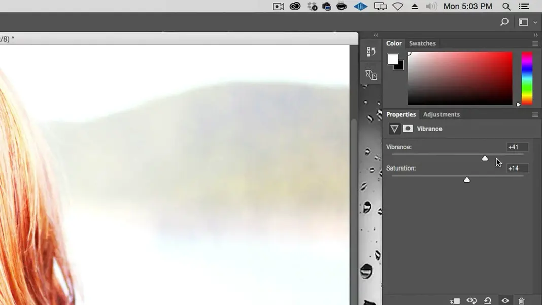
Now let’s create a vibrance adjustment layer to add some vibrance and saturation.
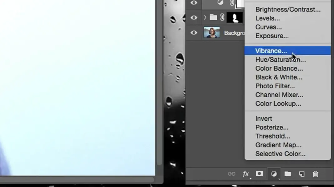
I’ve set the vibrance to +41 and the saturation to +14.
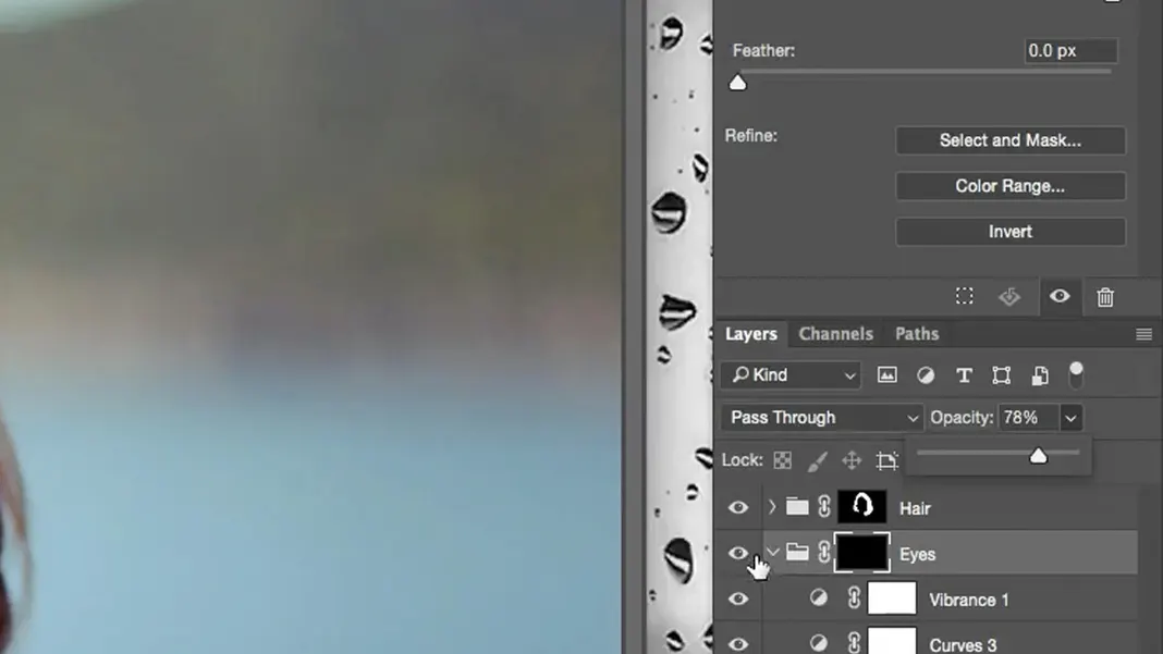
Then I’ll click the Mask button.
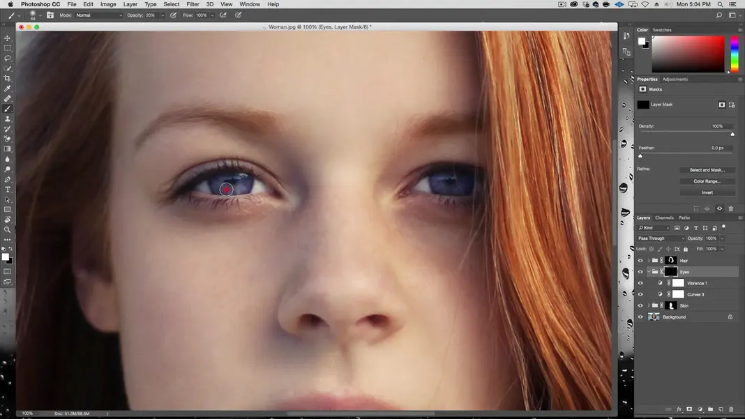
This adds a black concealing mask to the eyes layer, just like we did for the skin layer. I can now zoom in close on the eyes, take the brush tool, and set it to 20% opacity and a very small size.
I’ll use this brush to paint in her eye to lighten the pupil so we can see that area better. I try to replicate every brush stroke for both eyes so that the changes are being made evenly and they still match. We can also brighten the whites of her eyes a bit, but I recommend not brightening them too much because this has a tendency to make the eyes look fake. If you brighten the eyes too much, you can hit X to invert so that you’re adding blacks back to the concealing mask, and then you can use the brush to dial the whites back down.
If we feel the change is too dramatic, we can also turn down the opacity on the whole Eyes layer. I’ve turned mine down to 78%.
I think this is a cool way to get some detail in the eyes, and we’re actually going to do the same thing for the mouth.
How to Make Lips Pop in Photoshop
Create a new group, and then we can start by creating a mask. In this case, I’ll click on quick mask; you can also just hit Q to enter quick mask mode.
Make sure the opacity is set to 100% and then click on the lips, which is what we will be working on. When the brush options pop up, I suggest defaulting to a 45 px size and a hardness of 85, which is my go-to for selections. Then let’s hit Enter and zoom in close on the mouth to something like 300%.
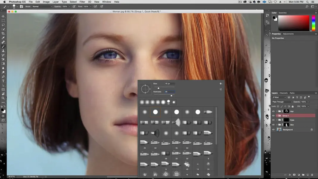
In this mode, whatever I draw is going to be masked. After drawing with this brush with my default settings, I’ve decided that the hardness is too high for this purpose, so I’ve changed the hardness to 40. We can then draw in the mask for the lips using Shift + click, which connects the last point we put down with the next one we draw in.
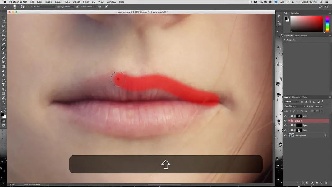
Once we have the whole mouth covered, hit Q again to leave quick mask mode and you have a selection of the mask.
Now, click on the Mask button.
Adding a Curves adjustment Layer
Now in this mask, let’s add a curves adjustment layer again.
Once again, let’s add some contrast by darkening the darks and lightening the lights.
If we wanted the lips to look really shiny, then we would need a lot of contrast. This kind of gives the effect that the woman is wearing lipstick.

I don’t really like that look too much here, so I’m going to keep the change more subtle. We also have the ability to color the lips a different color if we’d like. To do this, we create a hue/saturation layer.
Using Colorize in Photoshop
Check the “Colorize” box.
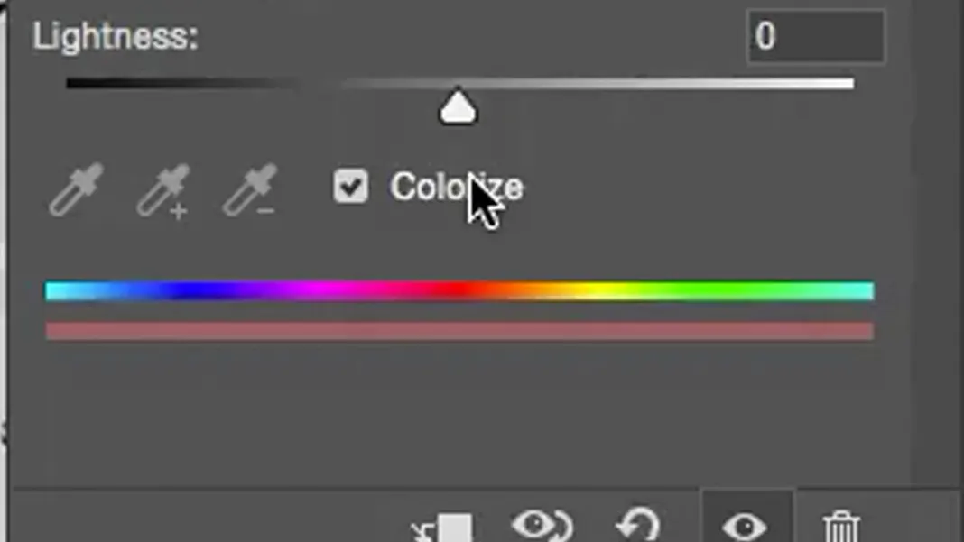
Bring the saturation up a lot and change the hue slider to pick a color that you like. Here we’ve selected a pink color. Then we can turn the opacity of the layer down if the change is too strong. We’ll set it to 64%.
Create a new layer in this new group.
If we change the hue to a more orange color, we get something like this.

How to accentuate colors
She definitely has a little more color in the lips now. We can go to the curves again and accentuate that a bit, making sure we don’t let the very dark areas get too dark because that will add a lot of shadows.
We can go back to the hue/saturation layer and see if we can improve this at all. After a little trial and error, it looks like a color more in the reds is nice, so let’s go with that.

Like I mentioned, if the change is too strong, turn down the opacity on the whole group. We’ll change the opacity on the hue/saturation layer to around 50% and the opacity of the whole group to around 60%.
Make sure to rename the group called “Group 1” to “Lips”.
Using the Quick Selection tool for the Sweater
Now, let’s do a similar thing for her sweater. Select the Quick Selection Tool.
Select her sweater by brushing over it.

Using Select and Mask in Photoshop
Once we have the sweater selected, click the Select and Mask button.
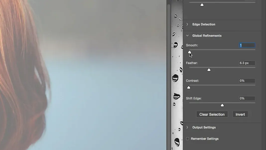
If any areas of the sweater are missing from the mask, brush over them to add them in. Turn up the smooth and feather settings; I’ve set the smooth setting to 1 and the feather setting to 6.3 px.
Now let’s create a new group with this selection and name it “Sweater”, turn the selection into a mask of this group, and create a curves adjustment layer once again.
Increase the contrast as we’ve been doing. As I mentioned, usually in the S-curve I have a tendency to keep the three quarter tones as they were and lower the quarter tones, so that’s a tip to keep in mind.
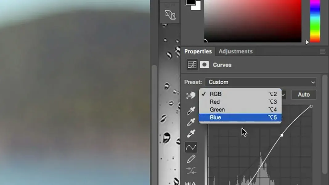
Now let’s go to the blue curve and see if any other changes would make an improvement.
We don’t want the color to be too vibrant since it is actually a dark blue sweater, but brightening the mid-tones a little will really make the colors pop.
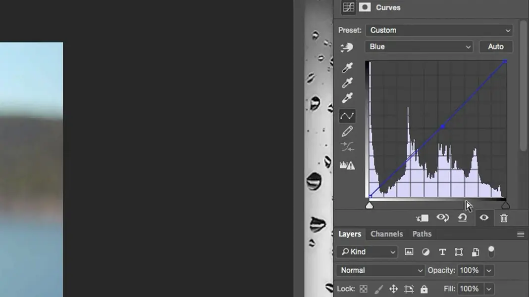
Then go back to the RGB curve and bring the lights down a little more, and we should be good to go.
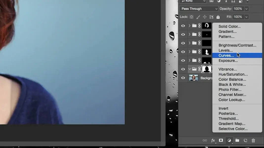
Background
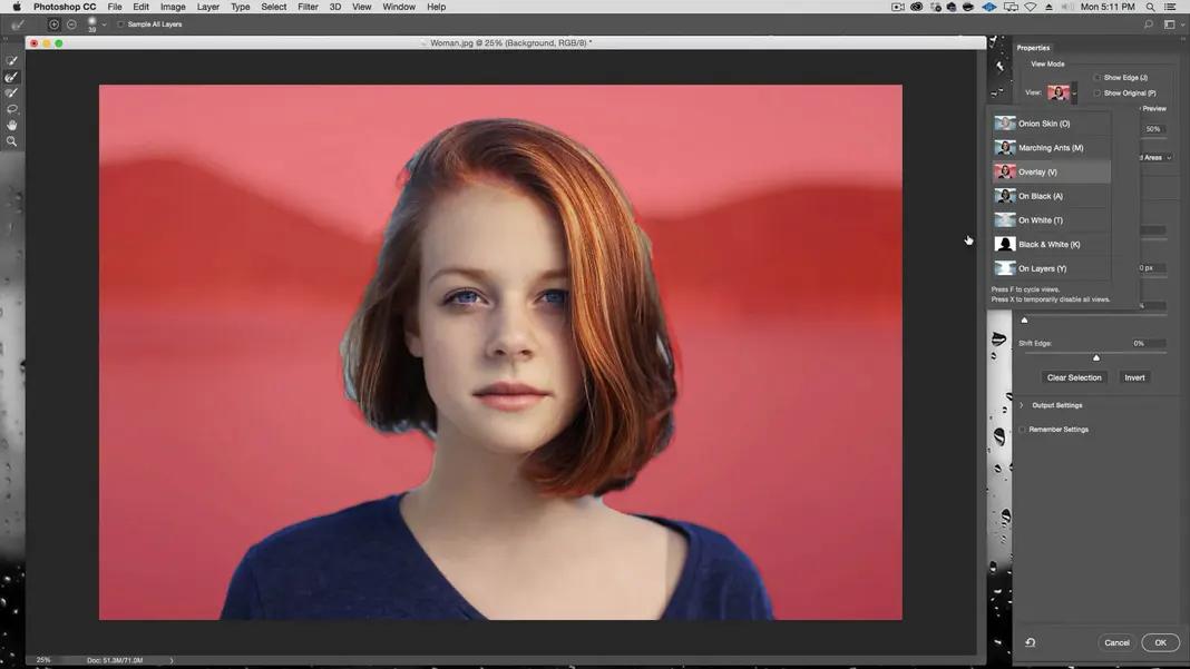
Finally, we have the background. Select the background layer, select the Quick Selection Tool, and brush over the whole background to select it.
Once the background is selected, click Select and Mask. You may find it hard to tell which parts of the background are masked. To remedy this, we can change the View Mode under properties in the upper right corner. We’ll set the View Mode to Overlay.
Pick the Refine Edges Tool and trace the border area of the selection. One thing to always keep in mind is that the better the selection is, the better the effect will be. In this case, the technique is not so much about selection but more about the color, so we won’t focus on getting it perfect, but if you put in a little more care in the selection process, the result is even better.
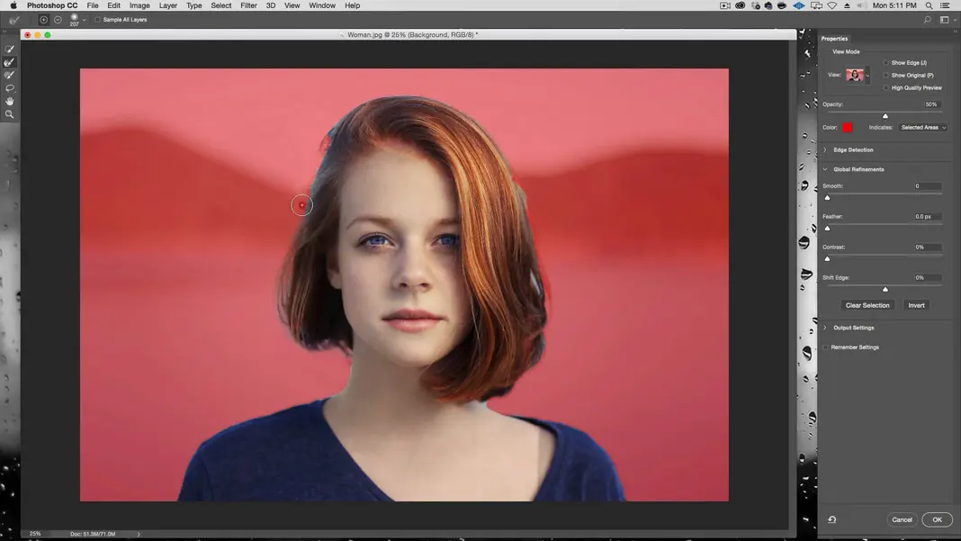
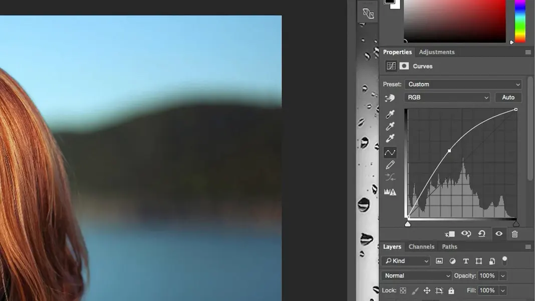
Set the feather setting to 1.0 px and click OK. Now we’ll create a new group, rename it to “Background”, and create a mask. Then add a curves adjustment layer. In this case, we’re going to darken it considerably. We want to get a lot of that color back.
The lighter background does make the woman stand out more, but I would prefer the background to have more color.
Adding a Vibrance Adjustment layer
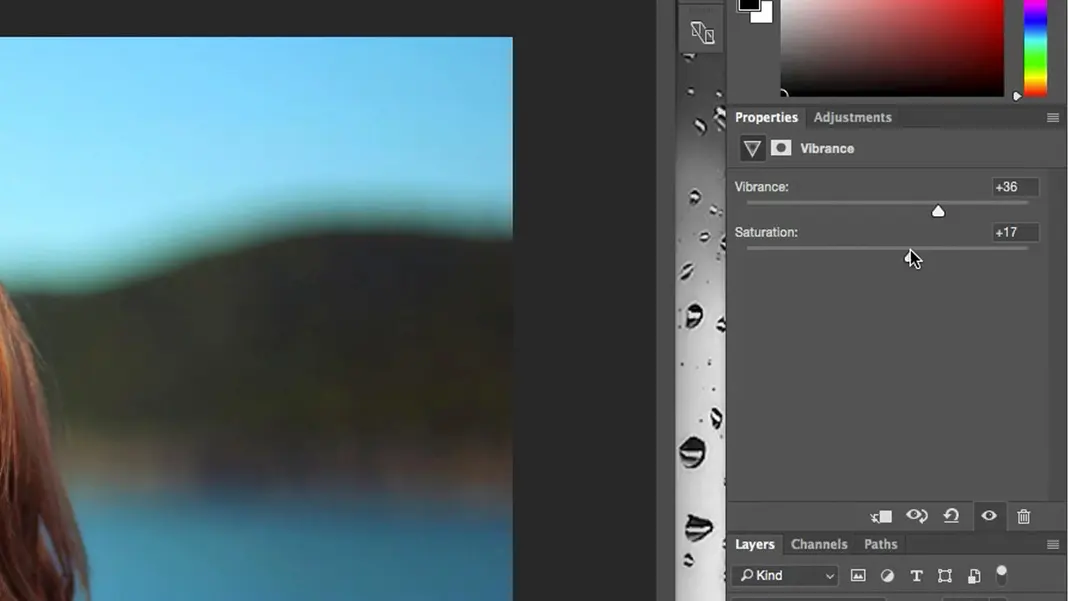
Let’s add a vibrance adjustment layer. We can add some saturation and some vibrance.
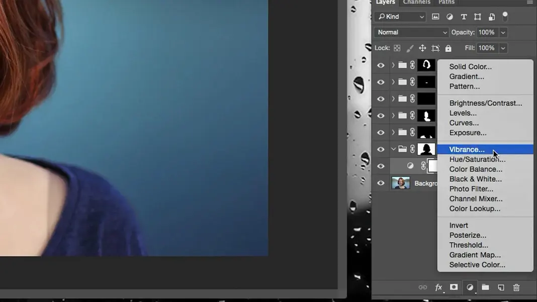
I’ve set vibrance to +36 and saturation to +17.
Another cool little trick is, if I want the border to be a little fuzzier after my selection has already been done, you can click on the Background mask and just increase the feather setting.
If you increase it too much it can create a halo effect around the subject, which I don’t want, but we can choose something in between.
Great, the background looks to be in good shape.
Fixing Problem Areas
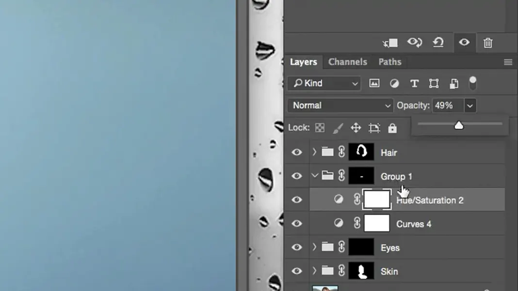
The only part here that I’m not very happy with is her skin tone. It’s a little flattened, and that’s because I basically applied a single color to it. I feel like the effect is a little too strong, so I’m going to turn the opacity of the skin’s color adjustment layer down to, say, 30%.
Adding another curves layer to add highlights
Also taking a look at the curves, I feel I can lighten my skin tones a touch. To do this we can add another curves layer and then lighten the lights slightly to brighten the skin tones up.
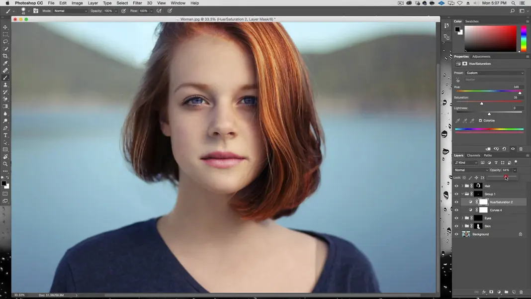
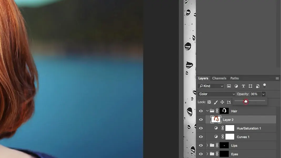
So what’s nice about this method of color correction is that, since I now have all these selections, I can edit each element individually very easily. For example, let’s say I wanted her hair to be even redder. We can go into the Hair group and create a new color layer there.
Then let’s select the eyedropper tool and select a really bright red from the woman’s hair, such as this.

With the color selected and the color layer created, we can easily switch to the Brush Tool and brush brighter reds onto the darker side of the hair to make it more even.
This is an exaggerated version of the change, but we can see that all of the darker areas have had color added back in. To lessen the intensity of the effect, we can lower the opacity to 40% or lower.
Then we can add a mask to this specific layer.
Finally we can switch to the Brush Tool and mask out areas that feel a little strong, such as areas close to her skin. This same type of process can be used for any adjustment you want to make.
Conclusion
If you’ve been following along, you should now have a finished product where we’ve color corrected the original image using all the tools at our disposal to really make the colors pop. Toggle the layers on and off to see the effect that each one has on the finished piece, and the difference should speak for itself.
More importantly, we’ve covered the process we used to achieve this result. To recap the basic process:
- Make a selection of the element we want to edit
- Select and Mask
- Refine the edges of the selection
- Create a group for our selection
- Turn the selection into a mask of the group
- Add adjustment layers (primarily curves, hue/saturation, and color) as desired
- Change opacity to increase or decrease the intensity of the adjustments
We also went over modified versions for skin and eyes, which involved filling layers with solid colors and/or using masks. However, the basic procedure alone should work for lots of different projects. I hope you learned How to make colors pop in Photoshop, if you did and want to learn more, you can find it on my YouTube channel, please subscribe and share with your friends.
Take a look at this article How to Use Overlays in Photoshop