Video Tutorials
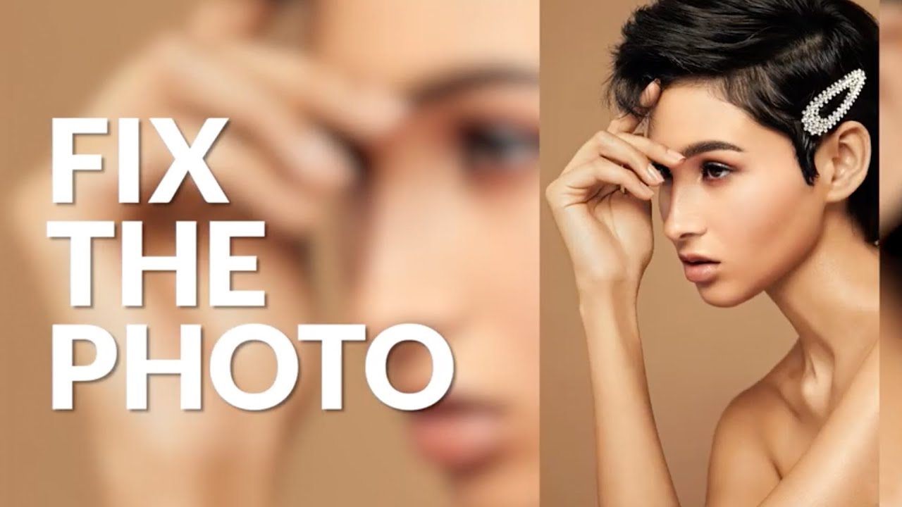
How to Remove Skin Redness in Photoshop Using Hue/Saturation (The Right Way)
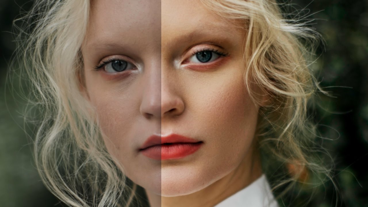
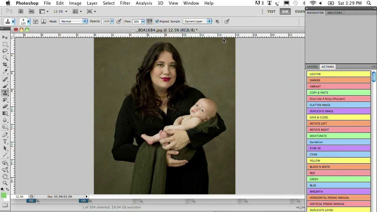
There’s a specific kind of client email I used to dread. The one that arrives two days after delivery, very polite, that says something like: “The skin still looks a little red in a few spots.” Early in my retouching work, my answer to redness was almost always the same wrong tool: the Brush tool, a sampled skin tone, and way too much opacity. The results looked painted. I’d fix the redness and introduce something worse.