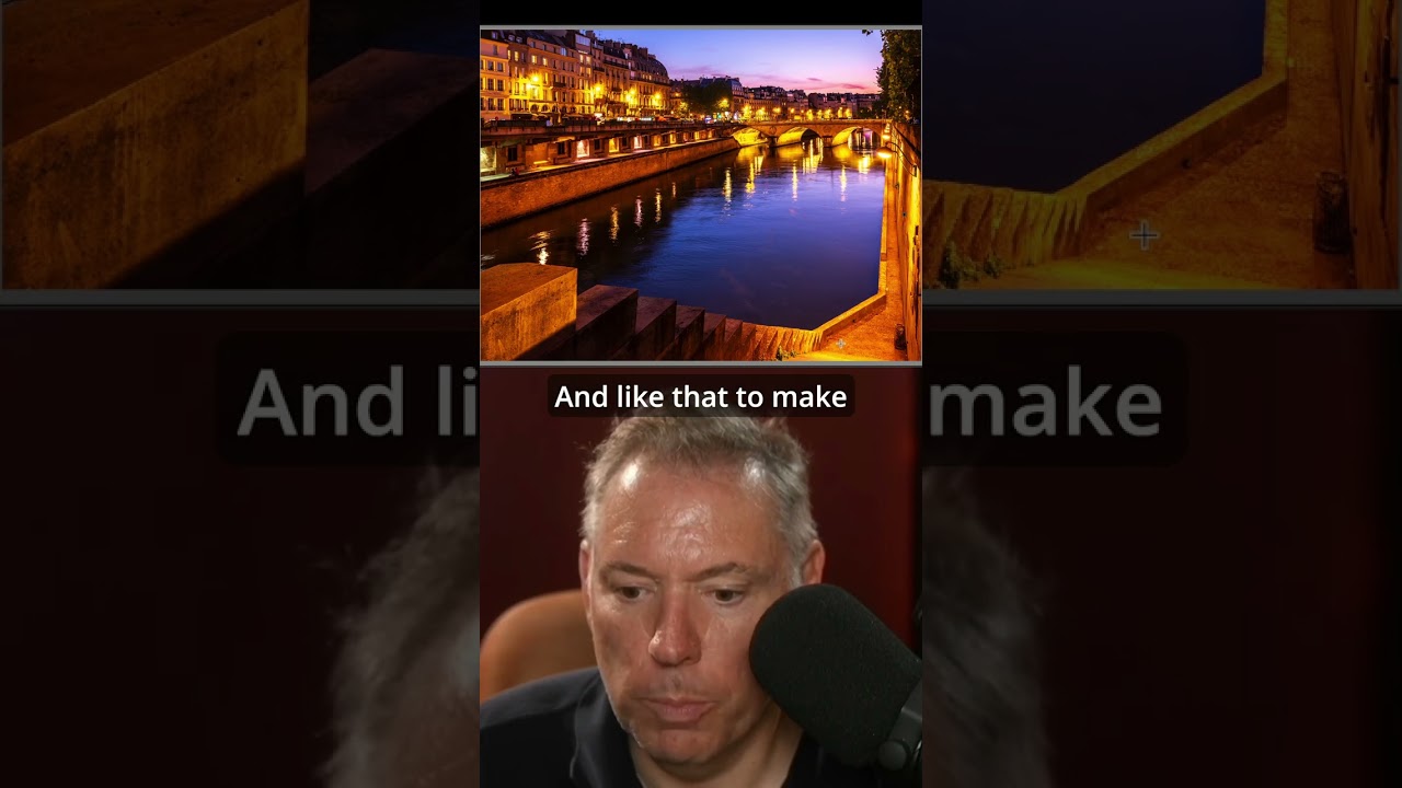
There’s a specific kind of photo that stops me mid-scroll. Not the technically perfect ones, not the overlit, every-detail-present shots. The ones that stop me are the ones that feel like a secret. Something contained. A world inside a world. That quality has a name: frame within a frame. And for years I understood it as a compositional idea, something you think about before you press the shutter. What I hadn’t fully appreciated was how much of that feeling gets built, or destroyed, in post-processing.
Watch the full tutorial on YouTube
In this Serge Ramelli tutorial, he works through a Paris street photograph that uses an architectural frame, and the editing choices he makes are what actually lock the viewer’s eye inside it. The adjustments he walks through are deceptively simple. But they work together as a system, and once you see the logic, you’ll start applying it to your own images almost automatically. I’ve been doing beauty and portrait work for long enough that I sometimes forget to pay attention to environmental context, to what’s around the subject rather than on it. This tutorial snapped me back to that.
Step 1: Open the Shadows and Blacks First
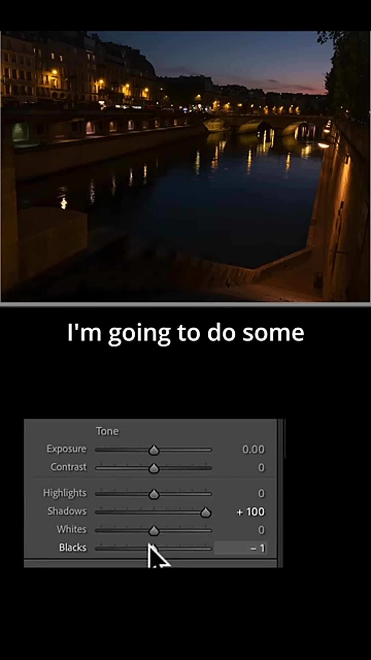 Shadows and blacks sliders being pulled open in Lightroom
The instinct for most photographers opening a dark image is to reach for Exposure. Serge doesn’t do that here. He goes straight to Shadows and Blacks, pulling them open before touching anything else. This matters because it preserves the tonal relationship between your darkest areas and your midtones. Lifting exposure first flattens everything together. Lifting shadows and blacks independently gives you depth you can then shape.
Shadows and blacks sliders being pulled open in Lightroom
The instinct for most photographers opening a dark image is to reach for Exposure. Serge doesn’t do that here. He goes straight to Shadows and Blacks, pulling them open before touching anything else. This matters because it preserves the tonal relationship between your darkest areas and your midtones. Lifting exposure first flattens everything together. Lifting shadows and blacks independently gives you depth you can then shape.
In Lightroom’s Basic panel, drag Shadows to the right until you can see detail in the darker interior areas of your frame. Then nudge Blacks up just enough to lift the deepest tones without making them look gray and washed out. You’re not trying to make the darks bright. You’re making them readable.
Step 2: Bring Down Highlights and Whites
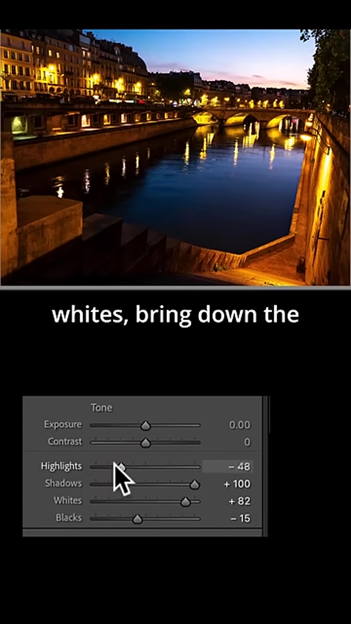 Highlights and whites being pulled down in the Basic panel
Once the shadows have some breath, the highlights need to come down to compensate. This is the classic exposure bracketing move inside a single RAW file, and it’s what keeps a high-contrast scene from blowing out while still feeling luminous. Serge pulls the Highlights down meaningfully here, not just a token adjustment.
Highlights and whites being pulled down in the Basic panel
Once the shadows have some breath, the highlights need to come down to compensate. This is the classic exposure bracketing move inside a single RAW file, and it’s what keeps a high-contrast scene from blowing out while still feeling luminous. Serge pulls the Highlights down meaningfully here, not just a token adjustment.
Drop your Highlights slider until the brightest parts of the image, sky, reflective surfaces, light sources, retain texture and color. Then bring Whites down slightly as well. The goal is a scene where nothing is clipped and nothing is competing for attention. The light should feel controlled, not accidental.
Step 3: Shift the Color Temperature Toward Magenta
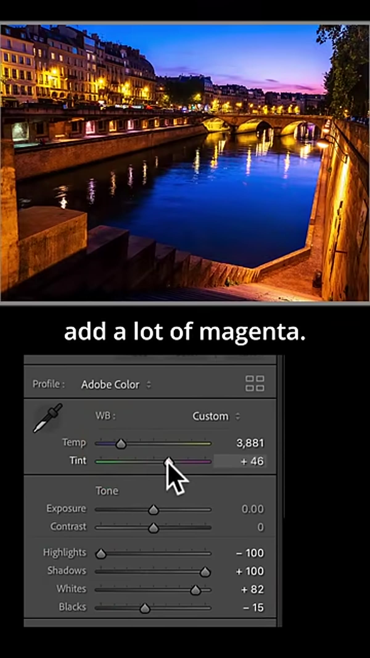 Tint slider being pushed toward magenta in the color panel
Here’s where Serge’s edit gets its personality. He pulls the Tint slider away from green and toward magenta, and he goes further than most people would feel comfortable with. The effect is a warmth that doesn’t read as orange, which is what excessive Temperature adjustment tends to produce. Magenta gives the image a moodier, more Parisian film-like quality.
Tint slider being pushed toward magenta in the color panel
Here’s where Serge’s edit gets its personality. He pulls the Tint slider away from green and toward magenta, and he goes further than most people would feel comfortable with. The effect is a warmth that doesn’t read as orange, which is what excessive Temperature adjustment tends to produce. Magenta gives the image a moodier, more Parisian film-like quality.
In the Basic panel, leave your Temperature relatively neutral or just slightly warm. Let the Tint do the heavy lifting for warmth instead. Push it toward magenta in increments, pausing to evaluate. Somewhere between +15 and +35 is typically where the magic lives, depending on your source image. If skin tones are in the frame, watch them carefully here. You want glow, not a sunburn.
Step 4: Increase Overall Brightness Intentionally
 Exposure being nudged up after color adjustments are set
After the tonal and color foundation is set, Serge brightens the image. This sequencing is important. You’re not guessing at exposure anymore. You’ve already shaped the shadows, reined in the highlights, and set the color mood. Now brightness is a finishing move, not a correction.
Exposure being nudged up after color adjustments are set
After the tonal and color foundation is set, Serge brightens the image. This sequencing is important. You’re not guessing at exposure anymore. You’ve already shaped the shadows, reined in the highlights, and set the color mood. Now brightness is a finishing move, not a correction.
Nudge your Exposure slider up until the image feels alive rather than dim. Because you’ve already protected the highlights, you have more room than you think. The image should feel inviting but not flat. If it starts to feel overexposed, your highlights weren’t pulled down far enough in the previous step. Go back and adjust.
Step 5: Straighten and Crop to the Frame
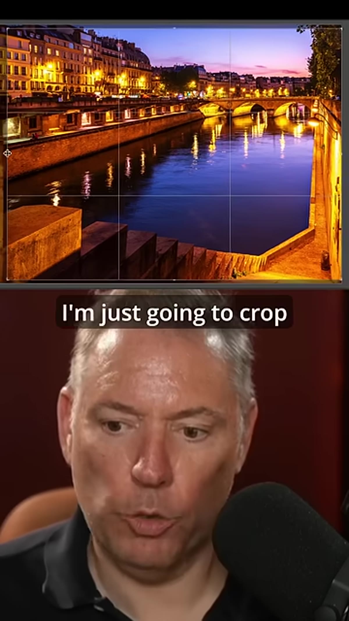
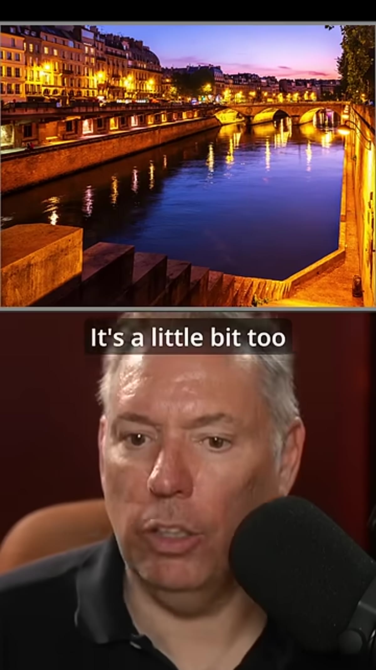 Crop tool active, image being straightened and composed tighter
Serge uses the crop tool not just to tighten the composition but to make the architectural frame do its job. A frame within a frame only works if the outer edges of your photograph feel like walls. If the crop lets the eye wander out the sides, the effect breaks.
Crop tool active, image being straightened and composed tighter
Serge uses the crop tool not just to tighten the composition but to make the architectural frame do its job. A frame within a frame only works if the outer edges of your photograph feel like walls. If the crop lets the eye wander out the sides, the effect breaks.
Open your Crop Overlay tool (R in Lightroom) and straighten any horizon or vertical lines that are pulling the eye off-balance. Then crop to contain the scene inside your natural frame. You may lose some of the image you thought you wanted to keep. That’s fine. The contained version is almost always stronger.
Step 6: Add Linear Gradients to Darken the Sides
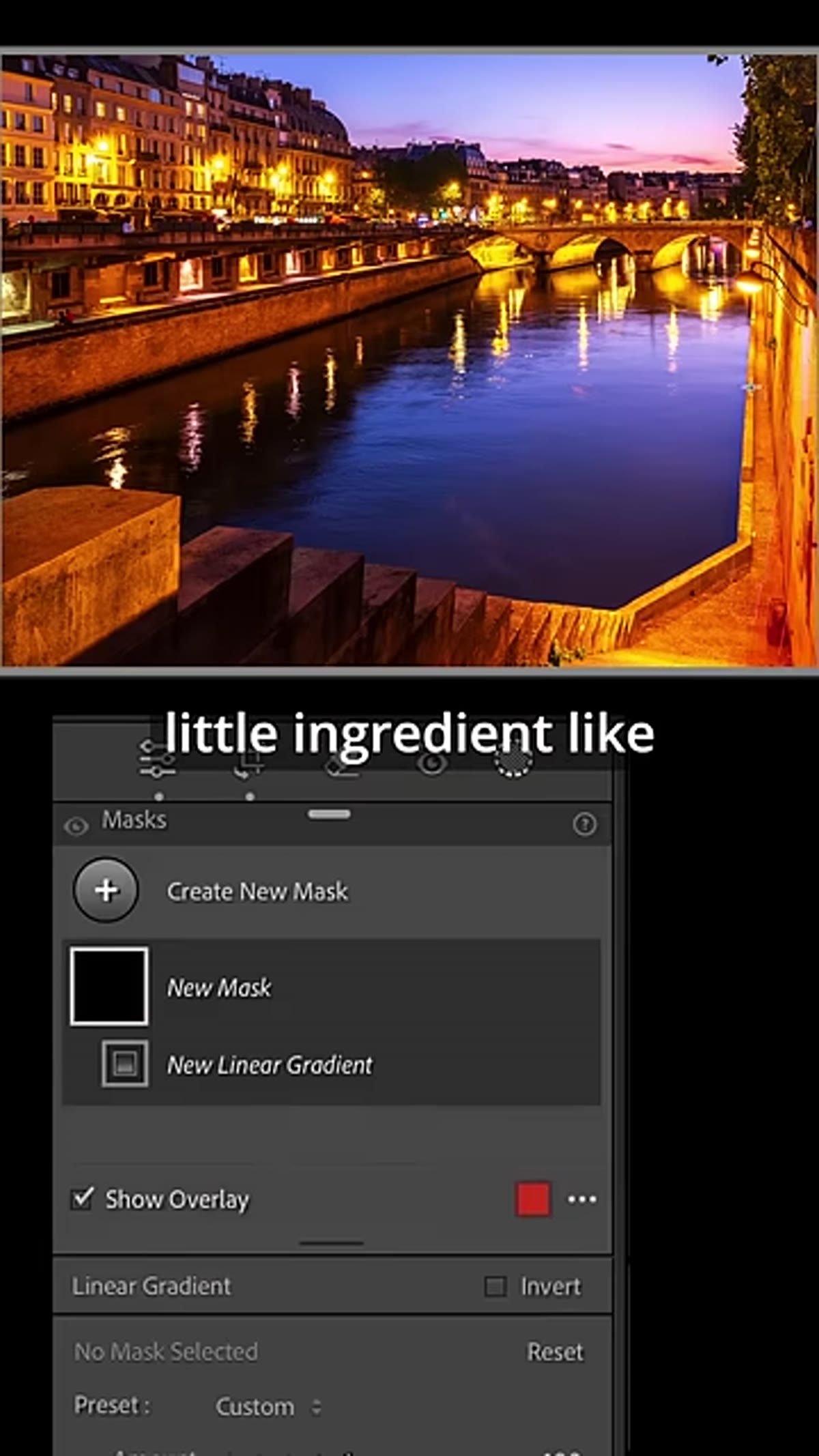 Linear gradient being dragged in from the left side of the image
This is the step that completes the psychological effect. Serge adds darkening gradients from the edges of the frame inward. This isn’t vignetting in the traditional circular sense. It’s directional shadow that mimics how a doorway or archway naturally falls. The viewer’s eye reads those darker edges as walls and moves toward the bright center automatically.
Linear gradient being dragged in from the left side of the image
This is the step that completes the psychological effect. Serge adds darkening gradients from the edges of the frame inward. This isn’t vignetting in the traditional circular sense. It’s directional shadow that mimics how a doorway or archway naturally falls. The viewer’s eye reads those darker edges as walls and moves toward the bright center automatically.
In Lightroom, select the Linear Gradient tool and drag in from the left edge toward the center, keeping Exposure in the negative range (-0.5 to -1.0 is a good starting point). Repeat from the right side. You can also add one from the top if the upper portion of the frame is competing for attention. The goal is not drama. The goal is direction. You are quietly telling the viewer where to look.
What I Do Differently in Portrait Context
When I bring this technique into my portrait and beauty work, I push the gradient darkening further than Serge does here, because a face in a frame needs even more visual containment than a street scene. I also run a separate Color Grading pass after the gradients are in place, adding a very slight cool shadow tone to counterbalance the magenta warmth in the midtones. It keeps skin from going too pink in the areas the gradient hasn’t fully touched.
The other thing I’ve learned to do is name these editing sequences so I can return to them. I have a Lightroom preset I built from this exact approach that I call “Amélie” because of the moody, warm-shadow French feel. If you do enough of these edits, you start to feel when an image wants that treatment. The architectural ones almost always do.
The most important thing this tutorial reinforced for me: your editing choices either support the compositional story or they fight it. In a frame-within-a-frame shot, every adjustment should be asking, “does this help the viewer’s eye stay inside the frame?” Tonal shaping, color mood, gradient shadows, all of it should answer yes.
Watch the full tutorial on YouTube and watch how quickly Serge moves through these decisions. The speed is the point. When you know what you’re doing and why, the edit stops being a series of guesses and becomes a conversation with the image.
Comments (1)
Would love to see a follow-up going deeper into this topic.
Leave a Comment