There’s a particular kind of frustration that comes from delivering a beauty retouch that looks completely flat on screen. The skin is clean, the tones are balanced, the color is consistent, and yet something is missing. Dimension. The sense that there’s actual space between the subject and the world behind them. For a long time, the only reliable fix I had was to manually paint luminosity masks or fake a depth-of-field effect with blur layers and a lot of patient masking. It worked, but it was slow, and “slow” is not a word that pays well in freelance.
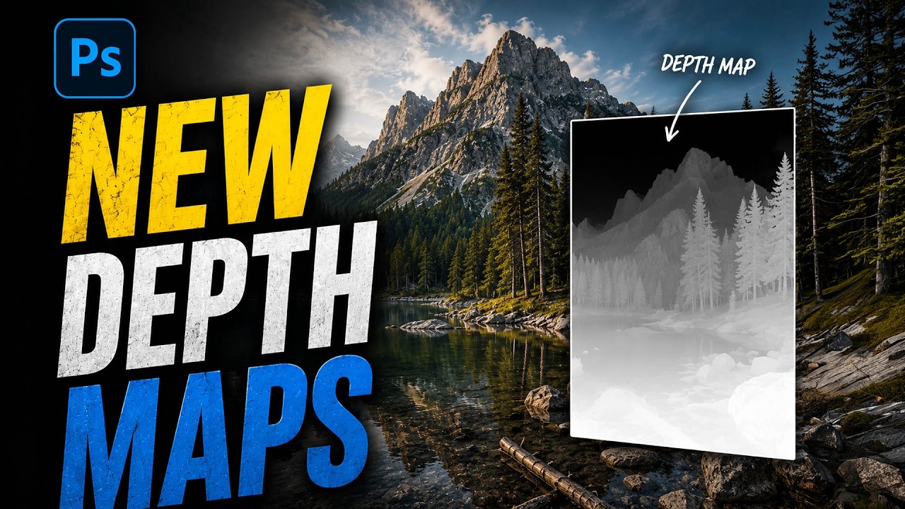
That’s why I got genuinely excited watching this tutorial from Matt Kloskowski, where he walks through a masking feature that Adobe quietly added to Adobe Camera Raw in a recent Photoshop update. It’s called Depth Range masking, and what makes it remarkable is that it now works on any image, including JPEGs, using an AI-generated depth map rather than requiring special hardware. Watch the full tutorial on YouTube if you want to see Matt’s hands-on demo alongside this breakdown.
This tool is genuinely new territory for anyone who works in Adobe Camera Raw regularly. It isn’t fully polished yet, and Matt is upfront about that. But the potential here for portrait and beauty work is significant enough that I think it’s worth getting familiar with it now, while it’s still under the radar.
Step 1: Make Sure Photoshop Is Up to Date
 Photoshop update reminder with Camera Raw filter open
Before anything else, you need to confirm you’re running the latest version of Photoshop. This feature lives in Adobe Camera Raw and is part of the main release, not a beta. It is not currently available in Lightroom Classic or Lightroom Desktop, which is frustrating if you work primarily in Lightroom. For now, your path to this tool is either opening a raw file directly (which launches Camera Raw automatically) or, if you’re already inside Photoshop, going to Filter and choosing Camera Raw Filter. Either route gets you there.
Photoshop update reminder with Camera Raw filter open
Before anything else, you need to confirm you’re running the latest version of Photoshop. This feature lives in Adobe Camera Raw and is part of the main release, not a beta. It is not currently available in Lightroom Classic or Lightroom Desktop, which is frustrating if you work primarily in Lightroom. For now, your path to this tool is either opening a raw file directly (which launches Camera Raw automatically) or, if you’re already inside Photoshop, going to Filter and choosing Camera Raw Filter. Either route gets you there.
If you’re working on a JPEG or a flattened layer rather than a raw file, the Camera Raw Filter still applies. You’ll have a bit less latitude for drastic exposure or shadow recovery, but for selective depth-based adjustments, it holds up well.
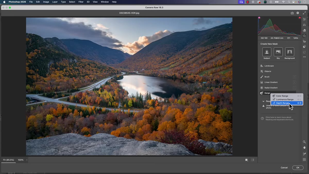
Step 2: Open the Masking Panel
 Masking tool panel open on the right side of Camera Raw
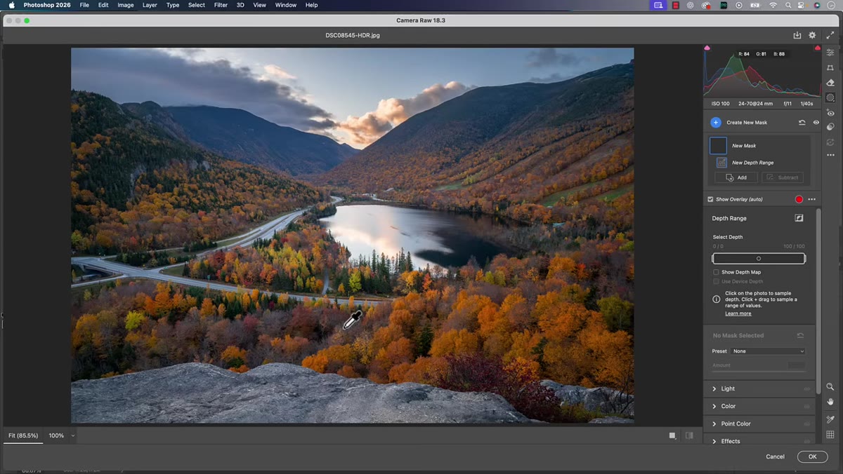
Once you’re inside Adobe Camera Raw, look to the right-hand panel and find the masking icon. It looks like a circle with a dotted outline. Click it to open the masking panel, and you’ll see a list of masking options: Subject, Background, Sky, Object, Brush, Linear Gradient, Radial Gradient, Color Range, Luminance Range, and Depth Range. We’re heading straight to Depth Range.
Masking tool panel open on the right side of Camera Raw
Once you’re inside Adobe Camera Raw, look to the right-hand panel and find the masking icon. It looks like a circle with a dotted outline. Click it to open the masking panel, and you’ll see a list of masking options: Subject, Background, Sky, Object, Brush, Linear Gradient, Radial Gradient, Color Range, Luminance Range, and Depth Range. We’re heading straight to Depth Range.
Depth Range isn’t new to this panel. It’s been there for a while, but it used to rely on depth map data embedded by the camera itself, which really only applied to portrait mode images taken on certain smartphones. Because most of us shoot with DSLRs or mirrorless cameras that don’t embed depth maps, the feature was essentially decorative for years. The update changes that entirely.
Step 3: Click Depth Range to Activate the AI Depth Map
 Depth Range option selected in the masking panel
Click on Depth Range in the masking panel. When you do this on any image, Photoshop now generates an AI-powered depth map on the fly. You’ll notice there’s a checkbox that says “Use Device Depth Map” inside the options. That’s the old method, the one that required the phone or camera to have already embedded the data. You can leave that unchecked. The AI-generated depth map is what you want to be working with.
Depth Range option selected in the masking panel
Click on Depth Range in the masking panel. When you do this on any image, Photoshop now generates an AI-powered depth map on the fly. You’ll notice there’s a checkbox that says “Use Device Depth Map” inside the options. That’s the old method, the one that required the phone or camera to have already embedded the data. You can leave that unchecked. The AI-generated depth map is what you want to be working with.
This is the conceptual shift that makes the feature newly useful. Photoshop is now reading the image and inferring which parts of the scene are closer to the lens and which are farther away. The depth map it creates isn’t always perfect, particularly with complex scenes or unusual lighting, but for portrait and beauty work with a clear subject-to-background relationship, it tends to be quite good.
Step 4: Sample a Depth with the Eyedropper
 Eyedropper tool clicking on the foreground of the image
After activating Depth Range, you’ll get an eyedropper cursor. Click anywhere in your image to sample a depth location. Wherever you click, Photoshop will highlight the areas of the image that exist at roughly the same depth as that point. The selected region shows up in red, which is the standard mask overlay in Camera Raw.
Eyedropper tool clicking on the foreground of the image
After activating Depth Range, you’ll get an eyedropper cursor. Click anywhere in your image to sample a depth location. Wherever you click, Photoshop will highlight the areas of the image that exist at roughly the same depth as that point. The selected region shows up in red, which is the standard mask overlay in Camera Raw.
Click on the subject’s face, and you’ll see the mask cover the foreground. Click further back toward a midground element, and the selection shifts to that depth plane. Click on the background entirely, and the mask moves there instead. Each click resets and resamples. You can’t stack multiple sample points the way you might with some other tools, so think of each click as a fresh decision about which depth layer you want to work with.
Step 5: Understand What Depth Range Is and Isn’t For
 Red mask overlay showing selected depth plane in foreground
This is the part Matt emphasizes that I think is easy to gloss over. Depth Range masking is not a replacement for the Subject or Background masks. Those tools are already excellent at separating a person from their environment based on edge detection and AI subject recognition. Depth Range works differently. It works in planes, like layers of space moving away from the camera.
Red mask overlay showing selected depth plane in foreground
This is the part Matt emphasizes that I think is easy to gloss over. Depth Range masking is not a replacement for the Subject or Background masks. Those tools are already excellent at separating a person from their environment based on edge detection and AI subject recognition. Depth Range works differently. It works in planes, like layers of space moving away from the camera.
Think of it as painting with distance rather than with shape. Where Subject masking asks “what is this thing?” Depth Range asks “how far away is this thing?” For beauty retouching, that distinction matters because it lets you do things like brighten only the depth plane where the subject’s face sits, or add contrast to the background plane while leaving the subject entirely untouched, without ever drawing a single manual mask.
A Note From My Own Workflow
I’ve started using Depth Range as a first pass for background separation on beauty shots where the background has a similar color or tone to the subject’s hair or clothing, which is exactly where Subject masking tends to struggle. It won’t always give me a clean enough mask to use on its own, but combined with a Subject mask using the Intersect option in Camera Raw, I can isolate depth planes with a lot more precision than I used to be able to.
The tool is still early in its development, as Matt openly acknowledges. Complex scenes with overlapping depth planes can confuse it. Very flat, even-lit images don’t give the AI much to work with. But for any image with genuine depth, even a simple headshot against a blurred background, it can save real time and produce results that look much more natural than manual selections.
The biggest thing I took from this tutorial is simple: stop skipping Depth Range just because it didn’t work for you before. The AI depth map generation changes everything about what this feature can do. Get comfortable with it now, while it’s still underused.
Watch the full tutorial on YouTube to see Matt walk through the depth sampling in real time. Seeing the red overlay shift as he clicks across different depth planes makes the spatial logic click in a way that’s hard to fully capture in text.
Comments (6)
Applied this to my portfolio shots and the improvement is noticeable.
Excellent tutorial. I'd add that from a photography standpoint, this technique is incredibly versatile.
Solid advice. Especially the part about taking your time with it.
This is exactly what I needed today. Been struggling with this for weeks.
Great breakdown. The step-by-step approach really helps.
Printing this out and pinning it next to my monitor. That good.
Leave a Comment