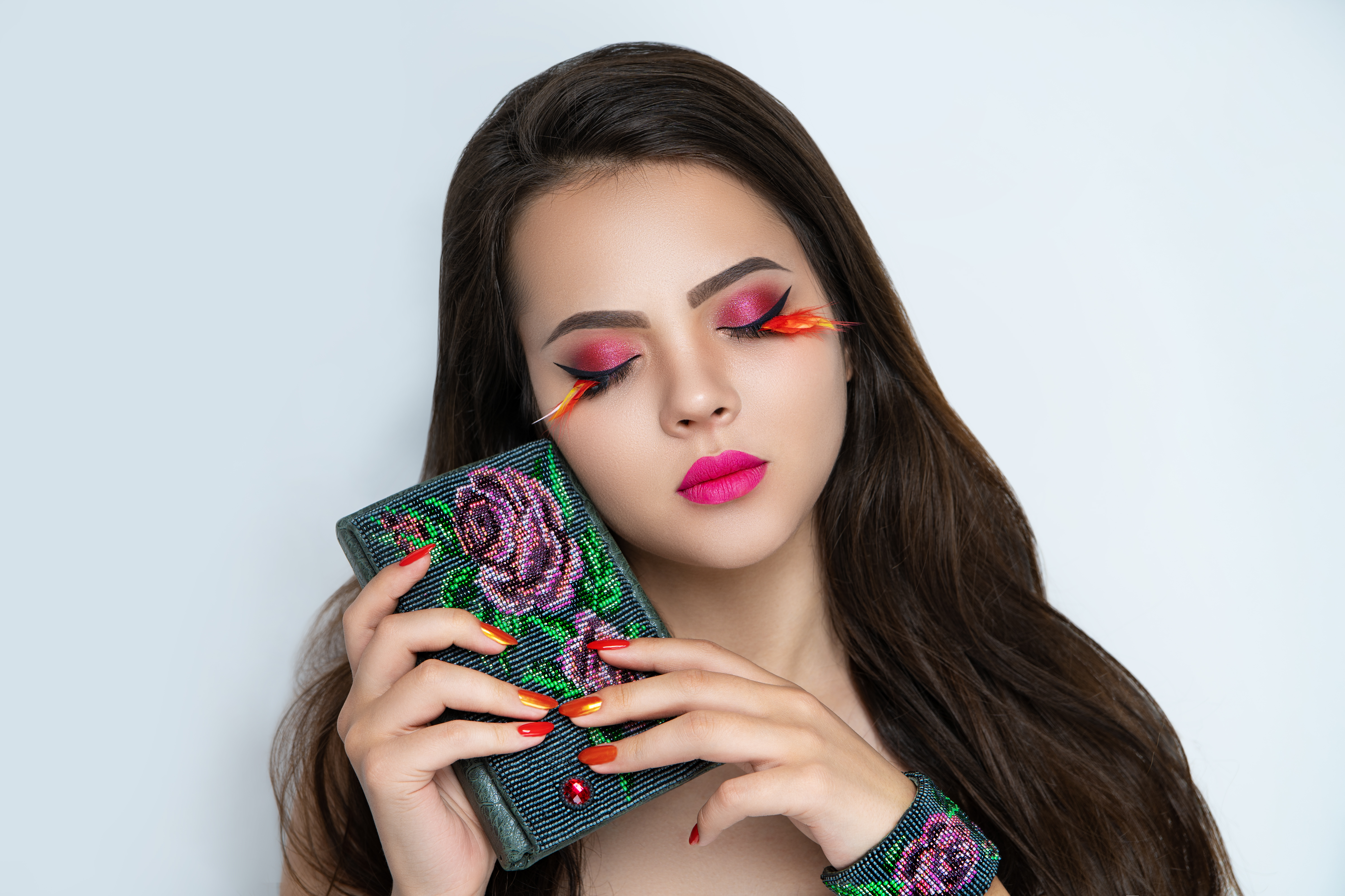
A few years into my retouching career, a client emailed me back after receiving her finished images. She was polite about it, which almost made it worse. “They look a little… smooth?” she wrote. “Like, really smooth.” I opened the files and felt my stomach drop. I had obliterated her skin. Every pore, every fine line, every piece of texture that made her look like a real human being, gone. She looked like she’d been rendered in a video game engine from 2009.
That email sent me down a six-month rabbit hole that eventually led me to frequency separation, and I have not retouched skin the same way since.
What “Smooth” Actually Means to Photoshop
Here is the thing most tutorials skip over: when we talk about skin texture in an image, we are actually talking about two completely separate kinds of visual information layered on top of each other. There is color and tone, meaning the blush on a cheek, the shadow under a jawline, the uneven redness around a nose. And then there is texture, the actual surface detail: pores, fine lines, individual hairs, the subtle topography that makes skin look like skin and not porcelain.
Standard healing tools and clone stamping blur these two things together. When you smooth out a blemish with a soft brush at 50% opacity, you are erasing both the color irregularity AND the texture underneath it. Do that twenty times across a face and you end up with what my client so diplomatically called “really smooth.”
Frequency separation works by physically separating those two channels into distinct layers so you can fix color without touching texture, and fix texture without disturbing color. It sounds technical because it is, but the execution is straightforward once you run through it a few times.
The Exact Setup, Step by Step
Start with your retouched base image flattened, or at minimum merged to a single working layer. Duplicate that layer twice. Name the bottom copy “Low Frequency” and the top one “High Frequency.”
Select the Low Frequency layer and run Gaussian Blur at a radius between 4 and 8 pixels. For most beauty work shot on a full-frame camera at moderate distance, I use 6 pixels. For tight macro shots where every pore is enormous on screen, I drop to 4. The goal is to blur just enough that skin texture disappears but the underlying tones remain readable.
Now select the High Frequency layer. Go to Image, Apply Image. In the dialog: set Layer to your Low Frequency layer, set Blending to Subtract, Scale to 2, Offset to 128. For 16-bit files, change Subtract to Add, Scale to 2, Offset to 0. Hit OK. Change the blending mode of the High Frequency layer to Linear Light. You now have a working frequency separation stack.
Paint on the Low Frequency layer with a soft brush, low opacity, using sampled skin tones to even out redness, shadows, or discoloration. The texture above stays completely intact. For the High Frequency layer, use the Clone Stamp tool at 100% opacity, 0% hardness, to move texture around without affecting color. A blemish becomes a matter of borrowing clean texture from nearby skin, not erasing the surface entirely.
The Setting Nobody Talks About
Opacity is where most people trip up on the Low Frequency layer. I see students painting at 30% or 40% and making thirty passes, which creates a muddy, overworked quality that is almost as bad as over-smoothing. I work at 10% to 15% maximum, build slowly, and check my work at 100% zoom every few strokes. The total time investment on a single portrait is usually 20 to 35 minutes for a thorough skin pass, but the result holds up to full-resolution scrutiny in a way that five minutes of healing brush work simply never will.
I also keep my Low Frequency brush diameter large, often 200 to 400 pixels on a file sized at 3000 pixels on the long edge. Small brushes create little islands of corrected color that are visible at print size. Large, feathered strokes blend transitions the way light actually moves across a face.
The File That Lives in My Archives as a Warning
I still have the first portrait I ever retouched, back when I was shooting weddings and thought Portraiture at default settings was all anyone needed. The woman in the photo has skin that looks like a rubber Halloween mask. Every time I feel tempted to rush a job or skip the frequency separation setup because a deadline is tight, I open that file. It takes about four seconds for me to close it and set up the layers properly.
The wedding work was relentless and I eventually stepped away from it, but the discipline of delivering dozens of portraits every single weekend gave me one thing I am genuinely grateful for: I learned fast what does not work, because clients saw everything at full size, printed, framed, and hung on walls. There is no hiding from a 20x30 print.
When to Break the Rules
Frequency separation is not always the right tool. For heavy creative beauty work, fashion editorial, or anything where the art director wants a painterly or surreal finish, you can and should push further. I have delivered beauty shots with almost no visible pore texture because that was the brief. The difference between “plastic” and “intentional” lives entirely in whether the rest of the image, the lighting, the color grade, the styling, supports that level of abstraction.
The technique exists to give you control, not to impose a single correct outcome.
The single most important habit you can build is separating texture from tone before you touch anything, because every retouching decision you make after that point becomes reversible, adjustable, and honest to the actual person sitting in front of the camera.
Comments (4)
Just subscribed. If the rest of your content is this good, I'm in.
This is the kind of content that keeps me coming back.
Applied this to my portfolio shots and the improvement is noticeable.
This should be required reading for anyone starting out.
Leave a Comment