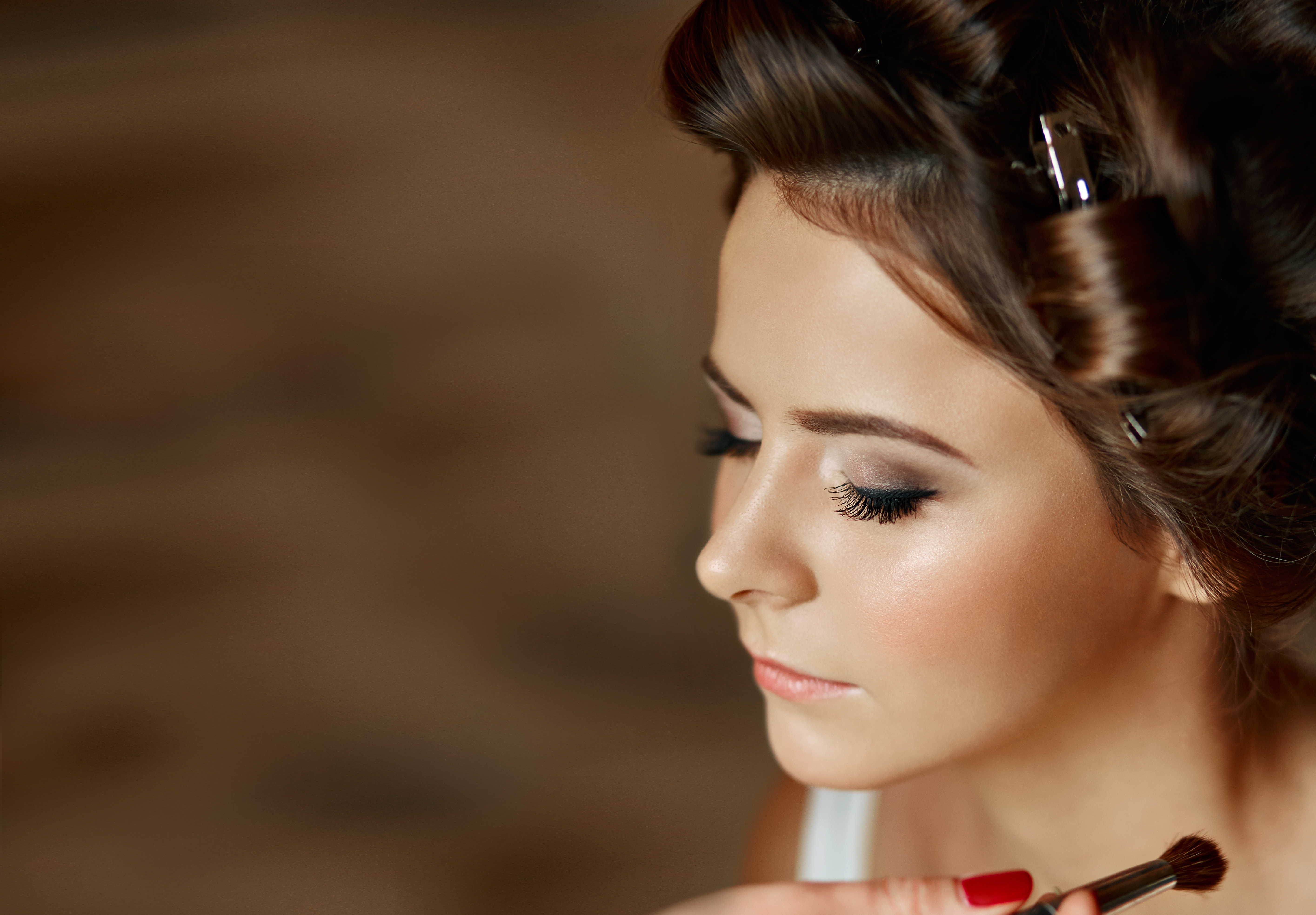
A few years into freelancing, I got an email from a client that I still think about. She was a cosmetics brand, small but growing, and after I delivered the first round of edits she wrote back with three words: “too plastic, sorry.” No other notes. Just that.
I knew exactly what she meant. I had smoothed the model’s skin until it looked like it had been buffed with a belt sander. Every pore was gone. The texture that makes a face look like a face, rather than a render, had been erased entirely. I had confused “clean” with “inhuman,” and it cost me a reshoot and a lot of embarrassment.
That project pushed me to spend a serious chunk of time, close to a year of weekends, learning frequency separation properly. Not the YouTube-in-ten-minutes version. The real version.
What Frequency Separation Is Actually Doing
Most retouchers have heard of frequency separation. Fewer understand what it’s separating. The core idea is this: a photograph contains two kinds of visual information layered on top of each other. There’s color and tone, which includes blotchiness, redness, and uneven shadows. And there’s texture, which includes pores, fine lines, and hair. Frequency separation splits those two things onto different layers so you can fix one without touching the other.
When you blur skin to even out tone in a standard workflow, you’re dragging texture information along with it. That’s where the plastic effect comes from. The luminosity gets smoothed, but so does everything that makes skin feel real. Frequency separation keeps those channels independent, so you can paint over a red patch without touching a single pore.
Setting Up the Layers Correctly in Photoshop
Here’s the setup I use, which I’ve refined into a Photoshop action I call “Apocalypse Now” because the before-and-after feels that dramatic.
Duplicate your background layer twice. Name the bottom copy “Color” and the top copy “Texture.” Select the Color layer and apply a Gaussian Blur. For medium-resolution beauty shots at 300 dpi, I use a radius between 6 and 10 pixels. For lower-resolution editorial work, 3 to 5 pixels is usually enough. The goal is to blur just far enough that individual pores disappear but the broader shapes of light and shadow remain readable.
Now select the Texture layer. Go to Image, Apply Image. Set the layer to your Color layer, the blending mode to Subtract, the scale to 2, and the offset to 128. This sounds like math homework, but what it’s doing is calculating the difference between the two layers and storing the texture information neutrally so it can sit on top without shifting your tones. Change the Texture layer’s blend mode to Linear Light.
From here, you work the Color layer with a soft brush at low opacity, anywhere from 8 to 15 percent, sampling nearby skin tones and painting over discoloration. The Texture layer stays untouched unless you need to clone out a specific blemish, in which case you stamp directly on it using the clone stamp set to Current Layer only.
Where Most People Get It Wrong
The mistake I see most often in the workshops I teach is over-working the Color layer. People treat it like a blank canvas and paint until the skin looks completely uniform. Real skin isn’t uniform. There are subtle shifts in value across the forehead, the cheeks read warmer near the cheekbones, the area around the nose and mouth tends to sit slightly cooler. Erasing all of that produces the same plastic result you’d get without frequency separation at all.
A rule I give my students: if you can’t see a visible difference between your painted area and the surrounding skin when you zoom out to 50 percent view, you’ve gone too far. Beauty retouching should be invisible at delivery size, not at 200 percent.
I also recommend keeping your opacity strokes low and building up gradually rather than painting one heavy pass. At 8 percent opacity, you have a lot of margin for error. At 40 percent, one misplaced stroke can flatten an entire cheekbone.
When to Use Dodge and Burn Instead
Frequency separation handles tone and color well, but it’s not always the right tool. For structural work, meaning the sculpting of light and shadow that shapes a face, dodge and burn on a separate 50 percent gray layer set to Overlay gives you more control. I use a soft brush at 3 to 5 percent opacity and work slowly across the planes of the face, lifting the highlights on the brow bone and darkening just under the jawline.
The two techniques work together rather than competing. Frequency separation handles the surface quality of skin. Dodge and burn handles the three-dimensional form underneath. Using both in sequence, frequency separation first and dodge and burn after, gives you a result that looks retouched without looking altered.
Keeping It Calibrated to the Image
Every image needs a different intensity. A beauty close-up for a skincare brand needs more attention than an editorial portrait for a magazine. A subject with naturally smooth skin needs a lighter hand than someone with more textural variation. I always check my work by toggling layers off and on at the delivery resolution, not zoomed in, to make sure the edit reads as enhancement rather than replacement.
The single most important thing I’ve learned, after hundreds of hours and one very pointed three-word client email, is that good skin retouching preserves what makes a face individual. Texture isn’t a flaw. It’s evidence that a real person was in front of the camera.
Comments (8)
This is exactly what I needed today. Been struggling with this for weeks.
Tried this technique this morning. Game changer for real.
Just used this on a wedding shoot edit. Client was thrilled.
Would love to see a follow-up going deeper into this topic.
Well explained. I think my audience would really benefit from this — mind if I link to it?
Tried this technique this morning. Game changer for real.
This is exactly what I needed today. Been struggling with this for weeks.
Wow, I had no idea you could do this. Mind blown.
Leave a Comment