There’s a skill that took me years to develop, and it has nothing to do with Photoshop. It’s knowing what to look at before you open a single panel. Early in my retouching career, I would dive straight into skin work, dodging and burning and smoothing, only to deliver a finished file and have a client point out that the framing was off, or that a distracting element was pulling the eye away from the subject. I had polished the wrong things. What changed for me was learning to read an image the way an editor reads a draft, starting with structure, then light, then texture and color.
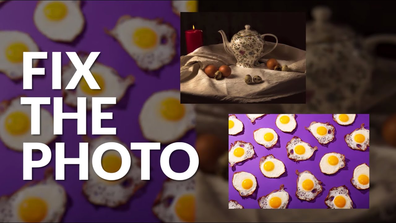
That’s exactly the instinct on display in this Visual Education tutorial, Watch the full tutorial on YouTube, where the instructor works through two member-submitted photos from a weekly challenge. The images aren’t portraits, but the diagnostic process he uses maps perfectly onto beauty and portrait retouching. He moves through each image in a consistent order: composition first, then luminosity problems, then surface and color. That order matters, and I’ll explain why as we go through each step.
Step 1: Read the Composition Before Anything Else
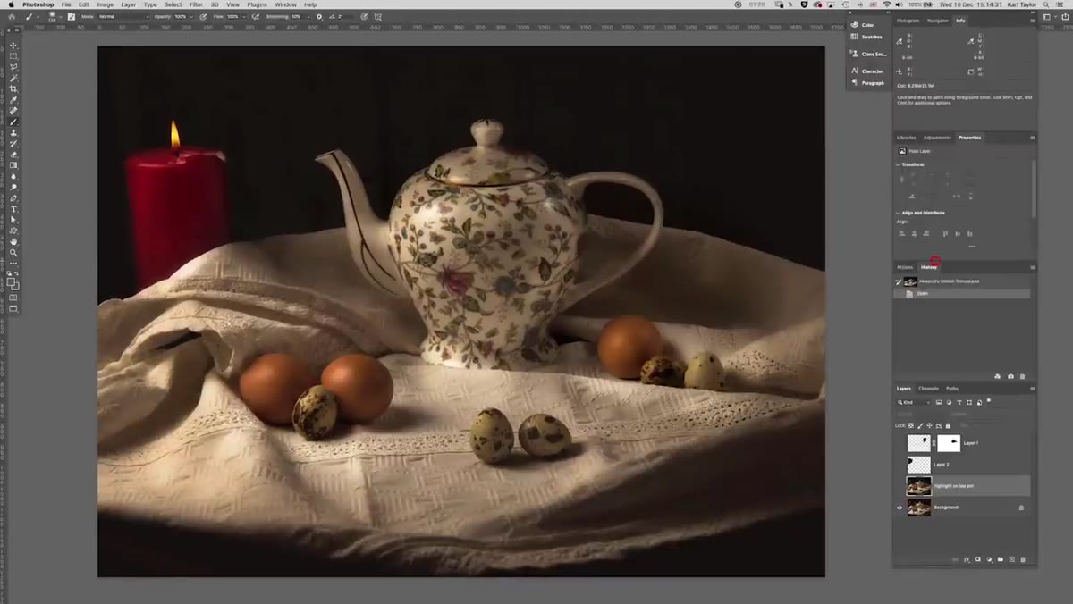 Full-screen view of Alexandru’s egg photo with candle visible
When the instructor pulls up the first image, he doesn’t reach for any tools. He looks. Within a few seconds he identifies a candle on the left side of the frame that, in his words, adds nothing and actively competes with the subject. The principle here is that every element in the frame should earn its place. If you’re looking at a portrait, ask the same question about background objects, loose hair strands near the face, or props that were part of the shoot setup. If an element doesn’t support the story you’re telling, it’s a distraction.
Full-screen view of Alexandru’s egg photo with candle visible
When the instructor pulls up the first image, he doesn’t reach for any tools. He looks. Within a few seconds he identifies a candle on the left side of the frame that, in his words, adds nothing and actively competes with the subject. The principle here is that every element in the frame should earn its place. If you’re looking at a portrait, ask the same question about background objects, loose hair strands near the face, or props that were part of the shoot setup. If an element doesn’t support the story you’re telling, it’s a distraction.
For composition fixes, the instructor considers two options: remove the candle entirely, or reposition it to the opposite side for better balance. He ultimately removes it, and the image immediately feels calmer and more focused. In portrait retouching, we face this choice constantly. Sometimes a stray piece of clothing at the frame edge is better cloned out; sometimes it just needs to shift. Train yourself to make that call before you open your healing brush.
Step 2: Address Highlight Clipping and Luminosity Balance
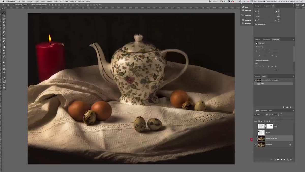 Teapot with blown highlight visible before adjustment
With the composition settled, the instructor moves to a small but important detail: a highlight on the teapot that reads as too bright and pulls attention. He dials it back slightly, just enough to return texture to that area without making the shot feel flat. This is the luminosity read, and it’s the second thing I look at in any file I retouch.
Teapot with blown highlight visible before adjustment
With the composition settled, the instructor moves to a small but important detail: a highlight on the teapot that reads as too bright and pulls attention. He dials it back slightly, just enough to return texture to that area without making the shot feel flat. This is the luminosity read, and it’s the second thing I look at in any file I retouch.
In portrait work, this translates directly to specular highlights on skin, particularly on foreheads, noses, and cheekbones. The goal isn’t to eliminate them, it’s to ensure they don’t overpower the subject’s features. A highlight that clips to pure white loses all texture information and reads as a blown-out patch rather than a natural reflection of light. Bring it down just until you can see the surface again.
Step 3: Crop to Focus, Not Just to Tighten
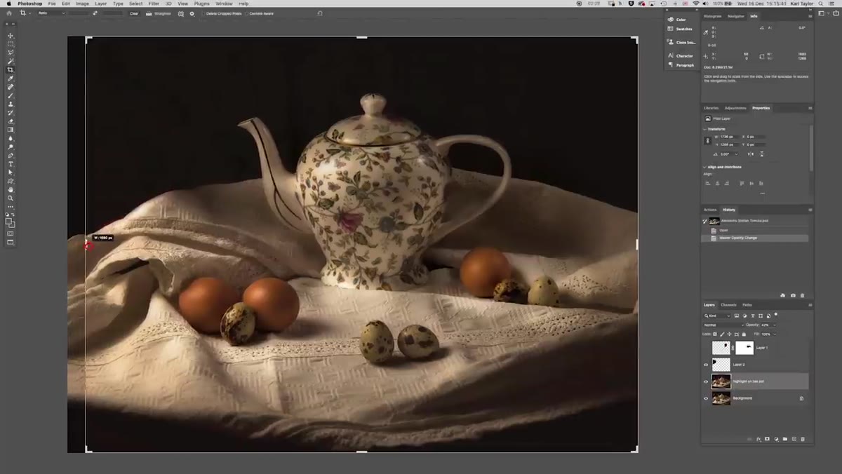 Crop tool applied to bring focus toward the eggs
The instructor’s third move is a crop, but he’s deliberate about where he crops and where he doesn’t. He brings the top and sides in to concentrate attention on the eggs, but he leaves the bottom of the frame untouched because a natural dark vignette there is already doing compositional work. Cropping over it would lose that framing.
Crop tool applied to bring focus toward the eggs
The instructor’s third move is a crop, but he’s deliberate about where he crops and where he doesn’t. He brings the top and sides in to concentrate attention on the eggs, but he leaves the bottom of the frame untouched because a natural dark vignette there is already doing compositional work. Cropping over it would lose that framing.
This is a principle worth keeping: a crop isn’t always about removing empty space. Sometimes it’s about redirecting the viewer’s eye to the most important area of the image. In headshots and beauty work, this often means cropping into the shoulders to push the face forward, or trimming dead space to one side so the subject feels anchored rather than adrift.
Step 4: Use Liquify to Fix Unnatural Lines and Shapes
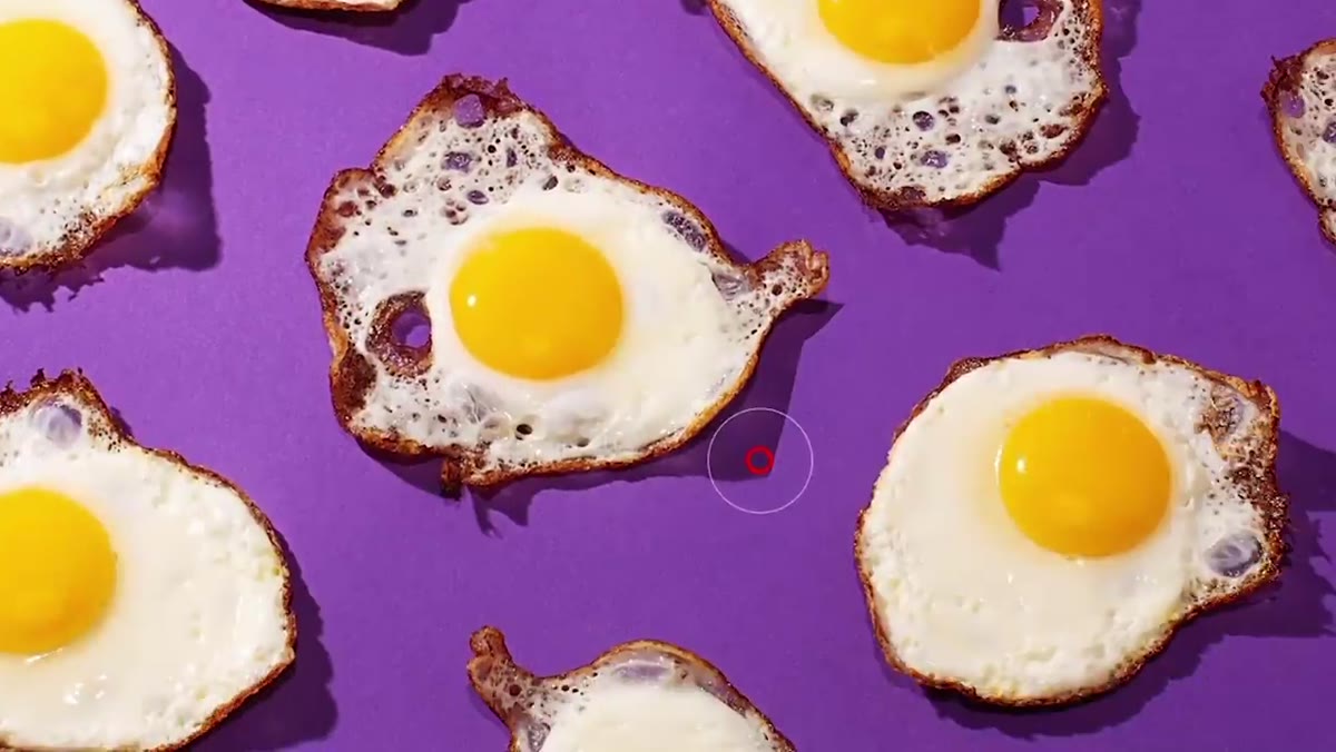 Liquify filter open with shadow being warped in the second image
Moving to the second image, the instructor spots a shadow that runs in a completely straight line beneath the eggs. It looks mechanical and wrong next to the organic, irregular shadows that fall naturally from the subjects. He duplicates the layer, opens Liquify, and uses the warp tool to introduce subtle curves and irregular bumps into that line until it reads as something that could have happened in real light.
Liquify filter open with shadow being warped in the second image
Moving to the second image, the instructor spots a shadow that runs in a completely straight line beneath the eggs. It looks mechanical and wrong next to the organic, irregular shadows that fall naturally from the subjects. He duplicates the layer, opens Liquify, and uses the warp tool to introduce subtle curves and irregular bumps into that line until it reads as something that could have happened in real light.
This is a technique I use regularly on portrait retouching, not for shadows, but for stray hairs, jawline edges that caught a hard light, or clothing edges that digitized into an unnatural straight line during a sharpen pass. Liquify in small, gentle strokes is almost always preferable to cloning or patching when the shape is right but just needs to feel less rigid.
Step 5: Select by Color to Isolate Background and Subject Separately
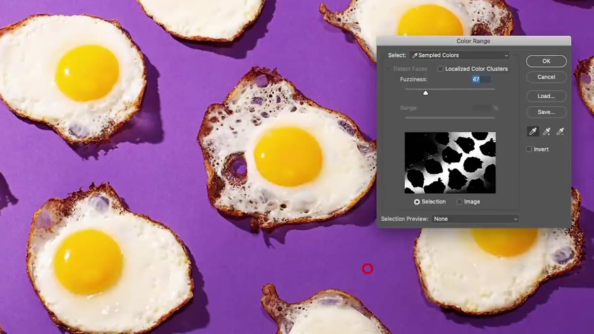 Color Range dialog open with background color sampled
Because the background in the second image is a single, distinct color, the instructor uses Select > Color Range to grab it precisely. He samples the base color, adds to the selection by clicking around the surface, and deliberately excludes the shadows at this stage. He saves that selection, duplicates the background onto its own layer, then inverts the selection and duplicates the eggs and their shadows onto a separate layer.
Color Range dialog open with background color sampled
Because the background in the second image is a single, distinct color, the instructor uses Select > Color Range to grab it precisely. He samples the base color, adds to the selection by clicking around the surface, and deliberately excludes the shadows at this stage. He saves that selection, duplicates the background onto its own layer, then inverts the selection and duplicates the eggs and their shadows onto a separate layer.
This separation gives him independent control over each element. In beauty retouching, we do the same thing when we separate skin from hair, or lips from teeth. Working on a merged layer means every adjustment is a compromise. Working on isolated layers means each area gets exactly what it needs.
Step 6: Apply Gaussian Blur to Smooth a Distracting Surface
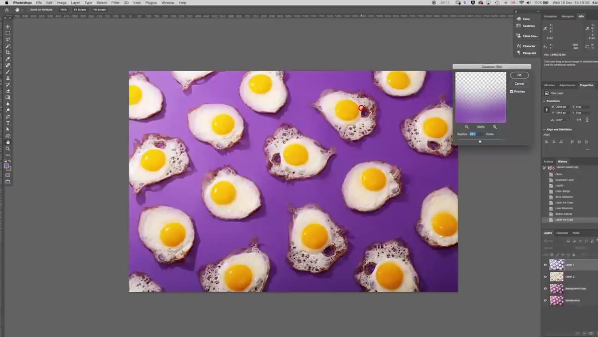 Gaussian Blur dialog with 34-pixel radius applied to background
With the background isolated, the instructor applies a Gaussian Blur at around 34 pixels. The surface had a grainy, speckled texture that was competing visually with the texture of the eggs themselves. Blurring it subordinates the background, and it suddenly reads as a supporting element rather than a rival one.
Gaussian Blur dialog with 34-pixel radius applied to background
With the background isolated, the instructor applies a Gaussian Blur at around 34 pixels. The surface had a grainy, speckled texture that was competing visually with the texture of the eggs themselves. Blurring it subordinates the background, and it suddenly reads as a supporting element rather than a rival one.
In portrait retouching, this concept applies to busy or distracting backgrounds that couldn’t be thrown out of focus in camera. A gentle blur on a selected background layer can recover the separation between subject and setting without requiring a complex mask.
What I’d Add From My Own Practice
The most important thing this tutorial reinforced for me is the value of a diagnostic pass before any tools come out. I now keep a physical checklist taped near my monitor: composition, highlight clipping, distracting lines, color relationships, surface texture. I run through it on every file before I open Photoshop’s panels. It takes maybe two minutes, and it has saved me from spending an hour polishing something that needed structural work first.
If you retouch portraits professionally, I’d also suggest doing your diagnostic pass on a full-screen preview with no panels open at all. Panels create tunnel vision. A clean screen forces you to look at the whole image the way a viewer will, which is the only perspective that actually matters.
The single most transferable lesson from this tutorial is sequence. Fix the structure of an image before you fix the surface. Composition and luminosity problems will undermine even the most technically perfect skin retouch. Get the foundation right first, then refine.
Watch the full tutorial on YouTube to see the instructor’s complete edits side by side with the originals.
Comments
Leave a Comment