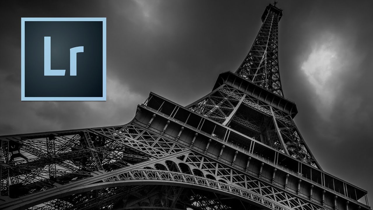
I came up through wedding photography, which means I learned to retouch under pressure and mostly by instinct. Skin, hair, the soft glow of a ceremony room — that was my world for years. So when I started freelancing for beauty brands and teaching retouching workshops, I had to deliberately go looking for techniques outside my comfort zone. That’s what led me to Watch the full tutorial on YouTube — a Kelvin Designs episode on dodge and burn for urban landscapes. I was not expecting a cityscape tutorial to shift how I think about light on skin. And yet here we are.
What Kelvin demonstrates in this video is a workflow built around a counterintuitive idea: instead of starting with a good exposure and nudging it, you deliberately darken everything first, then selectively paint light back in where you want it. It’s a sculpting approach, not a correcting one. For portrait retouching, that distinction matters enormously. We spend so much time fighting flat skin tones or blown-out highlights because we’re trying to fix what’s there. This tutorial reframes the question entirely.
The subject is a black-and-white Eiffel Tower shot, which sounds far removed from beauty work. But the logic of chasing drama in a sky full of detail is the same logic we use when we’re trying to make cheekbones read on camera. Light goes where you put it. Here’s how Kelvin does it, step by step.
Step 1: Build a Global Foundation in the Develop Module
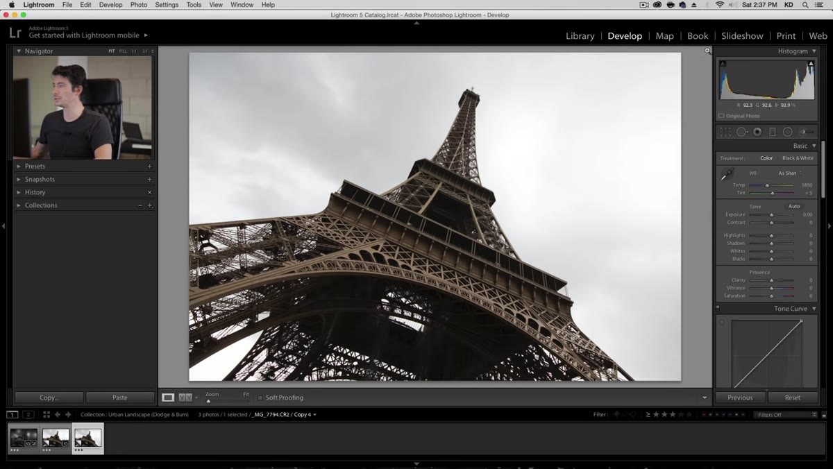 Lightroom develop module with before and after virtual copy
Before any brush work begins, Kelvin makes a few global adjustments in Lightroom’s Develop module. He pulls highlights down slightly to recover sky detail, opens shadows just a touch (without going so far that the contrast flattens out), and adds a small amount of clarity at the global level. The key word here is “small.” He’s not trying to finish the image in the basic panel. He’s creating a workable starting point, something that gives him enough tonal range to sculpt from.
Lightroom develop module with before and after virtual copy
Before any brush work begins, Kelvin makes a few global adjustments in Lightroom’s Develop module. He pulls highlights down slightly to recover sky detail, opens shadows just a touch (without going so far that the contrast flattens out), and adds a small amount of clarity at the global level. The key word here is “small.” He’s not trying to finish the image in the basic panel. He’s creating a workable starting point, something that gives him enough tonal range to sculpt from.
One specific note: he ultimately decides to remove global clarity and handle it at the brush level instead. The reason is a very recognizable artifact — that soft, glowing halo that appears around edges when clarity is pushed too high. If you’ve ever added clarity to a portrait and ended up with a strange rim of light around a jawline or hairline, you’ve seen this. Handling clarity locally gives you control over where that edge contrast lands.
Step 2: Create a Darkening Brush and Kill the Exposure
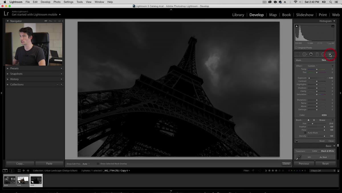
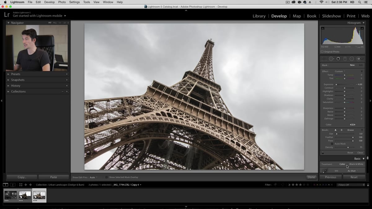 Adjustment brush panel open with minus four exposure setting
This is the move the whole workflow is built on. Kelvin creates a new adjustment brush in Lightroom and dials the exposure down to -4 stops. He sets the density to 100% and increases the brush size significantly. Then he paints this brush over the entire image, or at least every area he wants to have the option to reshape. He also nudges the highlights slider down within the brush settings to about -20, recovering just a little more edge detail.
Adjustment brush panel open with minus four exposure setting
This is the move the whole workflow is built on. Kelvin creates a new adjustment brush in Lightroom and dials the exposure down to -4 stops. He sets the density to 100% and increases the brush size significantly. Then he paints this brush over the entire image, or at least every area he wants to have the option to reshape. He also nudges the highlights slider down within the brush settings to about -20, recovering just a little more edge detail.
The result looks almost unusably dark. That’s the point. He describes it as starting with “as dark a canvas as possible without destroying it.” For portraits, think of this as the equivalent of doing your dodge and burn on a gray layer at low opacity in Photoshop. You’re building headroom so that every light you paint in feels intentional. Nothing is accidentally bright.
Step 3: Convert to Black and White
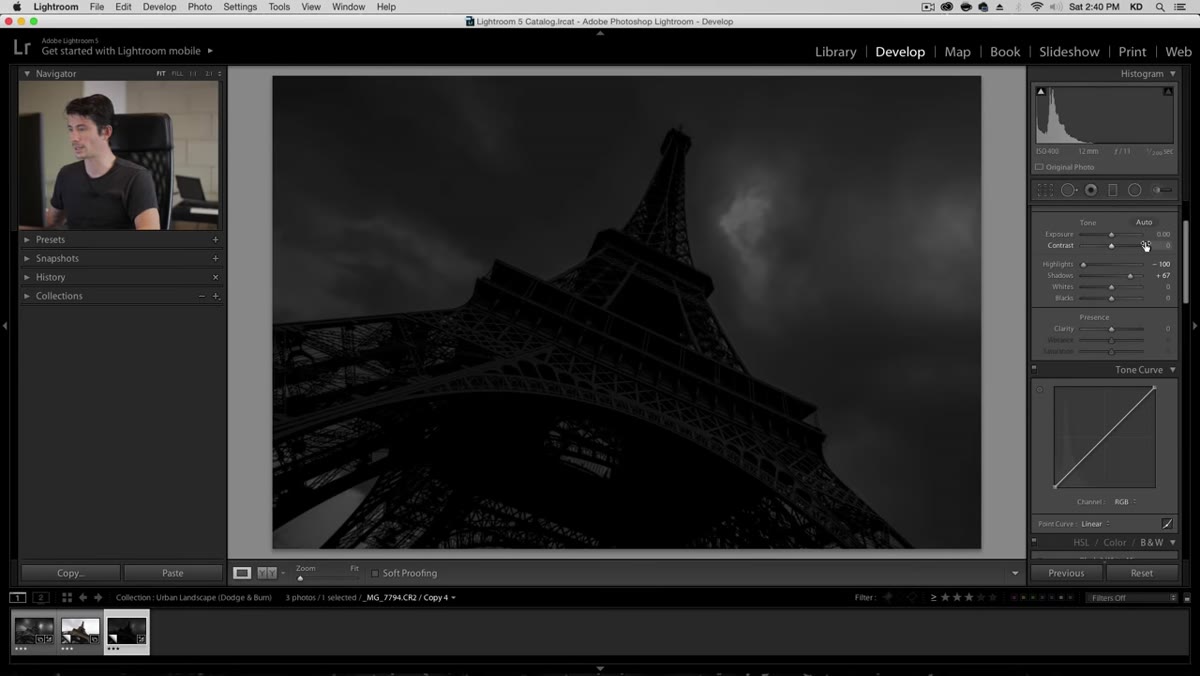 Black and white conversion applied in Lightroom HSL panel
After the darkening brush is in place, Kelvin switches the image to black and white using Lightroom’s built-in B&W conversion. He clicks the black and white option in the HSL panel and lets Lightroom apply its default grayscale mapping. He doesn’t spend time tweaking individual color channels at this stage. The conversion is a clarity move, not a stylistic one. Removing color makes it significantly easier to read luminosity — where things are actually bright or dark — without your eye being pulled around by hue or saturation.
Black and white conversion applied in Lightroom HSL panel
After the darkening brush is in place, Kelvin switches the image to black and white using Lightroom’s built-in B&W conversion. He clicks the black and white option in the HSL panel and lets Lightroom apply its default grayscale mapping. He doesn’t spend time tweaking individual color channels at this stage. The conversion is a clarity move, not a stylistic one. Removing color makes it significantly easier to read luminosity — where things are actually bright or dark — without your eye being pulled around by hue or saturation.
For anyone doing beauty retouching: this is why so many retouchers do their dodge and burn passes on desaturated or luminosity-masked layers. Color is distracting when you’re trying to see light.
Step 4: Create a New Brightening Brush for Selective Dodging
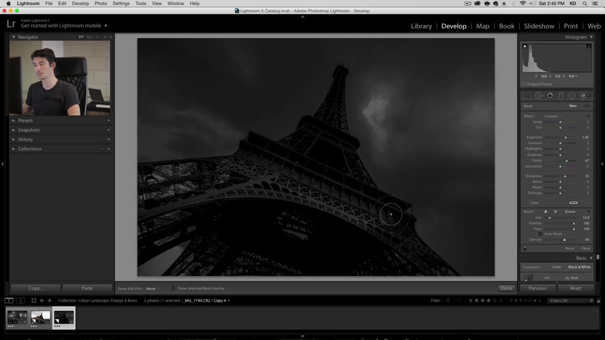
 New adjustment brush with raised exposure and clarity values
With the dark foundation in place, Kelvin creates a second adjustment brush. This one does the opposite: it raises exposure, adds a moderate amount of sharpness, and brings in some clarity. He drops the density to around 65% so the effect builds gradually rather than slamming in all at once. Using a mouse rather than a pressure-sensitive tablet, he compensates for the lack of natural variation by softening the brush edge and working in layers of strokes.
New adjustment brush with raised exposure and clarity values
With the dark foundation in place, Kelvin creates a second adjustment brush. This one does the opposite: it raises exposure, adds a moderate amount of sharpness, and brings in some clarity. He drops the density to around 65% so the effect builds gradually rather than slamming in all at once. Using a mouse rather than a pressure-sensitive tablet, he compensates for the lack of natural variation by softening the brush edge and working in layers of strokes.
The density setting is worth pausing on. At 100% density, each brush stroke delivers the full effect immediately. At 65%, each pass adds a percentage of the total effect, so you can build up in multiple strokes and stop when it feels right. For retouchers who use Photoshop’s dodge tool directly on skin, this is the same principle as lowering your tool opacity to 10 or 15%. Subtlety is control.
Step 5: Paint Light Back In Selectively
 Brightening brush being painted over the Eiffel Tower structure
Kelvin uses the brightening brush to paint over the Eiffel Tower itself, emphasizing the structure against the dark sky. He’s deliberate about staying away from the outer edges of the subject, keeping the clarity strokes toward the center of shapes rather than the silhouette. When he accidentally clips the edge, he immediately undoes and refines. The goal is to make the structure appear lit from within, not to simply raise exposure uniformly across it.
Brightening brush being painted over the Eiffel Tower structure
Kelvin uses the brightening brush to paint over the Eiffel Tower itself, emphasizing the structure against the dark sky. He’s deliberate about staying away from the outer edges of the subject, keeping the clarity strokes toward the center of shapes rather than the silhouette. When he accidentally clips the edge, he immediately undoes and refines. The goal is to make the structure appear lit from within, not to simply raise exposure uniformly across it.
This edge discipline transfers directly to portrait work. When we’re dodging a nose bridge or a cheekbone, painting into the edge creates a blown outline that looks retouched. Keeping the brightest value slightly inside the form reads as natural light. It’s the same principle working in two very different genres.
What I’d Do Differently in a Beauty Context
Kelvin’s workflow is built for Lightroom brushes, which are powerful but limited compared to what we can do with luminosity masks or frequency separation layers in Photoshop. When I apply this “dark canvas first” logic to portrait work, I do it on a dedicated dodge and burn layer in Photoshop, filled to 50% gray and set to Soft Light blending mode. I start by painting dark values across the entire face using a low-opacity black brush, then systematically paint light back in on high planes: cheekbones, brow bone, Cupid’s bow, the bridge of the nose.
The result of working this way is that nothing reads as an accident. Every bright area is a choice. That is exactly what Kelvin is doing on his cityscape, and it is exactly what separates retouching that looks sculpted from retouching that looks corrected. If your current approach feels like you’re always chasing problems, this is a method worth trying from scratch.
The single most important idea in this tutorial is the deliberate darkening pass before any dodging begins. Starting dark forces you to be intentional about every light you put back into an image. Whether you’re working on a blown-out Paris skyline or trying to make skin tones feel three-dimensional, that principle holds.
Watch the full tutorial on YouTube and see the before-and-after transformation for yourself. The final image is genuinely striking, and watching Kelvin build it in real time makes the logic click faster than any still breakdown can.
Comments (1)
Printing this out and pinning it next to my monitor. That good.
Leave a Comment