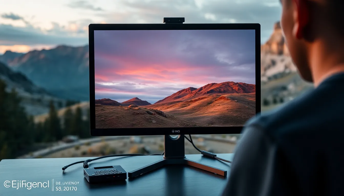
Do You Really Need a Color-Calibrated Monitor for Retouching? Yes — Here’s Why
I’m going to be honest with you: when I first started retouching portraits, I thought color calibration was something only “real” professionals needed to worry about. I worked on my laptop screen for nearly two years, wondering why my skin tones looked so different when clients received their edited images. The answer, I eventually learned, was staring me right in the face—literally.
A color-calibrated monitor isn’t a luxury. It’s the foundation of portrait retouching work that actually looks good to everyone, everywhere. Let me explain why, and help you find the right one for your workflow.
The Real Problem With Uncalibrated Screens
Here’s what happens when you edit on an uncalibrated monitor: you’re working blind. Your screen might be displaying colors in a way that’s unique to that specific panel. What looks like a perfectly balanced skin tone on your display could appear orange, muddy, or lifeless on your client’s phone, tablet, or printed album.
I once spent three hours perfecting a bride’s complexion, only to have her say the images looked “too red” on her end. I hadn’t changed anything—my monitor had simply been showing me a warmer version of the image than what actually existed in the file. That’s when I invested in proper calibration, and I never looked back.
When we calibrate our monitors, we’re essentially teaching them to display color accurately and consistently. This means the reds are truly red, the greens are truly green, and the skin tones we’re so carefully sculpting will look the same across devices. No surprises. No reshoot emails from unhappy clients.
What Makes a Monitor “Retouching Ready”
Not every monitor works equally well for portrait editing. We need to look for a few key features:
Color Gamut: Retouching monitors should cover at least 99% of the sRGB color space (and ideally AdobeRGB for print work). This ensures we can see the full range of colors we might work with.
Delta E: This measures color accuracy. A Delta E below 2 is excellent; below 1 is professional-grade. Lower numbers mean more accurate color representation.
Brightness and Contrast: Consistent brightness across the screen prevents us from over-brightening shadows or crushing highlights in certain areas.
Build Quality: We need sturdy stands, adjustable heights, and stable performance over time. These are tools we’ll use for hours daily.
The Contenders: Real-World Comparison
BenQ SW270C 27" Photo Editing Monitor
The BenQ SW270C is the workhorse I recommend to most portrait retouchers starting their color-management journey. I’ve been using one for nearly three years, and it’s become my gold standard.
What I love: The 27-inch screen gives us plenty of workspace for before/after comparisons. It ships pre-calibrated and maintains excellent color accuracy out of the box. The built-in colorimeter is a game-changer—it self-calibrates regularly, so we don’t need to buy separate calibration hardware. The adjustment controls are intuitive, and the included hood helps reduce ambient light interference (which we’ll discuss in a moment).
Where it shines: Portrait retouchers will appreciate the balanced approach to color accuracy. It’s not overkill for general retouching, but it’s absolutely professional-grade. The price-to-performance ratio is genuinely excellent.
Real talk: It’s not the cheapest option, but I’ve never regretted the investment. Every hour I work on this monitor, I feel the difference.
ASUS ProArt PA278QV 27" Monitor
The ASUS ProArt PA278QV is another strong competitor, particularly if you’re working with a tighter budget while refusing to compromise on quality.
What appeals to me: The 100% sRGB coverage is perfect for most retouching workflows. The stand is rock-solid, and the screen real estate feels generous without being overwhelming. I’ve seen many retouchers use this successfully for years.
The consideration: You’ll need to purchase calibration hardware separately (like the Calibrite ColorChecker Display Pro, which we’ll discuss). This adds cost initially, but it gives you the flexibility to recalibrate whenever you want, not just when the monitor recalibrates itself.
Calibrite ColorChecker Display Pro
If you’re going the ASUS route, or if you want maximum control over your calibration schedule, the Calibrite ColorChecker Display Pro is worth the investment.
I use this alongside my BenQ for periodic verification checks. It’s the industry standard for a reason—the calibration process is thorough, and the results are reliable. Think of it as an annual checkup for your monitor’s health.
The Calibration Setup You Actually Need
Having a great monitor is only half the equation. We also need to control our environment:
Room lighting: Work in consistent, non-flickering light. Avoid direct sunlight on your screen. I use daylight-balanced LED panels that don’t create reflections on my display.
Screen hood: The BenQ comes with one; if you choose the ASUS, consider buying an aftermarket hood. These reduce ambient light from washing out your colors.
Warm-up time: Give your monitor 30 minutes to reach stable temperature before starting critical work.
Regular recalibration: Every 2-4 weeks if you’re doing high-volume retouching, or monthly for weekly workflows.
My Recommendation for You
If you’re a serious portrait retoucher with a dedicated workspace, get the BenQ SW270C. The built-in calibration, pre-calibration accuracy, and inclusive hood make this the smartest single investment. You’ll have color-accurate retouching from day one.
If you want to build a more flexible system and potentially calibrate multiple displays, get the ASUS ProArt PA278QV paired with the Calibrite ColorChecker Display Pro. This approach costs slightly less and gives you professional-level tools that will serve you for many years.
Either path will transform your retouching. You’ll see colors accurately. Your clients will see images that match what you intended. And you’ll never again wonder why your beautiful edits look different on someone else’s screen.
That peace of mind? That’s worth every penny.
Comments (2)
This should be required reading for anyone starting out.
Excellent tutorial. I'd add that from a workflows standpoint, this technique is incredibly versatile.
Leave a Comment