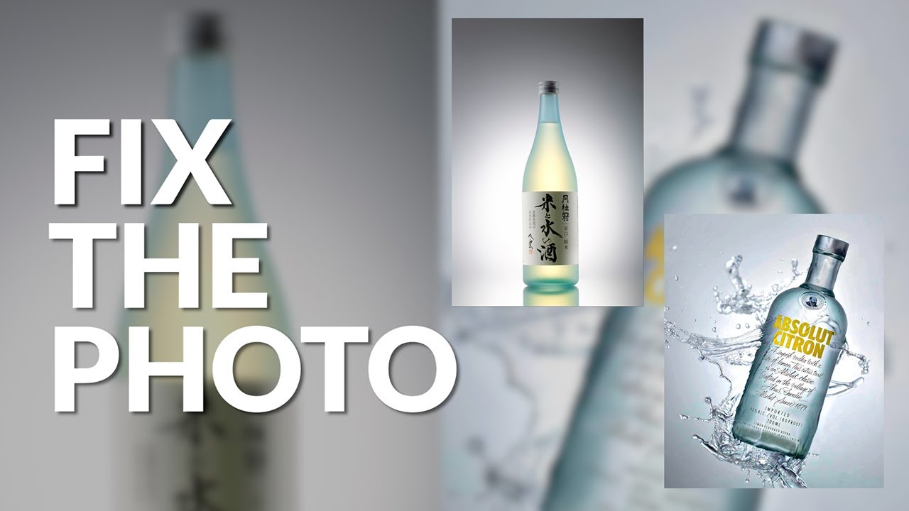
There’s a category of product photo that arrives in my inbox looking almost great. Not broken, not hopeless. Just… flat. The light is decent, the composition is solid, but something about it sits on the screen like a damp cloth. Early in my freelance career, I’d hand those images back with heavy-handed contrast pumped across the whole frame and call it done. Clients were polite about it. They weren’t thrilled. It took a while to understand that “making it pop” is actually a layered, surgical process, not a single slider move.
That’s why I found myself nodding along hard to this Visual Education tutorial on retouching clear bottle photos. Watch the full tutorial on YouTube – it covers two real member submissions, worked through live, and the transparency of that approach (messy guides, visible mistakes, real decisions) is exactly what most polished tutorials skip. Here’s my breakdown of every technique covered, with enough detail that you can follow along in Photoshop without pausing every thirty seconds.
Step 1: Diagnose Before You Touch a Single Slider
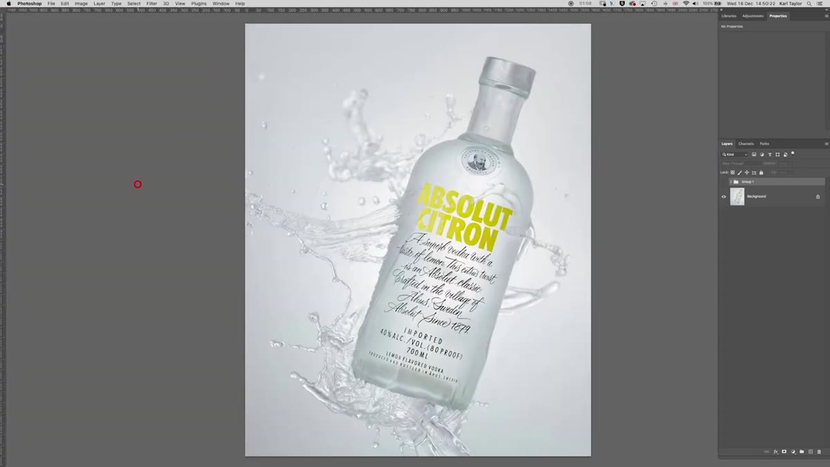 Flat bottle image displayed before any adjustments are made
The first image in the tutorial looks like it has potential – a clear bottle with nice compositional bones – but it reads as low-contrast and lifeless. Before reaching for any tool, the instructor takes a moment to name the actual problem: the image is flat, lacking depth and separation between the bottle and background. That diagnostic pause matters. When we know what’s wrong, we can choose the right fix instead of throwing adjustments at the wall. Ask yourself: is the problem contrast, color, geometry, or all three? In this case, it’s primarily contrast, with a small color component.
Flat bottle image displayed before any adjustments are made
The first image in the tutorial looks like it has potential – a clear bottle with nice compositional bones – but it reads as low-contrast and lifeless. Before reaching for any tool, the instructor takes a moment to name the actual problem: the image is flat, lacking depth and separation between the bottle and background. That diagnostic pause matters. When we know what’s wrong, we can choose the right fix instead of throwing adjustments at the wall. Ask yourself: is the problem contrast, color, geometry, or all three? In this case, it’s primarily contrast, with a small color component.
Step 2: Build Contrast in Layers, Not All at Once
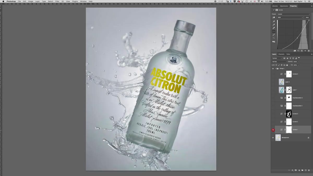 Multiple contrast adjustment layers stacked in the Photoshop layers panel
Rather than applying one large contrast boost, the tutorial stacks several smaller adjustments on top of each other. The first layer establishes a base level of contrast across the whole image. A second layer pushes that a little further. This incremental approach gives you finer control at each stage and makes it much easier to dial back any single step if it goes too far. Think of it like seasoning food – you add a little, taste, and adjust, rather than dumping the whole salt shaker in at once. Each adjustment layer stays editable and non-destructive, which means nothing is committed until you’re satisfied with the whole stack.
Multiple contrast adjustment layers stacked in the Photoshop layers panel
Rather than applying one large contrast boost, the tutorial stacks several smaller adjustments on top of each other. The first layer establishes a base level of contrast across the whole image. A second layer pushes that a little further. This incremental approach gives you finer control at each stage and makes it much easier to dial back any single step if it goes too far. Think of it like seasoning food – you add a little, taste, and adjust, rather than dumping the whole salt shaker in at once. Each adjustment layer stays editable and non-destructive, which means nothing is committed until you’re satisfied with the whole stack.
Step 3: Use Layer Masks to Protect the Background
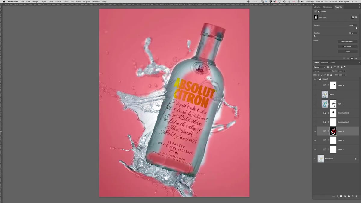 Layer mask showing contrast applied only to bottle and water areas
The third contrast layer in the tutorial does something smarter than the first two: it’s masked so that the boost applies only to the bottle and the water inside it, not the background. This is the move that separates a flat overall adjustment from something that genuinely makes the subject feel three-dimensional. To do this yourself, add your adjustment layer, then invert the mask to hide the effect entirely, and paint it back in with a white brush only where you want the contrast to hit. Keep your brush soft and work at around 70-80% opacity so the edge between affected and unaffected areas doesn’t look like a cutout.
Layer mask showing contrast applied only to bottle and water areas
The third contrast layer in the tutorial does something smarter than the first two: it’s masked so that the boost applies only to the bottle and the water inside it, not the background. This is the move that separates a flat overall adjustment from something that genuinely makes the subject feel three-dimensional. To do this yourself, add your adjustment layer, then invert the mask to hide the effect entirely, and paint it back in with a white brush only where you want the contrast to hit. Keep your brush soft and work at around 70-80% opacity so the edge between affected and unaffected areas doesn’t look like a cutout.
Step 4: Lift the Label with Hue/Saturation
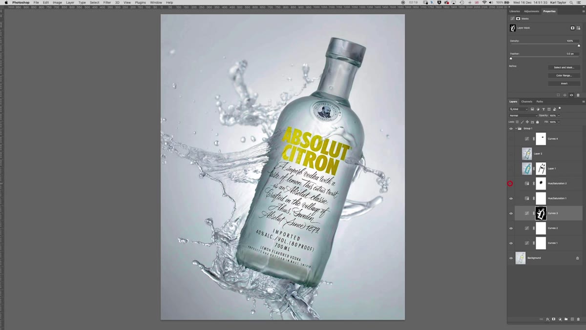 Hue/Saturation adjustment panel open targeting the bottle label
The label on the bottle in the first image reads as slightly dull compared to the surrounding areas. A targeted Hue/Saturation adjustment layer fixes this quickly. The key is not to just crank saturation globally – that tends to make everything look oversaturated and plastic. Instead, keep the saturation bump modest and use the lightness slider to lift the label slightly, which makes the text and design elements feel printed and present rather than faded. If your bottle has a specific label color, you can isolate that channel in the Hue/Saturation panel for even more precise control.
Hue/Saturation adjustment panel open targeting the bottle label
The label on the bottle in the first image reads as slightly dull compared to the surrounding areas. A targeted Hue/Saturation adjustment layer fixes this quickly. The key is not to just crank saturation globally – that tends to make everything look oversaturated and plastic. Instead, keep the saturation bump modest and use the lightness slider to lift the label slightly, which makes the text and design elements feel printed and present rather than faded. If your bottle has a specific label color, you can isolate that channel in the Hue/Saturation panel for even more precise control.
Step 5: Add a Subtle Color Tint with Blend Modes
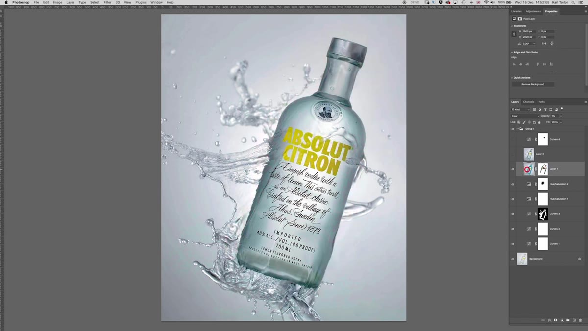 Blue paint layer set to Color blend mode over the bottle
This is the step I’ve started stealing for my own product work. To give the bottle a slightly cooler, cleaner blue tone, the instructor creates a new empty layer, sets its blend mode to Color, then paints over the bottle with a blue brush at full opacity – and then immediately drops the layer opacity down to around 7%. At full opacity it looks garish. At 7%, it’s a whisper of a shift that reads as “this product just looks cleaner and more premium.” Mask out the label area so the color tint doesn’t muddy the text, and you’re done. The Color blend mode is doing the heavy lifting here – it shifts hue without affecting luminosity, so the tonal structure of the bottle stays intact.
Blue paint layer set to Color blend mode over the bottle
This is the step I’ve started stealing for my own product work. To give the bottle a slightly cooler, cleaner blue tone, the instructor creates a new empty layer, sets its blend mode to Color, then paints over the bottle with a blue brush at full opacity – and then immediately drops the layer opacity down to around 7%. At full opacity it looks garish. At 7%, it’s a whisper of a shift that reads as “this product just looks cleaner and more premium.” Mask out the label area so the color tint doesn’t muddy the text, and you’re done. The Color blend mode is doing the heavy lifting here – it shifts hue without affecting luminosity, so the tonal structure of the bottle stays intact.
Step 6: Straighten the Bottle with Distort Transform
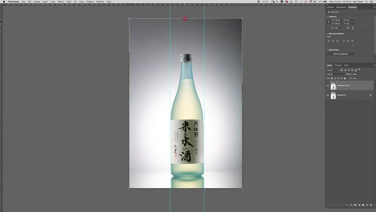 Distort transform handles being dragged to level the bottle
The second image in the tutorial is genuinely lovely as shot, but when guides are dropped in, the bottle is visibly off-vertical. This is surprisingly common with bottle and product photography, especially on reflective surfaces where small tilts are amplified. To fix it, duplicate your background layer first (always work on a copy), then go to Edit, Transform, Distort. This gives you four independent corner handles, which means you can pull one side of the bottle into alignment without distorting the other. It takes a light touch – overdo it and the bottle starts to look warped rather than straight. After transforming, re-crop the canvas to clean up any gaps at the edges.
Distort transform handles being dragged to level the bottle
The second image in the tutorial is genuinely lovely as shot, but when guides are dropped in, the bottle is visibly off-vertical. This is surprisingly common with bottle and product photography, especially on reflective surfaces where small tilts are amplified. To fix it, duplicate your background layer first (always work on a copy), then go to Edit, Transform, Distort. This gives you four independent corner handles, which means you can pull one side of the bottle into alignment without distorting the other. It takes a light touch – overdo it and the bottle starts to look warped rather than straight. After transforming, re-crop the canvas to clean up any gaps at the edges.
Step 7: Dodge the Center for Glow and Dimension
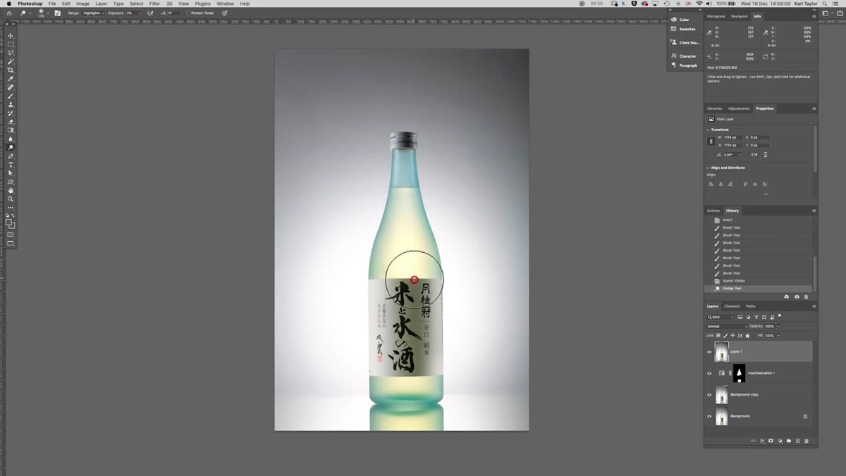 Dodge tool being brushed down the center highlight of the bottle
On a clean, merged stamp layer (Cmd+Alt+Shift+E on Mac, Ctrl+Alt+Shift+E on Windows), the instructor runs the Dodge tool down the center of the bottle using the Highlights range setting at low exposure – somewhere around 10-15% works well. This mimics the kind of bright specular highlight you’d see on a well-lit glass or plastic bottle in a studio, giving it a sense of roundness and sheen. The trick is keeping the tool moving and never stopping in one spot, which creates hot spots that look artificial. One or two slow, even passes down the central axis of the bottle is enough.
Dodge tool being brushed down the center highlight of the bottle
On a clean, merged stamp layer (Cmd+Alt+Shift+E on Mac, Ctrl+Alt+Shift+E on Windows), the instructor runs the Dodge tool down the center of the bottle using the Highlights range setting at low exposure – somewhere around 10-15% works well. This mimics the kind of bright specular highlight you’d see on a well-lit glass or plastic bottle in a studio, giving it a sense of roundness and sheen. The trick is keeping the tool moving and never stopping in one spot, which creates hot spots that look artificial. One or two slow, even passes down the central axis of the bottle is enough.
What I’d Add: Don’t Forget the Reflection
One thing I’d layer in from my own product work: if there’s a surface reflection beneath the bottle, it deserves the same attention as the bottle itself. A saturated, well-contrasted bottle sitting above a dull, gray reflection creates a visual disconnect that clients will feel even if they can’t name it. I usually bring the saturation and contrast adjustments from the bottle mask and extend them slightly down into the reflection zone. It’s a small thing that makes the whole image feel considered.
The single biggest lesson from this tutorial is one I keep relearning: contrast is not one adjustment, it’s a conversation between multiple layers, each one handling a different zone of the image. When you treat it that way, the result feels organic rather than processed.
Watch the full tutorial on YouTube to see both images worked through in real time – the live editing on the second image especially is worth watching for how small decisions get made on the fly.
Comments (3)
The tip about from flat to striking a retouc was the missing piece for me. Thank you.
Well explained. I think my audience would really benefit from this — mind if I link to it?
Great breakdown. The step-by-step approach really helps.
Leave a Comment