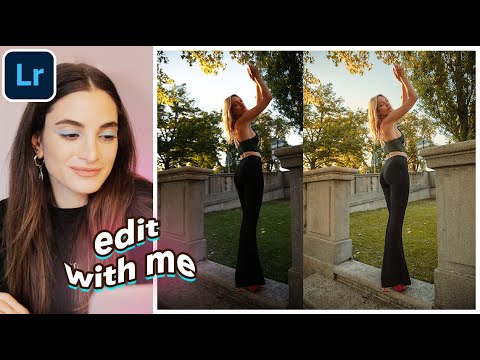
There’s a particular problem I run into every time a client sends me portraits shot in that narrow window just before sunset. The light is gorgeous in person, but RAW files from that hour often come back looking flat, slightly orange in the wrong places, and missing the warmth that made everyone excited on location. Getting from “flat golden hour RAW” to “this actually looks the way it felt” is a workflow problem I’ve been refining for years. So when I came across Watch the full tutorial on YouTube - Jessica Kobeissi’s Lightroom editing session using photos from Switzerland - I sat up straight. Here was someone working through exactly that scenario in real time, thinking out loud, and making decisions I recognized.
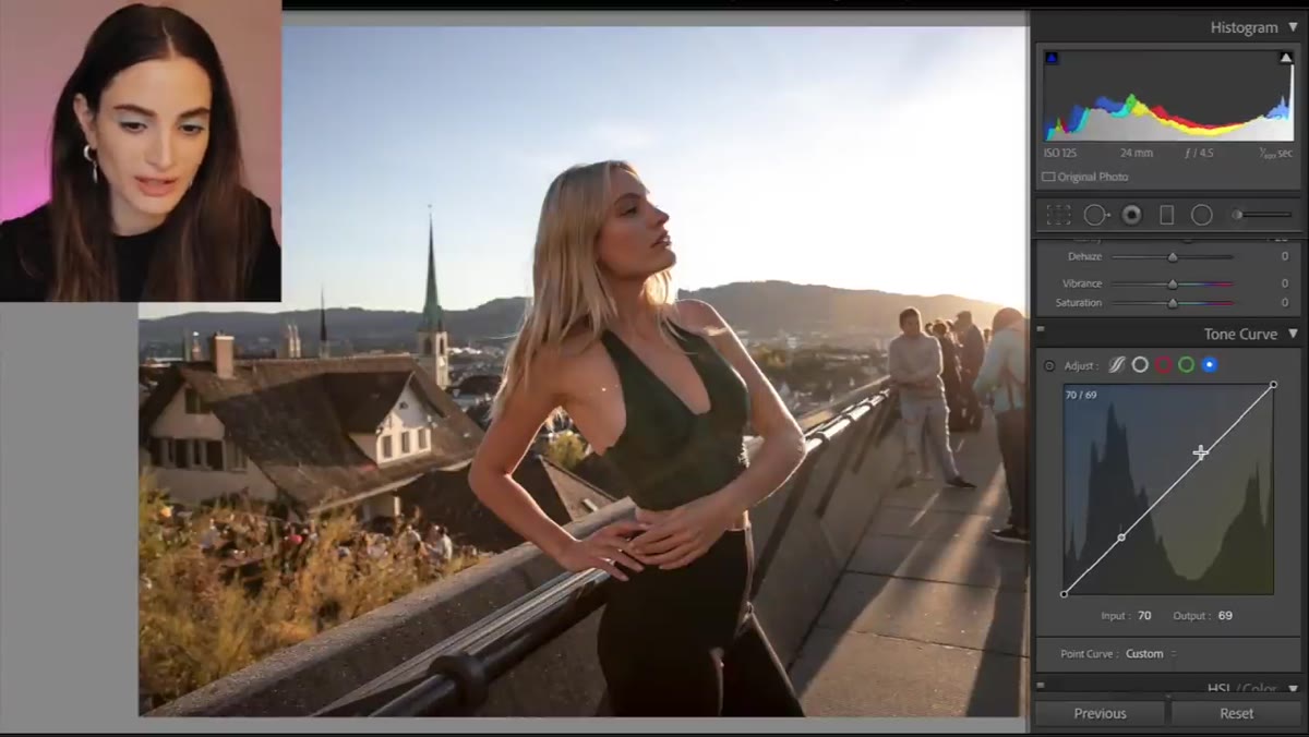
What I appreciate about Jessica’s approach is that it isn’t precious. She moves through Lightroom the way most working photographers actually do - not panel by panel in textbook order, but going to the tools that matter first and adjusting as the image talks back. The Switzerland shots she’s working with were captured around sunset, ISO 125, f/4.5, 1/400th of a second on a Canon 5D Mark IV with a 24-70mm lens. Those settings tell you a lot: she had great light and didn’t need to push the sensor, which means the RAW file has real information to work with. The edit is about revealing that, not compensating for technical problems.
If you primarily work in Photoshop the way I do, Lightroom sessions like this are worth studying because they force you to think in broad, global terms before you ever pick up a brush. Here’s how she moves through it.
Step 1: Start With Shadows to Open Up the Image
 Shadows slider being pushed up in the Basic panel
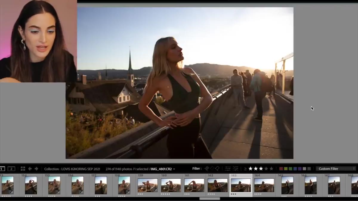
The first move Jessica makes is reaching for the Shadows slider and bringing it up. This is such a simple adjustment but it’s the right first move for sunset portraits. The shadows in golden hour shots are often cool and deep, and your eye reads them as muddy rather than moody. Lifting shadows recovers detail in darker areas without blowing out the highlights that are already doing the heavy lifting in the frame. Don’t go all the way to 100 - somewhere in the 40 to 65 range usually gives you recovery without that flat, HDR look that makes an edit feel cheap.
Shadows slider being pushed up in the Basic panel
The first move Jessica makes is reaching for the Shadows slider and bringing it up. This is such a simple adjustment but it’s the right first move for sunset portraits. The shadows in golden hour shots are often cool and deep, and your eye reads them as muddy rather than moody. Lifting shadows recovers detail in darker areas without blowing out the highlights that are already doing the heavy lifting in the frame. Don’t go all the way to 100 - somewhere in the 40 to 65 range usually gives you recovery without that flat, HDR look that makes an edit feel cheap.
Step 2: Add Clarity to Give the Image Structure
 Clarity slider adjusted in the Basic panel
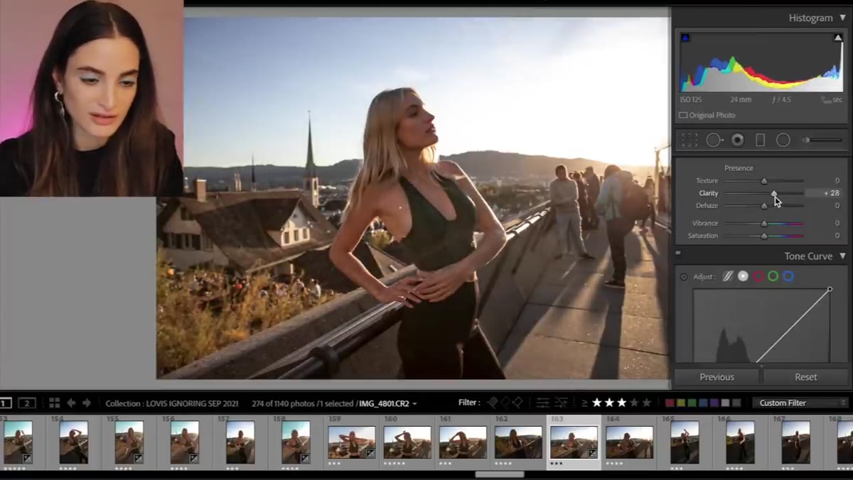
After the shadows, Jessica adds Clarity, and you can hear the satisfaction in her voice when it kicks in. Clarity in Lightroom increases local contrast around edges, which makes textures and details pop without touching overall exposure. For portrait work I’m usually more conservative with this than landscape photographers, but for an environmental portrait shot at distance - the way these Switzerland images are framed - a moderate Clarity boost, maybe 15 to 30, gives the image a sense of presence. It makes the scene feel real rather than digitally soft.
Clarity slider adjusted in the Basic panel
After the shadows, Jessica adds Clarity, and you can hear the satisfaction in her voice when it kicks in. Clarity in Lightroom increases local contrast around edges, which makes textures and details pop without touching overall exposure. For portrait work I’m usually more conservative with this than landscape photographers, but for an environmental portrait shot at distance - the way these Switzerland images are framed - a moderate Clarity boost, maybe 15 to 30, gives the image a sense of presence. It makes the scene feel real rather than digitally soft.
Step 3: Use the Tone Curve to Set the Color Direction
 Tone Curve panel open with channel adjustments being made
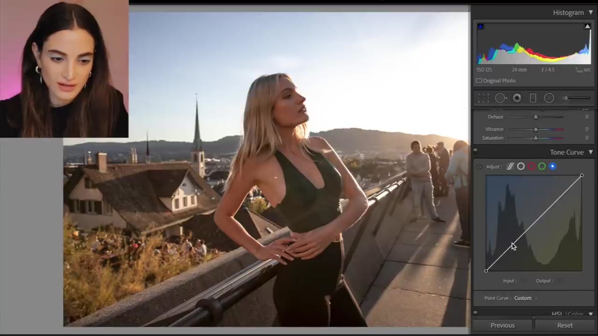
This is the step I found most instructive. Jessica opens the Tone Curve and uses it to push the image toward warmth, reasoning that since the sun was setting, the edit should reflect that color temperature. She’s thinking about the color channels individually - pulling toward yellow rather than letting the image drift into a neutral or cool tone. In practical terms this means working in the individual Red, Green, and Blue channel curves rather than the combined RGB curve. A slight lift in the Red channel and a small reduction in the Blue channel in the shadows goes a long way toward matching the emotional temperature of sunset light. This is more nuanced than just dragging the White Balance slider and it gives you color that feels built in rather than slapped on.
Tone Curve panel open with channel adjustments being made
This is the step I found most instructive. Jessica opens the Tone Curve and uses it to push the image toward warmth, reasoning that since the sun was setting, the edit should reflect that color temperature. She’s thinking about the color channels individually - pulling toward yellow rather than letting the image drift into a neutral or cool tone. In practical terms this means working in the individual Red, Green, and Blue channel curves rather than the combined RGB curve. A slight lift in the Red channel and a small reduction in the Blue channel in the shadows goes a long way toward matching the emotional temperature of sunset light. This is more nuanced than just dragging the White Balance slider and it gives you color that feels built in rather than slapped on.
Step 4: Match the Edit to the Light Story in the Scene
 Warm tone being applied as image shifts toward golden hues
What ties all of Jessica’s moves together is a clear editorial intention: the light was warm and directional, and the edit should tell that story. This sounds obvious but it’s easy to forget when you’re staring at sliders. Before touching anything else in your file, ask yourself what the light was actually doing when the shutter fired. In this case, the sun was low, slightly behind or beside the subject, and creating a warmth that made the location feel special. Every adjustment should push toward that feeling rather than toward some neutral “correct” version of the file. That discipline is what separates edits that feel coherent from edits that just look processed.
Warm tone being applied as image shifts toward golden hues
What ties all of Jessica’s moves together is a clear editorial intention: the light was warm and directional, and the edit should tell that story. This sounds obvious but it’s easy to forget when you’re staring at sliders. Before touching anything else in your file, ask yourself what the light was actually doing when the shutter fired. In this case, the sun was low, slightly behind or beside the subject, and creating a warmth that made the location feel special. Every adjustment should push toward that feeling rather than toward some neutral “correct” version of the file. That discipline is what separates edits that feel coherent from edits that just look processed.
What I’d Add From My Own Experience With Golden Hour RAWs
Jessica keeps her Lightroom edit intentionally broad, which is exactly right for a global correction pass. But if you’re taking these images into a more detailed retouching workflow afterward - which I almost always am for beauty or brand work - there are a couple of things worth layering on top.
First, watch your skin tones after you’ve moved the Tone Curve. The warmth that looks beautiful in the background can push skin into orange territory, especially if the subject has medium to deep complexion. Use the HSL panel to selectively pull back the orange and red saturation just a few points after you’ve set your curve. You’re not cooling the image down, you’re just protecting the skin from going muddy.
Second, if the image is going to be retouched for beauty at a pixel level later, export the Lightroom file with enough shadow detail preserved that you’re not trying to recover information in Photoshop that was already crushed. A slightly lighter export gives your frequency separation or dodge-and-burn work more to hold onto. I learned this the expensive way after delivering a retouched set where the shadow side of every face looked posterized. The Lightroom edit looked fine at normal size. It was only at 100% that the problem showed up, and by then the deadline had passed.
The single most transferable lesson from this tutorial is Jessica’s instinct to let the actual light conditions in the scene guide every editing decision. The camera settings tell you what the light was doing. The edit should confirm that story, not override it. That discipline, applied consistently, is what makes a finished image feel cohesive rather than corrected.
Watch the full tutorial on YouTube to see Jessica work through these adjustments in real time - watching how quickly she moves and how she responds when something isn’t working yet is as valuable as any individual setting.
Comments (3)
This is exactly what I needed today. Been struggling with this for weeks.
Simple but effective. Sometimes that's all you need.
Love how you break down complex stuff into manageable steps.
Leave a Comment