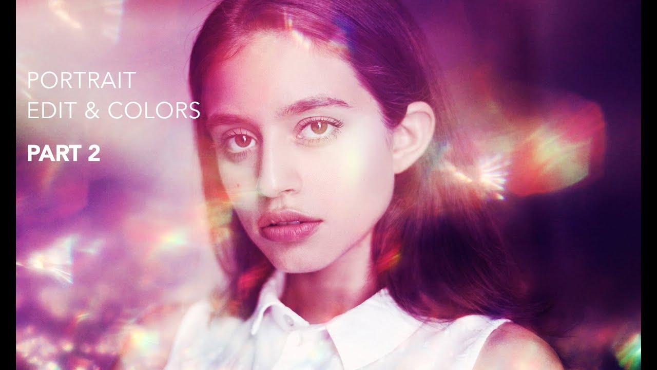
There is a specific kind of portrait that stops you mid-scroll. The skin looks real, the light feels warm, and there is something almost painterly happening in the background or around the edges that you cannot quite name. For a long time, I chased that quality by pushing color grading harder and harder, wondering why my results kept feeling flat. It was not a color problem. It was a texture problem. Adding a well-chosen texture overlay changes the entire atmosphere of an image, and once you start doing it you will wonder why you ever skipped the step.
In this Jessica Kobeissi tutorial, she walks through the second half of her natural light portrait workflow, focusing entirely on texture and finishing adjustments. Watch the full tutorial on YouTube if you want to follow along in real time. Her approach is intuitive and low-friction, which is exactly why I keep coming back to it. The technique layers a found texture with a color fill, a curves adjustment, levels, and a vibrance tweak to create something that feels cohesive rather than composited.
What I love about this workflow is that it works equally well on soft, romantic portraits and on more editorial, high-contrast images. The texture does not fight the retouching. It completes it.
Step 1: Find and Source Your Texture
 Jessica browsing a cotton candy pink texture on DeviantArt
Before you open Photoshop, you need a texture worth using. Jessica goes to DeviantArt, which remains one of the best free sources for artistic, high-resolution textures that photographers have shared under creative commons or similar licenses. Search for terms like “photoshop texture overlay,” “bokeh texture,” or “light leak texture” and filter by image size. You want something at least as large as your working file so you are not scaling up a low-resolution image and introducing pixelation.
Jessica browsing a cotton candy pink texture on DeviantArt
Before you open Photoshop, you need a texture worth using. Jessica goes to DeviantArt, which remains one of the best free sources for artistic, high-resolution textures that photographers have shared under creative commons or similar licenses. Search for terms like “photoshop texture overlay,” “bokeh texture,” or “light leak texture” and filter by image size. You want something at least as large as your working file so you are not scaling up a low-resolution image and introducing pixelation.
Pay attention to the creator’s licensing terms and always credit them. Jessica credits the specific artist she used, which is good practice and good karma. I keep a folder called “Texture Library” on my desktop sorted loosely by mood: airy, moody, warm, and cool. Having these ready before a deadline means I am not hunting through websites when I am already in the retouching zone.
Step 2: Place the Texture Beneath Your Adjustment Layers
 Texture layer being pasted below adjustment layers in the Layers panel
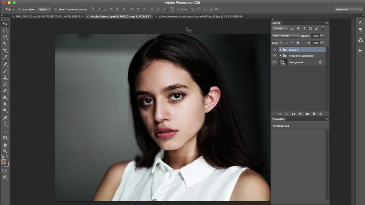
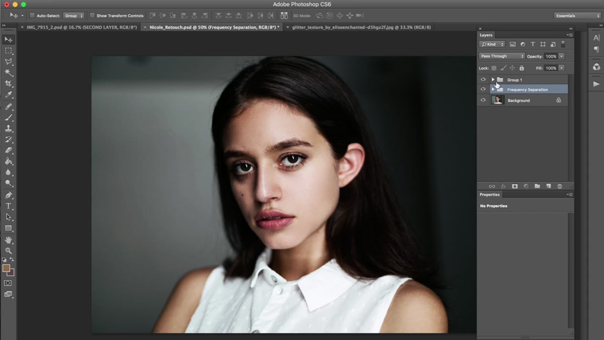
Copy your texture file and paste it into your portrait document. The critical detail here is layer order. You want the texture sitting below all of your existing adjustment layers so that those adjustments apply to the texture as well as the portrait beneath. If you drop the texture on top of everything, it will sit outside your color grading and the two elements will never feel unified.
Texture layer being pasted below adjustment layers in the Layers panel
Copy your texture file and paste it into your portrait document. The critical detail here is layer order. You want the texture sitting below all of your existing adjustment layers so that those adjustments apply to the texture as well as the portrait beneath. If you drop the texture on top of everything, it will sit outside your color grading and the two elements will never feel unified.
Use Command+T (Ctrl+T on Windows) to transform and reposition the texture. Think about what part of the texture you want to land on the subject’s face versus the background. A busier section of texture near the edges and a softer section near the face tends to work well. Do not worry too much about perfection here. You are going to reduce opacity and change the blend mode, so the placement matters less than you think at this stage.
Step 3: Set the Blend Mode to Screen
 Blend mode dropdown open with Screen selected on the texture layer
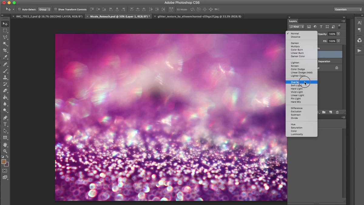
With the texture layer selected, open the blend mode dropdown in the Layers panel and choose Screen. Screen is the go-to for light-based textures because it only adds luminosity and ignores dark values, which means your subject’s skin stays intact underneath. The texture integrates rather than obscures.
Blend mode dropdown open with Screen selected on the texture layer
With the texture layer selected, open the blend mode dropdown in the Layers panel and choose Screen. Screen is the go-to for light-based textures because it only adds luminosity and ignores dark values, which means your subject’s skin stays intact underneath. The texture integrates rather than obscures.
If Screen feels too bright or washed out for your particular texture, Soft Light and Overlay are good alternatives. Soft Light is gentler and preserves more midtone detail. Overlay increases contrast and can feel a little crunchy if you are not careful. For bright, airy textures like the cotton candy style Jessica uses in this video, Screen is almost always the right call.
Step 4: Add a Solid Color Fill Layer in Multiply Mode
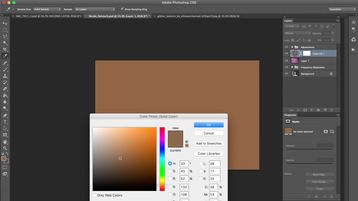 Solid color dialog open with a warm yellow tone selected
Next, go to Layer, New Fill Layer, Solid Color. Choose a warm yellow tone, something in the golden or straw family rather than a sharp lemon yellow. The exact hue is a matter of feel, so sample around until the preview looks like the image has been kissed by late afternoon light rather than dipped in mustard.
Solid color dialog open with a warm yellow tone selected
Next, go to Layer, New Fill Layer, Solid Color. Choose a warm yellow tone, something in the golden or straw family rather than a sharp lemon yellow. The exact hue is a matter of feel, so sample around until the preview looks like the image has been kissed by late afternoon light rather than dipped in mustard.
Change the blend mode for this fill layer from Normal to Multiply, then pull the opacity down to around 6 percent. Six percent sounds like nothing, and visually it almost is, but that tiny warmth underneath everything is the difference between a portrait that feels digital and one that feels like it was shot on film. Train yourself to toggle these subtle layers on and off and you will start to see what they are actually doing.
Step 5: Strengthen the Color with a Curves Adjustment
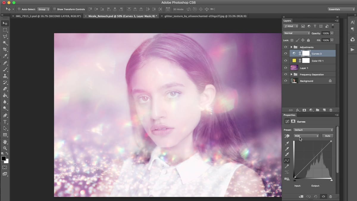 Curves adjustment layer dialog with an S-curve being drawn
Add a new Curves adjustment layer and use it to deepen the contrast slightly and pull out the character of the texture’s colors. An S-curve, where you lift the highlights a touch and pull the shadows down a little, is usually enough. You are not trying to regrade the image here. You are trying to make the texture feel like it belongs to the same world as the portrait rather than sitting on top of it.
Curves adjustment layer dialog with an S-curve being drawn
Add a new Curves adjustment layer and use it to deepen the contrast slightly and pull out the character of the texture’s colors. An S-curve, where you lift the highlights a touch and pull the shadows down a little, is usually enough. You are not trying to regrade the image here. You are trying to make the texture feel like it belongs to the same world as the portrait rather than sitting on top of it.
Keep checking the overall image by toggling the layer on and off. If you lose skin texture or the highlights blow out, dial back the curve. Subtlety is the whole game with finishing adjustments.
Step 6: Refine Tonal Range with Levels
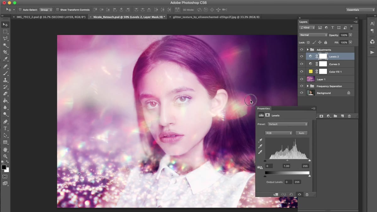 Levels dialog open showing RGB channel input sliders being adjusted
Add a Levels adjustment layer and work in the RGB channel. Bring the shadow input slider in slightly from the left to clip the deepest blacks and give the image a richer, more intentional base. Adjust the midpoint slider to taste. This step is about tightening up what the curves adjustment started, making sure the tonal range feels purposeful rather than accidental.
Levels dialog open showing RGB channel input sliders being adjusted
Add a Levels adjustment layer and work in the RGB channel. Bring the shadow input slider in slightly from the left to clip the deepest blacks and give the image a richer, more intentional base. Adjust the midpoint slider to taste. This step is about tightening up what the curves adjustment started, making sure the tonal range feels purposeful rather than accidental.
Step 7: Finish with Vibrance and a Saturation Pull
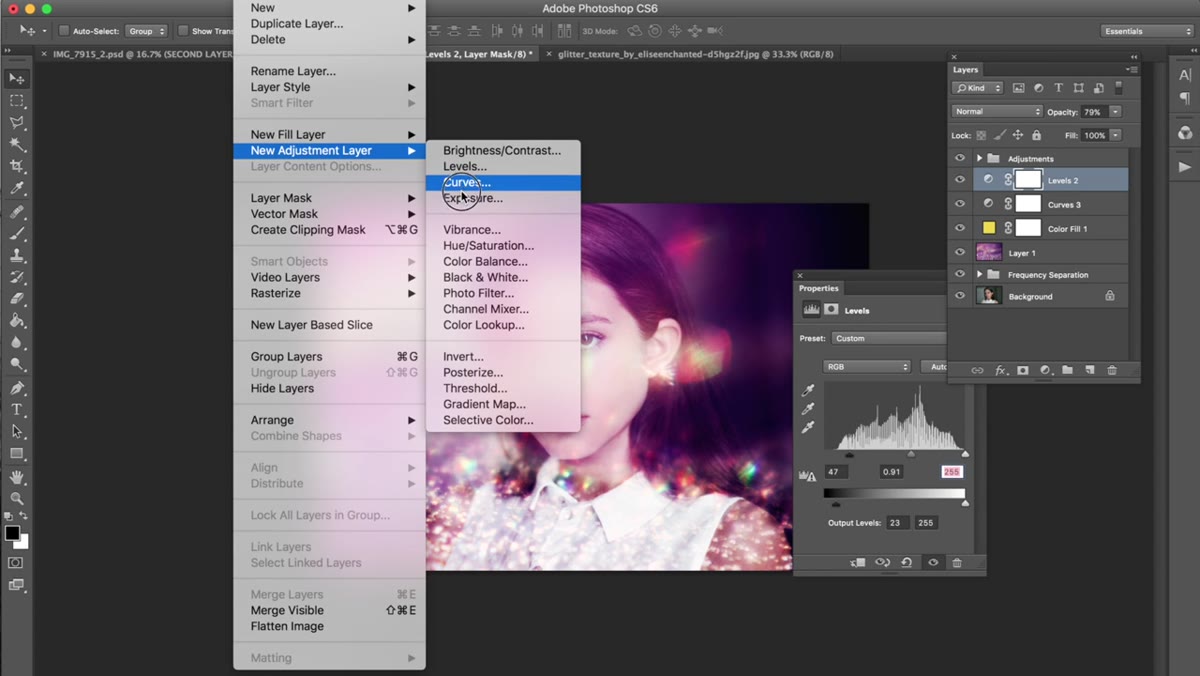 Vibrance adjustment layer with Vibrance raised and Saturation lowered
The last adjustment layer is Vibrance. Bump the Vibrance slider up while simultaneously lowering the Saturation slider. This combination is one of those small discoveries that changes how you approach color finishing. Lowering raw saturation pulls the most aggressively colored tones back without going gray, and raising Vibrance selectively re-introduces richness in the less-saturated areas, like skin tones. The result is a balanced, complex color feel rather than the pumped-up look you get from simply adding saturation.
Vibrance adjustment layer with Vibrance raised and Saturation lowered
The last adjustment layer is Vibrance. Bump the Vibrance slider up while simultaneously lowering the Saturation slider. This combination is one of those small discoveries that changes how you approach color finishing. Lowering raw saturation pulls the most aggressively colored tones back without going gray, and raising Vibrance selectively re-introduces richness in the less-saturated areas, like skin tones. The result is a balanced, complex color feel rather than the pumped-up look you get from simply adding saturation.
A Note from My Own Workflow
One thing I have added to this process is masking the texture layer on the subject’s face. Depending on the texture, some of it can land in a way that reads as noise or unintended grain on skin, even at lower opacities. I paint a gentle black mask at around 30 to 40 percent brush opacity over the face to let the texture recede there while remaining full-strength in the background and around the edges. It takes two minutes and keeps the retouching work you did in the previous stage from getting buried.
The most important thing this tutorial reinforced for me is that finishing a portrait is its own skill, completely separate from the retouching itself. A clean retouch with a thoughtful texture overlay and careful finishing adjustments reads as professional work. Getting comfortable with sourcing textures, understanding blend modes, and using subtle fill layers is worth every minute you invest in it. Watch the full tutorial on YouTube and try this on one of your own portraits this week. You will not want to go back to finishing without texture again.
Comments (2)
The before and after really sells it. Incredible difference.
Been doing this wrong for years apparently. Thanks for the wake-up call.
Leave a Comment