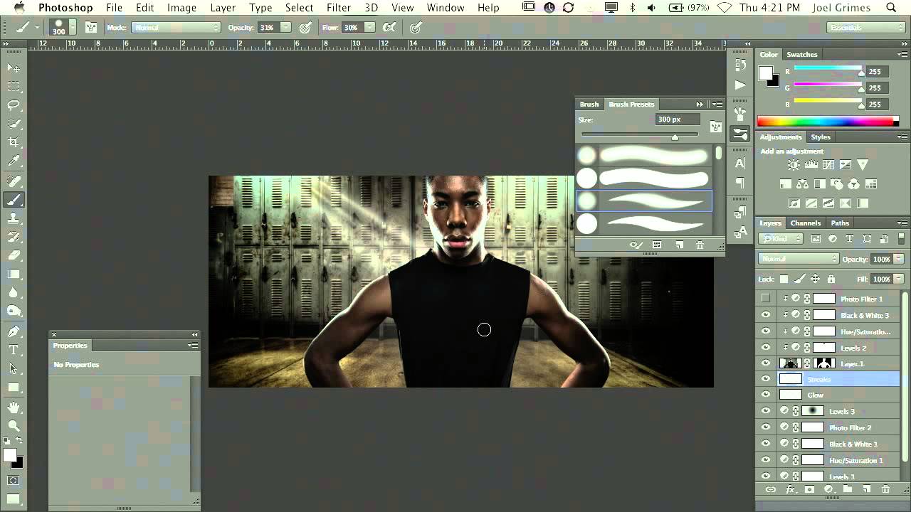
There is a specific kind of frustration that comes from knowing exactly what a finished image should look like and not having the tools to get there. For years, I added light effects to my beauty work with a mouse, and the results were stiff. The streaks were uniform. The glow felt pasted on. It was not until I finally committed to learning a pressure-sensitive tablet that everything clicked, and it happened faster than I expected. The learning curve people warn you about is real, but it is closer to learning to ride a bike than learning a new language. Three days of discomfort, then muscle memory takes over and you never go back.
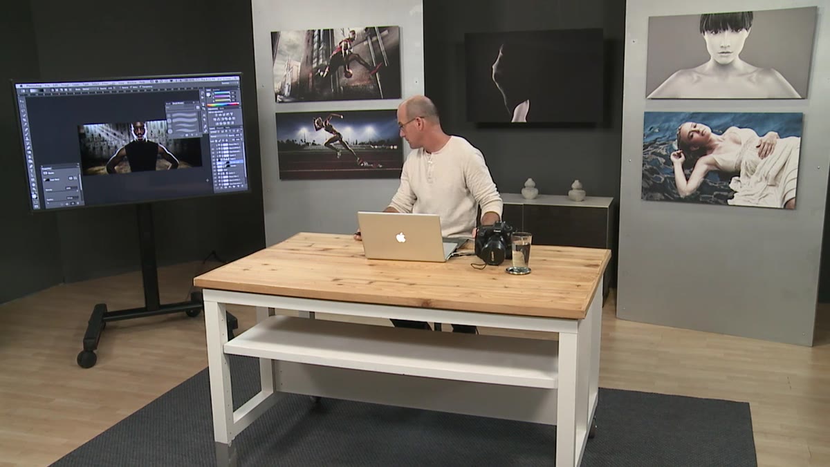
Joel Grimes demonstrates exactly why the tablet matters in this CreativeLive tutorial. Watch the full tutorial on YouTube before or alongside this walkthrough. What he shows is not just a brush trick. It is a complete small system for painting, masking, and selling a light streak that reads as photographic rather than digital. I have since built this into my own workflow for beauty campaigns, and I want to walk you through each piece so you can use it immediately.
Step 1: Set Up Your Brush with Pressure Sensitivity
 Wacom tablet and brush settings panel open in Photoshop
Before you paint anything, confirm that your tablet’s pressure sensitivity is mapped to brush size or opacity in Photoshop. Open the Brush Settings panel (F5) and check that “Transfer” and “Shape Dynamics” are enabled with “Pen Pressure” selected as the control for both. Grimes works with a white brush at around 30% opacity, which gives you room to build intensity gradually rather than committing to a single heavy stroke.
Wacom tablet and brush settings panel open in Photoshop
Before you paint anything, confirm that your tablet’s pressure sensitivity is mapped to brush size or opacity in Photoshop. Open the Brush Settings panel (F5) and check that “Transfer” and “Shape Dynamics” are enabled with “Pen Pressure” selected as the control for both. Grimes works with a white brush at around 30% opacity, which gives you room to build intensity gradually rather than committing to a single heavy stroke.
The low opacity is doing important work here. It means each pass of the brush adds a soft layer of light rather than a solid stroke. When you combine that with pressure sensitivity, you get natural variation along the stroke’s length without any manual adjustment.
Step 2: Use Shift-Click to Create a Tapered Stroke
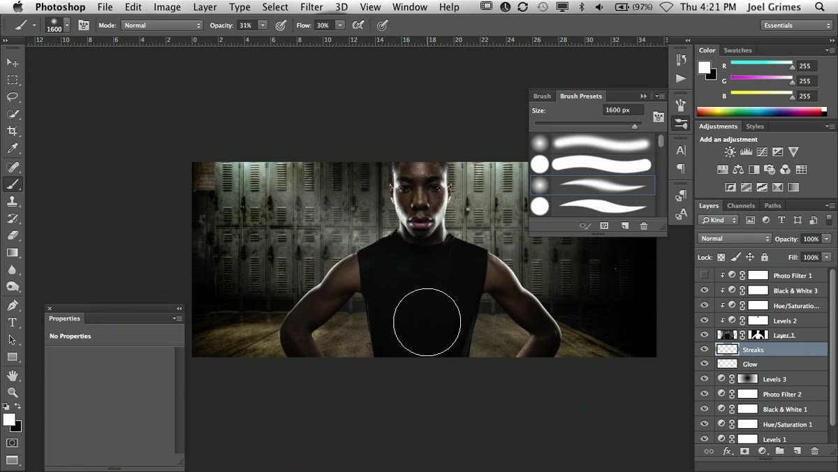 Single pressure-sensitive brush stroke tapering from top to bottom
This is the core move. Click once at the top of where you want your light streak to begin, hold Shift, then click at the end point. Photoshop draws a straight line between the two clicks, but because your pen pressure is heavier at the start and lighter at the finish (or vice versa, depending on how you hold the stylus), the stroke naturally tapers. The result looks like light entering from outside the frame and fading as it travels across the image.
Single pressure-sensitive brush stroke tapering from top to bottom
This is the core move. Click once at the top of where you want your light streak to begin, hold Shift, then click at the end point. Photoshop draws a straight line between the two clicks, but because your pen pressure is heavier at the start and lighter at the finish (or vice versa, depending on how you hold the stylus), the stroke naturally tapers. The result looks like light entering from outside the frame and fading as it travels across the image.
Grimes experiments with brush size here, undoing and redoing until the proportions feel right relative to the subject. Do not skip this adjustment. A streak that is too thick reads as a shape. A streak that is fine and tapered reads as light. Start smaller than you think you need and build from there.
Step 3: Add a Layer Mask and Invert It to Black
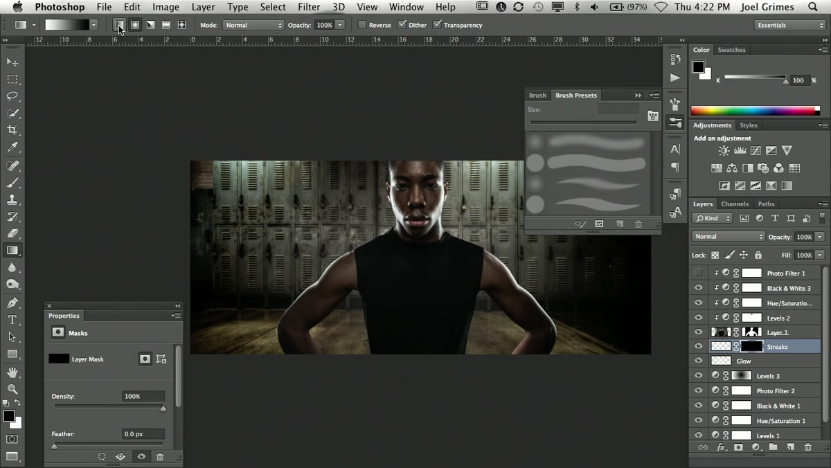
 Layer panel showing mask thumbnail filled with black
Once you have a stroke you like on its own layer, add a layer mask by clicking the mask icon at the bottom of the Layers panel (second icon from the left). The mask will default to white, revealing everything. Press Command+I (Ctrl+I on Windows) to invert it to black, which hides the entire stroke. This gives you a blank slate to reveal the light selectively, rather than erasing it after the fact, which is a destructive approach and harder to control.
Layer panel showing mask thumbnail filled with black
Once you have a stroke you like on its own layer, add a layer mask by clicking the mask icon at the bottom of the Layers panel (second icon from the left). The mask will default to white, revealing everything. Press Command+I (Ctrl+I on Windows) to invert it to black, which hides the entire stroke. This gives you a blank slate to reveal the light selectively, rather than erasing it after the fact, which is a destructive approach and harder to control.
Working mask-first like this is a habit worth building into everything you do. You preserve the original stroke, and every change you make from this point is completely reversible.
Step 4: Use a Linear Gradient on the Mask to Reveal the Streak
 Gradient tool dragged across black mask revealing tapered light
Select the Gradient tool (G), confirm you are on the Linear Gradient option in the options bar, and make sure your foreground is white. While your black mask is selected in the Layers panel, drag the gradient in the same direction as your brush stroke. White areas on the mask reveal the stroke beneath; black areas hide it. Dragging from top to bottom (or corner to edge, depending on your composition) creates a smooth transition from full brightness down to nothing.
Gradient tool dragged across black mask revealing tapered light
Select the Gradient tool (G), confirm you are on the Linear Gradient option in the options bar, and make sure your foreground is white. While your black mask is selected in the Layers panel, drag the gradient in the same direction as your brush stroke. White areas on the mask reveal the stroke beneath; black areas hide it. Dragging from top to bottom (or corner to edge, depending on your composition) creates a smooth transition from full brightness down to nothing.
This is what separates a painted streak from something that looks like light. The gradient handles the falloff for you, and the result is a beam that brightens at the source and dissolves naturally at the edge. Grimes notes that this is “selling the fake,” and he is right. The gradient is the convincing part.
Step 5: Transform and Position with Free Transform
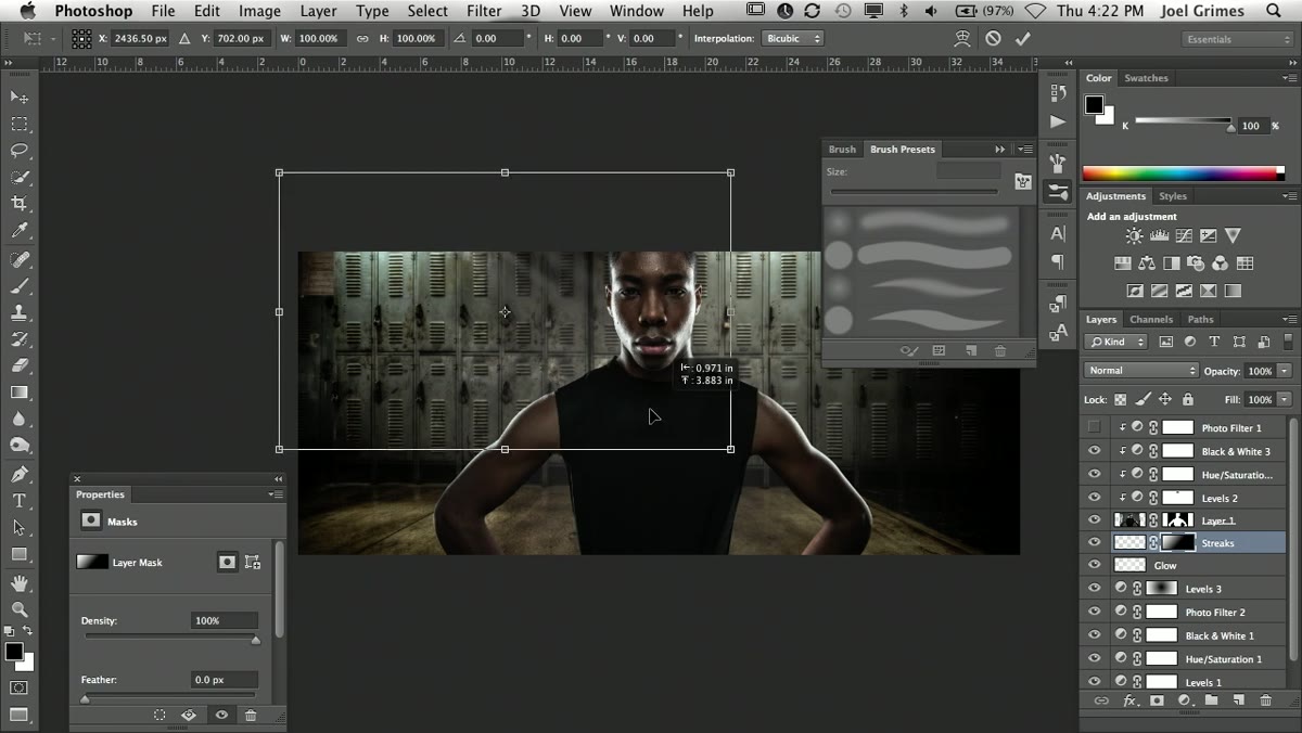 Free Transform handles around the light streak layer
With the streak layer selected, press Command+T (Ctrl+T) to enter Free Transform. From here you can reposition the streak, scale it, stretch it vertically to make it longer, or compress it to change how concentrated the light feels. You can also rotate it to match the angle of your actual light source in the image, which matters a lot for believability.
Free Transform handles around the light streak layer
With the streak layer selected, press Command+T (Ctrl+T) to enter Free Transform. From here you can reposition the streak, scale it, stretch it vertically to make it longer, or compress it to change how concentrated the light feels. You can also rotate it to match the angle of your actual light source in the image, which matters a lot for believability.
Take your time here. The position of the streak relative to your subject’s face or the background’s existing light will determine whether the whole effect reads as intentional or accidental.
Step 6: Duplicate the Layer to Build Intensity and Add Glow
 Duplicated streak layer with Gaussian Blur applied for soft glow
Press Command+J to duplicate the streak layer. On the duplicate, apply a Gaussian Blur (Filter > Blur > Gaussian Blur) to soften it significantly. This blurred copy acts as a glow around the original sharp streak, the way real light spills and blooms around a bright source. Lower the opacity of the blurred layer to taste, typically somewhere between 40% and 70%, so it adds warmth without overpowering the sharper stroke beneath it.
Duplicated streak layer with Gaussian Blur applied for soft glow
Press Command+J to duplicate the streak layer. On the duplicate, apply a Gaussian Blur (Filter > Blur > Gaussian Blur) to soften it significantly. This blurred copy acts as a glow around the original sharp streak, the way real light spills and blooms around a bright source. Lower the opacity of the blurred layer to taste, typically somewhere between 40% and 70%, so it adds warmth without overpowering the sharper stroke beneath it.
You now have two layers working together: one that defines the streak’s shape and one that sells its luminosity. Use Command+T on the blurred layer independently if you want to shift or scale the glow separately from the streak itself.
A Note from My Own Practice
The technique Grimes teaches here assumes you already have a strong sense of where your light source is, either from the original photograph or from a background composite. When I use this in beauty work, I almost always reference the catchlights in the subject’s eyes first. They tell me exactly where the light is coming from, and I align my streaks to match. If your streaks contradict the catchlights, the eye catches it immediately even if the viewer cannot name why something feels off. Consistency between the ambient light, the catchlights, and any added streaks is what makes the entire image feel real rather than assembled.
I also create a dedicated group in my Layers panel called “light effects” and keep all streak and glow layers inside it with a single group opacity slider. That way I can dial back the entire effect at once if a client wants something more subtle, without touching each layer individually.
The single most important thing this tutorial taught me is that painting light is a two-part job: the stroke gives you the shape, and the mask controls the believability. Neither one works without the other. If you invest in a Wacom tablet and learn to pair pressure-sensitive strokes with gradient masking, you will have a technique that holds up across beauty, commercial, and composite work alike.
Watch the full tutorial on YouTube to see Grimes work through the complete sequence in real time, including the additional flare elements he adds after the streak to push the effect even further.
Comments
Leave a Comment