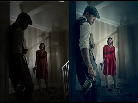
There’s a specific kind of dread that sets in when a client sends you a beautifully composed shot and says, “Can you bring out the detail in the dark areas?” You open the file, you zoom in, and what you see is a wall of near-black pixels that looks like it has no information left to give. Early in my retouching career, I thought that was the end of the conversation. Either you had detail or you didn’t. It took me a while to learn that the data is almost always there, buried in the shadows, and that Photoshop has a tool specifically designed to go get it.
Watch the full tutorial on YouTube
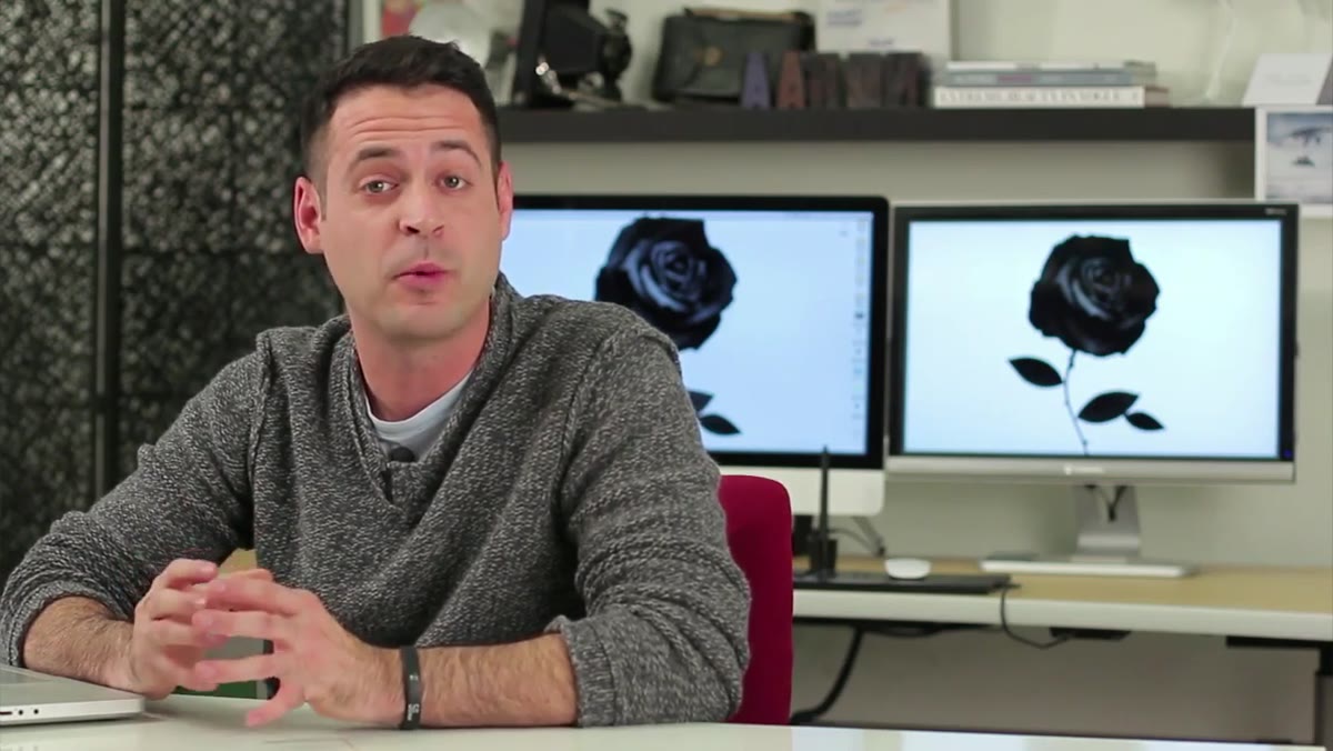
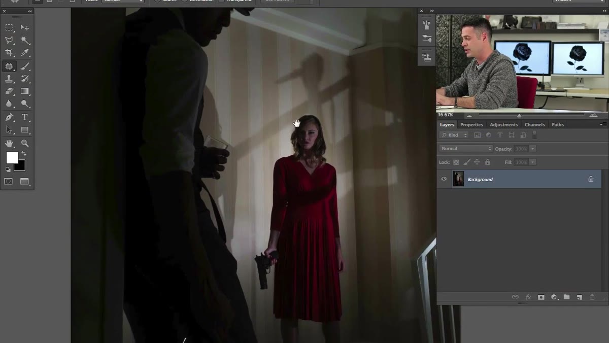
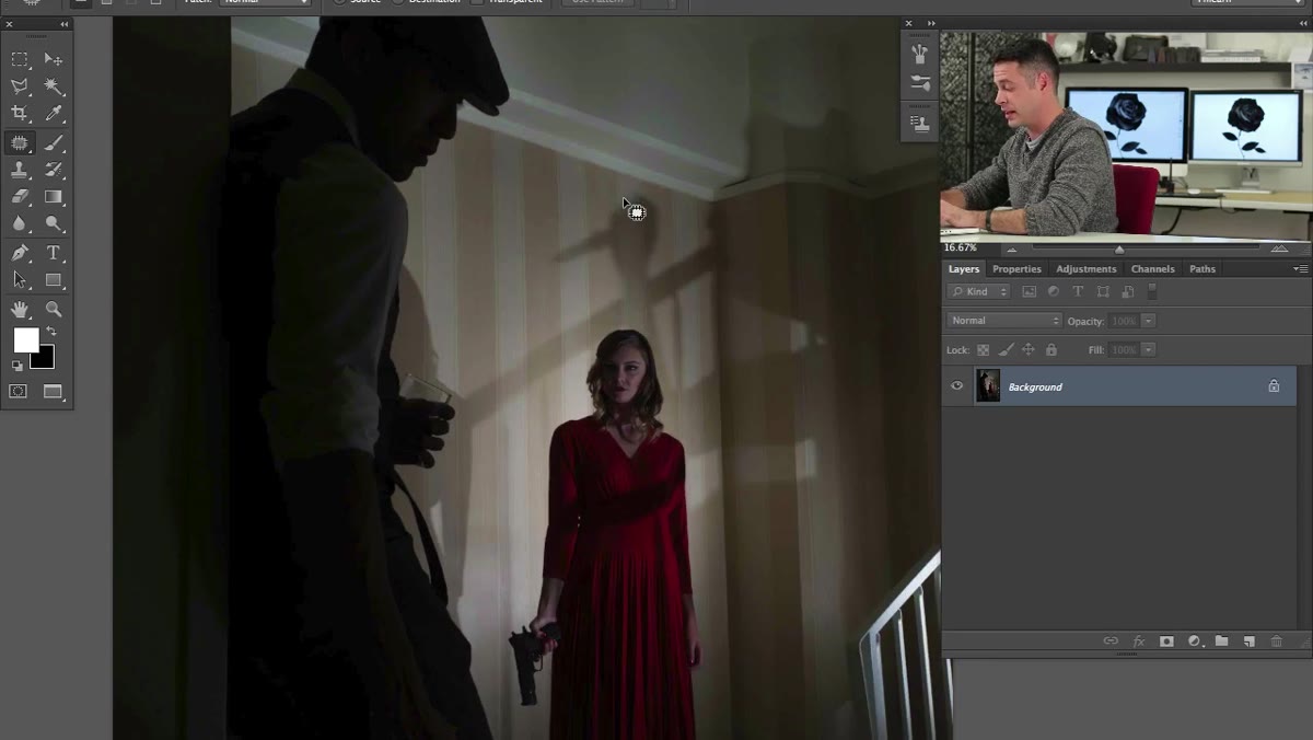
In this Aaron Nace (PHLEARN) tutorial, Aaron works through a dramatic portrait where the subject’s shadow areas looked totally unrecoverable straight out of camera. The image was intentionally dark and moody, which is a creative choice many photographers make, but the client later decided they wanted to see more. Aaron’s approach using Photoshop’s Shadows/Highlights adjustment is fast, non-destructive in spirit, and produces results that can honestly feel a little miraculous the first time you try it. I’ve since built this technique into my own workflow for beauty and brand work, and I keep coming back to it because it gives you precise, natural-looking control without reaching for a third-party plugin.
Step 1: Duplicate Your Background Layer
 Duplicating background layer in Photoshop layers panel
Before touching any adjustments, protect your original. With your image open, hit Command + J (Mac) or Ctrl + J (Windows) to duplicate the background layer. Everything we do from here happens on that duplicate. This keeps your original pixel data untouched and gives you the option to mask, blend, or dial back the effect later by adjusting the duplicate layer’s opacity. It’s a small habit that saves a lot of pain, especially when a client changes their mind three rounds into an edit.
Duplicating background layer in Photoshop layers panel
Before touching any adjustments, protect your original. With your image open, hit Command + J (Mac) or Ctrl + J (Windows) to duplicate the background layer. Everything we do from here happens on that duplicate. This keeps your original pixel data untouched and gives you the option to mask, blend, or dial back the effect later by adjusting the duplicate layer’s opacity. It’s a small habit that saves a lot of pain, especially when a client changes their mind three rounds into an edit.
Step 2: Open Shadows/Highlights
 Image menu open showing Adjustments and Shadows/Highlights options
Go to Image > Adjustments > Shadows/Highlights. When the dialog opens, Photoshop will apply its default settings immediately, and honestly the first thing you’ll notice is that it already does something impressive without you touching a slider. Don’t get too excited just yet, because the defaults are rarely what you actually want. The first thing to do is check the Show More Options checkbox at the bottom of the dialog. This expands the panel and gives you access to the full range of controls rather than just the basic Amount slider. You need those extra controls to get a result that looks intentional rather than over-processed.
Image menu open showing Adjustments and Shadows/Highlights options
Go to Image > Adjustments > Shadows/Highlights. When the dialog opens, Photoshop will apply its default settings immediately, and honestly the first thing you’ll notice is that it already does something impressive without you touching a slider. Don’t get too excited just yet, because the defaults are rarely what you actually want. The first thing to do is check the Show More Options checkbox at the bottom of the dialog. This expands the panel and gives you access to the full range of controls rather than just the basic Amount slider. You need those extra controls to get a result that looks intentional rather than over-processed.
Step 3: Adjust the Shadows Amount
 Shadows/Highlights dialog with Amount slider being adjusted
The Amount slider under the Shadows section controls how much brightness you’re pulling into the dark regions of the image. As you push it up, watch how it lifts the shadows without meaningfully affecting your highlights. That selective behavior is what makes this tool so useful for portrait work. A heavy-handed curves adjustment would blow out the bright areas while you were trying to fix the dark ones. Shadows/Highlights is smarter than that. Aaron recommends experimenting with this slider rather than locking into a number, because the right value depends entirely on how much shadow you’re trying to recover and how much of a stylized look you’re after.
Shadows/Highlights dialog with Amount slider being adjusted
The Amount slider under the Shadows section controls how much brightness you’re pulling into the dark regions of the image. As you push it up, watch how it lifts the shadows without meaningfully affecting your highlights. That selective behavior is what makes this tool so useful for portrait work. A heavy-handed curves adjustment would blow out the bright areas while you were trying to fix the dark ones. Shadows/Highlights is smarter than that. Aaron recommends experimenting with this slider rather than locking into a number, because the right value depends entirely on how much shadow you’re trying to recover and how much of a stylized look you’re after.
Step 4: Dial In the Tonal Width
 Tonal Width slider being moved in Shadows/Highlights dialog
Tonal Width (sometimes labeled as Total Width depending on your version of Photoshop) controls which tones actually get classified as “shadow” and therefore get affected by the adjustment. A lower value restricts the effect to only the darkest tones, which pushes the result toward a high-contrast, HDR-adjacent look. A higher value casts a wider net and pulls in the midtones as well, producing something that reads as more naturalistic. Aaron notes that for the particular image in this tutorial, the photographer was actually going for a slightly stylized HDR feel, so he kept the Tonal Width on the lower side. For beauty retouching, where skin texture is precious, I tend to nudge this a bit higher to keep the result looking like light rather than processing.
Tonal Width slider being moved in Shadows/Highlights dialog
Tonal Width (sometimes labeled as Total Width depending on your version of Photoshop) controls which tones actually get classified as “shadow” and therefore get affected by the adjustment. A lower value restricts the effect to only the darkest tones, which pushes the result toward a high-contrast, HDR-adjacent look. A higher value casts a wider net and pulls in the midtones as well, producing something that reads as more naturalistic. Aaron notes that for the particular image in this tutorial, the photographer was actually going for a slightly stylized HDR feel, so he kept the Tonal Width on the lower side. For beauty retouching, where skin texture is precious, I tend to nudge this a bit higher to keep the result looking like light rather than processing.
Step 5: Set the Radius
 Radius slider adjustment showing effect on image texture
The Radius slider controls how Photoshop decides what counts as a shadow in relation to its surrounding pixels. Think of it as a sensitivity setting. A high Radius value means the tool looks at a larger neighborhood of pixels when making its decision, which produces smoother, more natural transitions. A low Radius creates harder, more defined edges between the recovered areas and the rest of the image, which can look a bit artificial on organic subjects like skin. For a natural portrait look, err on the side of a higher Radius. If you’re working on something intentionally gritty or graphic, pulling the Radius down adds a stylized edge that can actually work in your favor.
Radius slider adjustment showing effect on image texture
The Radius slider controls how Photoshop decides what counts as a shadow in relation to its surrounding pixels. Think of it as a sensitivity setting. A high Radius value means the tool looks at a larger neighborhood of pixels when making its decision, which produces smoother, more natural transitions. A low Radius creates harder, more defined edges between the recovered areas and the rest of the image, which can look a bit artificial on organic subjects like skin. For a natural portrait look, err on the side of a higher Radius. If you’re working on something intentionally gritty or graphic, pulling the Radius down adds a stylized edge that can actually work in your favor.
Step 6: Correct the Color in the Shadows
 Color Correction slider being adjusted in expanded Shadows/Highlights dialog
This is the step most people skip, and it’s also the one that separates results that look retouched from results that look real. The Color Correction slider, found in the expanded options, addresses a genuine optical truth: naturally lit shadow areas carry less color saturation than highlights. When you artificially brighten shadows, you’re increasing their luminosity without touching their chroma, so they still look like shadows, just lighter ones. By increasing the Color Correction value, you’re pushing more saturation into those recovered areas so that they read as properly exposed rather than as lifted blacks. It’s a subtle shift, but it makes the recovered detail feel like it was always there.
Color Correction slider being adjusted in expanded Shadows/Highlights dialog
This is the step most people skip, and it’s also the one that separates results that look retouched from results that look real. The Color Correction slider, found in the expanded options, addresses a genuine optical truth: naturally lit shadow areas carry less color saturation than highlights. When you artificially brighten shadows, you’re increasing their luminosity without touching their chroma, so they still look like shadows, just lighter ones. By increasing the Color Correction value, you’re pushing more saturation into those recovered areas so that they read as properly exposed rather than as lifted blacks. It’s a subtle shift, but it makes the recovered detail feel like it was always there.
A Note From My Own Practice: Blend the Effect With Layer Opacity
The one thing I always do after applying Shadows/Highlights that Aaron doesn’t cover in this particular tutorial is opacity blending. Once you click OK, the adjustment is baked into your duplicate layer, but that layer’s opacity is still fully adjustable. Dropping it to somewhere between 70 and 85 percent often gets you the recovered detail without any of the slight flatness that can creep in at full strength. For beauty work especially, where the goal is skin that looks luminous and alive, that extra blending step keeps the shadows from looking like they were simply brightened. I named the action I use for this whole process after the movie “Sunshine” because it genuinely feels like flooding dark places with light.
The biggest thing this tutorial taught me is that shadow recovery isn’t about salvaging a bad image. It’s about expanding creative decisions after the fact, which is something clients ask for constantly. The data is usually there. You just need the right tool and enough patience with the sliders to find it.
Watch the full tutorial on YouTube and follow along with Aaron’s original image to see just how much detail was hiding in what looked like pure black.
Comments (2)
Been doing this wrong for years apparently. Thanks for the wake-up call.
Great article! I actually covered something related on my site — the workflows angle is really complementary to this.
Leave a Comment