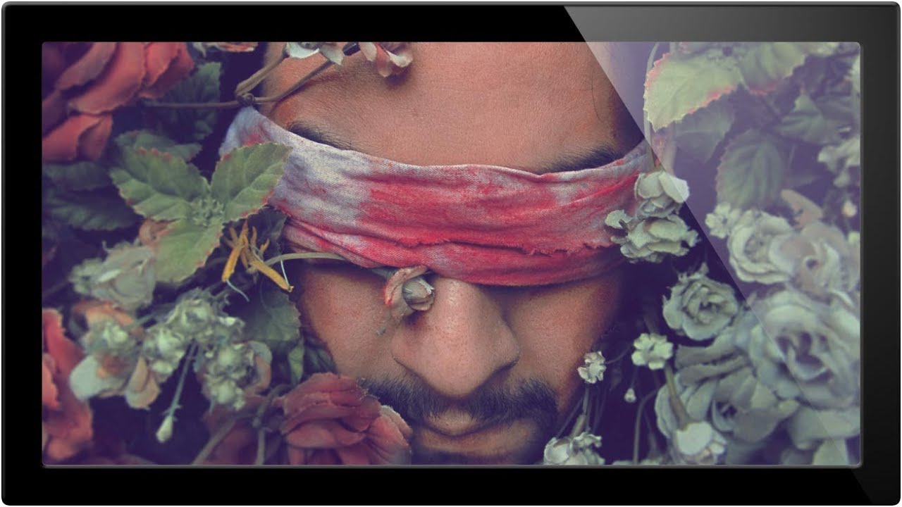
There’s a specific kind of client email I used to dread. The one that arrives two days after delivery, very polite, that says something like: “The skin still looks a little red in a few spots.” Early in my retouching work, my answer to redness was almost always the same wrong tool: the Brush tool, a sampled skin tone, and way too much opacity. The results looked painted. I’d fix the redness and introduce something worse. What I needed was a method that changed problem colors without touching anything else, one that understood the difference between a blemish and a cheekbone. In Watch the full tutorial on YouTube, Aaron Nace of PHLEARN demonstrates exactly that technique using Hue/Saturation adjustment layers in Photoshop CS6, and the logic behind it applies just as well in every version since.
What makes this approach worth your time is that it’s non-destructive, color-specific, and faster than any healing brush workflow once you understand the targeting step. Aaron uses a deliberately extreme example for the tutorial, a portrait with vivid red powder covering parts of the face, to prove that if the technique holds up there, it will hold up on any standard blemish or patch of rosacea you encounter in real client work. I’ve run through this technique on dozens of portraits since, and he’s right.
Step 1: Open Your Image and Add a Hue/Saturation Adjustment Layer
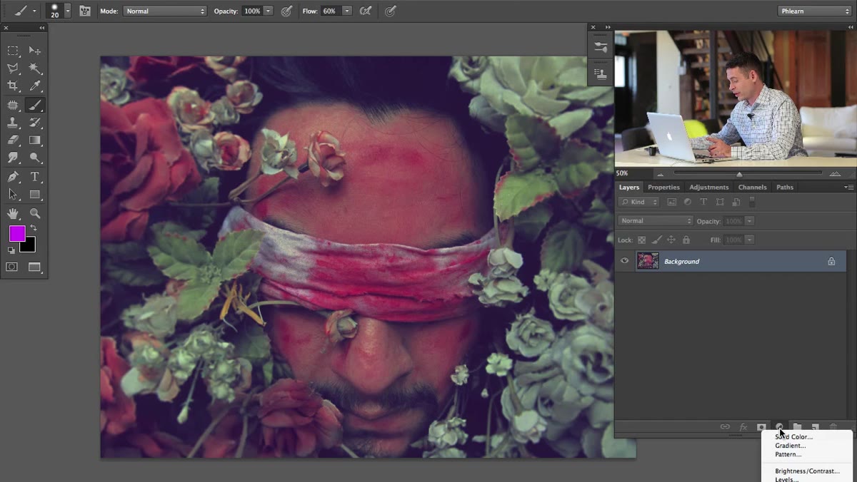 Hue/Saturation option highlighted in adjustment layers panel
Skip the destructive edits entirely. At the bottom of your Layers panel, click the half-circle icon to open the Adjustments menu and choose Hue/Saturation. This adds a non-destructive layer above your image, meaning your original pixel data stays completely untouched. If you’re working from Camera Raw, flatten to a Smart Object first so you preserve that flexibility.
Hue/Saturation option highlighted in adjustment layers panel
Skip the destructive edits entirely. At the bottom of your Layers panel, click the half-circle icon to open the Adjustments menu and choose Hue/Saturation. This adds a non-destructive layer above your image, meaning your original pixel data stays completely untouched. If you’re working from Camera Raw, flatten to a Smart Object first so you preserve that flexibility.
Step 2: Switch the Channel from “Master” to “Reds”
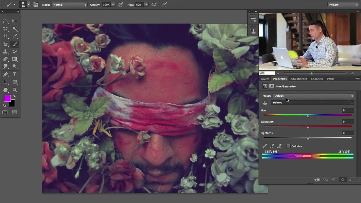 Dropdown menu showing Reds selected instead of Master
By default, the Hue/Saturation panel operates on the Master channel, which means any adjustment you make hits every color in the image simultaneously. That’s useful for global grading but disastrous for targeted blemish work. Click the dropdown that says “Master” and switch it to “Reds.” Now the adjustment layer is only paying attention to pixels that contain red information. Greens, blues, and neutral tones will be left completely alone when you start moving sliders.
Dropdown menu showing Reds selected instead of Master
By default, the Hue/Saturation panel operates on the Master channel, which means any adjustment you make hits every color in the image simultaneously. That’s useful for global grading but disastrous for targeted blemish work. Click the dropdown that says “Master” and switch it to “Reds.” Now the adjustment layer is only paying attention to pixels that contain red information. Greens, blues, and neutral tones will be left completely alone when you start moving sliders.
Step 3: Drag Saturation Up to Reveal Exactly What the Layer Is Targeting
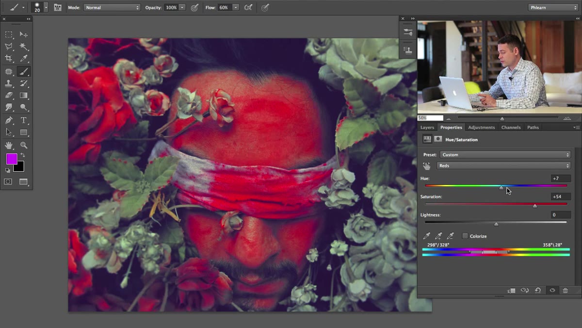 Saturation slider dragged high, showing red areas exaggerated on face
This is the diagnostic step that most people skip, and it’s the one that makes everything else work. Pull the Saturation slider up dramatically, higher than you’d ever use in a final edit, maybe 60 or 80. You’re not doing this for aesthetics. You’re doing it to see a visual map of every pixel the adjustment layer currently considers “red.” Whatever goes neon or oversaturated on screen is what you’re working with. This step shows you immediately whether the red channel’s default range is capturing your blemish, your entire face, or something in between. It’s the difference between guessing and knowing.
Saturation slider dragged high, showing red areas exaggerated on face
This is the diagnostic step that most people skip, and it’s the one that makes everything else work. Pull the Saturation slider up dramatically, higher than you’d ever use in a final edit, maybe 60 or 80. You’re not doing this for aesthetics. You’re doing it to see a visual map of every pixel the adjustment layer currently considers “red.” Whatever goes neon or oversaturated on screen is what you’re working with. This step shows you immediately whether the red channel’s default range is capturing your blemish, your entire face, or something in between. It’s the difference between guessing and knowing.
Step 4: Refine the Color Range Using the Gradient Bar at the Bottom
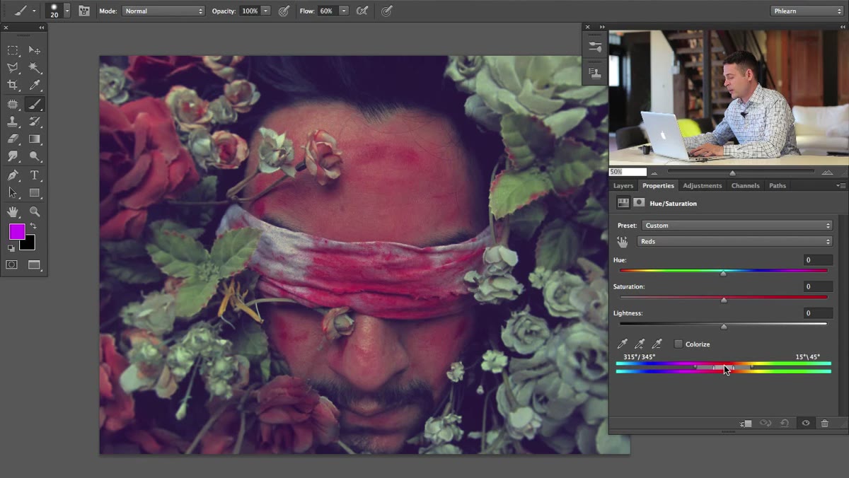 Color range gradient bar at bottom of Hue/Saturation panel with handles visible
At the bottom of the Hue/Saturation panel you’ll see a gradient bar with a set of small handles. This is where the real targeting happens. The handles define which specific hues within the red family are affected by your adjustment, and you can drag them to narrow or widen that range. If the saturation preview from Step 3 is lighting up your entire face, drag the outer handles inward to restrict the affected range to only the more saturated or specific reds that your blemishes occupy. If it’s missing the problem area, widen the range. Small moves here create significant changes, so go slowly and keep your exaggerated saturation slider up so you can see the targeting update in real time.
Color range gradient bar at bottom of Hue/Saturation panel with handles visible
At the bottom of the Hue/Saturation panel you’ll see a gradient bar with a set of small handles. This is where the real targeting happens. The handles define which specific hues within the red family are affected by your adjustment, and you can drag them to narrow or widen that range. If the saturation preview from Step 3 is lighting up your entire face, drag the outer handles inward to restrict the affected range to only the more saturated or specific reds that your blemishes occupy. If it’s missing the problem area, widen the range. Small moves here create significant changes, so go slowly and keep your exaggerated saturation slider up so you can see the targeting update in real time.
Step 5: Shift the Hue to Match the Surrounding Skin Tone
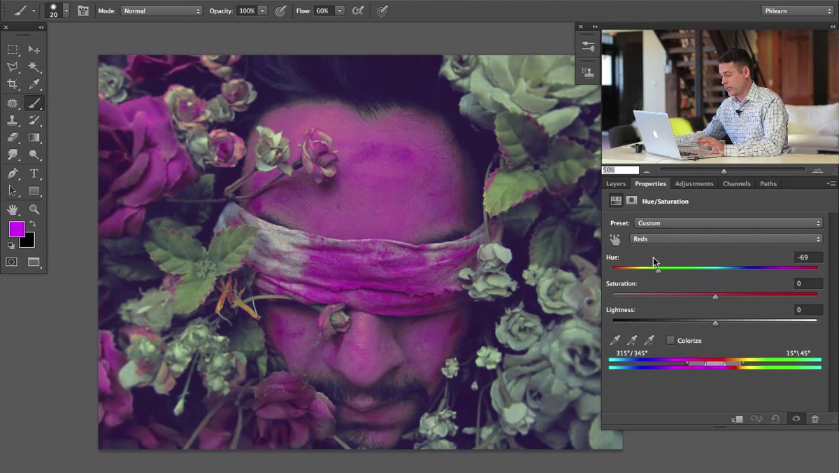 Hue slider being moved while greens in background remain unchanged
Once your targeting feels accurate, bring your Saturation slider back to zero and move to the Hue slider. A small nudge toward the yellow side of the spectrum, often just 5 to 15 degrees, pushes reddish skin tones into the warmer, more neutral range where healthy skin typically lives. Watch the edges carefully as you move it. If you start seeing unnatural transitions or the color shifts feel abrupt, you’ve either moved too far or your color range from Step 4 still needs refining. The goal is for the correction to look like it was never there.
Hue slider being moved while greens in background remain unchanged
Once your targeting feels accurate, bring your Saturation slider back to zero and move to the Hue slider. A small nudge toward the yellow side of the spectrum, often just 5 to 15 degrees, pushes reddish skin tones into the warmer, more neutral range where healthy skin typically lives. Watch the edges carefully as you move it. If you start seeing unnatural transitions or the color shifts feel abrupt, you’ve either moved too far or your color range from Step 4 still needs refining. The goal is for the correction to look like it was never there.
Step 6: Drop Saturation Slightly to Complete the Correction
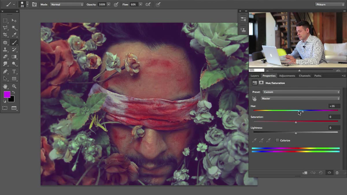 Saturation slider adjusted slightly in Hue/Saturation panel
After dialing in the hue shift, a modest Saturation reduction, somewhere between -10 and -25 for most portraits, takes the remaining intensity out of the problem area. Think of the hue shift as pointing the color in the right direction and the saturation reduction as quieting it down. Together they’re far more convincing than either adjustment alone. Check your before/after by toggling the adjustment layer’s visibility eye. The transition should look seamless.
Saturation slider adjusted slightly in Hue/Saturation panel
After dialing in the hue shift, a modest Saturation reduction, somewhere between -10 and -25 for most portraits, takes the remaining intensity out of the problem area. Think of the hue shift as pointing the color in the right direction and the saturation reduction as quieting it down. Together they’re far more convincing than either adjustment alone. Check your before/after by toggling the adjustment layer’s visibility eye. The transition should look seamless.
Step 7: Add a Layer Mask to Control Where the Correction Applies
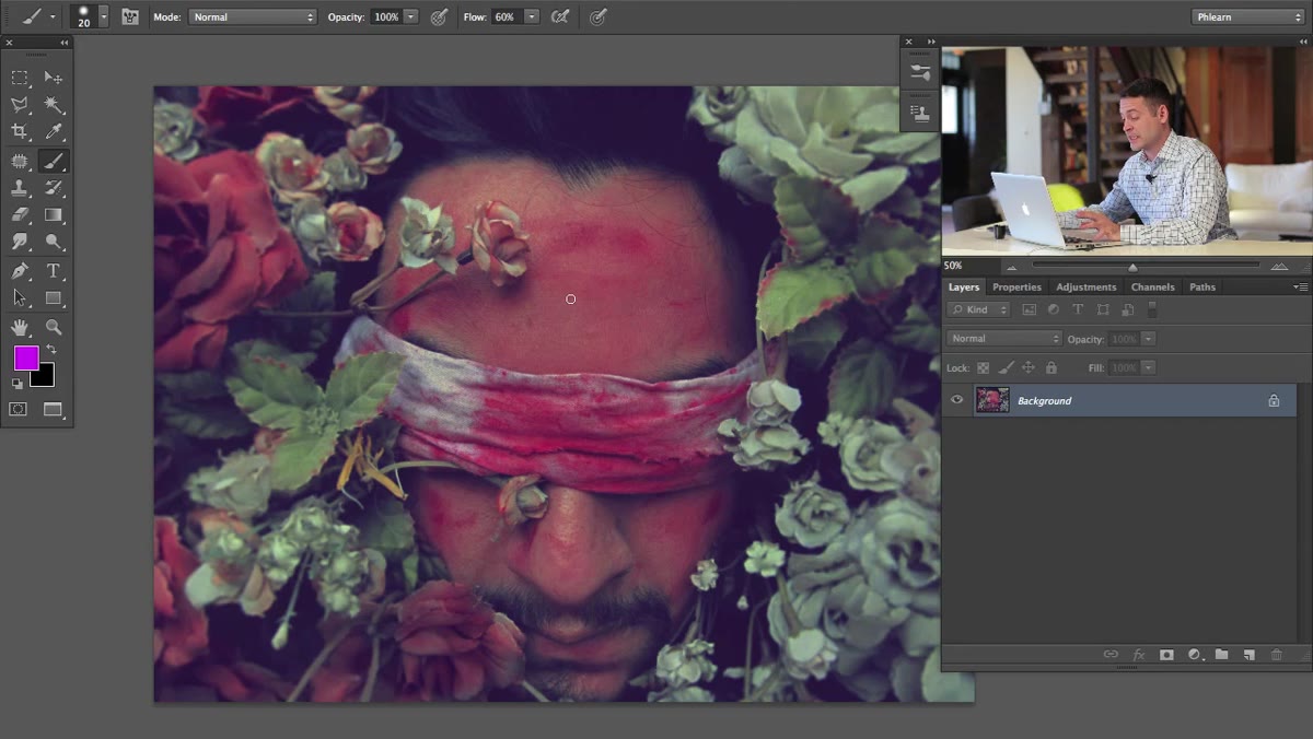 Layers panel showing adjustment layer above background image
A Hue/Saturation layer with a color range already handles a lot of the isolation automatically, but for precise work, add a layer mask. Click the mask thumbnail on the adjustment layer, fill it with black (Edit, Fill, Black) to hide the correction entirely, and then paint white with a soft brush only over the areas you want the fix to apply. This is especially useful when the targeted red range overlaps with something you want to preserve, like lip color or a warm background. The mask gives you spatial control on top of the color-range control you already set up.
Layers panel showing adjustment layer above background image
A Hue/Saturation layer with a color range already handles a lot of the isolation automatically, but for precise work, add a layer mask. Click the mask thumbnail on the adjustment layer, fill it with black (Edit, Fill, Black) to hide the correction entirely, and then paint white with a soft brush only over the areas you want the fix to apply. This is especially useful when the targeted red range overlaps with something you want to preserve, like lip color or a warm background. The mask gives you spatial control on top of the color-range control you already set up.
From My Own Practice: Watch the Lips and Nostrils
The one place this technique will come back to bite you, and I say this from a very specific memory of a beauty campaign edit that almost went out wrong, is the lips. Deep pinks and reds in the lips often fall inside the same hue range as skin blemishes, especially on subjects with saturated lip color or naturally dark lips. After I build my Hue/Saturation correction, I always zoom in at 100% on the lips, the inner nostrils, and any reddish undertones in the eyes before I call the edit done. A layer mask (see Step 7) solves this completely, but only if you remember to look. Set yourself a habit of doing one final pass over those areas. Your clients won’t know why the edit looks so clean, but you will.
The core idea here is deceptively simple: instead of trying to paint over a problem, you teach Photoshop to find a specific color and quietly move it closer to where it should be. That precision is what separates retouching that holds up at full resolution from retouching that only looks good as a thumbnail. Watch the full tutorial on YouTube to see Aaron work through the extreme example in real time. Watching the color range targeting step on a saturated subject makes the logic click in a way that’s hard to get from screenshots alone.
Comments
Leave a Comment