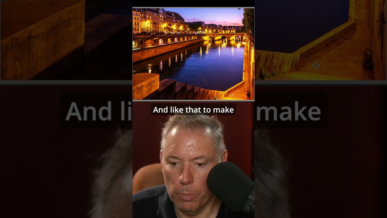
Last month I was sorting through a batch of outdoor portrait shots I’d taken for a skincare client, and something felt flat. The skin work was solid, the light was decent, but the images had no pull. Nothing made you want to lean in. I’ve learned over the years that no amount of retouching rescues a composition that isn’t doing its job, and these weren’t doing theirs. That’s what sent me back to a tutorial I’d bookmarked months ago from Serge Ramelli, shooting on location in Paris. What I found was a refresher on something I knew intellectually but wasn’t applying deliberately enough: the frame within a frame.
Why Environmental Framing Is a Retoucher’s Problem Too
Most retouchers don’t think of themselves as having a stake in composition. We get the file, we do the work. But if you also shoot, or if you’re advising photographers you collaborate with, understanding what makes a capture strong upstream saves everyone hours downstream. A portrait with strong environmental framing already has depth, context, and visual hierarchy baked in. You’re enhancing something intentional rather than trying to rescue something accidental.
In this Serge Ramelli tutorial, he shoots in Paris using doorways, archways, and architectural cutouts as natural borders that wrap around his subject. The technique isn’t new, but the way he executes it on location, adjusting his position and focal length to control how much of the frame element appears, gives it real instructional weight.
The Setup: Position, Focal Length, and the Two-Frame Rule
Ramelli’s core move is finding an architectural element, typically something with depth like a doorway or a tunnel of columns, and placing his subject inside it while keeping himself far enough back that the frame element occupies a meaningful portion of the edges of his image. He’s not just putting someone in a doorway. He’s treating the doorway as a second rectangle inside the camera’s rectangle.
The focal length choice matters here more than most people realize. He shoots with something in the short telephoto range, which compresses the scene just enough to keep the background architecture from going abstract while still separating the subject from it. If you go too wide, the environmental frame dominates. If you go too long, you lose it entirely and the background becomes a blur. There’s a sweet spot where the framing element is sharp enough to read as intentional but soft enough that your eye still lands on the subject first.
His positioning is deliberate and patient. He moves laterally and adjusts his distance from the framing element, not just his distance from the subject. A few steps to the left or right can change how symmetrically the frame wraps the subject, and symmetry versus asymmetry changes the mood of the shot significantly. Symmetry reads as formal and editorial. Asymmetry feels more candid and intimate.
Light Direction Inside the Frame
One thing Ramelli addresses that I think gets glossed over in most framing tutorials is what the light is doing inside that secondary frame. If your subject is standing in a doorway and the light source is directly behind them, you have a silhouette situation, which can be beautiful but requires a different exposure strategy. He exposes for the subject’s face, which means the background architectural elements blow out slightly, and that actually reinforces the frame effect by creating contrast between the lit subject and the darker edge material.
For portrait retouchers, this lighting situation means you’re likely to get some localized exposure inconsistency to deal with in post, particularly where the frame element transitions to the brighter background. A targeted luminosity mask or a careful dodge on the subject’s shadow side can bring that balance back without flattening the depth the composition created.
How This Falls Down in Tight Urban Spaces
I want to offer one honest caveat from my own experience, because I think it’s worth naming. The frame-within-a-frame technique assumes you have the physical room to back up and include both the subject and the framing architecture in a single shot. In Paris, Ramelli has grand 19th-century doorways and wide cobblestone streets. In a lot of North American cities, and especially in interior commercial shoots, that physical space doesn’t exist.
I tried adapting this approach for a beauty brand shoot in a historic building in Portland. The doorways were narrow, the hallway was tight, and every time I backed up far enough to include the door frame properly, I was practically in the stairwell. What I ended up doing instead was using a single vertical element, a column, as a partial frame that anchored one side of the image rather than wrapping the subject entirely. It worked, but it required me to think about the negative space on the other side of the frame much more carefully. Ramelli’s tutorial is strongest in wide, architecturally generous environments. In tighter spaces, treat it as a principle to adapt rather than a recipe to follow exactly.
The Edit Follows the Composition
After the shoot, Ramelli’s post-processing pulls the image toward the mood the composition already established. He works in Lightroom, adding contrast and deepening shadows in the framing edges to push the viewer’s eye inward toward the subject. He’s not correcting the image so much as completing it, reinforcing the visual intention that was there at capture.
That sequencing is the part I return to most often. Strong composition gives your edit a direction. When I know why a shot was framed the way it was, I know where to add contrast, where to let shadows breathe, and where to keep the retouching invisible so the architecture can do its job.
The single most transferable idea from this tutorial is that framing is not decoration. It’s a structural decision that shapes every editing choice that follows. Watch the full video to see Ramelli work through the location choices and camera adjustments in real time. Seeing him physically move and reposition is worth more than any written description of the technique.
Comments
Leave a Comment