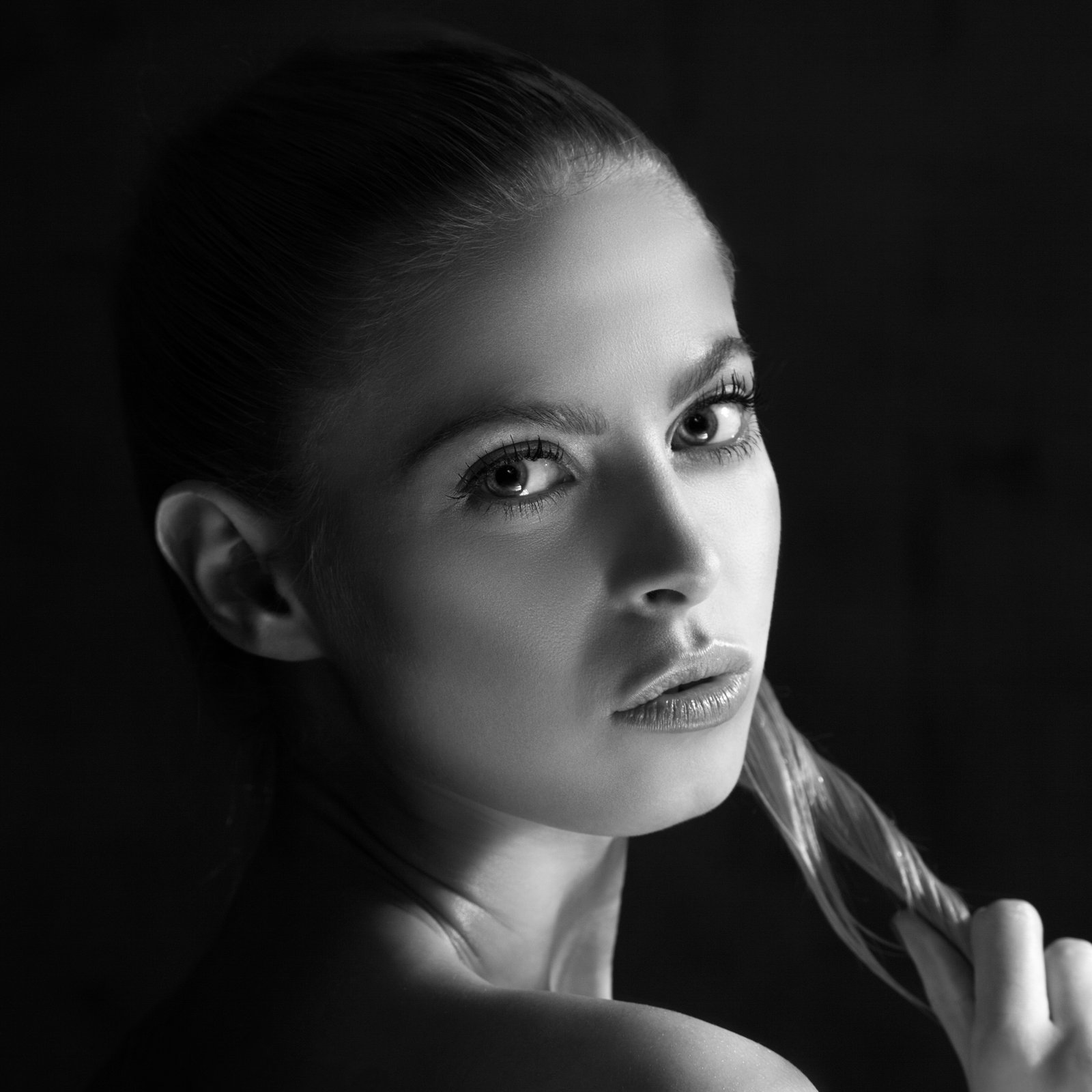
Shadows vs. Blacks in Portrait Retouching: Master the Subtle Difference
When I’m reviewing portrait retouching work from students and fellow editors, I notice one consistent area where even experienced artists sometimes stumble: the confusion between shadow and black adjustments. It’s one of those technical distinctions that seems small on the surface but makes a huge difference in the final result.
Let me be honest—I didn’t always understand this distinction clearly either. We’ve all been there, tweaking sliders without fully grasping what we’re actually doing to our images. But once it clicked for me, my entire retouching process became more intentional and my results significantly improved.
Understanding the Technical Difference
Here’s what I’ve learned through countless hours in Lightroom and similar software: shadows and blacks control different tonal ranges in your image. Think of your portrait as existing on a spectrum from pure white to pure black. Shadows affect the darker midtones—those areas that still hold detail and dimension. Blacks, on the other hand, target the deepest, darkest parts of your image where detail is already minimal.
When to Adjust Each
In portrait retouching, we’re typically working with skin tones, eyes, and facial features that exist mostly in the midtone to shadow range. When we adjust shadows, we’re shaping the depth and dimension of the face. We can add richness to a client’s eyes, deepen cheekbones, or create more definition without losing the delicate detail that makes portraits feel alive.
Black adjustments? We use those more sparingly in beauty work. They’re your tool for pure contrast when you need it—think dramatic background separation or defining the darkest lashes without affecting the subtle shadows on a client’s face.
My Practical Approach
I always start with shadows first. I’ll push them slightly darker to see how the portrait responds. This is where the magic happens in portrait work. Then I’ll check the blacks only if I need that extra punch of contrast. Rushing straight to black adjustments often results in harsh, unflattering portraits.
The Takeaway
The beauty of understanding this distinction is that it gives us precision. We’re no longer randomly sliding things around hoping something sticks. Instead, we’re making educated, intentional choices that respect the subtle artistry of portrait retouching.
Have you noticed this difference in your own work? I’d love to hear how you approach shadows and blacks in your editing workflow.
Comments (2)
This is exactly what I needed today. Been struggling with this for weeks.
Solid advice. Especially the part about taking your time with it.
Leave a Comment