There’s a skill I didn’t expect to need when I made the move from wedding photography into beauty retouching: learning to tell the difference between a photograph and a fabrication. Back when I started, the question was whether a retouch looked natural or “plastic.” Now the question has expanded. Clients send me reference images pulled from social media, mood boards assembled from Pinterest, and inspiration packs cobbled together from who-knows-where, and at least a few of those images in every batch are AI-generated, sometimes without the client even knowing. If I build a retouching direction around a face or a scene that was never real, I’m setting both of us up for disappointment.
That’s exactly why I’ve been digging into resources on AI image detection, and this KelbyOne tutorial stopped me mid-scroll. Watch the full tutorial on YouTube before or after reading this, because the visual examples are genuinely instructive. The conversation centers on landscape photography, but every principle translates directly to portrait and beauty work, where “too perfect” is something I think about every single day.
The core argument in the tutorial is deceptively simple: AI doesn’t know what imperfection looks like. It knows what imperfection is supposed to look like. That gap, small as it sounds, is exactly where trained eyes catch the tell. Here’s how to develop that instinct.
Step 1: Start With a Reference You Already Know
 Real vs. AI Mushroom Rock Arizona side by side on screen
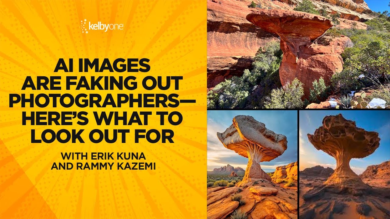
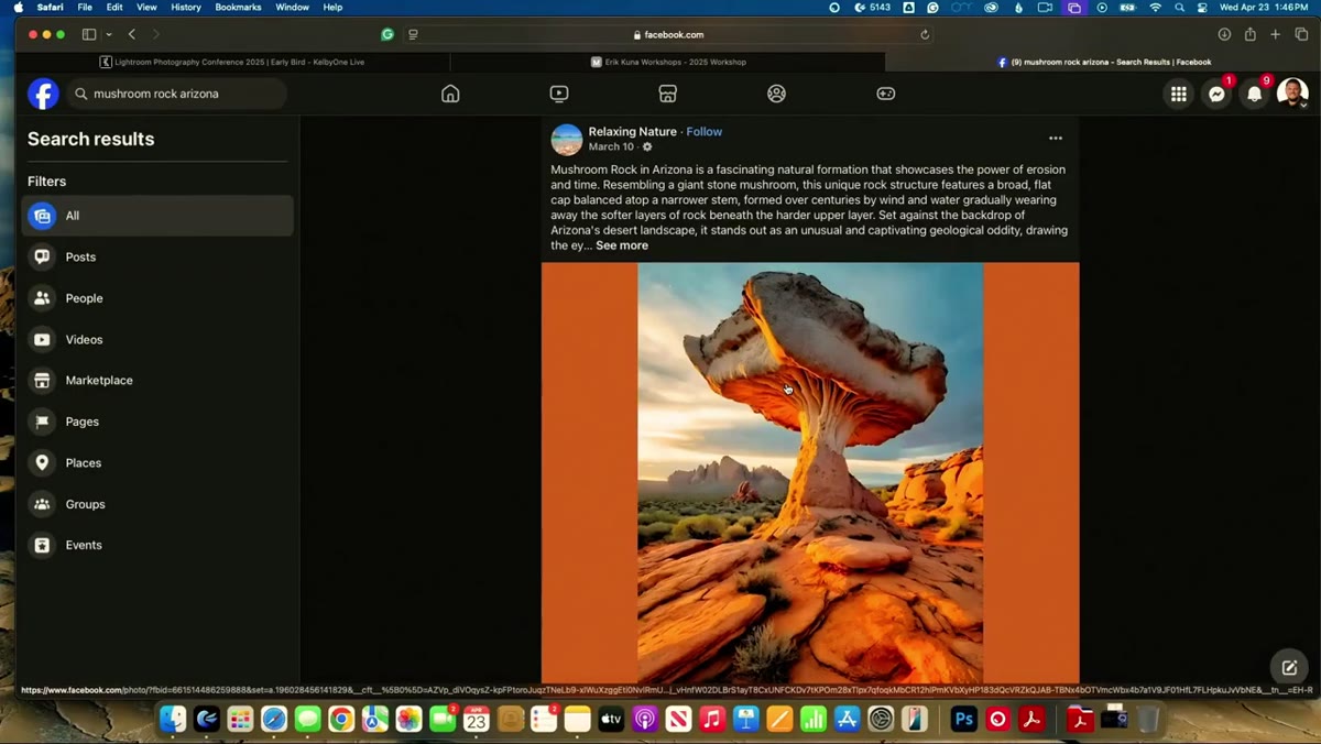
The first move is grounding yourself in reality before you look at the suspect image. In the tutorial, the instructor immediately pulls up a location he’s actually visited, Mushroom Rock in Arizona, and holds the AI version next to documentation of the real place. The AI version looks more dramatic, more cinematic, more like what you’d want the place to be. That’s the first red flag: if an image looks like the idealized version of a place or a face rather than the actual version, your suspicion meter should tick up.
Real vs. AI Mushroom Rock Arizona side by side on screen
The first move is grounding yourself in reality before you look at the suspect image. In the tutorial, the instructor immediately pulls up a location he’s actually visited, Mushroom Rock in Arizona, and holds the AI version next to documentation of the real place. The AI version looks more dramatic, more cinematic, more like what you’d want the place to be. That’s the first red flag: if an image looks like the idealized version of a place or a face rather than the actual version, your suspicion meter should tick up.
In portrait work, I do something similar. If a client sends me a reference skin texture or a reference on lighting, I ask myself whether I’ve ever seen that in a real photograph, or whether it looks like the averaged composite of ten thousand photographs. Real skin has asymmetry. Real light has falloff that doesn’t quite behave. Start by asking: have I ever seen this in life?
Step 2: Read the Texture at the Pixel Level
 Close-up of AI landscape texture showing overly uniform detail
The instructor’s go-to detection method is texture, and it’s mine too. Zoom into the fine detail of any image you’re questioning. In an AI-generated image, the texture tends to be consistent in a way that real surfaces never are. Flowers have the same level of crispness as rocks. Skin pores are evenly distributed. Hair strands resolve with identical clarity across the entire frame.
Close-up of AI landscape texture showing overly uniform detail
The instructor’s go-to detection method is texture, and it’s mine too. Zoom into the fine detail of any image you’re questioning. In an AI-generated image, the texture tends to be consistent in a way that real surfaces never are. Flowers have the same level of crispness as rocks. Skin pores are evenly distributed. Hair strands resolve with identical clarity across the entire frame.
Real photographs have noise distribution, micro-blur, and focus falloff that changes organically across the frame. When I’m looking at a portrait, I zoom to 100 percent and check the transition zones: where the hair meets the background, where the eyelashes meet the eyelid, where the lip edge meets the skin. AI tends to hallucinate those transitions with a soft uniformity that no lens actually produces. It’s not wrong exactly. It’s just too resolved, too clean, too consistent.
Step 3: Look for Structural Logic in Natural Elements
 Discussion of eroded rock formations and geological inconsistency
One of the sharpest observations in the tutorial involves erosion. The instructors point out that once you’ve spent years photographing and editing real rocks, you develop an intuitive understanding of how erosion actually works. An AI can generate a rock that looks eroded, but the erosion pattern won’t follow the logic of water, wind, and time. It follows the logic of what erosion looks like in training images.
Discussion of eroded rock formations and geological inconsistency
One of the sharpest observations in the tutorial involves erosion. The instructors point out that once you’ve spent years photographing and editing real rocks, you develop an intuitive understanding of how erosion actually works. An AI can generate a rock that looks eroded, but the erosion pattern won’t follow the logic of water, wind, and time. It follows the logic of what erosion looks like in training images.
This maps directly onto faces. I’ve spent years studying how skin ages, how fat pads shift, how brow bones catch light differently than cheek bones. AI portraits often have faces where the structural logic doesn’t hold. The under-eye area might look textured but sit at the wrong depth relative to the cheekbone. The nose might cast a shadow that contradicts the key light direction. These aren’t obvious mistakes. They’re quiet structural lies, and you catch them by asking whether the face makes physical sense, not just visual sense.
Step 4: Scan the Background and Secondary Elements
 Background clouds and mountains examined for composite inconsistency
The tutorial makes a point of looking beyond the hero element of the image: past the dramatic rock formation to the clouds, the mountains, the mid-ground. AI images very often have a focal point that looks plausible and a background that starts to unravel under examination. Clouds repeat. Mountain ridges don’t connect logically. Light sources in the sky contradict light sources on the ground.
Background clouds and mountains examined for composite inconsistency
The tutorial makes a point of looking beyond the hero element of the image: past the dramatic rock formation to the clouds, the mountains, the mid-ground. AI images very often have a focal point that looks plausible and a background that starts to unravel under examination. Clouds repeat. Mountain ridges don’t connect logically. Light sources in the sky contradict light sources on the ground.
In portrait retouching, this means looking past the face. Check the hair edges, especially against complex backgrounds. Check what the catch lights in the eyes reveal about the shooting environment. Look at the clothing fabric and whether the weave makes sense. AI portrait generators spend most of their “attention” on the face. The further you move from the face, the more the image loosens up, and that looseness is information.
Step 5: Ask Whether the Image Is Too Convenient
 Perfect AI landscape compared to the actual Mushroom Rock location
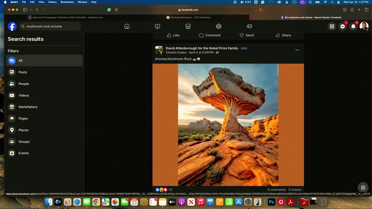
The instructors circle back to this point more than once, and it’s worth sitting with. The AI landscape of Mushroom Rock is more beautiful than the actual Mushroom Rock. It has better light, better foreground, a more dramatic mushroom shape. It is, in their words, too perfect. Nobody’s travel photo looks like that.
Perfect AI landscape compared to the actual Mushroom Rock location
The instructors circle back to this point more than once, and it’s worth sitting with. The AI landscape of Mushroom Rock is more beautiful than the actual Mushroom Rock. It has better light, better foreground, a more dramatic mushroom shape. It is, in their words, too perfect. Nobody’s travel photo looks like that.
The same logic applies to beauty imagery. Real portraits, even beautifully lit and expertly retouched ones, have something slightly off. A catchlight that’s a degree too high. A shadow that softens more than you’d expect. A wisp of hair that didn’t quite behave. When every element of an image is exactly where you’d want it to be, that convenience is its own tell. Perfection, paradoxically, is the giveaway.
What I’ve Learned Catching These in Client Decks
I’ve started keeping a small folder of AI images I’ve flagged from client reference decks over the past year. What strikes me looking at them together is how consistent the tells are across very different subjects. The texture is always too resolved. The structural logic always has at least one quiet inconsistency. And there’s always that quality of convenience, of everything being exactly placed.
The skill the tutorial describes isn’t really about AI detection as a technical process. It’s about developing a working relationship with reality, with what real skin looks like, what real light does, what real places actually are. That’s something you build through hours of looking at and working with real photographs. It makes you a better retoucher before it makes you a better AI detector.
The single most important takeaway here is this: perfection is a symptom, not a standard. Train your eye to notice when nothing is wrong, because that is often when something is very wrong. Watch the full tutorial on YouTube and pay attention to the moment the instructors hold the real and the AI versions side by side. That before-and-after is more instructive than any detection algorithm.
Comments
Leave a Comment