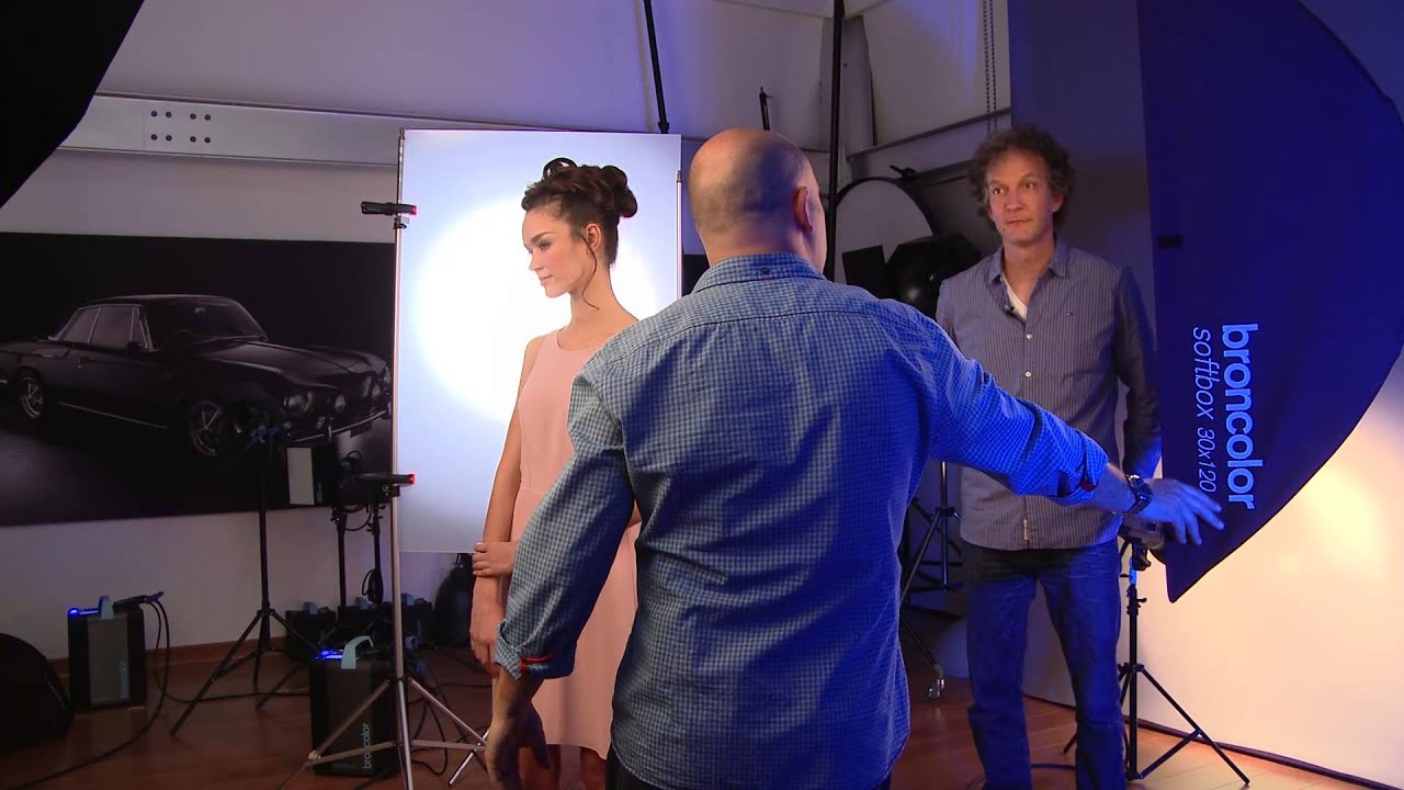
There’s a version of me from a few years back who would have watched a lighting tutorial like this and thought, “That’s a photographer thing, not a retoucher thing.” I used to believe my job started when the file landed in my inbox. What I’ve learned since then, mostly the hard way, is that understanding how an image was lit changes everything about how you retouch it. When I know where the shadows are supposed to fall, I don’t fight them. When I know a light source was deliberately hard to make gemstones pop, I don’t try to soften what looks like “harsh” contrast in the highlights. The lighting IS the retouch brief.
That’s exactly why I keep coming back to tutorials like this one from Visual Education, featuring commercial photographer Karl Taylor and broncolor consultant Urs Recher. Watch the full tutorial on YouTube before or alongside this breakdown. They walk through two distinct beauty setups in the same session, with the same model, and the contrast between the two approaches is genuinely instructive. One setup is Urs’s, built around dramatic side lighting and a necklace that practically lights itself. The other is Karl’s, a warmer, more editorial portrait with a color contrast trick that I immediately wanted to steal.
What follows is my breakdown of each setup, written so you can apply these ideas whether you’re planning a shoot or sitting down to retouch someone else’s beautifully lit files.
Step 1: Understand What the Setup Is Actually Trying to Do
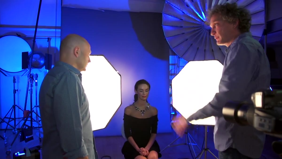 Urs explaining the two OCTA box side-lighting concept on set
Before you touch a light stand or a slider, get clear on the creative intention. Urs’s first setup looks simple on paper: two OCTA boxes, placed symmetrically on the left and right. But the placement is the whole story. Instead of pointing those boxes at the model’s face straight on, he angles them from the sides so far back that the model’s ears are actually behind the lights. This creates a natural fall-off from the lit cheekbones toward the ears and another fall-off toward the center of the face. Only the cheekbones are really catching the light. Everything else softens away. Keep that intention locked in your mind because it explains every decision that follows.
Urs explaining the two OCTA box side-lighting concept on set
Before you touch a light stand or a slider, get clear on the creative intention. Urs’s first setup looks simple on paper: two OCTA boxes, placed symmetrically on the left and right. But the placement is the whole story. Instead of pointing those boxes at the model’s face straight on, he angles them from the sides so far back that the model’s ears are actually behind the lights. This creates a natural fall-off from the lit cheekbones toward the ears and another fall-off toward the center of the face. Only the cheekbones are really catching the light. Everything else softens away. Keep that intention locked in your mind because it explains every decision that follows.
Step 2: Position the Lights to Create Intentional Fall-Off
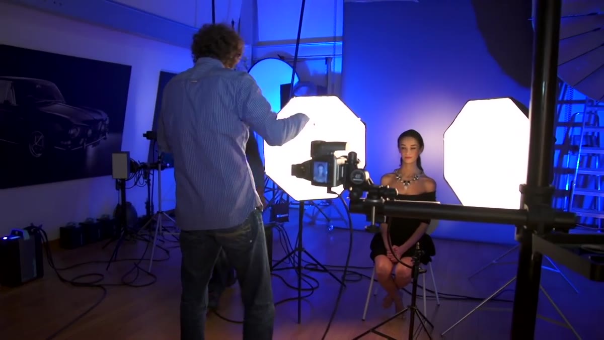
 Wide shot showing OCTA boxes angled far to the sides of the model
The OCTA boxes are placed well to the sides, not the standard 45-degree Rembrandt position most of us default to. Because they’re rotated away from the front plane of the face, they effectively behave more like strip lights from the model’s perspective. The light source reads as narrow and directional rather than large and wrapping. This is a key insight: the perceived size and softness of a light source changes depending on the angle at which it strikes your subject, not just its physical size. A large OCTA angled sharply to the side becomes a hard, dramatic light. That hardness is deliberate here, because hard light makes specular highlights on jewelry and gemstones explode with intensity.
Wide shot showing OCTA boxes angled far to the sides of the model
The OCTA boxes are placed well to the sides, not the standard 45-degree Rembrandt position most of us default to. Because they’re rotated away from the front plane of the face, they effectively behave more like strip lights from the model’s perspective. The light source reads as narrow and directional rather than large and wrapping. This is a key insight: the perceived size and softness of a light source changes depending on the angle at which it strikes your subject, not just its physical size. A large OCTA angled sharply to the side becomes a hard, dramatic light. That hardness is deliberate here, because hard light makes specular highlights on jewelry and gemstones explode with intensity.
Step 3: Add a Background Light and a Reflector Fill
 Three-light setup overview with background reflector and fill card visible
The setup is technically three lights: the two side OCTA boxes and a single background light using a standard P70 reflector on a medium spread. The background light keeps the scene from going flat and gives separation behind the model. For fill, Urs adds something refreshingly low-tech: a simple white reflector card positioned to bounce a little light back onto the body, which sits behind the reach of the main lights. A small secondary card goes above the forehead to add just a touch of fill at the top of the face. He notes that whether you need that forehead fill depends entirely on the specific face shape you’re working with. There’s no universal rule, just observation and adjustment.
Three-light setup overview with background reflector and fill card visible
The setup is technically three lights: the two side OCTA boxes and a single background light using a standard P70 reflector on a medium spread. The background light keeps the scene from going flat and gives separation behind the model. For fill, Urs adds something refreshingly low-tech: a simple white reflector card positioned to bounce a little light back onto the body, which sits behind the reach of the main lights. A small secondary card goes above the forehead to add just a touch of fill at the top of the face. He notes that whether you need that forehead fill depends entirely on the specific face shape you’re working with. There’s no universal rule, just observation and adjustment.
Step 4: Choose an Aperture That Matches the Hard-Light Look
 Camera settings discussion, aperture set to f/8 for controlled depth of field
Because the lights are acting hard and directional, Urs shoots at f/8 rather than the tighter f/16 or f/22 you might expect in a controlled studio environment. The reasoning is straightforward: a very high aperture would render everything with clinical sharpness, which fights the softness he’s built into the face through the fall-off. At f/8, the cheekbones and necklace are sharp and sparkling, but the image retains a little breathing room in the depth. For retouching purposes, this matters too. Files shot at f/8 in this kind of setup tend to have beautifully smooth skin texture in the shadow zones, which means your frequency separation work in those areas can be lighter-handed.
Camera settings discussion, aperture set to f/8 for controlled depth of field
Because the lights are acting hard and directional, Urs shoots at f/8 rather than the tighter f/16 or f/22 you might expect in a controlled studio environment. The reasoning is straightforward: a very high aperture would render everything with clinical sharpness, which fights the softness he’s built into the face through the fall-off. At f/8, the cheekbones and necklace are sharp and sparkling, but the image retains a little breathing room in the depth. For retouching purposes, this matters too. Files shot at f/8 in this kind of setup tend to have beautifully smooth skin texture in the shadow zones, which means your frequency separation work in those areas can be lighter-handed.
Step 5: Build the Second Setup Around Color Contrast
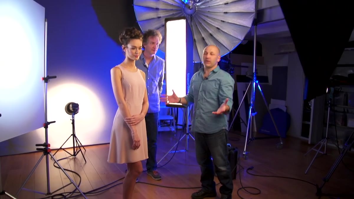 Karl Taylor’s setup with large OCTA, strip light, and blue-gelled light visible
Karl’s setup is where things get more editorial. His main light is a large 150cm OCTA box placed as the key source. On one side of the model’s face, he adds a strip light soft box to give a defined edge along the cheek and jaw. On the opposite side, rather than a standard fill, he places a blue-gelled light behind a panel of frosted perspex. The frosted material diffuses the gel so the color falls as a soft, glowing wash rather than a hard splash. The result is a warm-lit side facing the key light and a cool blue side created by the gel, a classic warm-cold contrast that reads as sophisticated and dimensional in beauty photography.
Karl Taylor’s setup with large OCTA, strip light, and blue-gelled light visible
Karl’s setup is where things get more editorial. His main light is a large 150cm OCTA box placed as the key source. On one side of the model’s face, he adds a strip light soft box to give a defined edge along the cheek and jaw. On the opposite side, rather than a standard fill, he places a blue-gelled light behind a panel of frosted perspex. The frosted material diffuses the gel so the color falls as a soft, glowing wash rather than a hard splash. The result is a warm-lit side facing the key light and a cool blue side created by the gel, a classic warm-cold contrast that reads as sophisticated and dimensional in beauty photography.
Step 6: Use the Focus Position on the Background Light to Feather Gradient
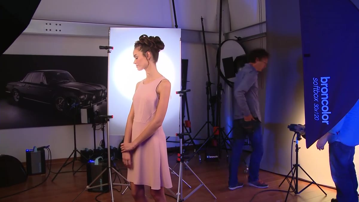 Background light positioned to feather and create gradient blend on backdrop
Karl mentions something small that I think retouchers especially need to hear. He uses the focus adjustment on his background light (the pulso head) to feather the output rather than aiming it squarely at the backdrop. In the feathered position, the edges of the light cone hit the background, creating a gentle gradient bloom rather than a hard circle of illumination. He skips the grid on this particular setup because the feathering alone gives him the blend he wants, though he notes he does use grids in other situations. For anyone retouching beauty images with gradient backgrounds, knowing whether that gradient came from feathering, a grid, or post-production dodging changes how you’d approach matching or extending it.
Background light positioned to feather and create gradient blend on backdrop
Karl mentions something small that I think retouchers especially need to hear. He uses the focus adjustment on his background light (the pulso head) to feather the output rather than aiming it squarely at the backdrop. In the feathered position, the edges of the light cone hit the background, creating a gentle gradient bloom rather than a hard circle of illumination. He skips the grid on this particular setup because the feathering alone gives him the blend he wants, though he notes he does use grids in other situations. For anyone retouching beauty images with gradient backgrounds, knowing whether that gradient came from feathering, a grid, or post-production dodging changes how you’d approach matching or extending it.
What I’d Add From My Own Experience
Both setups in this tutorial were designed with the end image in mind from the first light placement, and that discipline is something I try to apply when I consult with photographers before a beauty shoot. The single thing I always ask about is where the intended shadow edge falls on the face, because that edge tells me whether I’ll be enhancing natural contour in post or fighting it. When the lighting does the sculpting work the way Urs’s side-angled setup does here, my retouching job becomes about clarity and skin quality rather than reconstructing dimension. The blue gel in Karl’s setup is a shortcut I’ve started recommending to photographers shooting beauty on a budget: one gel and a sheet of frosted acrylic can replace a whole color grading pass in post, and it looks more natural because the color is actually IN the light on set.
The biggest takeaway from this tutorial is deceptively simple: the angle and character of a light source matters more than the size of the modifier. A large OCTA used sideways becomes a strip. A background light feathered instead of aimed becomes a gradient. These aren’t expensive upgrades. They’re decisions made before the shutter opens. Understanding those decisions is what separates a retouch that works with an image from one that quietly fights it.
Watch the full tutorial on YouTube and pay close attention to how both photographers talk through their reasoning before they ever pick up a camera. That thinking-out-loud is the real lesson.
Comments
Leave a Comment