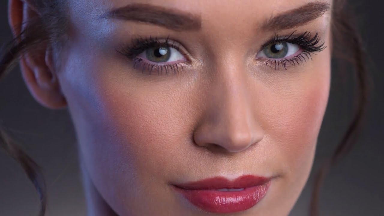
There’s a version of a beauty portrait that most of us have shot a hundred times: soft main light, maybe a reflector underneath, clean background. Safe. Competent. Forgettable. For a long time, I thought the path to better beauty work ran almost entirely through retouching. Add more light in post, finesse the skin, call it done. It took me longer than I’d like to admit to understand that the most interesting thing you can do for your retouching workflow is to give yourself better raw material to start with.
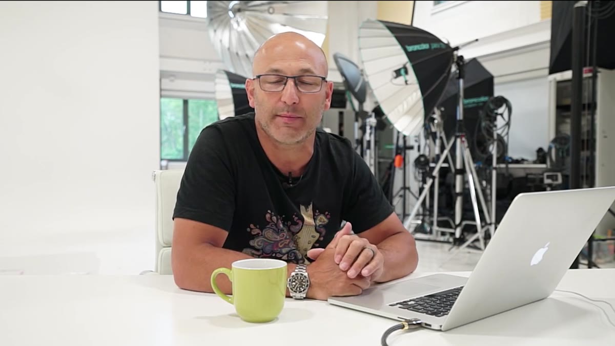
That’s why this tutorial from Karl Taylor over at Watch the full tutorial on YouTube stopped me mid-scroll. In it, he builds a compact four-light beauty setup that introduces something I now consider essential: a colored gel filling the shadow side of the face. The result is a portrait that reads as dimensional and editorial straight out of camera. Less heavy lifting in post, more character from the start. If you do any beauty or portrait work at all, this one is worth your time.
What I love most about this approach is how it reframes shadows. Instead of treating the dark side of the face as a problem to correct, you treat it as a canvas. Here’s how Karl builds the setup, and how I’d approach it if I were pulling it together in my own studio.
Step 1: Establish Your Main Light First
 Large Octabox positioned as main beauty light
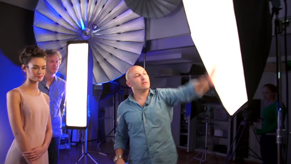
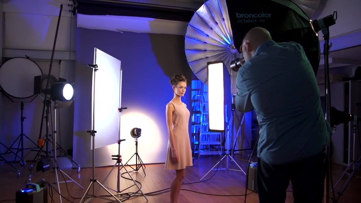
Everything else in this setup is relative to the main light, so place it before you do anything else. Karl uses a large Octabox, the 150cm size, positioned slightly to one side of the subject rather than dead center. That slight offset does quiet but meaningful work: it shifts the catchlight in the eyes away from a flat, frontal position, which reads as more three-dimensional to viewers even if they can’t articulate why. Shoot through this light alone first, get your base exposure locked in, then build from there.
Large Octabox positioned as main beauty light
Everything else in this setup is relative to the main light, so place it before you do anything else. Karl uses a large Octabox, the 150cm size, positioned slightly to one side of the subject rather than dead center. That slight offset does quiet but meaningful work: it shifts the catchlight in the eyes away from a flat, frontal position, which reads as more three-dimensional to viewers even if they can’t articulate why. Shoot through this light alone first, get your base exposure locked in, then build from there.
Step 2: Add an Edge Light on the Opposite Side
 Strip softbox positioned for edge lighting on face
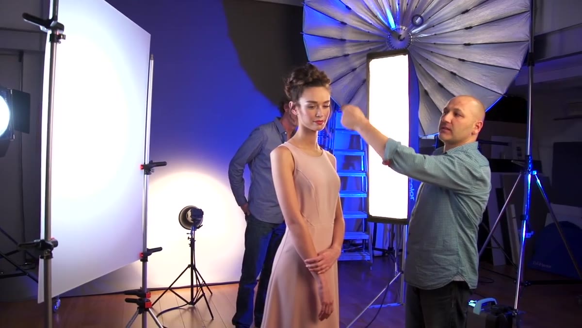
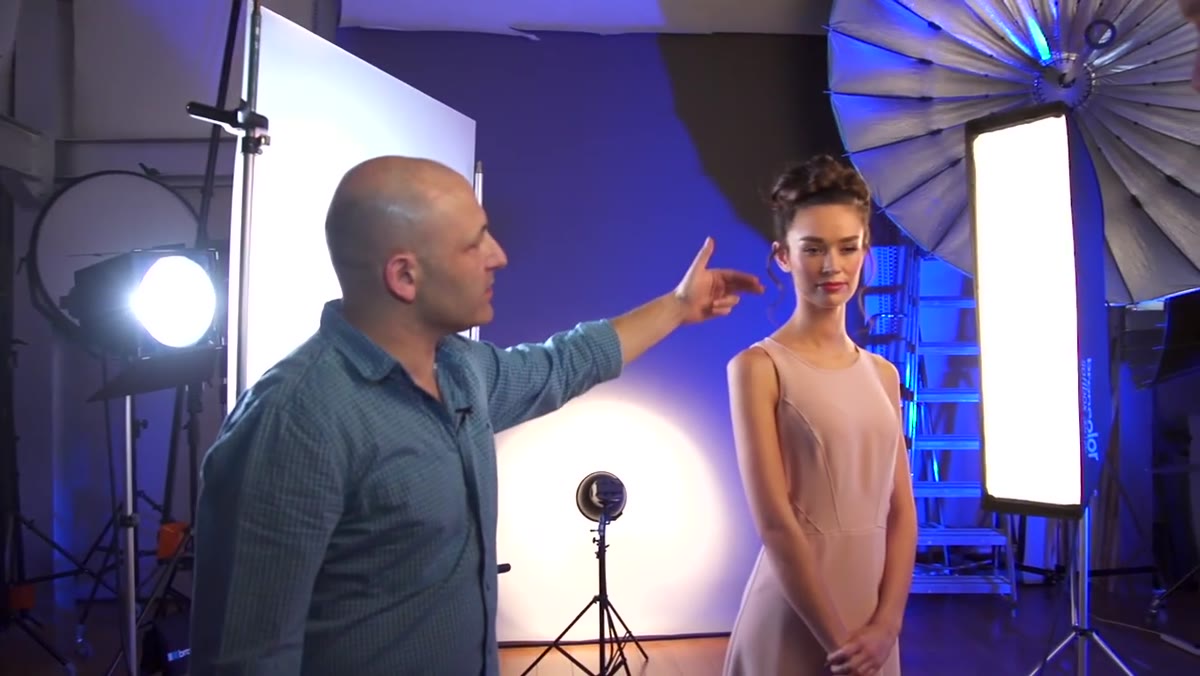
On the side opposite the main Octabox, Karl adds a 30x120cm strip softbox. This is your edge light, and its job is subtle. It traces a thin rim of brightness down the cheekbone, jaw, and shoulder, giving the face a clean separation from the background and a sense of volume. Keep this light dimmer than your main, roughly one stop under is a good place to test. If you’re seeing it compete with the Octabox, it’s too bright. It should feel like light catching an edge, not a second main source.
Strip softbox positioned for edge lighting on face
On the side opposite the main Octabox, Karl adds a 30x120cm strip softbox. This is your edge light, and its job is subtle. It traces a thin rim of brightness down the cheekbone, jaw, and shoulder, giving the face a clean separation from the background and a sense of volume. Keep this light dimmer than your main, roughly one stop under is a good place to test. If you’re seeing it compete with the Octabox, it’s too bright. It should feel like light catching an edge, not a second main source.
Step 3: Place Your Blue Gel Light Through Frosted Perspex
 Blue gel light set up behind frosted perspex panel
This is the centerpiece of the whole setup, and it’s simpler than it looks. On the same side as the edge strip light, Karl adds a separate light with a blue gel, firing it through a panel of frosted perspex. The perspex diffuses the colored light into a soft, even glow rather than a harsh colored spot. The result is a cool blue wash down the cheekbone and neck on the shadow side of the face. The key insight here is that the blue doesn’t eliminate the shadow, it inhabits it. Viewers still read that side of the face as the darker side, but the blue adds a chromatic dimension that makes the image feel alive. Warm and neutral on one side, cool and atmospheric on the other.
Blue gel light set up behind frosted perspex panel
This is the centerpiece of the whole setup, and it’s simpler than it looks. On the same side as the edge strip light, Karl adds a separate light with a blue gel, firing it through a panel of frosted perspex. The perspex diffuses the colored light into a soft, even glow rather than a harsh colored spot. The result is a cool blue wash down the cheekbone and neck on the shadow side of the face. The key insight here is that the blue doesn’t eliminate the shadow, it inhabits it. Viewers still read that side of the face as the darker side, but the blue adds a chromatic dimension that makes the image feel alive. Warm and neutral on one side, cool and atmospheric on the other.
Step 4: Build the Warm/Cold Contrast Intentionally
 Final lit portrait showing warm and cool light contrast
Once the blue gel is in place, step back and look at the full picture as a color story. You now have a neutral-to-warm key light on one side and a cool shadow fill on the other. This contrast is what Karl calls the warm light/cold light scenario, and it works because it mirrors how we perceive natural light. Think of late afternoon sun on a face with open blue sky filling the shadows. Our eyes trust that combination. For beauty work specifically, this contrast also gives the skin a luminosity that’s genuinely difficult to recreate in post. The warm tones sing brighter because the cool tones are right next to them.
Final lit portrait showing warm and cool light contrast
Once the blue gel is in place, step back and look at the full picture as a color story. You now have a neutral-to-warm key light on one side and a cool shadow fill on the other. This contrast is what Karl calls the warm light/cold light scenario, and it works because it mirrors how we perceive natural light. Think of late afternoon sun on a face with open blue sky filling the shadows. Our eyes trust that combination. For beauty work specifically, this contrast also gives the skin a luminosity that’s genuinely difficult to recreate in post. The warm tones sing brighter because the cool tones are right next to them.
Step 5: Set Up the Background Gradient
 Background light creating gradient glow on dark grey backdrop
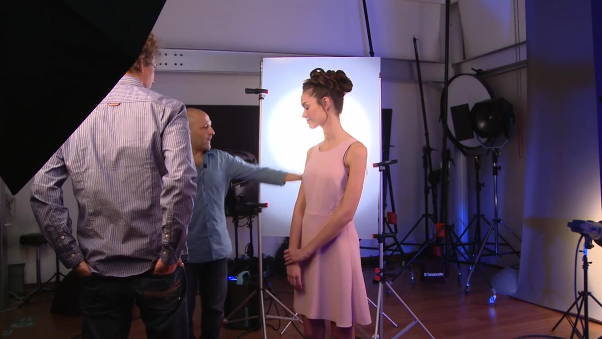
Karl’s fourth light is a standard reflector dish, no grid, aimed at the dark grey background. What he’s going for is a soft gradient of light that rises up from behind the subject’s shoulders, just enough to separate the body from the background without blowing out a full white splash. He adjusts the focus position on his Pulso light to feather the beam, which naturally creates that gradient fade rather than a hard circle of light. If you don’t have the same unit, a large reflector dish aimed slightly away from center and powered down will approximate this. The goal is lift, not separation.
Background light creating gradient glow on dark grey backdrop
Karl’s fourth light is a standard reflector dish, no grid, aimed at the dark grey background. What he’s going for is a soft gradient of light that rises up from behind the subject’s shoulders, just enough to separate the body from the background without blowing out a full white splash. He adjusts the focus position on his Pulso light to feather the beam, which naturally creates that gradient fade rather than a hard circle of light. If you don’t have the same unit, a large reflector dish aimed slightly away from center and powered down will approximate this. The goal is lift, not separation.
Step 6: Dial In Aperture for Controlled Depth
 Camera settings showing f/4 aperture selection
Karl shoots this portrait at f/4, which on his lens sits just shy of wide open. This is a deliberate choice. A fully wide aperture risks losing one eye to focus fall-off, but stopping down too far flattens the image and makes the background separation you worked for less visible. f/4 on a medium telephoto keeps both eyes sharp, allows the background to go softly out of focus, and preserves the dimensionality the lighting setup built. If you’re shooting full-frame at a shorter focal length, you may need to open up a little more to get a similar look.
Camera settings showing f/4 aperture selection
Karl shoots this portrait at f/4, which on his lens sits just shy of wide open. This is a deliberate choice. A fully wide aperture risks losing one eye to focus fall-off, but stopping down too far flattens the image and makes the background separation you worked for less visible. f/4 on a medium telephoto keeps both eyes sharp, allows the background to go softly out of focus, and preserves the dimensionality the lighting setup built. If you’re shooting full-frame at a shorter focal length, you may need to open up a little more to get a similar look.
One Thing I’d Add From My Own Experience
Colored shadow fills work beautifully in camera, but they also change how you approach retouching the image afterward. The blue gel introduces a color cast on the skin along the shadow edge that you’ll want to handle carefully. My instinct when I first tried this was to neutralize it in post because it looked “off” on the histogram. Don’t. That cool cast is the point. What I do now is work on each side of the face separately in Lightroom using masked HSL adjustments, protecting the warmth on the key-lit side while letting the blue on the shadow side breathe. Treating both halves as separate color zones saves a lot of back-and-forth and keeps the final image looking deliberate rather than corrected.
The single most transferable idea in this tutorial is that shadow doesn’t have to mean absence. Filling the shadow side with a low-powered colored light costs almost nothing extra in setup time and produces images that feel like they belong in an editorial spread. Next time you’re building a simple beauty setup and you have even one extra light and a cheap gel pack, try this before you start. You’ll hand yourself a much more interesting file to work with.
Watch the full tutorial on YouTube and see Karl walk through the setup and review the final image himself. His breakdown at the end of the video, where he examines what each light is doing to the finished portrait, is worth watching on its own.
Comments
Leave a Comment