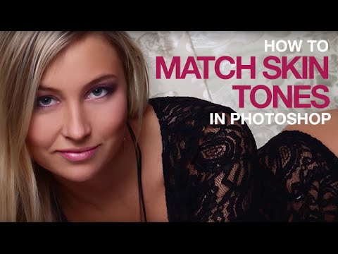
There’s a specific kind of sinking feeling you get when you’re 80% through a retouch and you suddenly notice it: the subject’s face is a completely different color from their neck and body. Maybe it’s foundation that photographs warmer than bare skin. Maybe it’s a spray tan that stops at the jawline. Maybe the light just caught one surface differently than the other. Whatever the cause, the result is the same — your subject looks like they’ve been assembled from two different people, and no amount of local dodging and burning is going to fix a fundamental color mismatch. I spent more time than I’d like to admit pushing pixels around trying to solve this problem intuitively before I found a method that actually works.
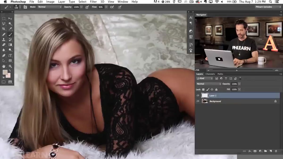
In this Aaron Nace (PHLEARN) tutorial on matching skin tones in Photoshop, the approach is methodical in a way I genuinely wish someone had shown me earlier. Watch the full tutorial on YouTube before or after reading through these steps. The image Aaron works with is a textbook case: a beautifully lit beauty shot where the face reads noticeably lighter and redder than the body below the collarbone. It’s the kind of thing clients notice immediately and retouchers sometimes stop seeing because they’ve been staring at it too long.
What makes his workflow click is that he doesn’t just eyeball the difference and start pulling sliders. He builds a visual diagnostic first, then corrects with precision using Levels adjustment layers grouped with a shared mask. Here’s how to walk through it yourself.
Step 1: Sample Colors from Both Zones to Diagnose the Problem
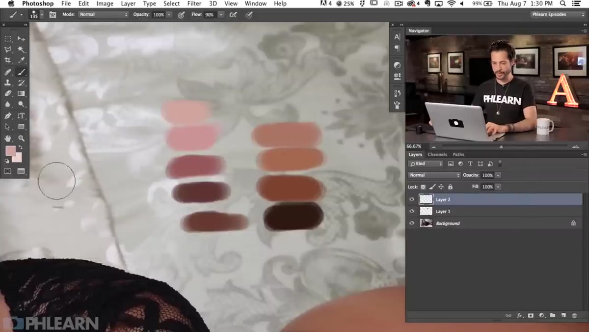
 Color swatches painted on new layer over subject’s skin
Before touching a single adjustment, create a new blank layer above your image. Grab the Brush tool (B), then hold Alt on Windows or Option on Mac to temporarily switch to the Eyedropper. Sample a color from the darkest shadows of the body, paint a small swatch, then do the same for the midtones and highlights. Repeat the process for the face: darks, midtones, highlights. You’re building a side-by-side color reference right on the canvas.
Color swatches painted on new layer over subject’s skin
Before touching a single adjustment, create a new blank layer above your image. Grab the Brush tool (B), then hold Alt on Windows or Option on Mac to temporarily switch to the Eyedropper. Sample a color from the darkest shadows of the body, paint a small swatch, then do the same for the midtones and highlights. Repeat the process for the face: darks, midtones, highlights. You’re building a side-by-side color reference right on the canvas.
The reason this step matters so much is that it forces your eye to compare the two zones without the distraction of the full image. Once you have those swatches sitting next to each other, the difference becomes obvious in a way it wasn’t before. Aaron notes that the body colors read cooler, trending toward a yellow-pink, while the face colors read warmer and more red. That’s your roadmap for every adjustment that follows.
Step 2: Identify the Specific Color Difference
 Zoomed swatches showing warm face tones versus cool body tones
Zoom into your swatches and really study what you’re looking at. You’re not just looking for “lighter” or “darker” - you’re looking for the specific color cast that separates the two regions. In Aaron’s example, the face has more red in it and the body has more yellow. That distinction matters because it tells you exactly which channels to target when you open a Levels adjustment layer.
Zoomed swatches showing warm face tones versus cool body tones
Zoom into your swatches and really study what you’re looking at. You’re not just looking for “lighter” or “darker” - you’re looking for the specific color cast that separates the two regions. In Aaron’s example, the face has more red in it and the body has more yellow. That distinction matters because it tells you exactly which channels to target when you open a Levels adjustment layer.
Think of it like mixing paint in reverse. If you want the face to match the body, you need to either reduce the red in the face, add more yellow (which in Photoshop terms means pulling back on the blue channel slightly), or some combination of both. The swatches make this a diagnosis instead of a guess.
Step 3: Add a Levels Adjustment Layer Targeted to the Face
 Levels adjustment layer panel open in Photoshop
Add a Levels adjustment layer from the Adjustments panel. The key is that Levels lets you work channel by channel, not just on overall luminosity. Instead of staying in the default RGB composite channel, drop down into the individual channels: Red, Green, and Blue separately.
Levels adjustment layer panel open in Photoshop
Add a Levels adjustment layer from the Adjustments panel. The key is that Levels lets you work channel by channel, not just on overall luminosity. Instead of staying in the default RGB composite channel, drop down into the individual channels: Red, Green, and Blue separately.
Based on what your swatches told you, start pulling the channel that’s most out of balance. If the face is too red, move into the Red channel and shift the midtone slider (the gray triangle in the middle of the histogram) slightly toward reducing the red output. Work slowly. Small moves in individual channels add up fast, and it’s easy to overcorrect into a gray, flat-looking complexion. The goal is convergence with the body tones, not a complete transformation.
Step 4: Use Multiple Levels Layers for Separate Corrections
 Multiple adjustment layers stacked in the Layers panel
Don’t try to solve everything with one Levels layer. Aaron’s approach uses separate adjustment layers to handle different aspects of the correction independently: one for overall brightness differences, another for the red channel, another for warmth. This keeps your corrections non-destructive and reversible, and it means you can fine-tune one aspect without blowing up another.
Multiple adjustment layers stacked in the Layers panel
Don’t try to solve everything with one Levels layer. Aaron’s approach uses separate adjustment layers to handle different aspects of the correction independently: one for overall brightness differences, another for the red channel, another for warmth. This keeps your corrections non-destructive and reversible, and it means you can fine-tune one aspect without blowing up another.
This is one of those habits that separates a flexible retouch from a brittle one. If your client comes back and says “it’s close but the face still feels a little pink,” you can open just the red-channel Levels layer and nudge it rather than hunting through a single overcrowded adjustment for the one slider that’s causing problems.
Step 5: Group All Adjustment Layers and Apply One Shared Mask
 Grouped layers with single layer mask applied to the group
Select all your Levels adjustment layers and group them together (Ctrl+G on Windows, Cmd+G on Mac). Then add a single layer mask to the group itself, rather than masking each layer individually. Paint black on the mask everywhere you want the adjustments to be invisible, and white everywhere you want them to apply. In this case, you’re painting to isolate the face and neck from the body.
Grouped layers with single layer mask applied to the group
Select all your Levels adjustment layers and group them together (Ctrl+G on Windows, Cmd+G on Mac). Then add a single layer mask to the group itself, rather than masking each layer individually. Paint black on the mask everywhere you want the adjustments to be invisible, and white everywhere you want them to apply. In this case, you’re painting to isolate the face and neck from the body.
This technique is one of the most useful things in this entire tutorial. Instead of maintaining five separate masks that all need to match each other perfectly, you manage one. If you need to refine the edge around the jawline, you do it once and every adjustment inside the group respects it. Use a soft brush at a low opacity (around 20-30%) to build up the mask gradually at the edges so the transition doesn’t leave a hard line where the correction ends.
A Note from My Own Practice: Watch the Jawline Transition
The hardest part of this technique isn’t the color correction itself. It’s the transition zone at the jaw and neck where the two skin regions meet. In my experience retouching for beauty clients, this seam is where sloppy work becomes obvious fastest. A sharp mask edge reads as a filter applied to half a face, which is arguably worse than the original mismatch.
I’ve started using a second, softer mask pass at just 10% brush opacity along any skin boundary, feathering the correction out over a wider area than feels intuitive. It takes an extra few minutes, but it means the color shift reads as the natural variation of lighting across a three-dimensional face rather than an obvious Photoshop zone.
The single most important thing this tutorial reinforced for me is that color correction without diagnosis is guessing. Painting those reference swatches before touching any adjustments turns a subjective problem into something you can actually measure and respond to. It’s the difference between knowing your destination before you start driving versus just hoping you end up somewhere good.
Watch the full tutorial on YouTube to see Aaron walk through the complete retouch and hear his own explanations as the adjustments take shape in real time.
Comments (1)
Quality content like this is rare. Keep it up.
Leave a Comment