Why Your Portrait Colors Look Wrong (And the Correction Workflow That Actually Fixes It)

Why Your Portrait Colors Look Wrong (And the Correction Workflow That Actually Fixes It)

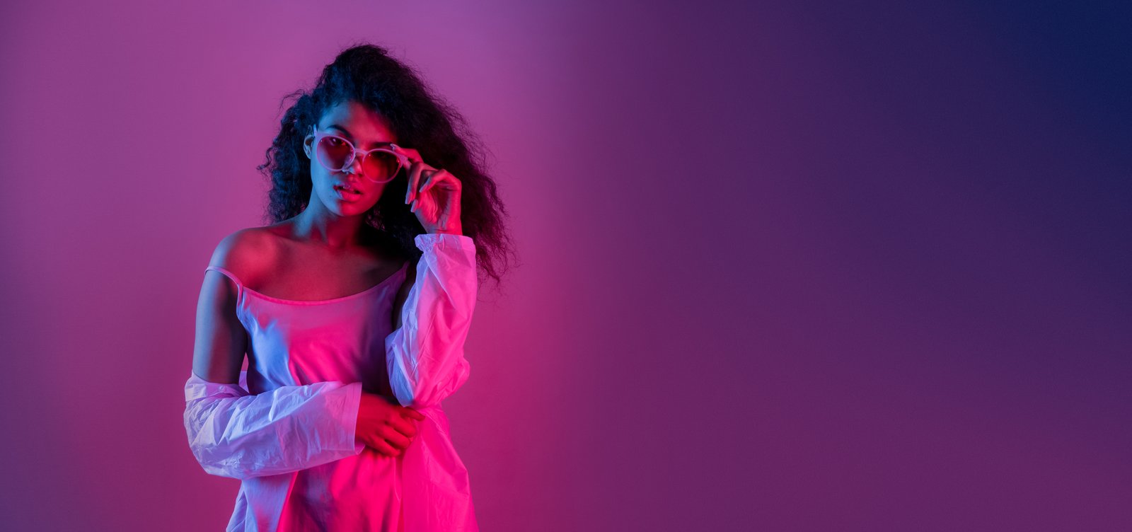
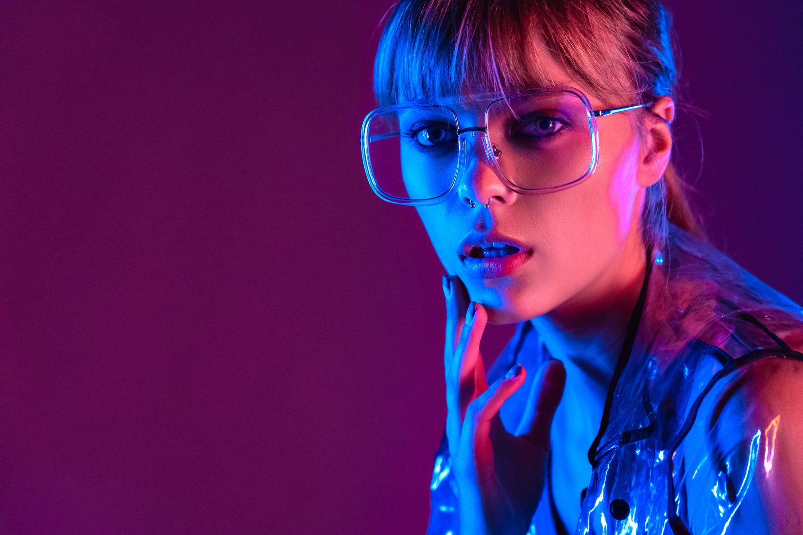
A few years into my retouching work, a beauty client sent back a batch of edits with a single line of feedback: “The skin looks like it was painted on.” I stared at my monitor for a long time after that. The tones were smooth. The highlights were clean. Technically, everything was fine. But she was right. The images felt embalmed rather than alive, and I knew exactly why. I had corrected the color, but I hadn’t corrected it for skin.

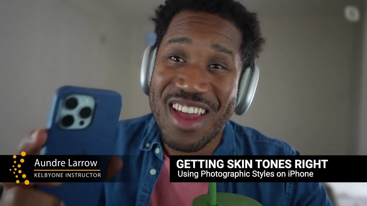
Nail Skin Tones on the First Try: Using iPhone Photographic Styles with Your Clients

Nail Skin Tones on the First Try: Using iPhone Photographic Styles with Your Clients

One of the most exhausting parts of client work isn’t the shoot itself. It’s the revision spiral. You deliver a gallery, the client says something feels “off” about the color, and suddenly you’re on round three trying to decode feedback like “can you make it warmer but not too orange?” I spent years treating this as a communication problem. Turns out, a big chunk of it is actually a workflow problem, and your iPhone’s built-in editing tools might already have a fix.

Why Your Portrait Colors Look Wrong (And the Correction Order That Fixes It)

Why Your Portrait Colors Look Wrong (And the Correction Order That Fixes It)

A few years back, I finished what I thought was a beautiful set of beauty edits for a skincare brand. Smooth skin, clean background, nice and bright. I sent the gallery over feeling genuinely proud. The creative director wrote back within an hour: “The skin looks a little… gray? And her lips are almost purple. Can you fix the color before we go further?” I stared at my monitor. The skin looked fine to me.

Dodge and Burn in Lightroom: The Portrait Technique I Wish I'd Known Earlier

Dodge and Burn in Lightroom: The Portrait Technique I Wish I'd Known Earlier

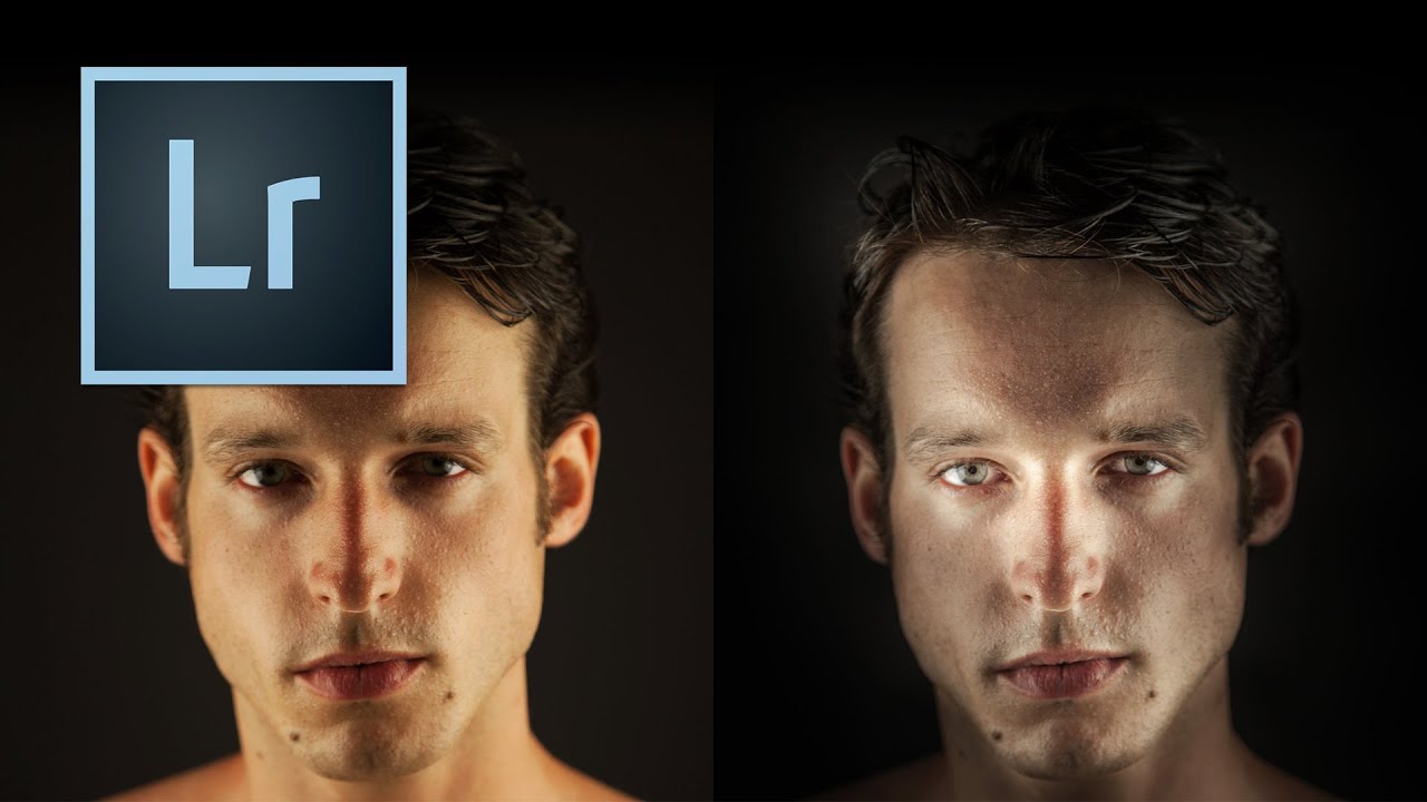
There’s a specific kind of portrait that used to make me nervous to retouch – the ones where the subject’s skin is blotchy, the lighting is a little flat, and the whole image feels like it needs something you can’t quite name. For a long time, I’d throw frequency separation at it, or get heavy-handed with the HSL panel, and the result would look corrected rather than beautiful. What was missing, more often than not, was intentional light shaping directly on the face.

Why Your Portrait Colors Look Wrong (And the Correction Order That Actually Fixes Them)

Why Your Portrait Colors Look Wrong (And the Correction Order That Actually Fixes Them)

A few years back, I delivered a full gallery to a beauty client and sat back feeling pretty good about myself. Clean skin, nice contrast, everything looked sharp on my monitor. Then her art director replied with one word: “Orange.” She was right. Every single image had a warm cast baked so deeply into the highlights that the model’s cheekbones looked like tangerines. I had been so focused on frequency separation and skin smoothing that I had skipped the foundation entirely.

How Sean Tucker's Lightroom Portrait Workflow Finally Got My Skin Tones Right

How Sean Tucker's Lightroom Portrait Workflow Finally Got My Skin Tones Right

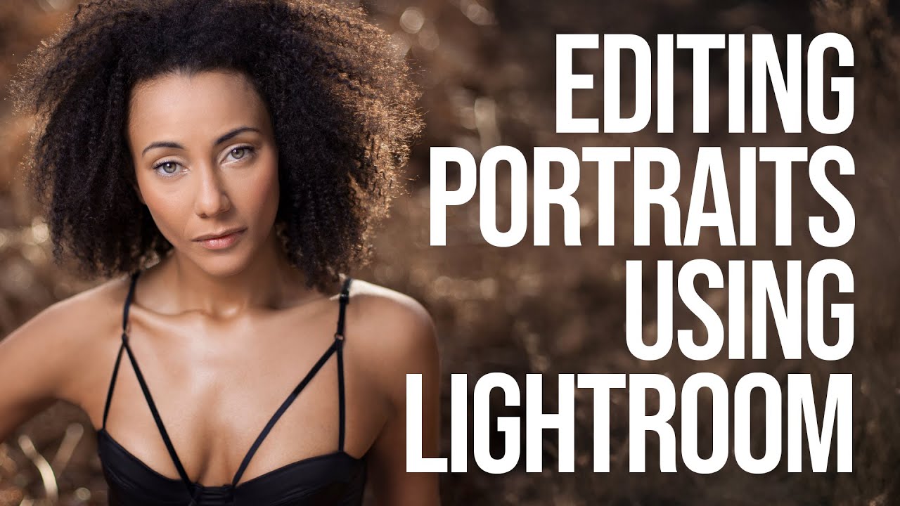
I’ll be honest with you: for years, I was a Photoshop-or-nothing person. Coming from wedding photography into beauty retouching, I built my entire workflow around layers, frequency separation, and a library of actions I’ve named after films. Lightroom felt like the place where images stopped, not where they got made. Then I sat down with Watch the full tutorial on YouTube this Sean Tucker tutorial on editing environmental portraits completely inside Lightroom, and I had one of those quiet, humbling moments where a working professional shows you that your assumptions were costing you time.

Master Color Correction in Portrait Retouching: A Step-by-Step Guide

Master Color Correction in Portrait Retouching: A Step-by-Step Guide

Master Color Correction in Portrait Retouching: A Step-by-Step Guide Color correction is where technical skill meets artistic vision in portrait retouching. I’ve watched countless editors struggle with this step because they either overcorrect or miss subtle color casts that undermine their entire edit. The good news? With a systematic approach, we can transform flat or color-shifted images into beautifully balanced portraits that make skin look its absolute best. Understanding Color Casts and Why They Matter Before we dive into correction, let’s talk about what we’re actually fixing.

The Complete Guide to Color Correction in Portrait Retouching

The Complete Guide to Color Correction in Portrait Retouching

The Complete Guide to Color Correction in Portrait Retouching Color correction is where portraiture truly comes alive. I’ve learned that even the most beautifully lit portrait can fall flat if the colors aren’t working in harmony. Whether you’re editing a single headshot or batch processing from a wedding, understanding color correction fundamentally changes how your portraits feel and how your clients respond to them. Let me walk you through the techniques I use daily to transform color in my retouching workflow.

The Art of Capturing Seasonal Beauty: What Cherry Blossoms Teach Us About Editing Light and Texture

The Art of Capturing Seasonal Beauty: What Cherry Blossoms Teach Us About Editing Light and Texture

A Decades-Long Study in Fleeting Beauty I recently learned about a photographer named Drew Geraci who has spent nearly two decades returning to Washington, D.C. each spring to photograph cherry blossoms. What struck me most wasn’t just his dedication—it was how his long-term project mirrors the delicate work we do in portrait retouching and beauty editing. When you commit to photographing the same subject across 17 years, you’re not just collecting images.

Retouching for Different Skin Types and Tones

Retouching for Different Skin Types and Tones

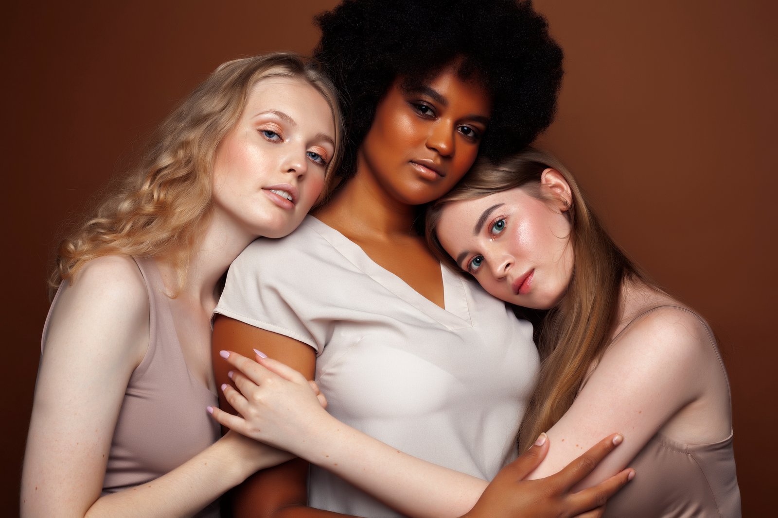
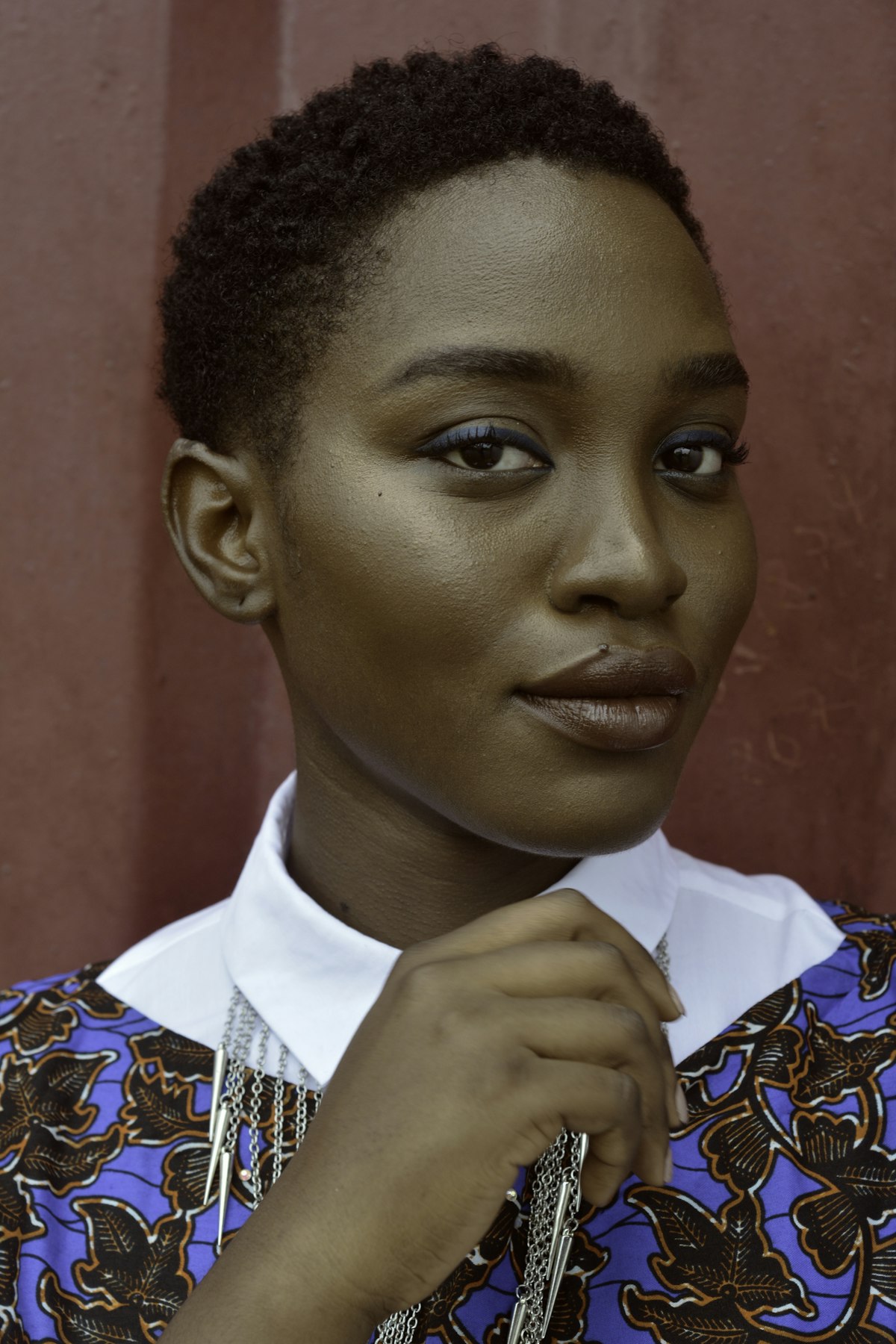
Most retouching tutorials assume a narrow range of skin types — usually fair to medium-toned, smooth skin. But real clients come with every possible combination of skin tone, texture, and type. Your retouching approach needs to adapt. Here’s what I’ve learned from retouching portraits across a wide range of skin types. Darker Skin Tones Darker skin has unique characteristics that affect how you retouch. Specular highlights are more visible. Darker skin reflects light differently, creating stronger, more distinct highlights especially on the forehead, nose, and cheekbones.