Why Your Portrait Colors Look Wrong (And the Correction Order That Actually Fixes Them)

Why Your Portrait Colors Look Wrong (And the Correction Order That Actually Fixes Them)

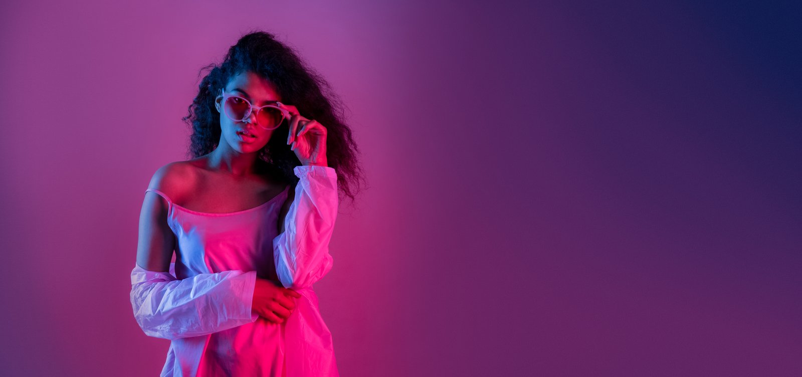
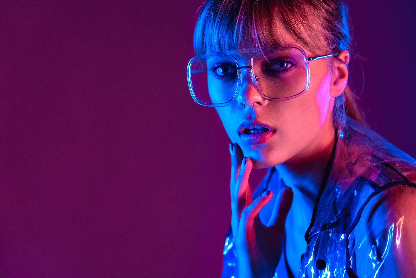
A few years back, I delivered a full gallery to a beauty client and sat back feeling pretty good about myself. Clean skin, nice contrast, everything looked sharp on my monitor. Then her art director replied with one word: “Orange.” She was right. Every single image had a warm cast baked so deeply into the highlights that the model’s cheekbones looked like tangerines. I had been so focused on frequency separation and skin smoothing that I had skipped the foundation entirely.

Why Your Portrait Colors Look Wrong (And the Correction Workflow That Actually Fixes Them)

Why Your Portrait Colors Look Wrong (And the Correction Workflow That Actually Fixes Them)

The Muddy Skin Problem Nobody Talks About Enough Last winter I was wrapping up a batch of beauty shots for a skincare client, feeling pretty good about my curves work, when I zoomed out and noticed something immediately wrong. The model’s face looked vaguely greenish, like she’d spent the week slightly ill. The background was a clean white. The photographer had shot under LED panels mixed with a daylight fill card, and my white balance correction hadn’t gone nearly deep enough.