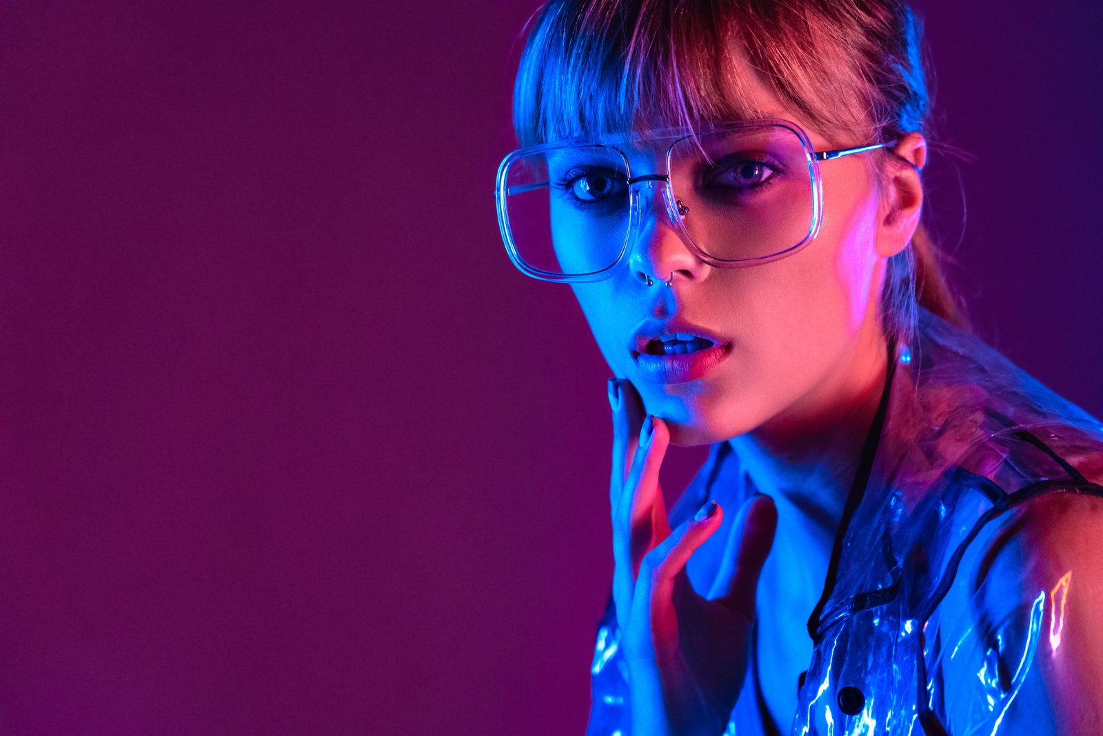
A few years back, I delivered a full gallery to a beauty client and sat back feeling pretty good about myself. Clean skin, nice contrast, everything looked sharp on my monitor. Then her art director replied with one word: “Orange.”
She was right. Every single image had a warm cast baked so deeply into the highlights that the model’s cheekbones looked like tangerines. I had been so focused on frequency separation and skin smoothing that I had skipped the foundation entirely. I hadn’t done a proper color correction pass. I had just vibed my way through the toning and called it done.
That was the last time I ever touched a retouch before addressing color first.
Why Skin Tones Break Differently Than Everything Else
Most photography subjects forgive sloppy color work. A slightly warm sky, a cooler shadow on a building, the viewer’s eye fills in the gaps. Skin doesn’t work that way. Human beings are wired to recognize faces, which means we are also wired to notice when something is wrong with one. A 5% magenta shift that reads as “moody” on a landscape reads as “sunburned” on a cheek.
The deeper issue is that skin tones occupy a surprisingly narrow zone in the color space. Healthy skin across a wide range of ethnicities sits within a predictable ratio on the hue wheel, and the moment you push outside that ratio, the image reads as wrong even to viewers who couldn’t tell you why. In RGB terms, you’re looking for the red channel to be the highest value, green in the middle, and blue the lowest, with specific gaps between them depending on depth of skin tone. Disrupt that hierarchy and you get something that looks “off” in the way that’s hard to name but impossible to ignore.
The Correction Order That Protects You From Yourself
I work in Photoshop, and I run my color correction in a strict sequence before I touch anything else on the file. Here’s what that looks like.
First, I add a Curves adjustment layer and click the gray eyedropper on a neutral point in the image, usually a white shirt collar, the whites of the eyes, or a gray card if the photographer was thoughtful enough to include one. This single click is doing more work than most retouchers realize. It’s mapping what the camera read as neutral to actual neutral, which removes the bulk of any color cast introduced by the light source or the camera’s white balance.
Second, I pull up the Info panel and hover over the subject’s skin in the midtone range, not the highlights, not the shadows. I’m looking at the RGB values. For medium skin tones, I want something roughly in the neighborhood of R:200, G:160, B:140. The exact numbers shift based on ethnicity and exposure, but the ratio matters more than the absolute values. If my green and blue channels are too close together, the skin will look yellow. If blue is too high relative to green, I’ve got a gray, ashy cast.
Third, I address any remaining imbalance with a selective Hue/Saturation layer targeted to reds and yellows, with a feathered range that doesn’t blow into the oranges. I almost never move saturation more than plus or minus 8 on this step. The goal is nudging, not painting.
Calibration Is the Work You Do Before the Work
Here’s the thing nobody told me when I was shooting weddings and doing my own post-processing: your monitor is probably lying to you. I use a Datacolor Spyder X Pro to calibrate monthly, and the difference between an uncalibrated and a calibrated display is not subtle. On an uncalibrated monitor, you will correct for problems that don’t exist and miss ones that do. The calibrator runs about $170 and takes 10 minutes. I cannot justify skipping it when I’m billing for color-accurate work.
Beyond hardware, I keep a reference library of approved skin tone files from previous jobs, images the client signed off on. Before I start a new project, I’ll open one of those alongside the new raw files and do a quick visual comparison. It takes about two minutes and it’s caught drift in my own perception more than once.
When the Lighting Fights You
Mixed lighting is where color correction gets genuinely hard, and beauty shoots are especially vulnerable because they often involve rim lights, hair lights, and a key light that are all running at slightly different color temperatures. A strobe that’s been fired ten thousand times shifts warmer. A modifier you just pulled out of a bag runs cooler. The result is a face where the highlight is amber and the shadow is blue-gray, and you cannot fix both with a single global correction.
The solution is to work in zones. I use a luminosity mask built in the Calculations dialog (Channel: Gray, Blending: Multiply, Inversion checked) to isolate highlights and shadows separately. Then I apply independent Curves corrections to each zone, dragging the blue channel up slightly in highlights and the red channel down slightly in shadows until the color temperature reads as consistent across the tonal range. It’s slower than a single global pass but it’s the only method that doesn’t create new problems while solving the old one.
The Single Thing That Changed How I See Color
A client once called my edits “plastic-looking.” I was genuinely stung. But when I went back through the file, I understood what had happened. I had overcorrected. I had chased perfect neutrals so aggressively that I had stripped the warmth that makes skin look alive. Technically correct is not the same as visually correct.
Now I use a simple gut check. Before I export anything, I make a merged visible layer, reduce the color correction’s effect to about 80% opacity, and ask myself if the image still looks like a person I’d want to meet. If yes, I might even back off to 75%. Color correction is not about eliminating color. It’s about making the color honest.
The camera records light. Your job is to translate it.
Comments (3)
This is going in my reference folder. Incredibly useful.
My workflow just got 10x faster. Not even kidding.
My workflow just got 10x faster. Not even kidding.
Leave a Comment