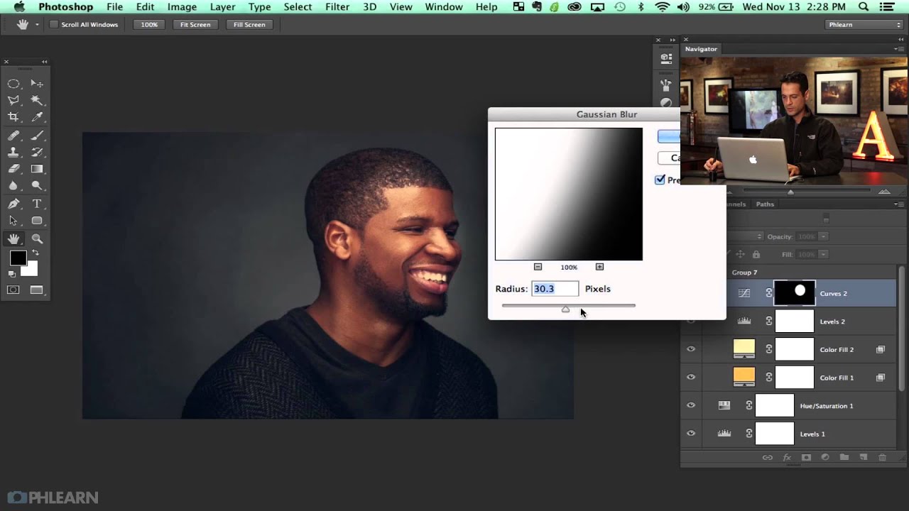
There’s a specific kind of disappointment that comes from finishing a retouch, stepping back, and thinking: this looks like Photoshop. Not “polished.” Not “professional.” Just obviously, undeniably, digitally manipulated. I’ve been there more times than I care to admit, especially in my early days when I thought a perfectly symmetrical gradient vignette was the finishing touch every portrait needed. It wasn’t. It looked like a preset slapped on at the last second, because that’s essentially what it was.
That’s why the third installment of Aaron Nace’s editorial headshot series hit me the way it did. In this Aaron Nace (PHLEARN) tutorial, the focus shifts to the finishing stage of a portrait: building a vignette that actually looks like it belongs in the image, and using color and sharpening to bring everything together. The subject is Asa Davis, PHLEARN’s video editor, and by part three the image is already looking strong. What Aaron does in this final pass is the kind of subtle work that separates a good retouch from a great one.
What I find most useful about this approach is that it treats the finishing stage as a creative decision, not a checklist. Let me walk you through the core technique so you can apply it to your own editorial portraits.
Step 1: Start with a Curves Adjustment Layer for Your Vignette Base
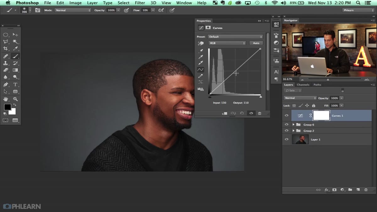 Curves adjustment layer darkening the overall image
Before reaching for the Vignette filter or the Lens Correction panel, create a Curves adjustment layer and pull the midpoint of the curve down to darken the entire image significantly. Don’t be shy here. You want a noticeably darkened version of the image because you’ll be masking most of it back out. The goal is to create raw material, not a finished effect. Think of this layer as your shadow source.
Curves adjustment layer darkening the overall image
Before reaching for the Vignette filter or the Lens Correction panel, create a Curves adjustment layer and pull the midpoint of the curve down to darken the entire image significantly. Don’t be shy here. You want a noticeably darkened version of the image because you’ll be masking most of it back out. The goal is to create raw material, not a finished effect. Think of this layer as your shadow source.
Step 2: Use a Marquee Selection to Define the Vignette Shape
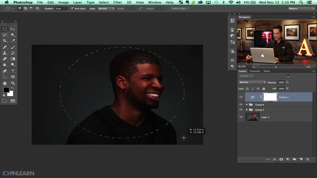 Elliptical Marquee selection drawn over the subject
Grab the Elliptical Marquee tool and draw a selection roughly around the subject’s face and upper body. Once you have your selection, invert it with Command+Shift+I (so the edges of the frame are selected rather than the center), then fill the layer mask with black in that inverted selection area using Command+Delete. Deselect with Command+D. What you now have is a darkened border with a relatively clean center, the skeleton of a vignette. It’s a solid start, but Aaron is honest about it: at this stage it looks very much like something a computer made.
Elliptical Marquee selection drawn over the subject
Grab the Elliptical Marquee tool and draw a selection roughly around the subject’s face and upper body. Once you have your selection, invert it with Command+Shift+I (so the edges of the frame are selected rather than the center), then fill the layer mask with black in that inverted selection area using Command+Delete. Deselect with Command+D. What you now have is a darkened border with a relatively clean center, the skeleton of a vignette. It’s a solid start, but Aaron is honest about it: at this stage it looks very much like something a computer made.
Step 3: Soften the Mask Edge with a Gaussian Blur
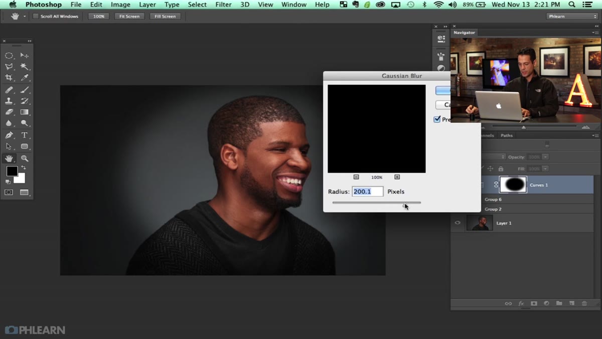 Gaussian Blur dialog applied to the layer mask
With the layer mask still selected (click directly on the mask thumbnail in the Layers panel), go to Filter > Blur > Gaussian Blur and apply a large radius. Aaron uses a generous value here, enough to create a smooth, gradual transition between the darkened edges and the clear center. This removes the hard line and gives you something that reads as atmospheric rather than mechanical. But even with the blur applied, the vignette still has that telltale digital perfection to it. Perfectly smooth gradients don’t exist in nature, and your viewer’s eye knows it even if their brain doesn’t register why.
Gaussian Blur dialog applied to the layer mask
With the layer mask still selected (click directly on the mask thumbnail in the Layers panel), go to Filter > Blur > Gaussian Blur and apply a large radius. Aaron uses a generous value here, enough to create a smooth, gradual transition between the darkened edges and the clear center. This removes the hard line and gives you something that reads as atmospheric rather than mechanical. But even with the blur applied, the vignette still has that telltale digital perfection to it. Perfectly smooth gradients don’t exist in nature, and your viewer’s eye knows it even if their brain doesn’t register why.
Step 4: Load the Custom Texture Brush and Paint onto the Mask
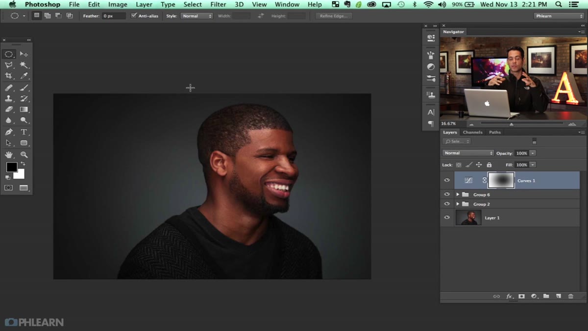 Custom brush selected in the brush picker panel
Here’s where the technique becomes genuinely interesting. Aaron calls on a custom brush he built in part one of the series, a textured, irregular brush that mimics the kind of randomness you’d find in a naturally lit scene. Set your foreground color to white and your flow to around 10%. Begin painting over the layer mask in areas where you want the darkening effect to pull back, revealing more of the original image underneath. The low flow setting means you’re building the effect gradually, which gives you control and keeps the transitions feeling soft.
Custom brush selected in the brush picker panel
Here’s where the technique becomes genuinely interesting. Aaron calls on a custom brush he built in part one of the series, a textured, irregular brush that mimics the kind of randomness you’d find in a naturally lit scene. Set your foreground color to white and your flow to around 10%. Begin painting over the layer mask in areas where you want the darkening effect to pull back, revealing more of the original image underneath. The low flow setting means you’re building the effect gradually, which gives you control and keeps the transitions feeling soft.
The irregularity of the custom brush is doing the heavy lifting. Instead of a perfectly feathered circle, you’re getting organic edges, patches of light and dark that feel like they came from the scene itself rather than from a slider.
Step 5: Alternate Between Black and White to Sculpt the Effect
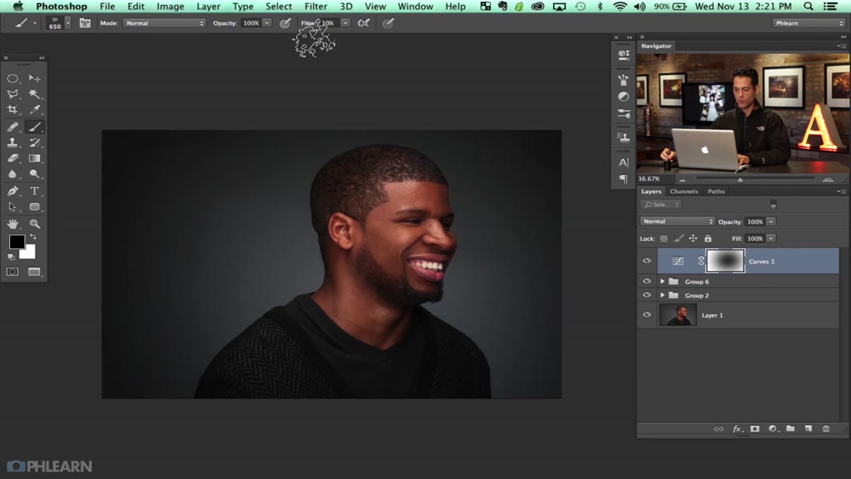 Painting black and white on the mask with custom brush
Switch between black and white on your mask as you paint. Black conceals the curves darkening; white reveals it. By alternating, you’re sculpting a gradation that has real texture and variation. Aaron keeps his brush size changing too, going larger for broad strokes and smaller for more intentional edges near the subject’s face. Work in passes rather than trying to nail it in one go. The randomness you’re introducing is the point. If it starts to look too even or too deliberate, zoom out, assess, and break up the pattern.
Painting black and white on the mask with custom brush
Switch between black and white on your mask as you paint. Black conceals the curves darkening; white reveals it. By alternating, you’re sculpting a gradation that has real texture and variation. Aaron keeps his brush size changing too, going larger for broad strokes and smaller for more intentional edges near the subject’s face. Work in passes rather than trying to nail it in one go. The randomness you’re introducing is the point. If it starts to look too even or too deliberate, zoom out, assess, and break up the pattern.
Keep your flow low (Aaron mentions hovering around 20% in later passes) and resist the urge to over-paint any single area. A little darkening in a lot of places is more convincing than a lot of darkening in a few.
Step 6: Step Back and Evaluate the Whole Image
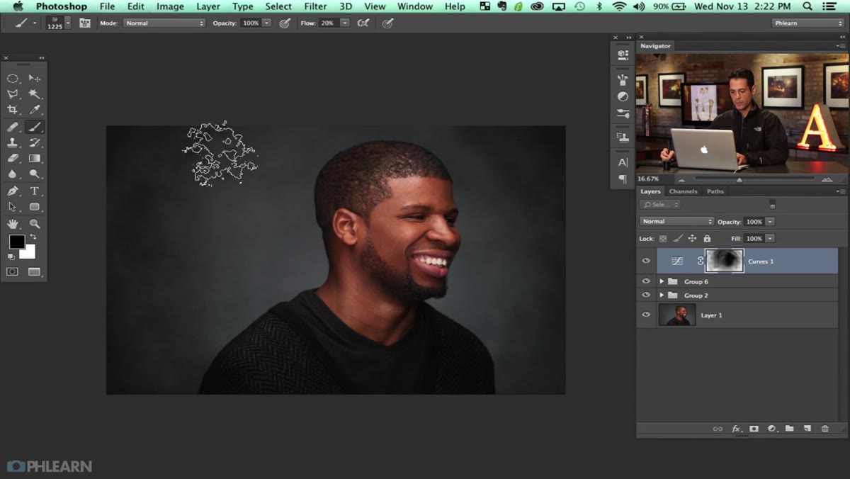 Full portrait with refined vignette visible at image edges
Toggle the Curves layer on and off to check your progress against the flat image. The vignette should feel like the light naturally falls away at the edges, the way it does in a studio portrait with controlled lighting, not like a frame was drawn around the subject. If any section reads as too uniform or too perfectly graduated, go back to the mask and break it up with a few more passes of the texture brush. Aaron spends time here just assessing and adjusting, and that patience is part of the craft.
Full portrait with refined vignette visible at image edges
Toggle the Curves layer on and off to check your progress against the flat image. The vignette should feel like the light naturally falls away at the edges, the way it does in a studio portrait with controlled lighting, not like a frame was drawn around the subject. If any section reads as too uniform or too perfectly graduated, go back to the mask and break it up with a few more passes of the texture brush. Aaron spends time here just assessing and adjusting, and that patience is part of the craft.
What I Do Differently After Watching This
One thing I’ve added to my own workflow after studying this approach is naming the Curves layer something like “Vignette - Texture” immediately after creating it. It sounds trivial, but when you’re three hours into a complex retouch and your Layers panel looks like a city skyline, descriptive naming saves you from accidentally painting on the wrong mask. I also tend to duplicate the layer at around 50% opacity and merge it down once I’m happy with the mask, so I can make final opacity tweaks without touching the mask I spent time building.
If you don’t have Aaron’s custom brush from part one, a chalk or watercolor brush with low spacing and high scatter will get you surprisingly close. The goal is irregularity. Any brush that introduces randomness will work better than a standard round brush with feathering.
The single biggest insight from this tutorial is that convincing vignettes are not about the gradient, they’re about the texture on the mask edge. A smooth gradient tells the viewer’s brain “someone did this.” A textured, organic transition says “this is just how the light fell.” That shift in thinking changed how I approach every finishing pass I do now.
Watch the full tutorial on YouTube to see Aaron’s complete workflow across all three parts, including the frequency separation and dodging and burning work that sets up everything covered here.
Comments (1)
Quality content like this is rare. Keep it up.
Leave a Comment