
Every few months I get a file from a photographer who has just switched camera systems, and they cannot figure out why their skin tones look off. The exposure is fine, the white balance reads correct, but something about the color just feels wrong. Before I learned to diagnose this properly, I would chase it around in the HSL panel for twenty minutes and usually make things worse. What I needed was a clear, side-by-side explanation of what these sensors are actually doing to color, not just vague reassurances that “every camera renders differently.”
That explanation showed up in this Sean Tucker tutorial, where he runs a controlled test comparing the Canon 5D Mark III and the Sony A7 III shooting the same subject, same lens, same light, same settings. The results are more dramatic than I expected, and more importantly, Tucker breaks down exactly what each sensor is doing in color terms, which gives you a roadmap for correction rather than just a before and after. Watch the full tutorial on YouTube before or after reading this, but the walkthrough below should let you follow the technique on your own files right away.
This one matters especially if you retouch files from multiple photographers. You might be getting Canon files from one client and Sony files from another, and if you are applying the same baseline color treatment to both, you are probably fighting the sensor instead of working with it.
Step 1: Shoot a Gray Card for Each Session
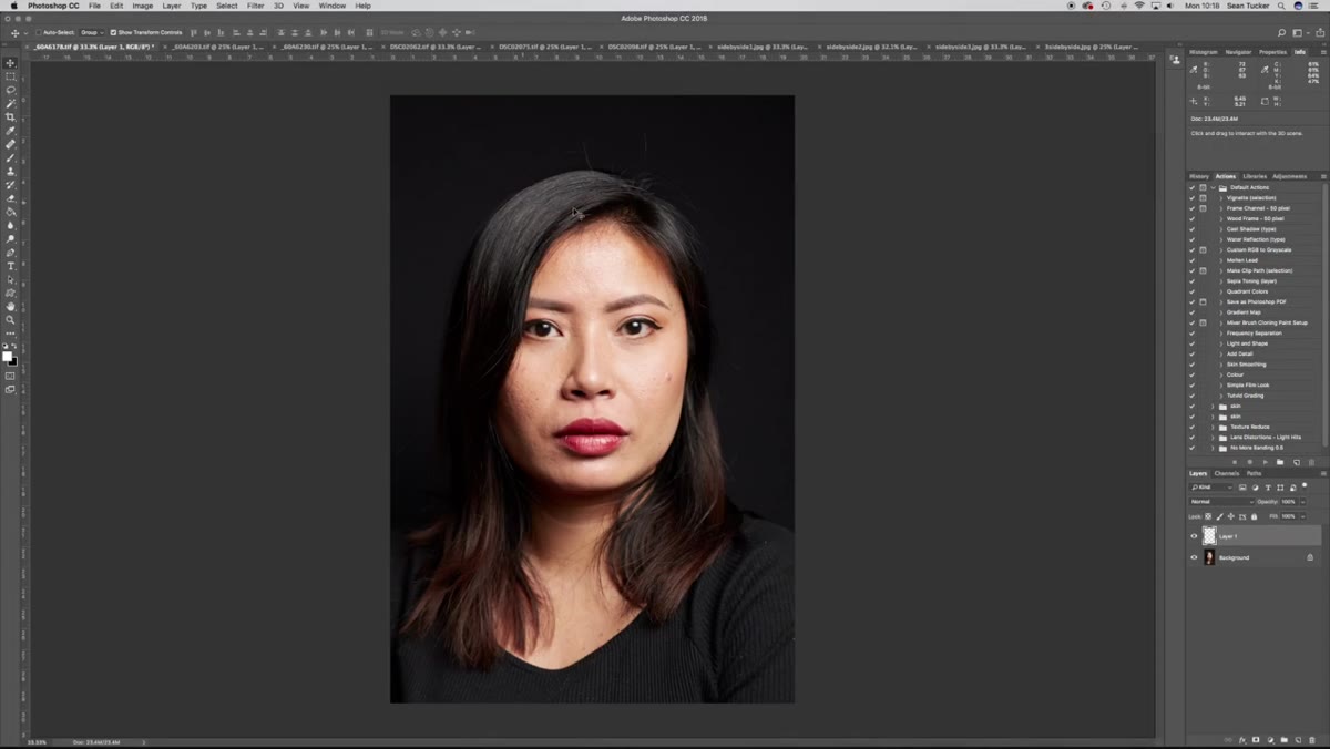
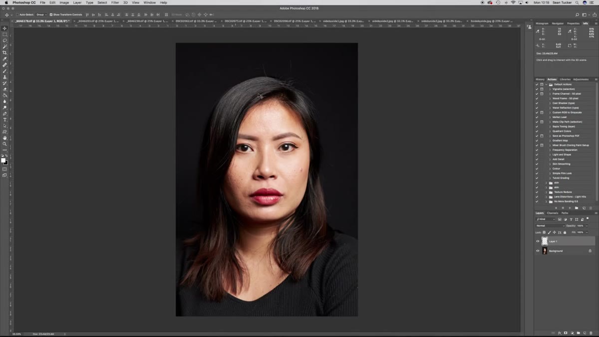 Gray card white balance being picked in Capture One
Before any retouching conversation can happen, the white balance has to be grounded in reality. Tucker shoots one frame with a gray card at the start of each lighting setup, then uses that frame in Capture One to color-pick the white balance. Both cameras were set to flash white balance in-camera, but as he points out, every camera and every flash unit interprets that setting slightly differently. Relying on in-camera white balance alone means you are comparing two cameras’ guesses rather than a shared neutral baseline.
Gray card white balance being picked in Capture One
Before any retouching conversation can happen, the white balance has to be grounded in reality. Tucker shoots one frame with a gray card at the start of each lighting setup, then uses that frame in Capture One to color-pick the white balance. Both cameras were set to flash white balance in-camera, but as he points out, every camera and every flash unit interprets that setting slightly differently. Relying on in-camera white balance alone means you are comparing two cameras’ guesses rather than a shared neutral baseline.
If you receive files from a photographer who did not shoot a gray card, ask them to do it going forward. It is a thirty-second habit that saves both of you significant correction time on every shoot.
Step 2: Bring the Corrected Files Into Photoshop Side by Side
 Canon and Sony portrait sets displayed side by side in Photoshop
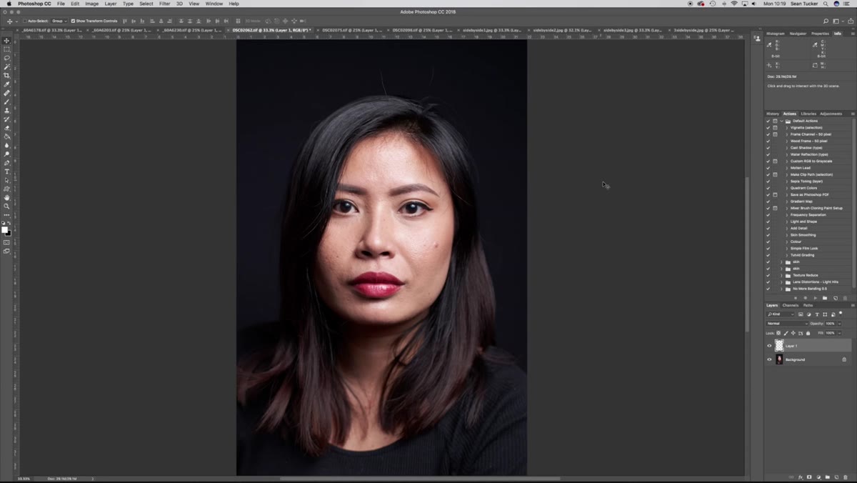
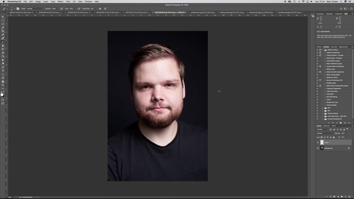
Once the white balance is pinned to the gray card in your raw processor, export the files and open them together in Photoshop so you can compare them directly. Tucker lines up the Canon shots and Sony shots next to each other at the same zoom level. The difference becomes obvious immediately, even at a glance, which tells you this is not a subtle perceptual thing. It is a real, measurable color shift.
Canon and Sony portrait sets displayed side by side in Photoshop
Once the white balance is pinned to the gray card in your raw processor, export the files and open them together in Photoshop so you can compare them directly. Tucker lines up the Canon shots and Sony shots next to each other at the same zoom level. The difference becomes obvious immediately, even at a glance, which tells you this is not a subtle perceptual thing. It is a real, measurable color shift.
Do not skip this side-by-side step even if you are only working with one camera system. Seeing the difference between systems trains your eye to recognize the cast faster on future files.
Step 3: Identify the Canon Cast - Warm Yellow With a Green Lean
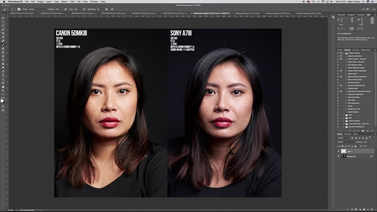 Canon portrait showing warm yellow color cast analysis
Tucker describes what the Canon sensor is doing more precisely than most people do. The common assumption is that Canon skews red or magenta in skin tones. What the test actually reveals is a yellow cast that spreads across the entire frame, including the shadows, with a slight lean toward green at the extreme. It is warm, but the warmth is yellow-forward rather than red-forward.
Canon portrait showing warm yellow color cast analysis
Tucker describes what the Canon sensor is doing more precisely than most people do. The common assumption is that Canon skews red or magenta in skin tones. What the test actually reveals is a yellow cast that spreads across the entire frame, including the shadows, with a slight lean toward green at the extreme. It is warm, but the warmth is yellow-forward rather than red-forward.
For retouching purposes, this means a simple warming or cooling adjustment will not fully solve it. You need to reduce yellow specifically, and if the image has that green lean he mentions, you will also need to push slightly toward magenta. Knowing the direction of the cast before you open any panels saves you from correcting blindly.
Step 4: Identify the Sony Cast - Cool Magenta With Cyan in the Highlights
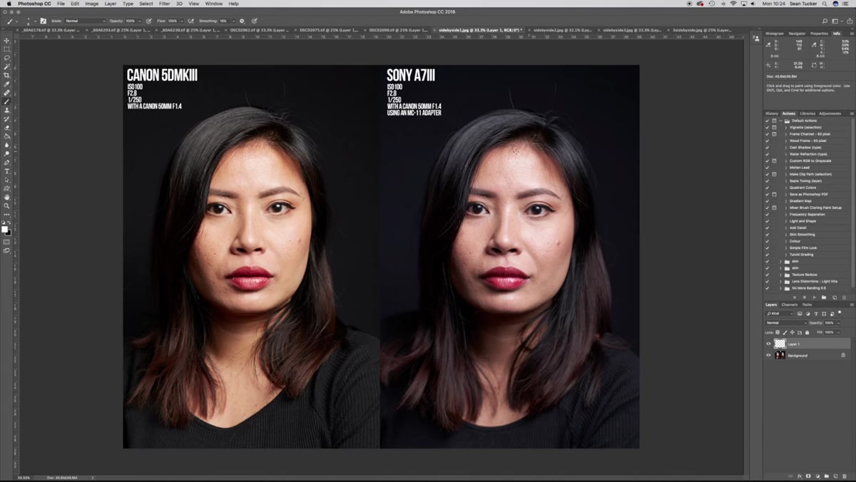 Sony portrait showing cool magenta and cyan highlights
The Sony sensor in this test pulls in the opposite direction. The overall tone is cooler, and Tucker identifies the color shift as moving toward magenta and pink in the midtones, with a hint of cyan appearing in the highlights. This is a much more common description of Sony skin tones in portrait photography communities, and seeing it visually confirmed against a matched Canon frame is clarifying.
Sony portrait showing cool magenta and cyan highlights
The Sony sensor in this test pulls in the opposite direction. The overall tone is cooler, and Tucker identifies the color shift as moving toward magenta and pink in the midtones, with a hint of cyan appearing in the highlights. This is a much more common description of Sony skin tones in portrait photography communities, and seeing it visually confirmed against a matched Canon frame is clarifying.
For your correction workflow, this means Sony files often need a small reduction in magenta and a touch of warmth added, with particular attention to the highlights where that cyan creep shows up. It is a different set of moves than what you would apply to a Canon file, even if the final result looks similar.
Step 5: Use Targeted HSL or Selective Color Adjustments to Correct
 Color comparison and correction approach demonstrated in Photoshop
Tucker does not just identify the problem; the logical correction follows directly from the diagnosis. For the Canon yellow-green cast, go into your HSL panel or a Selective Color adjustment layer and work the yellows and greens independently. Pull yellow luminance and saturation down slightly, nudge the green hue toward yellow rather than letting it push cyan. For Canon files with that warm yellow base, I often use a Curves adjustment on just the blue channel, lifting it very slightly in the shadows to neutralize the yellow without cooling the highlights too aggressively.
Color comparison and correction approach demonstrated in Photoshop
Tucker does not just identify the problem; the logical correction follows directly from the diagnosis. For the Canon yellow-green cast, go into your HSL panel or a Selective Color adjustment layer and work the yellows and greens independently. Pull yellow luminance and saturation down slightly, nudge the green hue toward yellow rather than letting it push cyan. For Canon files with that warm yellow base, I often use a Curves adjustment on just the blue channel, lifting it very slightly in the shadows to neutralize the yellow without cooling the highlights too aggressively.
For Sony files, the magenta-heavy midtones respond well to reducing red and magenta in the HSL panel, specifically in the skin tone range. To address cyan highlights, try adding a very small amount of red back into the highlight end of a Curves adjustment layer, or use the Selective Color adjustment targeting whites and neutrals directly.
Step 6: Compare Against a Known Reference Before Finishing
 Side by side sensor comparison as color reference check
Tucker’s entire methodology here is comparison-based, and that is the part I think retouchers sometimes skip when they are working fast. Once you have made your targeted corrections, put the file next to a reference, either another image from the same shoot that already looks right, or a skin tone reference swatch you trust. Do not rely entirely on your monitor reading or your gut feeling after staring at the same image for twenty minutes.
Side by side sensor comparison as color reference check
Tucker’s entire methodology here is comparison-based, and that is the part I think retouchers sometimes skip when they are working fast. Once you have made your targeted corrections, put the file next to a reference, either another image from the same shoot that already looks right, or a skin tone reference swatch you trust. Do not rely entirely on your monitor reading or your gut feeling after staring at the same image for twenty minutes.
For beauty retouching specifically, I keep a small library of corrected files from different camera systems that I use as sanity checks. It sounds like extra overhead but it takes about five seconds to pull one up, and it has saved me from handing back files that looked neutral on my screen but were still pulling in a direction.
What I Do Differently: Log the Camera Body in Your File Notes
Something Tucker’s test reinforced for me is how useful it is to know which camera body produced a file before you open it. I now ask photographers to include the camera model in their file naming convention or delivery notes. Canon files get one baseline treatment applied first, Sony files get another, and I adjust from there. It is not that one system is better; they are just different starting points. Treating them as identical wastes correction time on every single file.
The deeper point in this tutorial is that “bad skin tones” is almost never a camera flaw you are stuck with. It is a color cast with a direction, and once you can name the direction, you can fix it in a few targeted moves rather than a dozen frustrated ones.
The single most important thing Tucker demonstrates here is that these casts are systematic, not random. Canon leans yellow-green and warm. Sony leans magenta-cool with cyan highlights. Learn those two fingerprints, and you will be faster and more precise on every portrait file you retouch from either system.
Watch the full tutorial on YouTube to see the side-by-side comparison in motion. The visual difference between the two sensors is genuinely worth seeing with your own eyes.
Comments
Leave a Comment