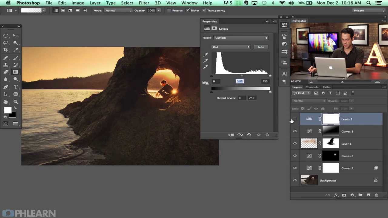
There’s a particular kind of portrait image that stops you mid-scroll. The light feels alive. The highlights glow with color rather than just blowing out to white. The shadows have personality. More often than not, that look comes from deliberate color work in post, not lucky golden hour lighting. For a long time, I chased that quality using the same handful of tools I’d been using since my wedding photography days, and the results were fine. Technically fine. The kind of “fine” that doesn’t make anyone’s portfolio.
Then I watched Aaron Nace’s color dodge tutorial over at PHLEARN, and a few pieces clicked into place. Watch the full tutorial on YouTube before or after reading this, because seeing his process in motion is genuinely worth your time. What I want to do here is break the technique down into steps you can follow alongside a portrait of your own, and add a few notes from how I’ve adapted it for beauty retouching specifically.
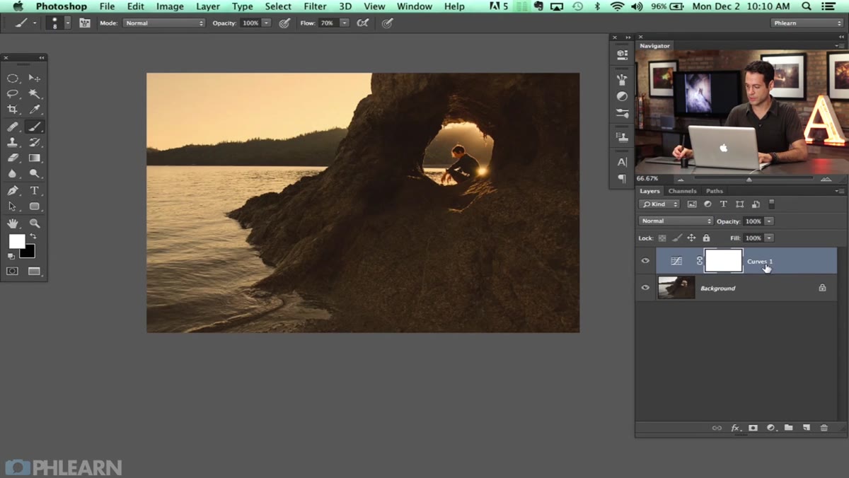
The core idea is this: Color Dodge as a blending mode interacts with light in a way that feels organic rather than painted on. Combined with targeted Curves adjustments and a technique called “blend if” to isolate where the effect lands, it gives you nuanced control over highlight color and atmosphere. Here’s how it works.
Step 1: Assess the Image and Plan Your Color Story
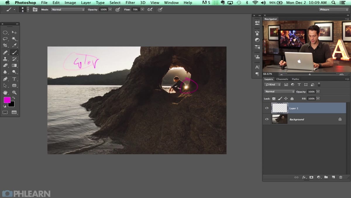
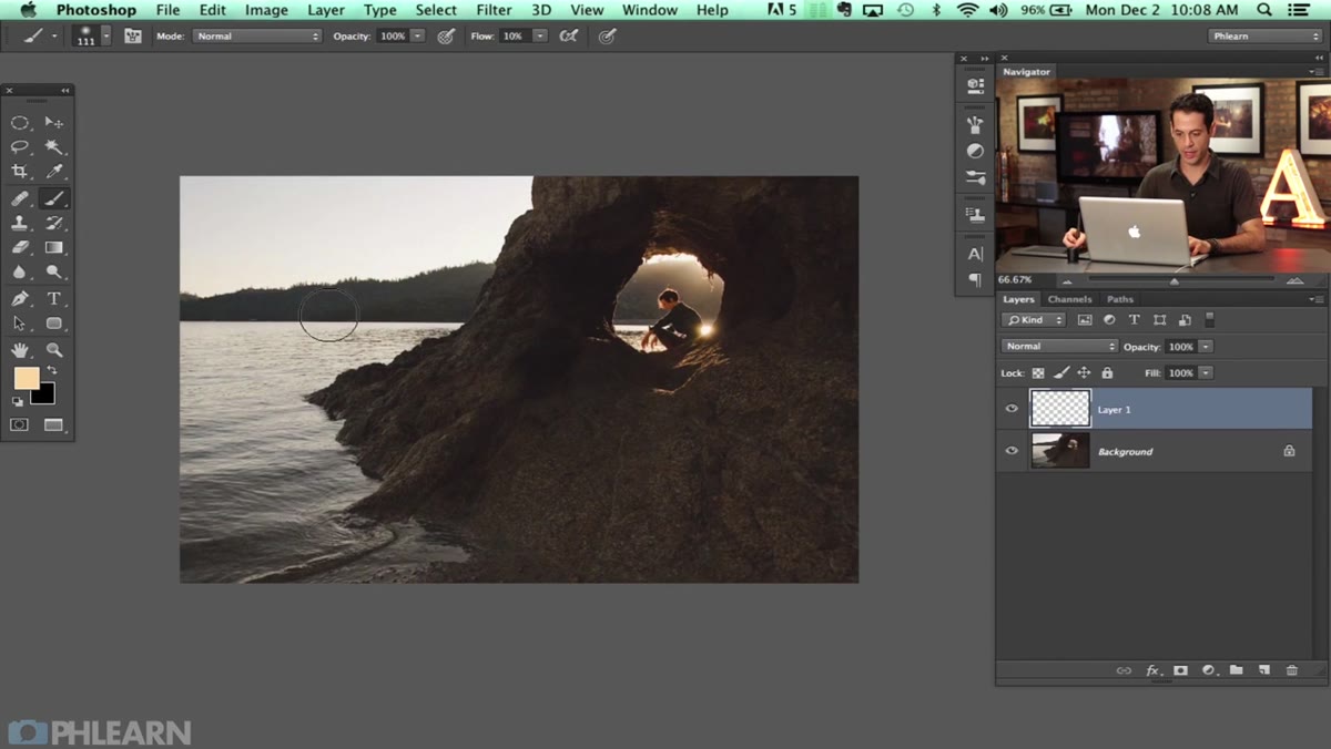 Aaron sketching over portrait, planning color changes
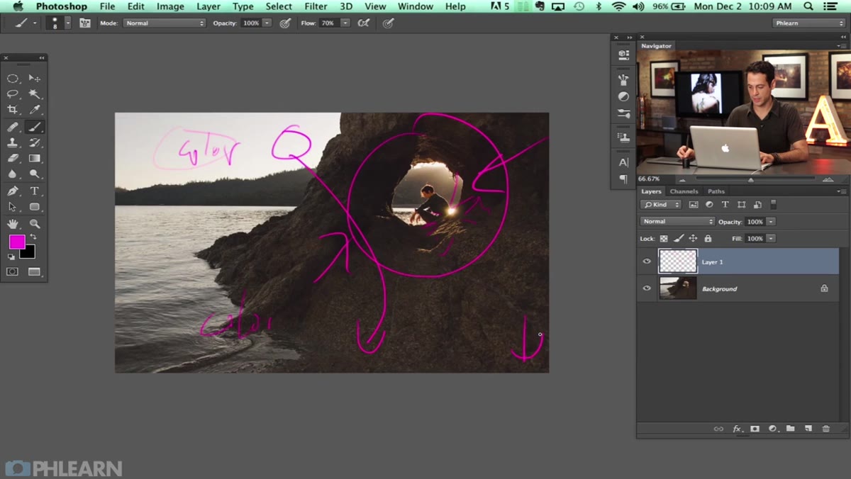
Before you touch a single slider, look at your image and identify where the light is already doing something interesting. In the tutorial, Aaron works with a backlit self-portrait that has a natural lens flare and a bright sky. He names two specific targets: the highlights in the sky, which he wants to push toward warm, golden tones, and the corners of the frame, which he wants to darken into a vignette that pulls the eye toward the subject.
Aaron sketching over portrait, planning color changes
Before you touch a single slider, look at your image and identify where the light is already doing something interesting. In the tutorial, Aaron works with a backlit self-portrait that has a natural lens flare and a bright sky. He names two specific targets: the highlights in the sky, which he wants to push toward warm, golden tones, and the corners of the frame, which he wants to darken into a vignette that pulls the eye toward the subject.
For your own portraits, the planning step is not optional. Open your image and ask: where is the light source, what color does it want to be, and what should the shadows do by contrast? Complementary color relationships, warm highlights against cool shadows, or vice versa, are usually what separates a graded image from an untouched one.
Step 2: Build a Curves Adjustment Layer for the Highlights
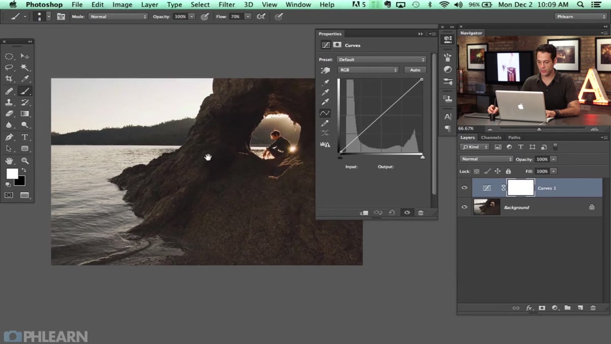 Curves adjustment layer panel open in Photoshop
Add a new Curves adjustment layer from the Adjustments panel. This is where the color work begins. Rather than staying in the composite RGB channel, switch to individual color channels: Red, Green, and Blue. In the tutorial, Aaron pulls the Red channel down in the highlights, which shifts those bright areas toward cyan, then brings the Green channel down slightly to introduce a touch of magenta, creating a sky that feels colored by real atmospheric light rather than a filter.
Curves adjustment layer panel open in Photoshop
Add a new Curves adjustment layer from the Adjustments panel. This is where the color work begins. Rather than staying in the composite RGB channel, switch to individual color channels: Red, Green, and Blue. In the tutorial, Aaron pulls the Red channel down in the highlights, which shifts those bright areas toward cyan, then brings the Green channel down slightly to introduce a touch of magenta, creating a sky that feels colored by real atmospheric light rather than a filter.
The specific values will depend entirely on your image, so use your eyes rather than copying numbers exactly. A small movement on these curves goes a long way. Nudge the highlight end of the Red channel down until you see the shift, then balance it with a corresponding move in another channel. Keep checking the subject’s skin tones as you work. The goal is to color the light, not to cast the whole image in a hue.
Step 3: Restrict the Effect to Highlights Using Blend If
 Layer Style dialog open, Blend If sliders visible
This is the step most tutorials skip, and it’s the one that actually makes the technique work. With your Curves layer selected, double-click the layer thumbnail to open the Layer Style dialog. Scroll down to the “Blend If” section at the bottom. You’ll see two gradient bars labeled “This Layer” and “Underlying Layer.”
Layer Style dialog open, Blend If sliders visible
This is the step most tutorials skip, and it’s the one that actually makes the technique work. With your Curves layer selected, double-click the layer thumbnail to open the Layer Style dialog. Scroll down to the “Blend If” section at the bottom. You’ll see two gradient bars labeled “This Layer” and “Underlying Layer.”
Hold Alt (Option on Mac) and click the white triangle on the right end of the “Underlying Layer” bar. Holding Alt splits the triangle into two handles, which creates a gradual, feathered transition. Drag the left half of that split triangle toward the middle. What you’re doing is telling Photoshop to apply this Curves adjustment only where the underlying image is already bright, and to fade out gradually as the tones get darker. Your shadows stay untouched. The adjustment lives only in the highlights where it belongs.
Step 4: Add Color to the Flare or Light Source Directly
 Bright sky and lens flare area highlighted in image
Natural light elements in a photo, lens flares, bright skies, rim light catching the hair or shoulders, are invitations to push the color further than you normally would. Aaron treats the flare in this image as an anchor point for the warm tones, and that’s a useful framing. Rather than applying color uniformly across the image, you can concentrate it in the areas where the light is already drawing attention.
Bright sky and lens flare area highlighted in image
Natural light elements in a photo, lens flares, bright skies, rim light catching the hair or shoulders, are invitations to push the color further than you normally would. Aaron treats the flare in this image as an anchor point for the warm tones, and that’s a useful framing. Rather than applying color uniformly across the image, you can concentrate it in the areas where the light is already drawing attention.
Create a new blank layer, set its blending mode to Color Dodge, and use a large, soft brush with a very low flow (5 to 10 percent) and a warm color sampled from your intended palette. Build the color up gradually with multiple passes. Color Dodge pushes the luminosity up while the color bleeds in, so the effect reads as light rather than paint. This is particularly effective on hair highlights and the edges of skin catching a backlight.
Step 5: Vignette the Corners to Anchor the Subject
 Dark vignette drawn around image corners, subject centered
A vignette is one of those things that’s invisible when it’s done right and obvious when it isn’t. The goal is to gently lower the brightness in the outer edges of the frame so the viewer’s eye is guided toward the center without feeling pushed. Aaron adds this as a separate step, and I’d recommend keeping it on its own layer too so you can adjust the opacity independently.
Dark vignette drawn around image corners, subject centered
A vignette is one of those things that’s invisible when it’s done right and obvious when it isn’t. The goal is to gently lower the brightness in the outer edges of the frame so the viewer’s eye is guided toward the center without feeling pushed. Aaron adds this as a separate step, and I’d recommend keeping it on its own layer too so you can adjust the opacity independently.
Add a Curves adjustment layer, pull the midtones down slightly, then invert the mask so the adjustment is hidden by default. Paint back in on the corners with a large, soft white brush at low opacity. Build it slowly. If you can see where the vignette starts, it’s too strong.
How I Use This on Beauty Retouching Jobs
The Blend If technique is the part of this tutorial I now use on almost every beauty retouch. Skin color grading is tricky because adjustments that look beautiful on a sky can make a complexion look jaundiced or gray. Using Blend If to restrict warm Curves adjustments to the upper highlight range means I can push a golden, sun-kissed tone into the brightest parts of the skin, the nose bridge, the cheekbones, the brow bone, without contaminating the midtones where skin texture lives. It took me an embarrassingly long time to figure out why my early color grades looked muddy, and this workflow was most of the answer.
I’d also encourage you to try this technique on images that weren’t shot in golden hour. A clean studio strobe shot with flat white light gives you a blank canvas to paint your own color story onto, and the Color Dodge blending mode with a warm brush on a separate layer can simulate that warmth convincingly without it ever looking like a preset.
The single most important idea from this tutorial is that blending modes and adjustment layers are not the same thing used in different places. They are different tools with fundamentally different relationships to the light in your image. Color Dodge doesn’t add color the way a Hue/Saturation layer does. It adds light that carries color, and that distinction is what makes results look real.
Watch the full tutorial on YouTube to see Aaron work through the image in real time. His instincts about where to push and where to hold back are worth studying just as much as the technical steps.
Comments
Leave a Comment