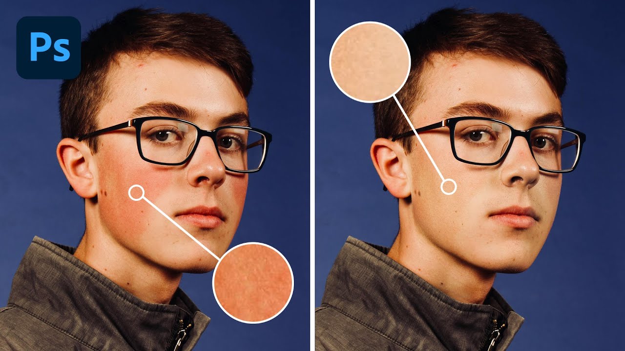
Red skin is one of those problems that sounds simple until you’re sitting across from a client who keeps saying “can you just fix the redness?” and every approach you try either makes them look sallow, gray, or – my personal low point – vaguely seasick. Early in my retouching work I leaned too hard on desaturation, which flattens everything and gives skin that telltale plastic quality that clients hate even when they can’t name exactly why. It took me a while to find an approach that actually works consistently across different skin tones and lighting situations.
In this Aaron Nace (PHLEARN) tutorial, the technique centers on Hue/Saturation adjustment layers with precise color range targeting and layer masks – a combination that gives you surgical control without flattening the skin overall. Watch the full tutorial on YouTube to see all four examples he works through. Below is my step-by-step breakdown of the core method so you can follow along in Photoshop right now.
Step 1: Add a Hue/Saturation Adjustment Layer
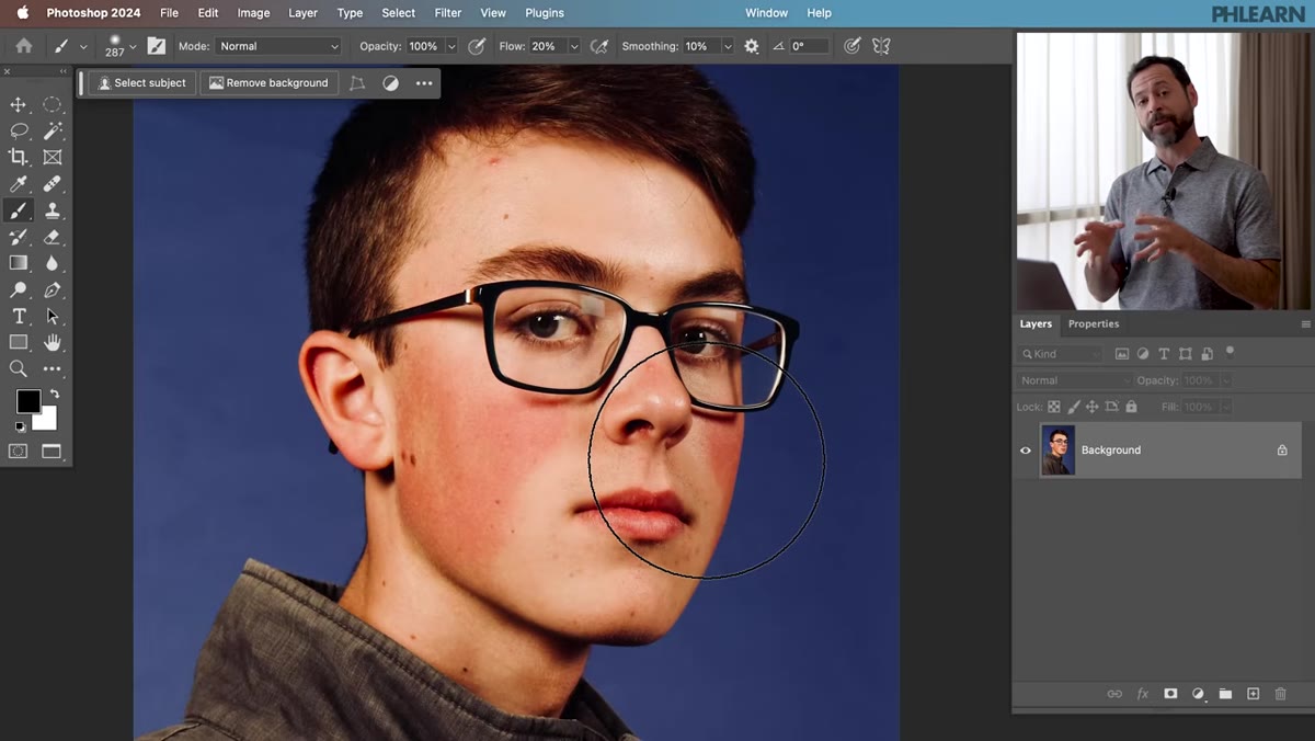 Hue/Saturation adjustment layer being added from menu
Go to Layer, then New Adjustment Layer, then Hue/Saturation. This keeps your edit completely non-destructive – the original pixel data underneath stays untouched, and you can come back and tweak values later without any quality loss. I name mine something like “RedFix” so it’s easy to find in a layered file. If you work on composites with lots of adjustments stacked up, you’ll thank yourself later for that habit.
Hue/Saturation adjustment layer being added from menu
Go to Layer, then New Adjustment Layer, then Hue/Saturation. This keeps your edit completely non-destructive – the original pixel data underneath stays untouched, and you can come back and tweak values later without any quality loss. I name mine something like “RedFix” so it’s easy to find in a layered file. If you work on composites with lots of adjustments stacked up, you’ll thank yourself later for that habit.
Step 2: Switch from Master to Reds
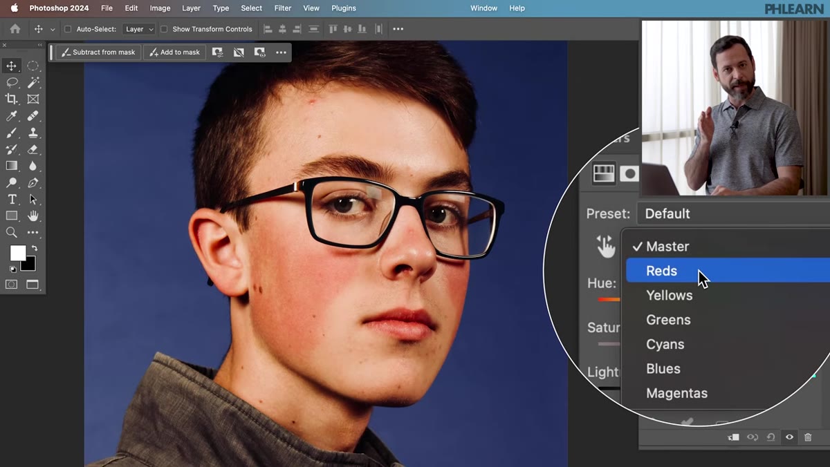 Hue/Saturation panel showing dropdown switched to Reds
In the Properties panel for your new adjustment layer, you’ll see a dropdown that defaults to “Master.” Click it and switch to “Reds.” This is the critical first move – you’re telling Photoshop to only pay attention to red values in the image. Working in Master would shift every color in the photo, which is not what we want. We’re being specific from the start.
Hue/Saturation panel showing dropdown switched to Reds
In the Properties panel for your new adjustment layer, you’ll see a dropdown that defaults to “Master.” Click it and switch to “Reds.” This is the critical first move – you’re telling Photoshop to only pay attention to red values in the image. Working in Master would shift every color in the photo, which is not what we want. We’re being specific from the start.
Step 3: Use the Eyedropper to Sample the Problem Area
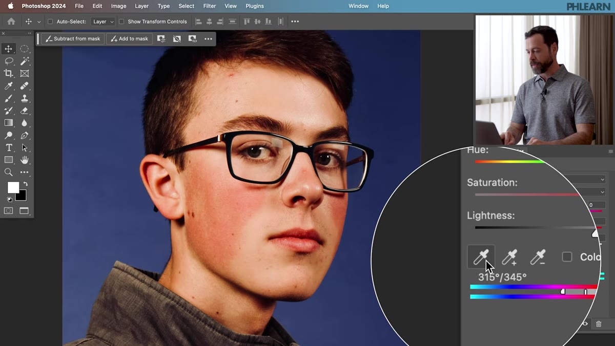 Eyedropper tool sampling red area on subject’s skin
Inside the Hue/Saturation panel, there’s an eyedropper icon on the left side. Click it, then click directly on the reddest area of your subject’s skin – typically the nose, cheeks, or forehead. This samples the exact hue you’re targeting and adjusts the color range selection accordingly. What Aaron does here that I find genuinely clever is a temporary diagnostic move: he cranks the Hue slider all the way to the right (into green territory) and bumps Saturation up just to see exactly which parts of the image are being captured by the selection. You’re not keeping those values – you’re just using them as a visual map.
Eyedropper tool sampling red area on subject’s skin
Inside the Hue/Saturation panel, there’s an eyedropper icon on the left side. Click it, then click directly on the reddest area of your subject’s skin – typically the nose, cheeks, or forehead. This samples the exact hue you’re targeting and adjusts the color range selection accordingly. What Aaron does here that I find genuinely clever is a temporary diagnostic move: he cranks the Hue slider all the way to the right (into green territory) and bumps Saturation up just to see exactly which parts of the image are being captured by the selection. You’re not keeping those values – you’re just using them as a visual map.
Step 4: Narrow the Color Range with the Bottom Slider
 Color range slider being dragged left to narrow selection
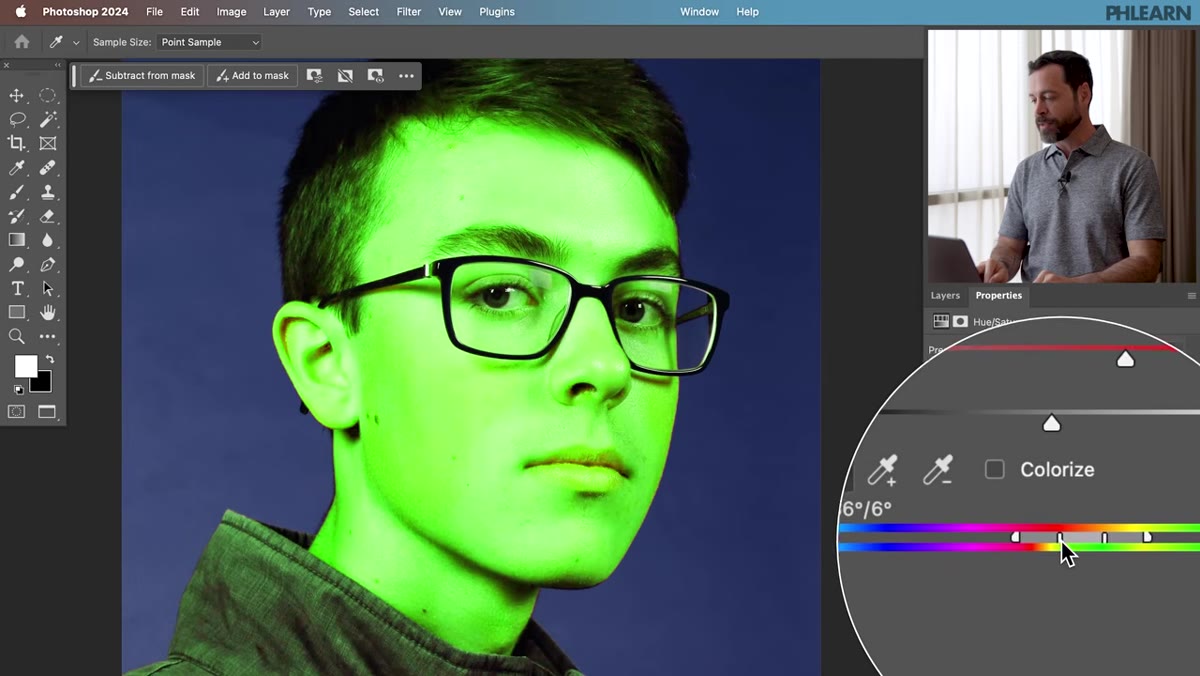
At the bottom of the Hue/Saturation panel, you’ll see a color bar with a set of sliders that control which range of reds are affected. The middle section (the darker gray bar between the two triangles on each side) is the core selection zone. Click the center of that bar and drag it to the left. As you drag, you’ll see the green diagnostic color pull back from the broader face and concentrate on just the overly red areas. You’re narrowing from “all reds in this image” to “only the specific reds that are the problem.” Take your time here. A range that’s too wide will shift colors you didn’t intend to touch.
Color range slider being dragged left to narrow selection
At the bottom of the Hue/Saturation panel, you’ll see a color bar with a set of sliders that control which range of reds are affected. The middle section (the darker gray bar between the two triangles on each side) is the core selection zone. Click the center of that bar and drag it to the left. As you drag, you’ll see the green diagnostic color pull back from the broader face and concentrate on just the overly red areas. You’re narrowing from “all reds in this image” to “only the specific reds that are the problem.” Take your time here. A range that’s too wide will shift colors you didn’t intend to touch.
Step 5: Dial In Hue, Saturation, and Lightness
 Hue slider being adjusted slightly right toward orange
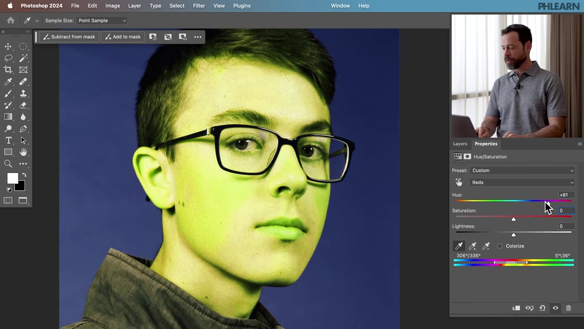
Now reset your Saturation to zero (type 0 in the field) and set your Hue slider to a small positive value – Aaron nudges it just slightly to the right, toward orange. The logic is sound: you’re not trying to remove redness entirely, you’re shifting those hyper-red pixels toward a warmer, more neutral skin tone. Think of it as moving them from “sunburned” to “tan.” Then move the Lightness slider to the right as well. Red patches in skin often read darker than the surrounding skin tone, so brightening them slightly helps them blend. The combination of a slight hue shift plus a lightness boost is what separates this approach from a blunt desaturation – it actually mimics what healthy skin looks like.
Hue slider being adjusted slightly right toward orange
Now reset your Saturation to zero (type 0 in the field) and set your Hue slider to a small positive value – Aaron nudges it just slightly to the right, toward orange. The logic is sound: you’re not trying to remove redness entirely, you’re shifting those hyper-red pixels toward a warmer, more neutral skin tone. Think of it as moving them from “sunburned” to “tan.” Then move the Lightness slider to the right as well. Red patches in skin often read darker than the surrounding skin tone, so brightening them slightly helps them blend. The combination of a slight hue shift plus a lightness boost is what separates this approach from a blunt desaturation – it actually mimics what healthy skin looks like.
Step 6: Invert the Layer Mask and Paint In the Effect
 Layer mask inverted to black, brush tool selected
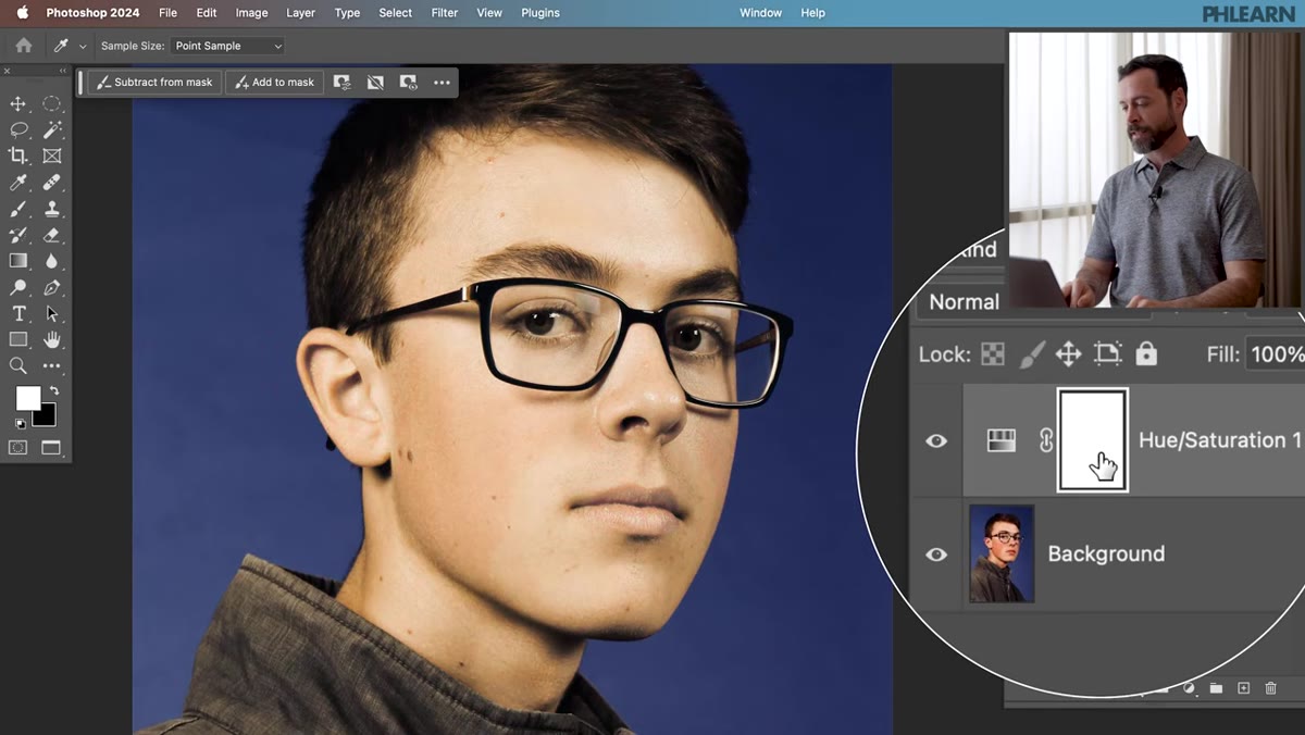
Here’s where precision comes in. Click on the white layer mask thumbnail on your adjustment layer in the Layers panel, then press Ctrl+I (or Cmd+I on Mac) to invert it to black. This hides the entire effect. Now nothing is changed – you’re starting from invisible.
Layer mask inverted to black, brush tool selected
Here’s where precision comes in. Click on the white layer mask thumbnail on your adjustment layer in the Layers panel, then press Ctrl+I (or Cmd+I on Mac) to invert it to black. This hides the entire effect. Now nothing is changed – you’re starting from invisible.
Grab your Brush tool (B), set your foreground color to white, and paint over the areas where you actually want the correction to appear. Use a soft-edged brush at a low flow – somewhere between 20 and 40 percent – and build up the correction gradually. Avoid the lips, eyebrows, and any areas with intentional warm color. Because the mask lets you paint with precision, you’re not committed to one global fix. You can go heavy on the nose and light on the cheeks, or leave one side untouched if the lighting hit it differently.
One Thing I’d Add From My Own Work
The approach Aaron demonstrates works beautifully on even-toned redness – post-workout flush, rosacea-style coverage, sunburn. Where I’ve had to adapt it is on high-contrast portraits where the redness is patchy and sits right next to areas of normal color. In those cases, I’ll often duplicate the Hue/Saturation layer and create two separate versions: one tuned for the deepest red zones with a more aggressive lightness shift, and one for the lighter pink areas with a gentler correction. Painting each mask separately gives me more control than trying to find one set of values that handles both. It takes an extra two minutes and saves me from that slightly off-color look where you can tell something was corrected but can’t quite tell what.
I also keep a levels or curves adjustment clipped to the Hue/Saturation layer when the corrected area looks flat – a tiny contrast boost on the clip brings back the texture that can get softened when you lift the lightness. Skin retouching is mostly about preserving what’s already there while removing what shouldn’t be.
The single most important thing this tutorial drove home for me: the fix for redness is rarely just “less red.” It’s a shift – hue moved toward orange, lightness brought up to match surrounding skin, and a mask that keeps the correction where it belongs. Get those three working together and the result looks like the redness was never there rather than like it was erased.
Watch the full tutorial on YouTube to see Aaron work through all four portrait examples, including variations that show how the technique adapts across different skin tones and lighting conditions.
Comments (2)
Finally someone explains this in a way that actually makes sense.
Well explained. I think my audience would really benefit from this — mind if I link to it?
Leave a Comment