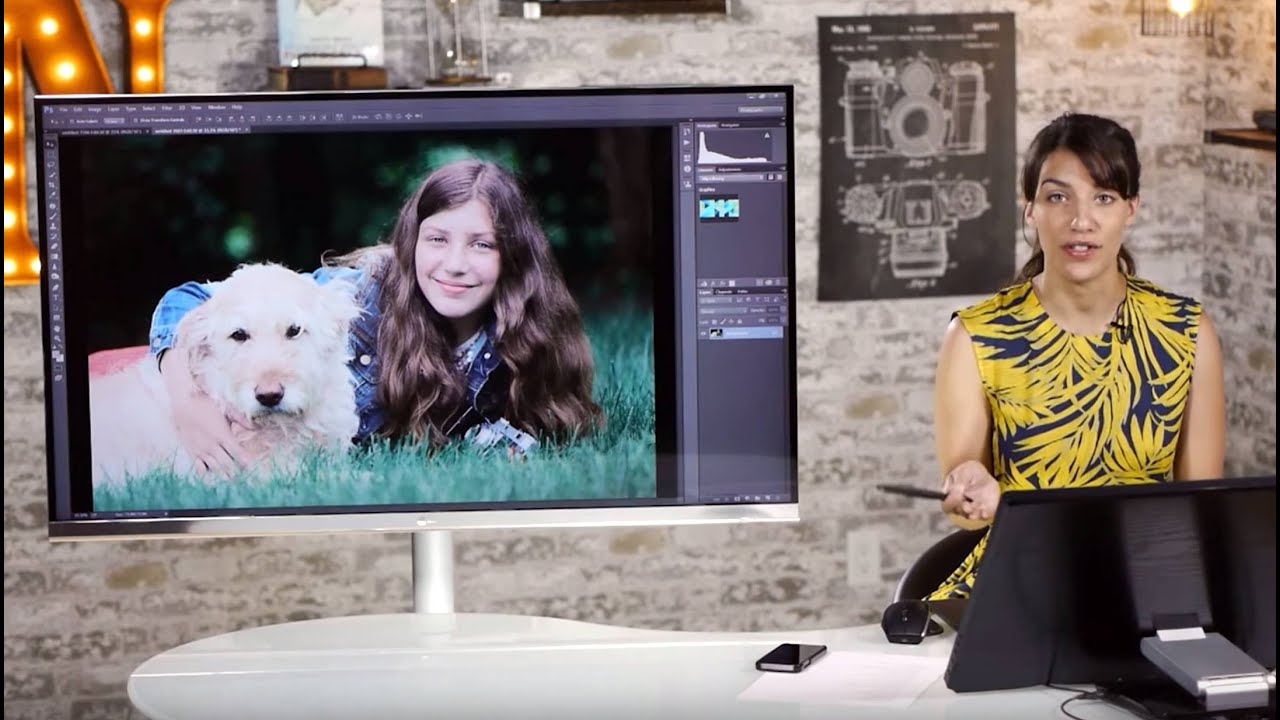
Early in my retouching career, a client told me my edits looked “plastic.” She wasn’t wrong. I was smoothing skin by painting over it with a low-opacity brush on a normal layer, which flattened everything - the texture, the pores, the tiny details that make a face look alive. That one comment sent me down a months-long rabbit hole, and frequency separation is what I eventually found at the bottom of it. It changed everything about how I work.
That’s why I keep coming back to this tutorial by Tony and Chelsea Northrup. Watch the full tutorial on YouTube - it’s one of the clearest, most practical walkthroughs I’ve seen of two techniques that belong in every portrait retoucher’s toolkit: frequency separation for skin cleanup, and dodging and burning for tonal sculpting. Chelsea works through a natural outdoor portrait of her daughter, which means real skin, real light, and real imperfections - not a studio shot that’s already halfway there. What follows is my step-by-step breakdown of everything she covers, written so you can follow along in Photoshop without pausing and rewinding every thirty seconds.
Step 1: Duplicate Your Background Layer Twice
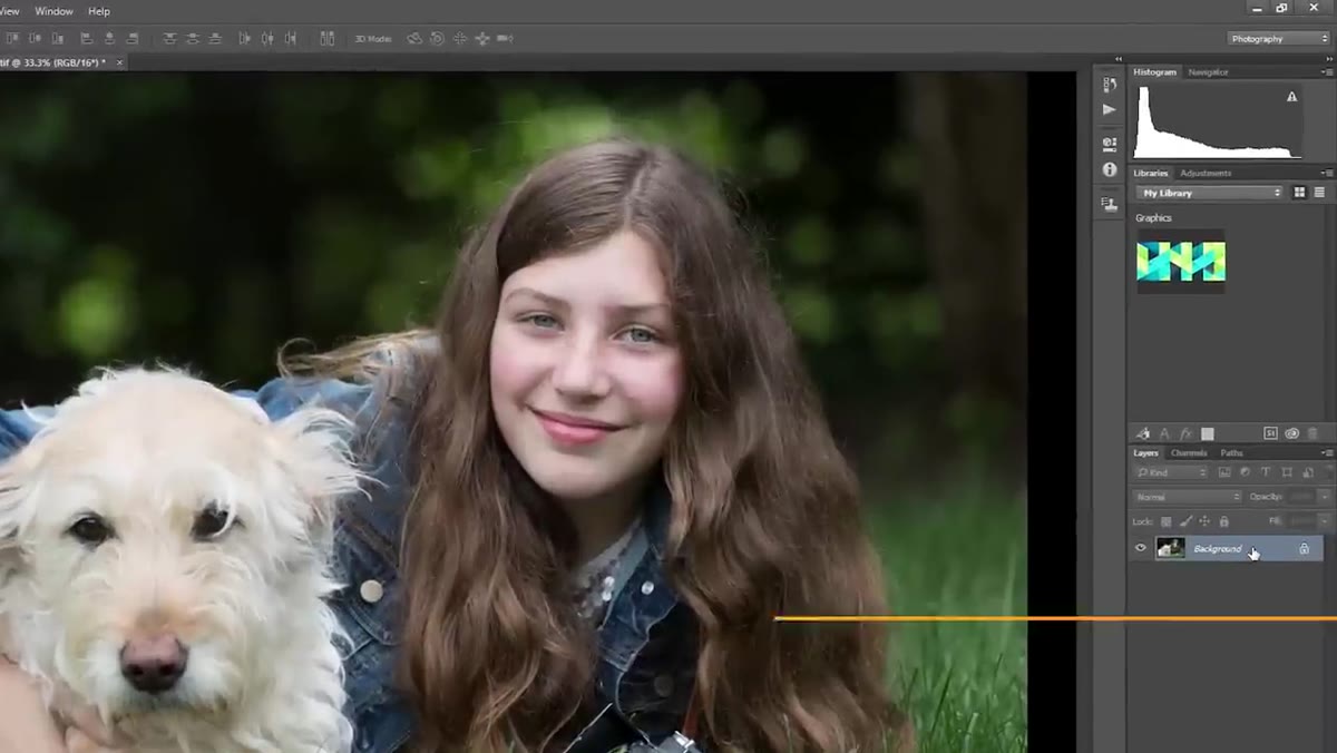 Duplicating the background layer twice in Layers panel
Start by selecting your background layer in the Layers panel, then press Ctrl+J (or Cmd+J on Mac) twice to create two copies. Name the lower duplicate “low” and the upper duplicate “high.” These names refer to frequency - low frequency means color and tone, high frequency means texture and detail. Keeping them labeled clearly will save you confusion every single time you open the file.
Duplicating the background layer twice in Layers panel
Start by selecting your background layer in the Layers panel, then press Ctrl+J (or Cmd+J on Mac) twice to create two copies. Name the lower duplicate “low” and the upper duplicate “high.” These names refer to frequency - low frequency means color and tone, high frequency means texture and detail. Keeping them labeled clearly will save you confusion every single time you open the file.
Step 2: Apply a Gaussian Blur to the Low Layer
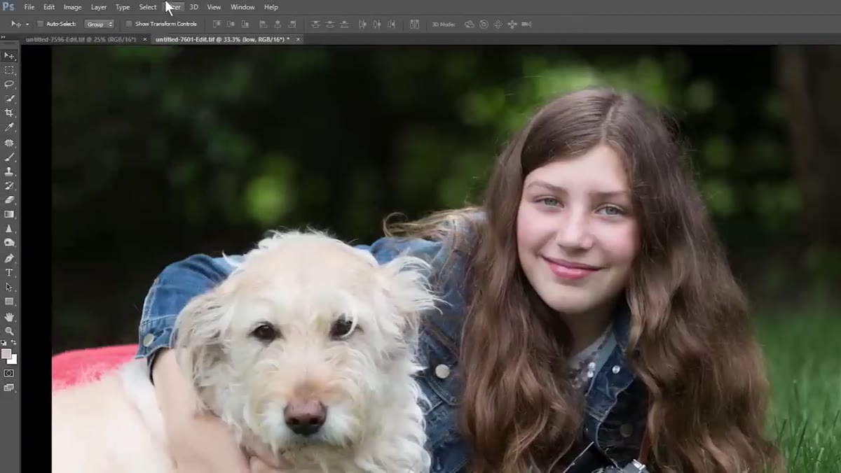 Gaussian Blur dialog open on the low frequency layer
Select your “low” layer and navigate to Filter, then Blur, then Gaussian Blur. The radius you choose here matters more than most people realize. You want enough blur to smooth out tonal variation in the skin, but not so much that facial features start bleeding together. Chelsea lands around 4.5 to 4.7 pixels for a typical portrait, which is a solid starting point. Zoom in on the face before you commit - you should see blended skin tones, not a smeared-looking face. Click OK when it looks right.
Gaussian Blur dialog open on the low frequency layer
Select your “low” layer and navigate to Filter, then Blur, then Gaussian Blur. The radius you choose here matters more than most people realize. You want enough blur to smooth out tonal variation in the skin, but not so much that facial features start bleeding together. Chelsea lands around 4.5 to 4.7 pixels for a typical portrait, which is a solid starting point. Zoom in on the face before you commit - you should see blended skin tones, not a smeared-looking face. Click OK when it looks right.
Step 3: Extract Texture on the High Layer Using Apply Image
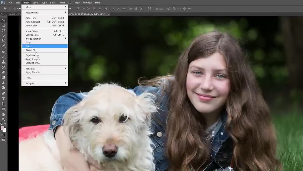 Apply Image dialog with Add blending mode and scale set to 2
Select your “high” layer and go to Image, then Apply Image. In the dialog, set the Layer dropdown to “low,” make sure the channel is set to RGB, change the blending mode to Add, set the scale to 2, and check the Invert box. The result will look strange - greenish, flat, almost like an X-ray. That’s exactly right. What you’ve done is mathematically subtract the low-frequency layer from the high-frequency layer, isolating only the fine texture and detail. This is the layer you’ll retouch without ever touching the underlying tone.
Apply Image dialog with Add blending mode and scale set to 2
Select your “high” layer and go to Image, then Apply Image. In the dialog, set the Layer dropdown to “low,” make sure the channel is set to RGB, change the blending mode to Add, set the scale to 2, and check the Invert box. The result will look strange - greenish, flat, almost like an X-ray. That’s exactly right. What you’ve done is mathematically subtract the low-frequency layer from the high-frequency layer, isolating only the fine texture and detail. This is the layer you’ll retouch without ever touching the underlying tone.
Step 4: Add a Curves Layer to Reveal Imperfections
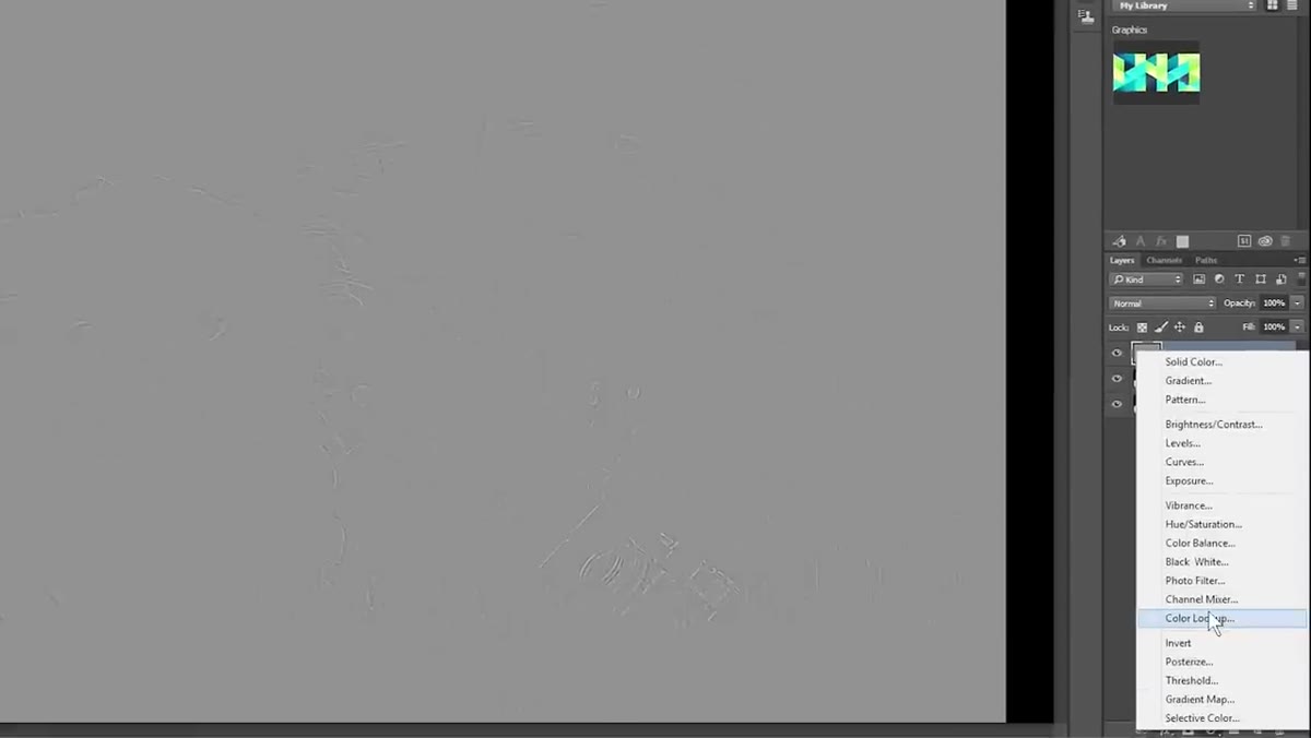 Curves adjustment layer with extreme S-curve applied for inspection
Before you start retouching, add a Curves adjustment layer above your high layer. Drag the shadow point hard left toward the base of the curve and the highlight point hard right toward the top - essentially creating an extreme, exaggerated S-curve. This will make the image look terrible on purpose. What it does is amplify every texture irregularity, every blemish, every stray hair so they’re impossible to miss. Think of it as a magnifying glass for imperfections. You’ll turn it off when you’re done retouching, but while it’s on, it shows you exactly where to work.
Curves adjustment layer with extreme S-curve applied for inspection
Before you start retouching, add a Curves adjustment layer above your high layer. Drag the shadow point hard left toward the base of the curve and the highlight point hard right toward the top - essentially creating an extreme, exaggerated S-curve. This will make the image look terrible on purpose. What it does is amplify every texture irregularity, every blemish, every stray hair so they’re impossible to miss. Think of it as a magnifying glass for imperfections. You’ll turn it off when you’re done retouching, but while it’s on, it shows you exactly where to work.
Step 5: Retouch Texture on the High Layer
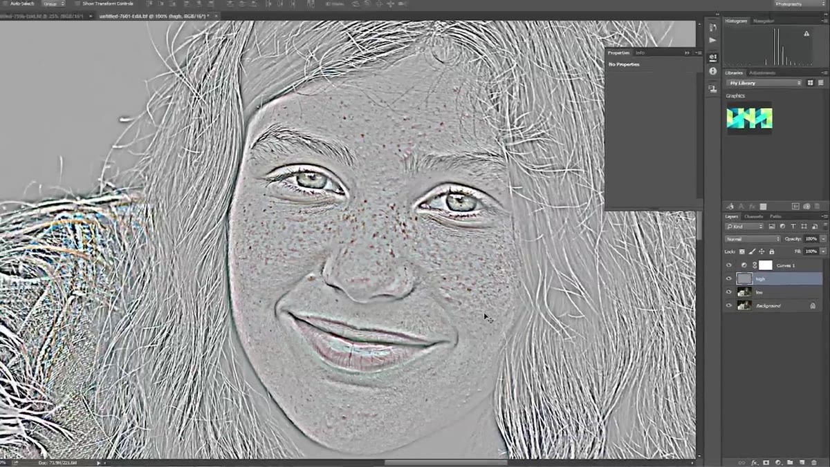 Clone stamp tool being used on the high frequency layer
Now select your “high” layer and reach for either the Clone Stamp tool or the Patch tool - whichever you’re more comfortable with. Chelsea uses Clone Stamp here, sampling from nearby skin at a similar tone and light level. The critical rule: always sample from an area that matches the zone you’re fixing. If you’re removing a blemish on a lit cheek, sample from lit cheek skin nearby, not from a shadow or a crease or a cluster of freckles. And watch for repeating patterns - if you clone the same patch of texture twice, the eye catches it immediately and the image reads as edited.
Clone stamp tool being used on the high frequency layer
Now select your “high” layer and reach for either the Clone Stamp tool or the Patch tool - whichever you’re more comfortable with. Chelsea uses Clone Stamp here, sampling from nearby skin at a similar tone and light level. The critical rule: always sample from an area that matches the zone you’re fixing. If you’re removing a blemish on a lit cheek, sample from lit cheek skin nearby, not from a shadow or a crease or a cluster of freckles. And watch for repeating patterns - if you clone the same patch of texture twice, the eye catches it immediately and the image reads as edited.
Follow the natural contours of the face as you work. If there’s a forehead line or a cheek crease, stay parallel to it rather than cloning across it. Breaking those lines creates subtle wrongness that viewers feel even if they can’t name it. Take your time here. This step is where most of the quality is made or lost.
Step 6: Set the High Layer to Linear Light and Group Everything
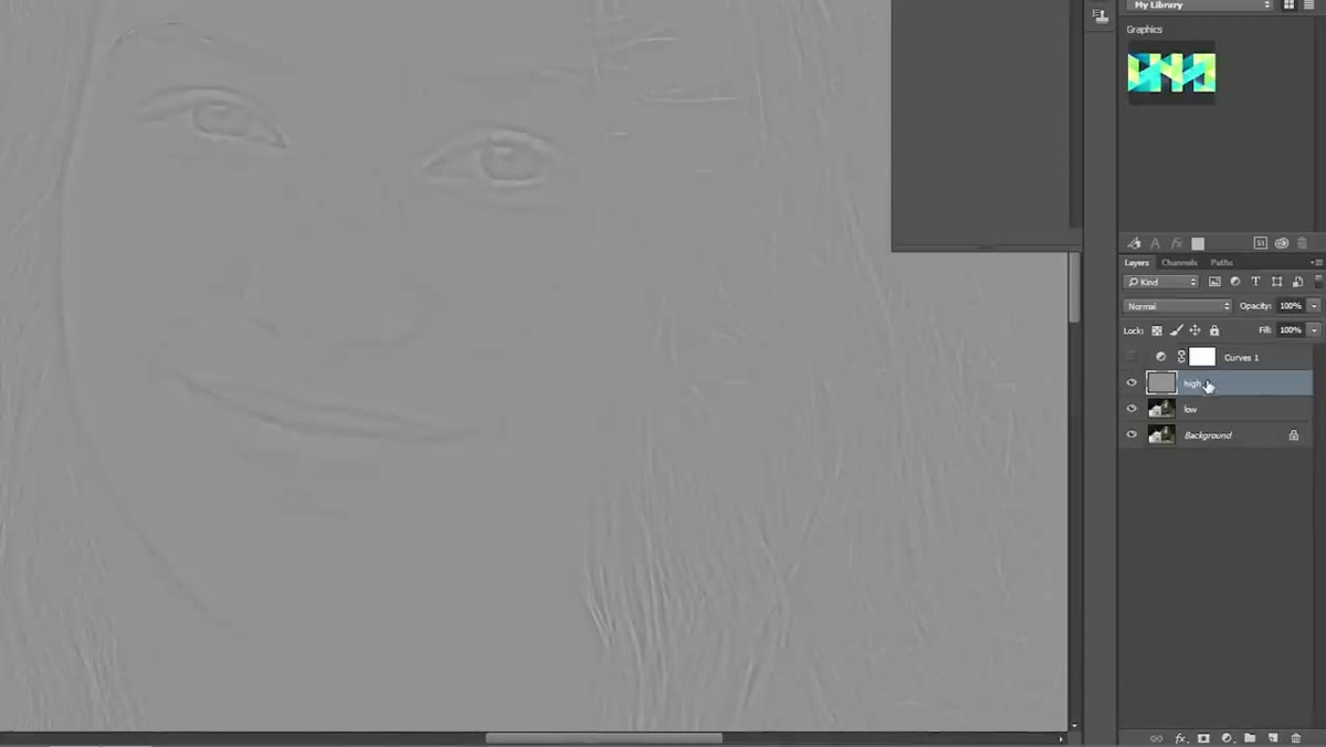 High layer blend mode changed to Linear Light, layers being grouped
Once you’re satisfied with the texture cleanup, turn off that Curves adjustment layer - it was only ever a viewing aid. Then change the blending mode of your “high” layer to Linear Light. Suddenly the image looks like a photograph again, but smoother. The texture you preserved on the high layer is now being composited back over the color and tone from the low layer, and it looks natural because none of the skin’s actual detail was destroyed.
High layer blend mode changed to Linear Light, layers being grouped
Once you’re satisfied with the texture cleanup, turn off that Curves adjustment layer - it was only ever a viewing aid. Then change the blending mode of your “high” layer to Linear Light. Suddenly the image looks like a photograph again, but smoother. The texture you preserved on the high layer is now being composited back over the color and tone from the low layer, and it looks natural because none of the skin’s actual detail was destroyed.
Select all three layers (your low layer, high layer, and the curves layer if you’re keeping it), group them with the folder icon, and name the group something clear - “FS” works fine. This keeps your file organized and makes it easy to toggle the entire frequency separation on and off.
Step 7: Correct Skin Tone on a New Layer Above the Group
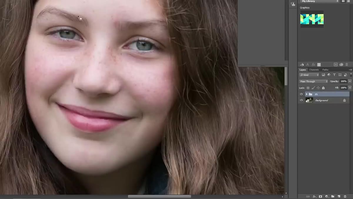 New layer created above the FS group, brush tool with low flow selected
Even after thorough frequency separation work, you’ll often have residual color inconsistencies - a patch of redness from a blemish, a slightly blotchy zone along the jaw. Create a new empty layer above the frequency separation group. Select a soft round brush, set the opacity to 100%, and bring the flow way down, somewhere around 5 to 10%. Sample a color from clean nearby skin using the eyedropper, then paint gently over the discolored area with this nearly-transparent brush pass. Build it up slowly. This approach lets you even out skin tone without affecting the texture underneath - the two layers do completely different jobs.
New layer created above the FS group, brush tool with low flow selected
Even after thorough frequency separation work, you’ll often have residual color inconsistencies - a patch of redness from a blemish, a slightly blotchy zone along the jaw. Create a new empty layer above the frequency separation group. Select a soft round brush, set the opacity to 100%, and bring the flow way down, somewhere around 5 to 10%. Sample a color from clean nearby skin using the eyedropper, then paint gently over the discolored area with this nearly-transparent brush pass. Build it up slowly. This approach lets you even out skin tone without affecting the texture underneath - the two layers do completely different jobs.
What I Do Differently After Years of Using This Workflow
The workflow Chelsea demonstrates is solid as-is, but one thing I’ve added over time is a dedicated viewing check at the end of the frequency separation stage. Before I do any skin tone correction, I zoom to 50% and toggle the FS group on and off rapidly. At 100% zoom, you can sometimes over-retouch areas that actually look fine at print or screen size. Pulling back to 50% catches overcorrections before you compound them with more work on top.
I also keep the Curves inspection layer inside the group rather than deleting it, set to invisible. That way I can always flip it back on if a client asks for revisions weeks later and I need to re-examine the texture layer quickly.
The single most important idea in this entire technique is that skin has two separate qualities - texture and tone - and trying to fix both at once is what creates that plastic look. Frequency separation gives each quality its own layer and its own tools. Once you internalize that principle, you’ll retouch faster, more confidently, and with results that actually hold up under scrutiny.
Watch the full tutorial on YouTube to follow Chelsea’s process in real time - seeing her decision-making on an actual portrait is worth more than any written description I can offer.
Comments
Leave a Comment