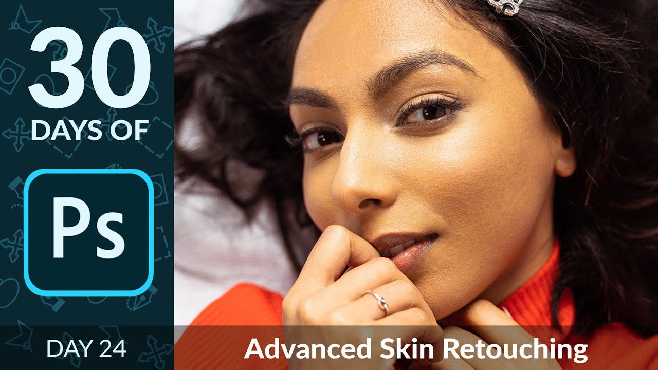
I spent the better part of a year convinced that good retouching meant smoothing everything until the skin looked like poured wax. A client finally told me my edits looked “plastic,” and honestly, she was right. What I was missing was a way to work on color and texture as two separate problems, because they are. Uneven skin tone is a color problem. A rough patch of texture is a texture problem. Treating them as one thing and blurring your way through both is how you end up with portraits that look like they belong on a department store mannequin.
Frequency separation is the technique that changed how I retouch. In this Aaron Nace (PHLEARN) tutorial, Watch the full tutorial on YouTube, he walks through the entire process clearly and methodically, including a free downloadable action that does the heavy lifting of setting up the layers. I’ve used this technique on beauty campaigns, brand headshots, and editorial work. Here’s exactly how it works.
Step 1: Load the Frequency Separation Action
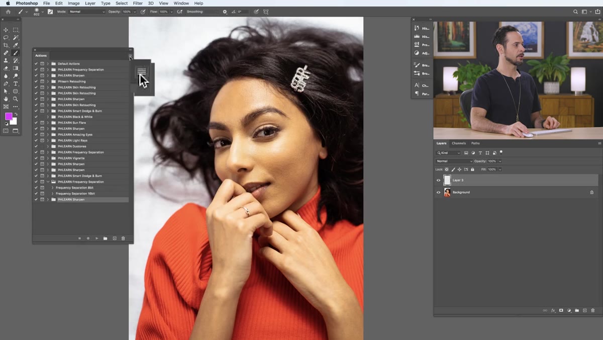 Actions panel open with Load Actions menu highlighted
Before anything else, open your Actions panel by going to Window > Actions. Click the small menu icon in the top right of the panel and choose Load Actions, then navigate to the PHLEARN Frequency Separation action file you downloaded from the tutorial link.
Actions panel open with Load Actions menu highlighted
Before anything else, open your Actions panel by going to Window > Actions. Click the small menu icon in the top right of the panel and choose Load Actions, then navigate to the PHLEARN Frequency Separation action file you downloaded from the tutorial link.
Once loaded, you’ll see two action options at the bottom of your panel: one for 8-bit images and one for 16-bit images. To check which you’re working in, go to Image > Mode. JPEGs are 8-bit. RAW files processed in Camera Raw will typically be 16-bit. Choose the matching action before you hit play. Running the wrong one will produce incorrect results that aren’t immediately obvious, so it’s worth the five seconds to double-check.
Step 2: Run the Action and Set Your Blur Amount
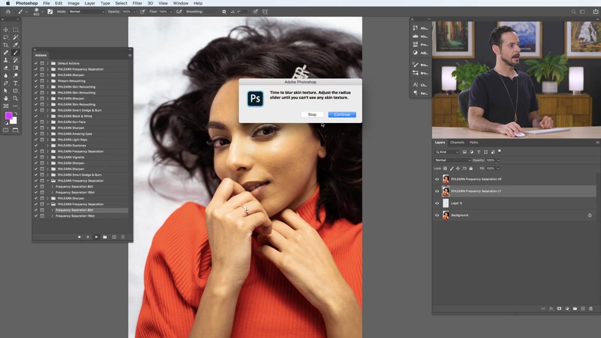 Gaussian Blur dialog box open over portrait image
Hit the play button on your chosen action. It will pause and prompt you to apply a Gaussian Blur. This is the step where the magic splits: you’re telling Photoshop how much blur to use when separating the low-frequency (color) layer from the high-frequency (texture) layer.
Gaussian Blur dialog box open over portrait image
Hit the play button on your chosen action. It will pause and prompt you to apply a Gaussian Blur. This is the step where the magic splits: you’re telling Photoshop how much blur to use when separating the low-frequency (color) layer from the high-frequency (texture) layer.
Aaron recommends blurring around 30 pixels for portrait work at this resolution. The goal is straightforward: blur until you can no longer see any skin texture in the preview. You’re not trying to create a final look here, you’re just setting a threshold for what counts as “color information” versus “texture information.” Too little blur and the two layers won’t be cleanly separated. Once you’re satisfied, click OK, and the action finishes building your layer stack automatically.
Step 3: Understand What You’re Looking At
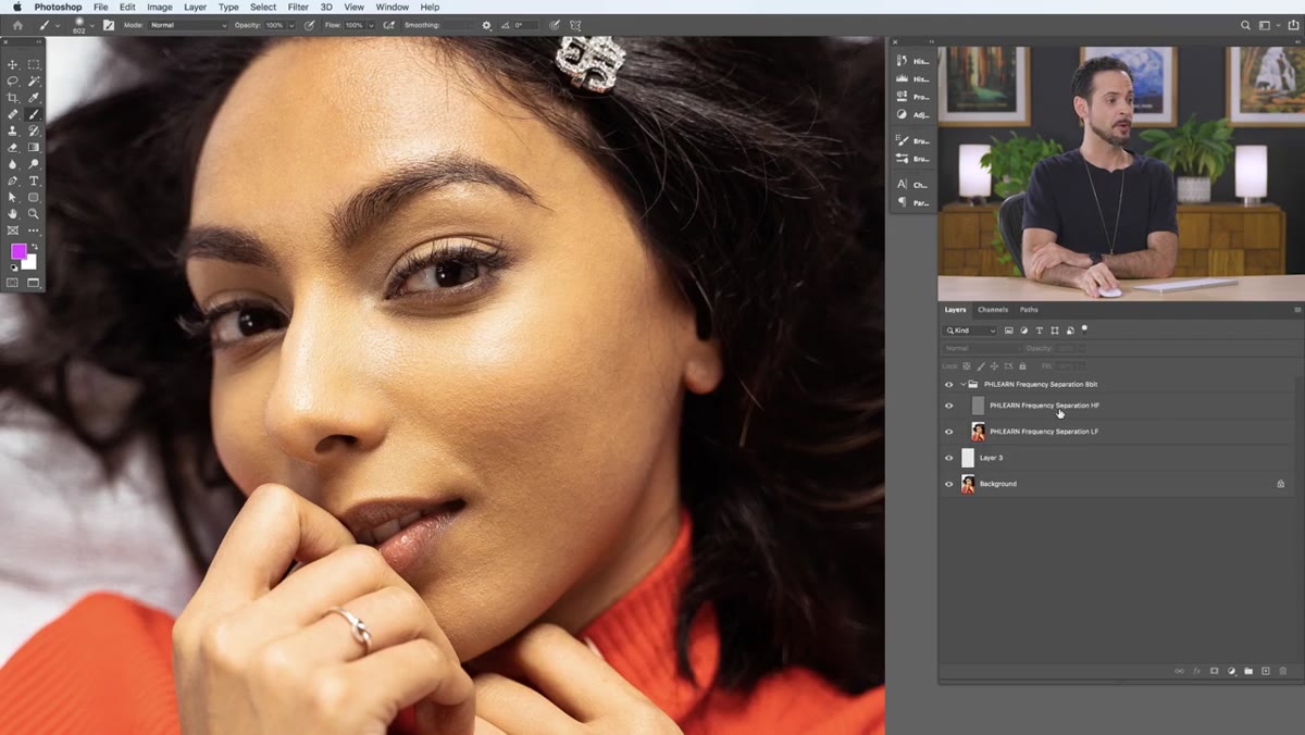 Layer panel showing HF and LF layers inside a group
When the action completes, you’ll have a layer group containing two layers: a High Frequency (HF) layer on top, and a Low Frequency (LF) layer below it. The HF layer holds all the texture information. The LF layer holds all the color and tone information. Together they look like your original photo. Separately, they each show only their half of the picture.
Layer panel showing HF and LF layers inside a group
When the action completes, you’ll have a layer group containing two layers: a High Frequency (HF) layer on top, and a Low Frequency (LF) layer below it. The HF layer holds all the texture information. The LF layer holds all the color and tone information. Together they look like your original photo. Separately, they each show only their half of the picture.
Here’s the clearest way to understand it: if you move the HF layer around on the canvas, you’re dragging the texture of the skin across the frame, but the color stays put underneath. Turn the HF layer off entirely and you’re left with a blurry wash of color. Turn it back on and all the detail snaps back. This separation is what lets us fix color problems without disturbing texture, and texture problems without disturbing color. That’s the entire premise.
Step 4: Create a New Layer for Color Work
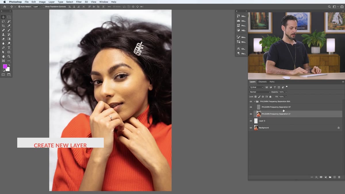 New empty layer added between HF and LF layers in panel
To start working on the color layer, create a new blank layer and place it between the HF and LF layers in your stack. This is where you’ll paint corrected color. Because the HF layer sits above it, any painting you do here will automatically show through with the skin’s real texture on top. The result looks natural rather than painted, which is the whole point.
New empty layer added between HF and LF layers in panel
To start working on the color layer, create a new blank layer and place it between the HF and LF layers in your stack. This is where you’ll paint corrected color. Because the HF layer sits above it, any painting you do here will automatically show through with the skin’s real texture on top. The result looks natural rather than painted, which is the whole point.
If you’re new to this workflow, it helps to think of yourself as a painter working on a canvas that someone has laid a transparent texture sheet over. You can change the color of the canvas all you want, and the texture sheet above it will make it still look like skin.
Step 5: Sample and Paint Color with a Low-Flow Brush
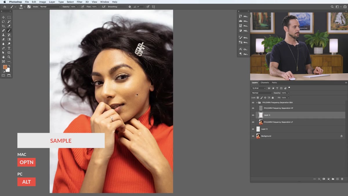 Brush tool active with Flow set to 5% in options bar
Press B to grab the Brush tool. Now go to the options bar and set your Flow to around 3-5%. To do this quickly, press Shift + 0, 5 to set it to 5%. Flow controls how much paint builds up with each stroke, and keeping it very low is critical here. You’re not trying to paint a solid color over the skin. You’re nudging the tone in a direction, gradually, pass by pass.
Brush tool active with Flow set to 5% in options bar
Press B to grab the Brush tool. Now go to the options bar and set your Flow to around 3-5%. To do this quickly, press Shift + 0, 5 to set it to 5%. Flow controls how much paint builds up with each stroke, and keeping it very low is critical here. You’re not trying to paint a solid color over the skin. You’re nudging the tone in a direction, gradually, pass by pass.
To sample a color, hold Alt (Windows) / Option (Mac) and click an area of skin that has the tone you want. Then paint over the problem area with slow, overlapping strokes. The texture above will remain intact while the color underneath gradually evens out. This works especially well for smoothing transitions between highlight and shadow areas that look patchy rather than naturally contoured.
Step 6: Work the Texture Layer Separately When Needed
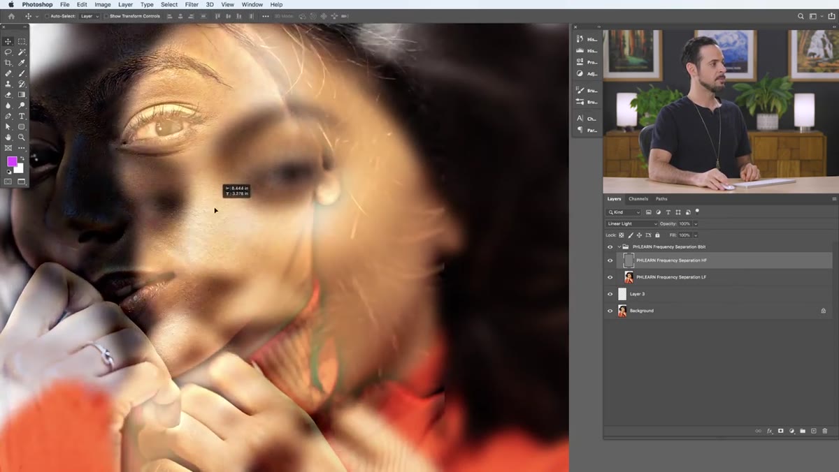 HF layer selected showing gray texture-only view
For texture problems, switch your attention to the HF layer directly. This is where you’d use tools like the Clone Stamp or Healing Brush to reduce specific texture issues, such as a noticeably rough patch or a pore cluster that’s catching light badly. Because you’re working only on the texture layer, your color information is completely untouched.
HF layer selected showing gray texture-only view
For texture problems, switch your attention to the HF layer directly. This is where you’d use tools like the Clone Stamp or Healing Brush to reduce specific texture issues, such as a noticeably rough patch or a pore cluster that’s catching light badly. Because you’re working only on the texture layer, your color information is completely untouched.
The key advantage here is precision. Traditional healing or cloning on a merged layer always risks muddying the color in the surrounding area. On the HF layer, that risk disappears.
A Note From My Own Practice
The action Aaron provides is genuinely one of the best free tools available for this workflow, and I still use a version of it myself (I renamed mine “Arrival,” because I name all my actions after films). But one thing I’d add from experience: frequency separation works best after you’ve already done basic blemish removal on a merged or stamped layer beneath the group. Trying to use it as a first-pass cleanup tool can spread texture problems around instead of solving them. Think of it as the refinement pass, not the removal pass.
The single most important thing frequency separation gives you is the ability to ask the right question. Before, I was always asking “how do I fix this area?” Now I ask, “is this a color problem or a texture problem?” That one shift in thinking separates retouching that looks natural from retouching that looks processed.
Watch the full tutorial on YouTube and download the free action Aaron provides. Run it on a portrait you’ve already retouched and see what a second pass with frequency separation does to the skin. You’ll be surprised how much room there is to improve work you thought was finished.
Comments (3)
Would love to see a follow-up going deeper into this topic.
This should be required reading for anyone starting out.
Couldn't agree more. I've seen this make a huge difference in workflows work specifically.
Leave a Comment