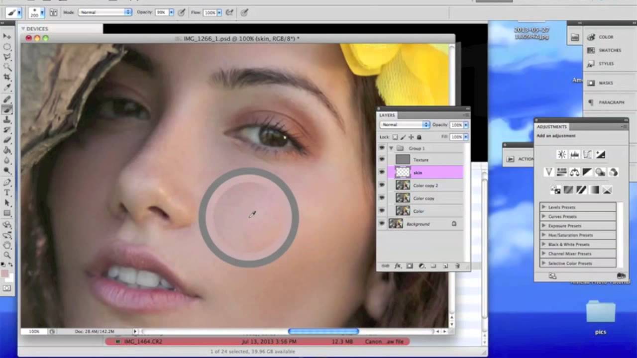
There’s a specific kind of dread that comes from delivering a round of portraits and hearing back that the skin looks “plastic.” I know that dread firsthand. Early in my retouching career, I was so focused on removing every blemish and evening out every tone that I was essentially painting over my subjects’ faces. The results were technically smooth and completely lifeless. Learning frequency separation was the moment that changed everything for me, because it finally let me work on the color and texture of skin as two separate problems instead of one blunt instrument.
In this Jessica Kobeissi tutorial, she walks through exactly that technique as part of her three-part series on professional skin retouching. Watch the full tutorial on YouTube before or after reading this breakdown. What I want to do here is slow down each step, fill in the “why” behind the settings, and give you something you can actually follow at your desk without rewinding the video six times.
The core idea behind frequency separation is elegant: skin has two distinct visual properties. There’s the color and tone, which includes uneven redness, blotchiness, and shadows. And then there’s the texture, which includes pores, fine lines, and surface detail. Most amateur retouching destroys the texture while trying to fix the color. Frequency separation lets you fix one without touching the other.
Step 1: Shoot (or Open) in RAW
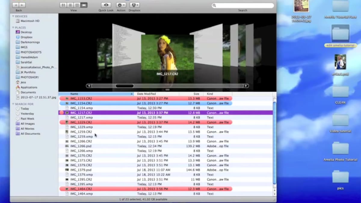 RAW file opening in Camera Raw dialog window
Before you even get to Photoshop’s main workspace, Kobeissi makes a point worth pausing on. RAW files give you a safety net that JPEGs simply don’t. If your exposure was slightly off during the shoot, the Camera Raw dialog lets you pull back highlights or lift shadows without destroying image data. For skin retouching specifically, this matters because clipped highlights on skin look like patches of white with no texture, and no amount of frequency separation will save that.
RAW file opening in Camera Raw dialog window
Before you even get to Photoshop’s main workspace, Kobeissi makes a point worth pausing on. RAW files give you a safety net that JPEGs simply don’t. If your exposure was slightly off during the shoot, the Camera Raw dialog lets you pull back highlights or lift shadows without destroying image data. For skin retouching specifically, this matters because clipped highlights on skin look like patches of white with no texture, and no amount of frequency separation will save that.
When the RAW file opens, you’ll see the Camera Raw window before the image lands in Photoshop. Kobeissi keeps her adjustments here minimal, mainly checking exposure and occasionally nudging white balance. I do the same. Resist the urge to do too much color grading at this stage. You want a clean, neutral starting point so your retouching decisions are based on accurate color, not a pre-baked filter.
Step 2: Duplicate Your Background Layer Twice
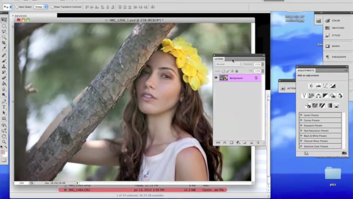 Two duplicate layers labeled texture and color in Layers panel
Once your image is open in Photoshop, duplicate the background layer twice. Name the top one “texture” and the one below it “color.” This naming isn’t just organizational tidiness. It maps directly to what each layer will do. Everything you touch on the color layer affects tone and hue. Everything you touch on the texture layer affects surface detail. Keeping them labeled means you’ll never lose track of which problem you’re solving.
Two duplicate layers labeled texture and color in Layers panel
Once your image is open in Photoshop, duplicate the background layer twice. Name the top one “texture” and the one below it “color.” This naming isn’t just organizational tidiness. It maps directly to what each layer will do. Everything you touch on the color layer affects tone and hue. Everything you touch on the texture layer affects surface detail. Keeping them labeled means you’ll never lose track of which problem you’re solving.
At this point, turn off the visibility on the texture layer by clicking the eye icon beside it. You should only be seeing the color layer right now. This is your starting point for the next step.
Step 3: Blur the Color Layer
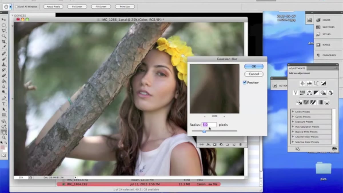 Gaussian Blur dialog set to 5.0 pixels on color layer
With the color layer selected and texture hidden, go to Filter, then Blur, then Gaussian Blur. Set the radius to 5.0 pixels. What this does is intentionally smear all the color information together, removing texture entirely from this layer. You want to see the tones blending into each other so that the layer looks soft and slightly out of focus. The exact pixel value can vary depending on your image resolution, but 5.0 is a solid starting point for most portrait work at standard print resolutions.
Gaussian Blur dialog set to 5.0 pixels on color layer
With the color layer selected and texture hidden, go to Filter, then Blur, then Gaussian Blur. Set the radius to 5.0 pixels. What this does is intentionally smear all the color information together, removing texture entirely from this layer. You want to see the tones blending into each other so that the layer looks soft and slightly out of focus. The exact pixel value can vary depending on your image resolution, but 5.0 is a solid starting point for most portrait work at standard print resolutions.
This blurred layer now holds only color information. The sharp detail you just blurred out will be recovered through the texture layer above it.
Step 4: Apply Apply Image to the Texture Layer
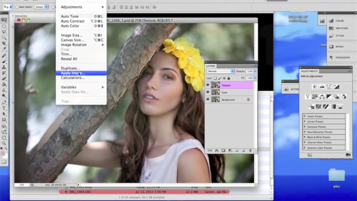 Apply Image dialog with Add blending and Scale set to 2
Turn the texture layer back on and select it. Now go to Image and choose Apply Image. This is the step that trips most people up the first time, so go slowly. In the Apply Image dialog, you’ll set the blending mode to Add and change the scale value to 2. Keep the offset at zero. The layer you’re selecting as the source should be your color layer. Before clicking OK, check the Invert box.
Apply Image dialog with Add blending and Scale set to 2
Turn the texture layer back on and select it. Now go to Image and choose Apply Image. This is the step that trips most people up the first time, so go slowly. In the Apply Image dialog, you’ll set the blending mode to Add and change the scale value to 2. Keep the offset at zero. The layer you’re selecting as the source should be your color layer. Before clicking OK, check the Invert box.
What you’re doing here is mathematically extracting the difference between the original sharp image and the blurred color layer. The result will look strange, almost like a gray embossed outline of the face. That’s correct. You haven’t made a mistake. The texture layer now contains only the high-frequency detail, separated cleanly from the color information below.
Step 5: Switch the Texture Layer to Linear Light
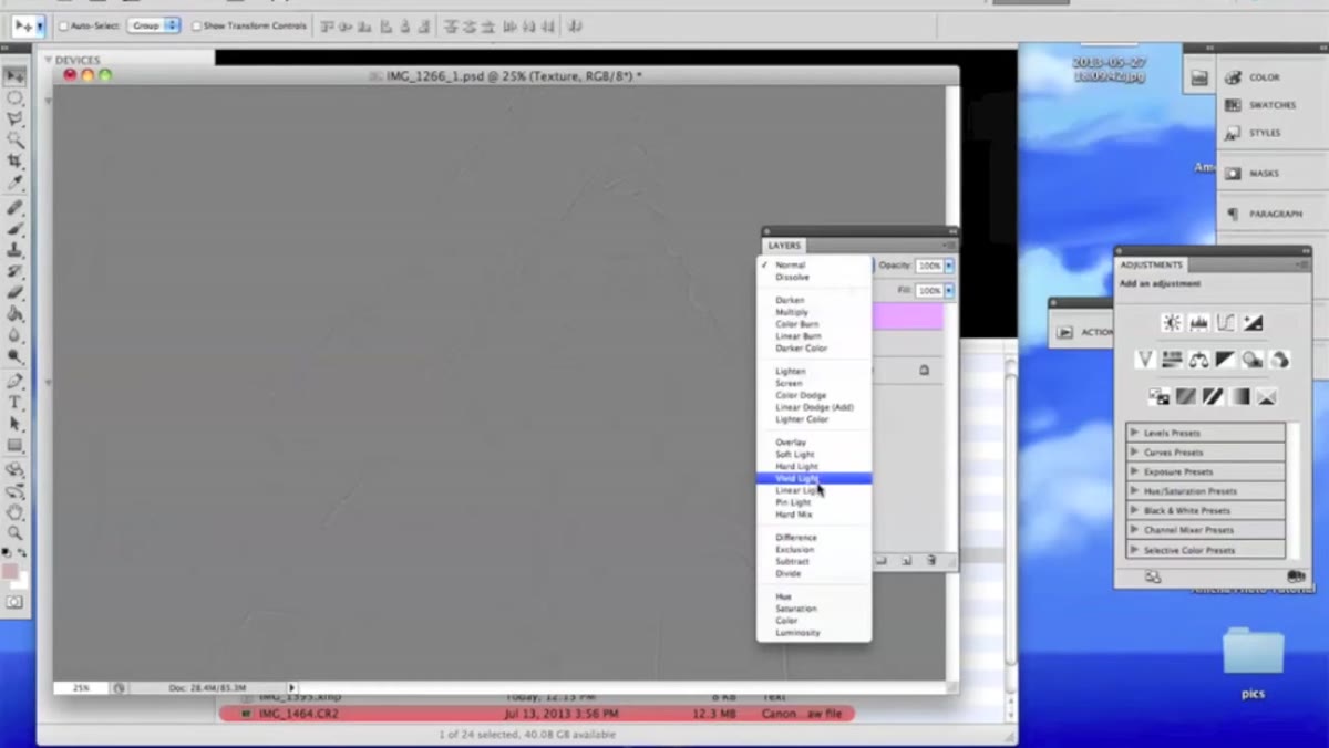 Blend mode dropdown on texture layer changed to Linear Light
With the texture layer still selected, go to the blend mode dropdown in the Layers panel (it defaults to “Normal”) and switch it to Linear Light. The moment you do this, the image should look completely normal again, indistinguishable from the original photograph.
Blend mode dropdown on texture layer changed to Linear Light
With the texture layer still selected, go to the blend mode dropdown in the Layers panel (it defaults to “Normal”) and switch it to Linear Light. The moment you do this, the image should look completely normal again, indistinguishable from the original photograph.
If it looks right, you’ve done the separation correctly. The two layers are now working together to reconstruct the original image, but they’re doing it as two separate components you can edit independently. Group both layers together with Command+G so you can keep your layers panel tidy and toggle the whole group on and off for before-and-after comparisons.
A Note From My Own Workflow
Once I have frequency separation set up, I work on the color layer with a large, soft brush set to low opacity. I’m smoothing out redness and uneven tone without touching pores or fine lines at all. Then I switch to the texture layer for any structural fixes, using the clone stamp at 100% opacity with a very small brush.
The thing I remind every student in my workshops is that frequency separation is not a one-click fix. It’s a framework that makes precise, targeted retouching possible. The quality of your result still depends on your eye and your patience. But when someone compliments a portrait’s skin and then says “it still looks like a real person,” that’s the technique working exactly as it should. The goal is never to remove the person. It’s to let the best version of them through.
The single most important idea in this whole tutorial is that skin has two separate visual layers and they deserve to be treated separately. Color work should never cost you texture. Once that clicked for me, every retouch I did improved. If you want to see the full walkthrough including Kobeissi’s own demonstration, watch the full tutorial on YouTube and follow along with her source images. Part 1 of her series covers the original shoot, which is worth watching to understand how the images were captured before retouching began.
Comments (1)
I've watched a dozen tutorials on this and yours is the clearest by far.
Leave a Comment