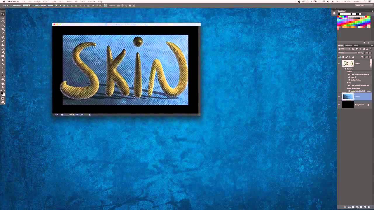
There is a specific kind of frustration that comes from finishing 90% of a design and knowing something is still off. The text looks great, the texture is working, but the background feels like an afterthought and the whole thing reads as unfinished. I ran into this constantly when I first started doing design work alongside my retouching, and honestly, it still happens. The difference now is I know how to diagnose it and fix it quickly. That is exactly what this tutorial addresses.
In this KelbyOne tutorial, Photoshop instructor Corey Barker walks through the finishing touches for a 3D snakeskin text effect he originally built for Photoshop User Magazine. The core technique, wrapping a real iPhone-shot snakeskin texture around 3D text, was covered in the magazine. But this video is where the polish happens. Watch it here: Watch the full tutorial on YouTube
What I love about Corey’s approach is that he treats finishing touches as actual design decisions, not afterthoughts. Bringing the same texture into the background, color-shifting it to complement the text, then masking it out gracefully – these are the moves that separate a design that looks done from one that looks considered. Let’s break down each step so you can follow along and apply this to your own work.
Step 1: Reuse the Snakeskin Texture for the Background
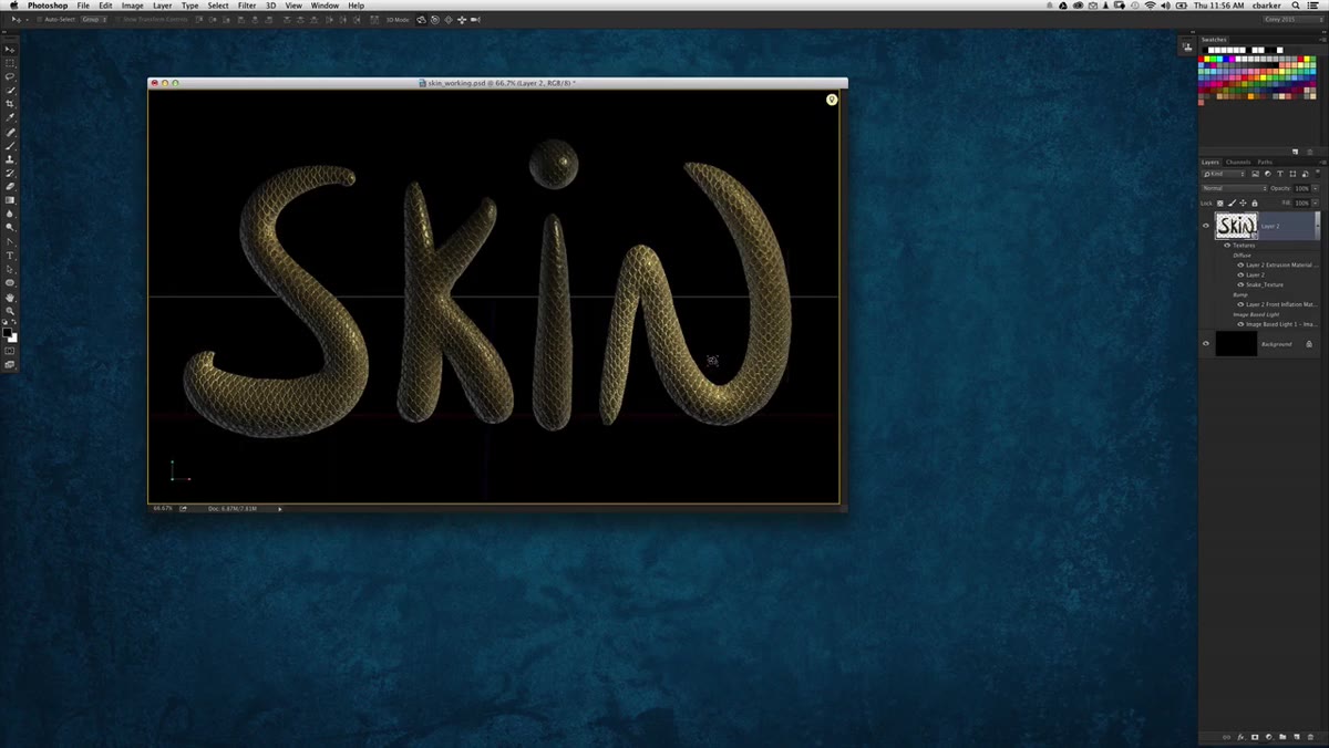 Snakeskin texture being dragged into the composition
Rather than sourcing a new background element, Corey goes back to the same snakeskin texture used on the text itself. This is smart design thinking – repeating a visual element unifies the whole piece. He drags and drops the texture into the document while holding Shift, which forces it to land centered on the canvas. That one habit alone saves a lot of manual repositioning.
Snakeskin texture being dragged into the composition
Rather than sourcing a new background element, Corey goes back to the same snakeskin texture used on the text itself. This is smart design thinking – repeating a visual element unifies the whole piece. He drags and drops the texture into the document while holding Shift, which forces it to land centered on the canvas. That one habit alone saves a lot of manual repositioning.
Once the texture is placed, it will almost certainly be oversized relative to your canvas. Do not panic. The next step handles that cleanly.
Step 2: Scale and Rotate with Free Transform
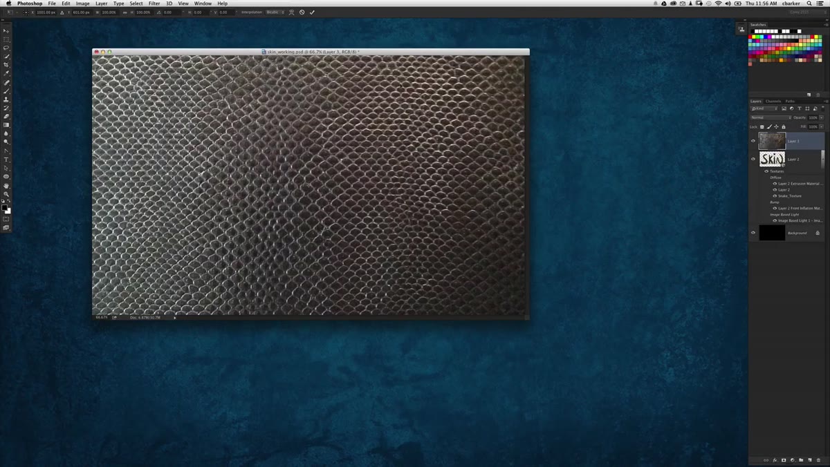 Free Transform handles visible around the oversized texture layer
Press Command+T (Mac) or Ctrl+T (Windows) to enter Free Transform. If the handles are outside your visible canvas area, press Command+0 (or Ctrl+0) to zoom out just enough to see all four corners. From there, hold Shift+Option (Mac) or Shift+Alt (Windows) while dragging a corner handle inward. This scales the layer down from the center, keeping it proportional and centered at the same time.
Free Transform handles visible around the oversized texture layer
Press Command+T (Mac) or Ctrl+T (Windows) to enter Free Transform. If the handles are outside your visible canvas area, press Command+0 (or Ctrl+0) to zoom out just enough to see all four corners. From there, hold Shift+Option (Mac) or Shift+Alt (Windows) while dragging a corner handle inward. This scales the layer down from the center, keeping it proportional and centered at the same time.
After scaling, Corey rotates the texture 90 degrees. Hold Shift while rotating to constrain the movement to 15-degree increments – this makes hitting exactly 90 degrees clean and easy. He then nudges the scale back up slightly so the texture fills the background area behind the text comfortably. The goal is coverage without the hard rectangular edge of the layer becoming visible.
Step 3: Apply a Hue/Saturation Shift Directly to the Layer
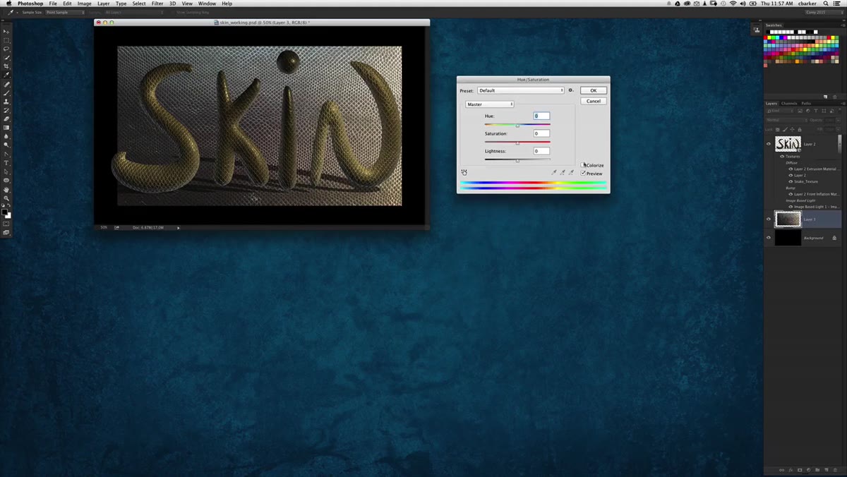 Hue/Saturation dialog open, texture shifting toward blue
Here is where Corey makes a choice I want to highlight because it is worth thinking about. He applies the Hue/Saturation adjustment directly to the texture layer rather than using an adjustment layer. In a retouching workflow I would almost always go the adjustment layer route for flexibility. But for a finishing pass on a design like this, where the decision is made and you just need the color locked in, applying directly is faster and keeps the layer stack cleaner.
Hue/Saturation dialog open, texture shifting toward blue
Here is where Corey makes a choice I want to highlight because it is worth thinking about. He applies the Hue/Saturation adjustment directly to the texture layer rather than using an adjustment layer. In a retouching workflow I would almost always go the adjustment layer route for flexibility. But for a finishing pass on a design like this, where the decision is made and you just need the color locked in, applying directly is faster and keeps the layer stack cleaner.
He shifts the hue toward blue. The text has a warm yellowish-gold tone from the snakeskin texture, and blue sits opposite that on the color wheel. The contrast is immediate and effective. If you are following along, drag the Hue slider in the Hue/Saturation dialog and watch how the background texture shifts. Land somewhere in the cool blue-green range and compare it against your text color – you will feel when the contrast clicks.
Step 4: Add a Layer Mask and Fade the Edges with Gradients
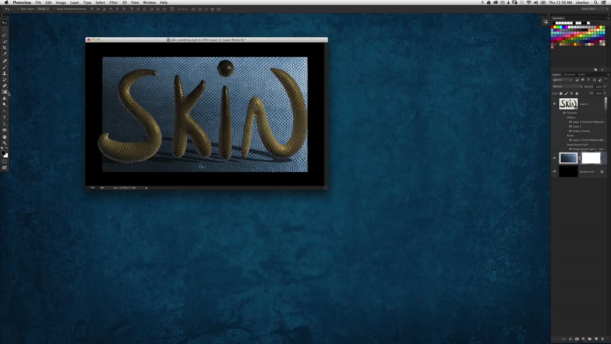 Gradient tool active, layer mask selected, fading edges of texture
The texture at this point has hard rectangular edges that cut off abruptly. To fix this, add a layer mask to the background texture layer by clicking the mask icon at the bottom of the Layers panel. Select the Gradient tool, then open the gradient picker and choose Foreground to Transparent. Set your blend mode to Linear.
Gradient tool active, layer mask selected, fading edges of texture
The texture at this point has hard rectangular edges that cut off abruptly. To fix this, add a layer mask to the background texture layer by clicking the mask icon at the bottom of the Layers panel. Select the Gradient tool, then open the gradient picker and choose Foreground to Transparent. Set your blend mode to Linear.
Press D on the keyboard to reset your foreground and background colors to black and white, then press X to swap so black is in the foreground. Now drag gradients inward from each edge of the canvas – top, bottom, left, right. Each drag paints black onto the mask in that direction, which hides the texture near the edges and creates a natural fade. The result is a background that feels like it belongs in the composition rather than being pasted on top of it.
Step 5: Remove the Ground Plane Shadow in the 3D Panel
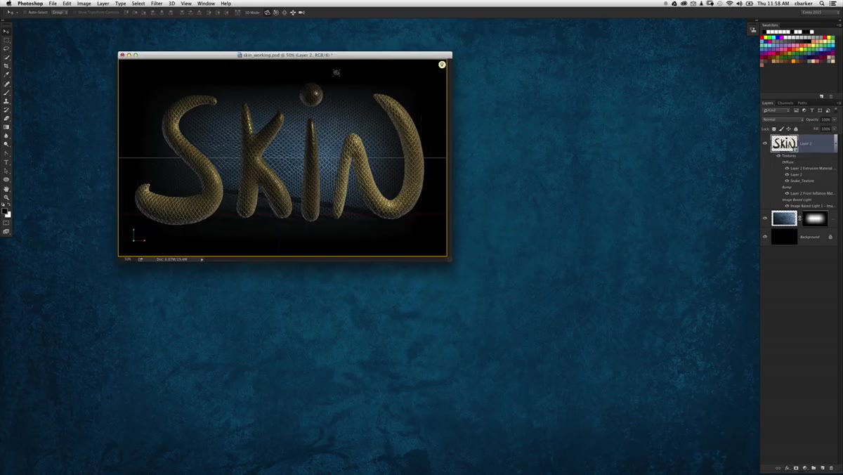 3D panel open with Environment selected, shadow opacity at zero
Once the background texture is in place, something becomes visible that was hidden before: a shadow cast by the 3D text onto the ground plane. It was invisible when the background was solid black, but now it shows up clearly against the texture. Left unchecked, it looks wrong – a remnant of the 3D environment rather than an intentional design choice.
3D panel open with Environment selected, shadow opacity at zero
Once the background texture is in place, something becomes visible that was hidden before: a shadow cast by the 3D text onto the ground plane. It was invisible when the background was solid black, but now it shows up clearly against the texture. Left unchecked, it looks wrong – a remnant of the 3D environment rather than an intentional design choice.
To remove it, open the 3D panel and click on the Environment property. Then open the Properties panel alongside it. You will see a Ground Plane section with a Shadow opacity slider set to 60% by default. Scrub that slider down to zero. The shadow disappears completely and the text sits cleanly against the background.
A Note from My Own Workflow
When I first started working with 3D text in Photoshop, I used to treat the 3D settings as a black box – something to get through as fast as possible before getting back to the parts of Photoshop I understood. Watching Corey move through the 3D panel with such ease made me realize how much control is sitting in there if you just slow down and look.
The ground plane shadow fix is a perfect example. It is one slider. But if you do not know where to look, you might spend 20 minutes trying to solve it with masks or blend modes before giving up. Tutorials like this one are valuable not just for the technique being taught, but for the mental map they build of where things live inside the software. I keep a running note in Notion of exactly these kinds of “oh, it’s just one setting” discoveries, and the ground plane shadow is now on that list.
The single most important idea in this tutorial is that finishing a design means treating every element – including the background – as a design decision, not a placeholder. Repeating the same texture across text and background, color-shifting it intentionally, and masking it with gradients is what makes a piece feel resolved rather than assembled.
Watch the full tutorial on YouTube to see Corey work through these steps in real time – seeing the texture shift in the Hue/Saturation dialog and watching the gradient masks fade the edges makes these concepts land faster than any screenshot can.
Comments
Leave a Comment