Sports portrait work is not something I stumbled into naturally. My background is beauty and wedding retouching, where the goal is usually smoothness, softness, a certain kind of quiet polish. But a few of my clients have been pushing into athletic branding, and I quickly realized my usual toolkit was leaving the images feeling a little… pleasant. Pleasant is death for a sports photo. What those images need is drama, contrast, and a visual language that signals performance before a single word is read.
That’s exactly what Aaron Nace tackles in this tutorial over on PHLEARN. Watch the full tutorial on YouTube – it’s worth your time even if you only pull two or three ideas from it. He’s working on a raw sports portrait that already has good bones but reads as flat and slightly color-contaminated. His goal is to push it into that stylized, high-impact territory you associate with major athletic campaigns. Think bold color zones, punchy contrast, and lens flares that feel earned rather than slapped on. I’ve since used variations of this workflow on three client projects, and here’s how it breaks down.
Step 1: Diagnose the Color Problems Before You Fix Them
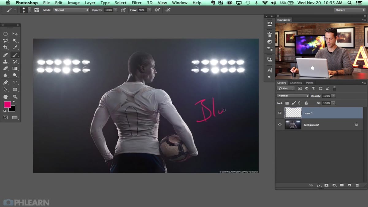 Flat, color-contaminated sports portrait open in Photoshop
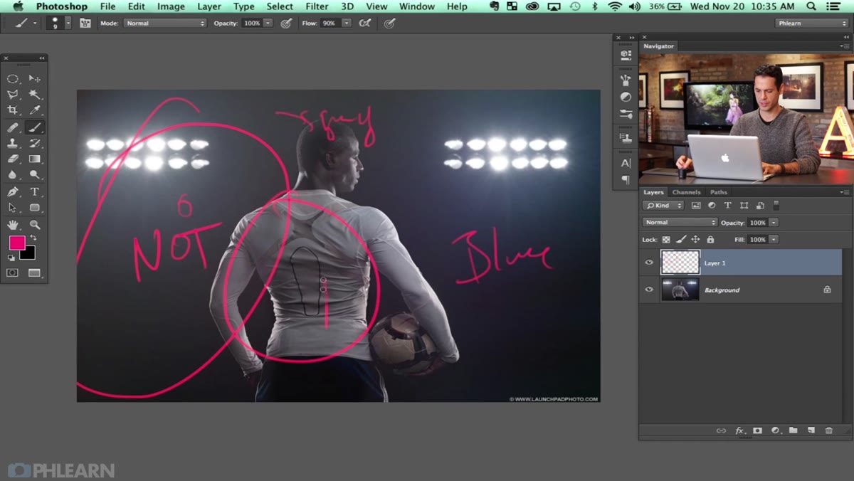
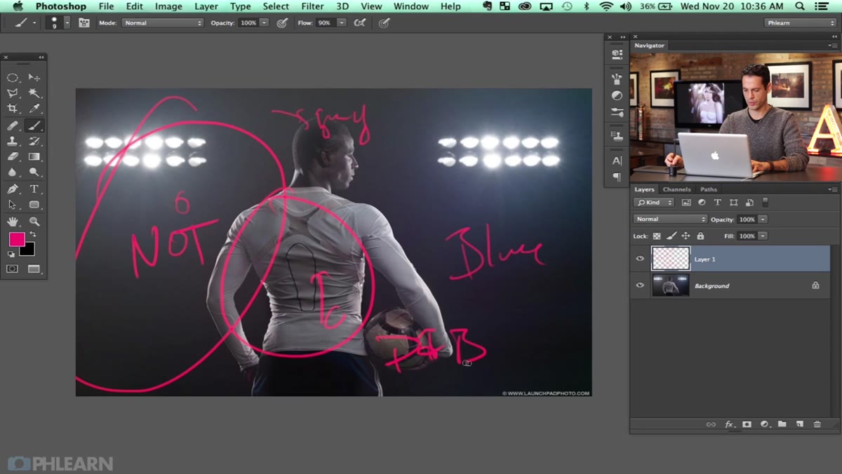
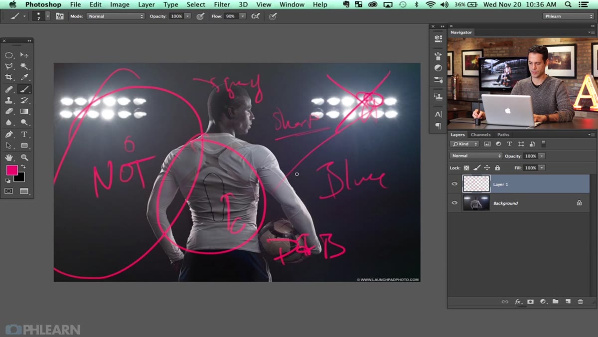
Before touching a single slider, Aaron pauses to actually read the image. The photo has a blue cast on one side, some greenish tones at the top, a hint of reddish-purple at the bottom, and a large area of low contrast caused by what looks like lens haze. This is a crucial habit. Jumping straight into corrections without mapping the problem areas first usually means overworking some zones and missing others entirely. Spend sixty seconds squinting at your image and naming the color offenders by region. Write them down if it helps. I have a sticky note system that my workshop students make fun of, but it genuinely stops me from chasing corrections in circles.
Flat, color-contaminated sports portrait open in Photoshop
Before touching a single slider, Aaron pauses to actually read the image. The photo has a blue cast on one side, some greenish tones at the top, a hint of reddish-purple at the bottom, and a large area of low contrast caused by what looks like lens haze. This is a crucial habit. Jumping straight into corrections without mapping the problem areas first usually means overworking some zones and missing others entirely. Spend sixty seconds squinting at your image and naming the color offenders by region. Write them down if it helps. I have a sticky note system that my workshop students make fun of, but it genuinely stops me from chasing corrections in circles.
Step 2: Use Curves Adjustment Layers to Build Color by Zone
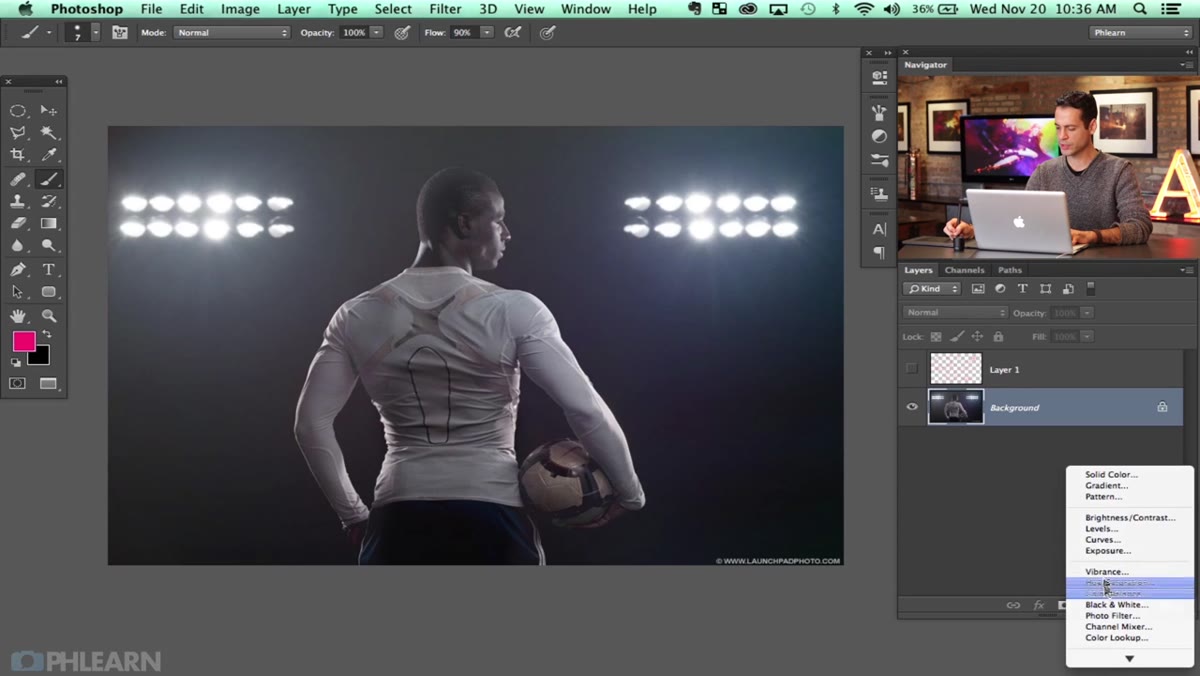 Curves adjustment layer open with Blue channel selected
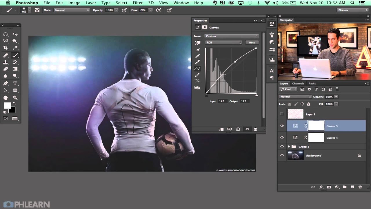
Aaron’s color correction strategy here is elegant: he uses multiple Curves adjustment layers, each targeting a specific color and a specific area of the image, rather than trying to solve everything in one adjustment. For the blue cast on one side, he adds a Curves layer, selects the Blue channel, and lifts the curve upward to increase blue saturation. The key move is what he does immediately after: he inverts the layer mask with Command+I, making the adjustment invisible everywhere, then paints back in the effect with a large, soft white brush only where the blue needs to live. This gives you precise, painterly control without any hard edges.
Curves adjustment layer open with Blue channel selected
Aaron’s color correction strategy here is elegant: he uses multiple Curves adjustment layers, each targeting a specific color and a specific area of the image, rather than trying to solve everything in one adjustment. For the blue cast on one side, he adds a Curves layer, selects the Blue channel, and lifts the curve upward to increase blue saturation. The key move is what he does immediately after: he inverts the layer mask with Command+I, making the adjustment invisible everywhere, then paints back in the effect with a large, soft white brush only where the blue needs to live. This gives you precise, painterly control without any hard edges.
He repeats this logic for the purple tones in the lower portion of the image. Purple is red plus blue, so he lifts both the Red channel and the Blue channel in a new Curves layer, inverts the mask, and paints it into the bottom of the frame. If the effect feels heavy, simply drop the layer opacity – he brings his down to something subtle so it reads as a color hint rather than a color statement.
Step 3: Pull the Green Tones into the Upper Areas
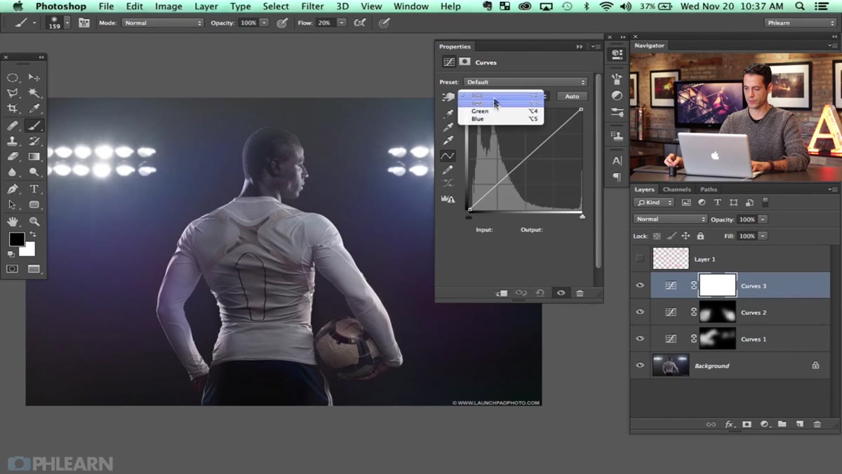 Green and Blue channels raised in Curves for upper zone
For the top of the frame, Aaron adds a third Curves layer and lifts both the Green channel and the Blue channel together. This creates a cool, slightly teal-green quality that works beautifully as an environmental light source color – as if the subject is lit from above by stadium or arena lighting. Again, the mask gets inverted first, and he paints the effect in only at the top. By the time these three Curves layers are stacked, the image has a coherent color story: warm purple at the base, neutral in the midground, cool green-blue overhead. That kind of deliberate color zoning is exactly what separates a stylized image from a corrected one.
Green and Blue channels raised in Curves for upper zone
For the top of the frame, Aaron adds a third Curves layer and lifts both the Green channel and the Blue channel together. This creates a cool, slightly teal-green quality that works beautifully as an environmental light source color – as if the subject is lit from above by stadium or arena lighting. Again, the mask gets inverted first, and he paints the effect in only at the top. By the time these three Curves layers are stacked, the image has a coherent color story: warm purple at the base, neutral in the midground, cool green-blue overhead. That kind of deliberate color zoning is exactly what separates a stylized image from a corrected one.
Step 4: Address Contrast and the Lens Haze Problem
 Hazy low-contrast area identified in center of image
The original image has a significant area of lens flare haze – not the pretty, graphic kind, but the kind that just kills contrast and makes a portion of the photo look gray and lifeless. Aaron’s approach to this is to treat it as a contrast problem first. Rather than trying to remove the haze directly, he rebuilds the luminosity structure of the image using Curves to pull down the midtones and lift the highlights selectively, restoring depth to the flattened areas. Think of it as re-carving the tonal range that the haze swallowed. This is a much more stable approach than reaching for Dehaze in Camera Raw, which can produce a crunchy, over-processed look if pushed too hard.
Hazy low-contrast area identified in center of image
The original image has a significant area of lens flare haze – not the pretty, graphic kind, but the kind that just kills contrast and makes a portion of the photo look gray and lifeless. Aaron’s approach to this is to treat it as a contrast problem first. Rather than trying to remove the haze directly, he rebuilds the luminosity structure of the image using Curves to pull down the midtones and lift the highlights selectively, restoring depth to the flattened areas. Think of it as re-carving the tonal range that the haze swallowed. This is a much more stable approach than reaching for Dehaze in Camera Raw, which can produce a crunchy, over-processed look if pushed too hard.
Step 5: Dodge and Burn for Dimension and Drama
 Dodge and Burn described as major step in the workflow
Aaron flags dodge and burn as one of the most important steps in this entire workflow, and I agree completely. For sports imagery specifically, heavy dodge and burn does double duty: it enhances the muscular or physical form of the subject, and it adds that high-contrast, sculpted look that reads as powerful and dynamic. His approach follows the standard non-destructive method – a 50% gray layer set to Overlay mode, then painting with soft white and black brushes at low opacity to build up light and shadow gradually. Burn the shadow edges of muscles or joints to push them back. Dodge the highlights on shoulders, forearms, or the crown of the head to make them pop forward. Work slowly and check your progress by toggling the layer visibility.
Dodge and Burn described as major step in the workflow
Aaron flags dodge and burn as one of the most important steps in this entire workflow, and I agree completely. For sports imagery specifically, heavy dodge and burn does double duty: it enhances the muscular or physical form of the subject, and it adds that high-contrast, sculpted look that reads as powerful and dynamic. His approach follows the standard non-destructive method – a 50% gray layer set to Overlay mode, then painting with soft white and black brushes at low opacity to build up light and shadow gradually. Burn the shadow edges of muscles or joints to push them back. Dodge the highlights on shoulders, forearms, or the crown of the head to make them pop forward. Work slowly and check your progress by toggling the layer visibility.
Step 6: Add Lens Flares That Actually Belong in the Image
 Lens flares mentioned as final stylizing element
This is the step people either love or quietly skip because they’ve been burned by bad lens flares before. Aaron’s method avoids the cheesy filter result by being intentional about placement and blending. The goal is to place flares where a real light source would logically produce them – along the edge of a shoulder catching a rim light, or from a corner where a practical light lives in the scene. He creates them on their own layer and uses Screen blending mode so the flare integrates with the highlights naturally rather than sitting on top of the image like a sticker. Opacity is your friend here. A lens flare at 60-70% opacity almost always reads better than one at 100%.
Lens flares mentioned as final stylizing element
This is the step people either love or quietly skip because they’ve been burned by bad lens flares before. Aaron’s method avoids the cheesy filter result by being intentional about placement and blending. The goal is to place flares where a real light source would logically produce them – along the edge of a shoulder catching a rim light, or from a corner where a practical light lives in the scene. He creates them on their own layer and uses Screen blending mode so the flare integrates with the highlights naturally rather than sitting on top of the image like a sticker. Opacity is your friend here. A lens flare at 60-70% opacity almost always reads better than one at 100%.
What I’d Add From My Own Experience
The color zoning technique in this tutorial translates beautifully beyond sports work. I’ve applied the same inverted-mask-and-paint approach to beauty editorials where I need to suggest colored gels or environmental light without it looking composited. The principle is identical: decide what color story you want each zone of the image to tell, build a Curves layer for each story, and paint it in with intention. Where I’d push Aaron’s workflow further is in adding a final Hue/Saturation layer with a mask to selectively desaturate the background. Pulling color slightly out of the environment forces the eye toward the subject and adds another layer of that cinematic, produced quality that makes the difference between a strong photo and a campaign-ready image.
The single biggest lesson from this workflow is that sports retouching is really a design problem more than a correction problem. You’re not just fixing what went wrong – you’re building a visual world around the subject. Color, light, and contrast are your materials. Aaron Nace’s approach gives you a repeatable system for that construction, and once you internalize the logic, you’ll see opportunities to apply it everywhere.
Watch the full tutorial on YouTube to see Aaron walk through each of these moves in real time – the way he reads the image at the start is alone worth the watch.
Comments (2)
Wow, I had no idea you could do this. Mind blown.
This is going in my reference folder. Incredibly useful.
Leave a Comment