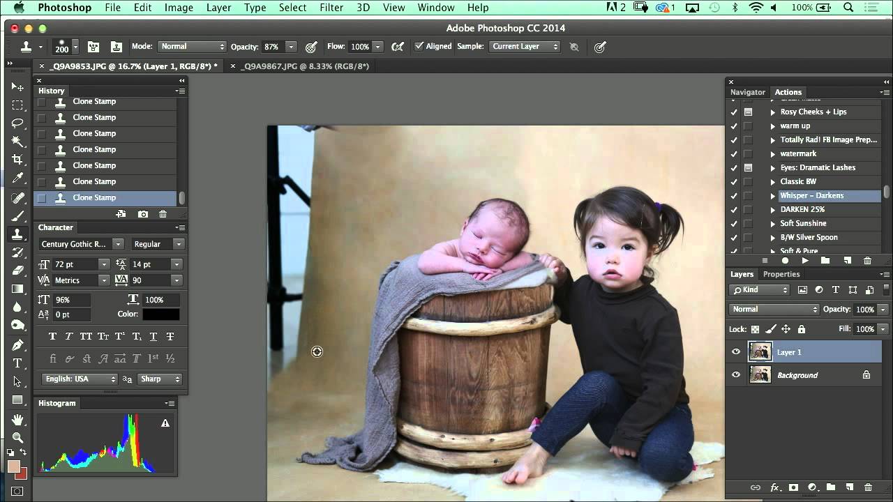
Shadow problems have a way of showing up exactly where you don’t want them. A subject’s arm falls across their torso, a leg casts a hard line across a background you spent twenty minutes setting up, and suddenly the composite you were proud of has a giveaway edge that screams “two separate images.” I used to patch these situations with heavy cloning and hope nobody noticed. They noticed.
Watch the full tutorial on YouTube
In this CreativeLive tutorial, photographer Kelly Brown walks through her compositing workflow for a toddler portrait session, and buried inside the broader lesson is some genuinely useful thinking about shadow management. It isn’t a deep-dive retouching masterclass. It’s a working photographer talking through real decisions in real time, and that’s exactly why it’s worth your attention. The advice is practical, unglamorous, and immediately applicable.
Step 1: Identify the Shadow Before You Start Blending
 Visible shadow cast by subject’s leg on background
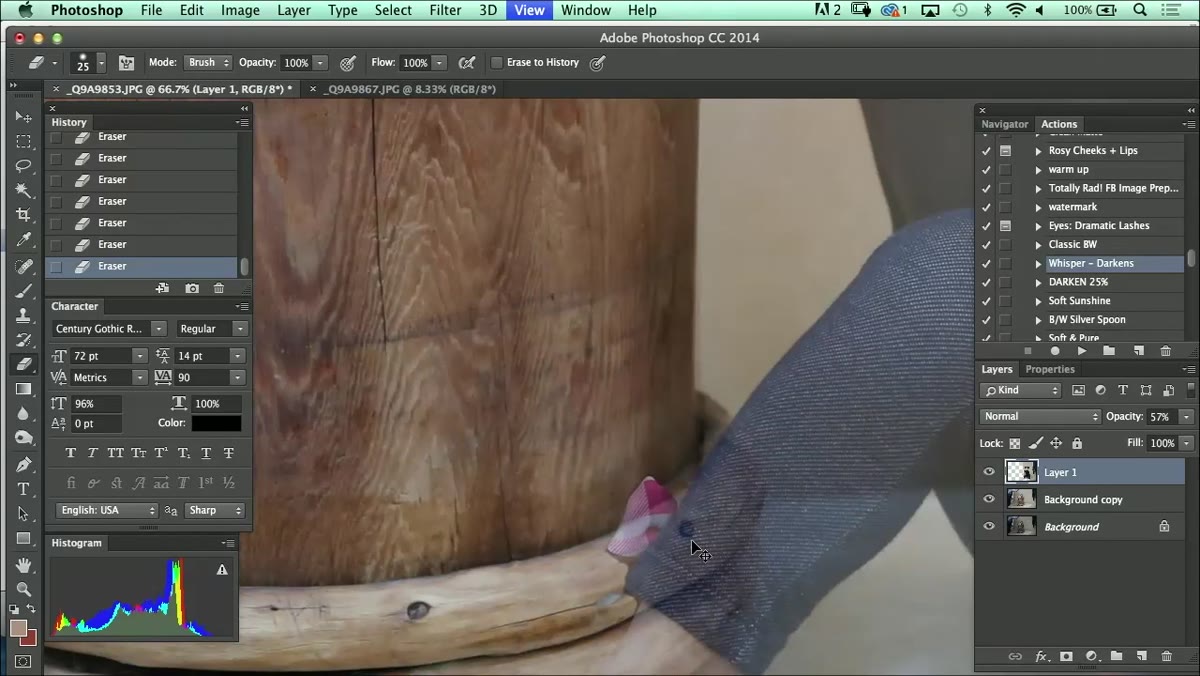
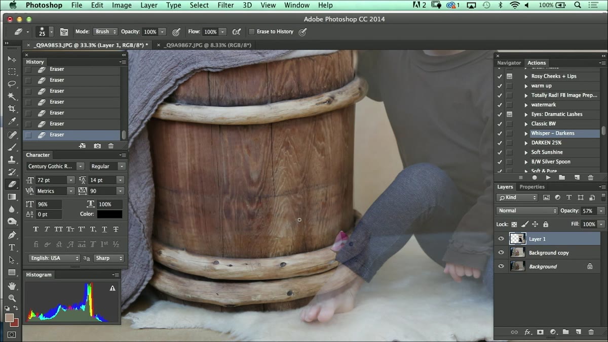
Before you reach for any tool, take a proper look at what the shadow is actually doing. Kelly points out a specific example where a child’s leg has cast a shadow onto the background beneath her. The first question isn’t “how do I remove this?” - it’s “does this shadow help or hurt the image?” A shadow that falls naturally and matches the lighting logic of the scene can be left in. A shadow that reads as a compositing artifact needs to go, or at least be softened.
Visible shadow cast by subject’s leg on background
Before you reach for any tool, take a proper look at what the shadow is actually doing. Kelly points out a specific example where a child’s leg has cast a shadow onto the background beneath her. The first question isn’t “how do I remove this?” - it’s “does this shadow help or hurt the image?” A shadow that falls naturally and matches the lighting logic of the scene can be left in. A shadow that reads as a compositing artifact needs to go, or at least be softened.
Get into the habit of toggling your layers on and off at this stage to see the shadow in isolation. You want to understand its shape, its softness, and how much it’s interacting with the subject before you commit to a removal approach.
Step 2: Turn Off Layers to Audit What You’ve Missed
 Layers panel with visibility toggled off to reveal gaps
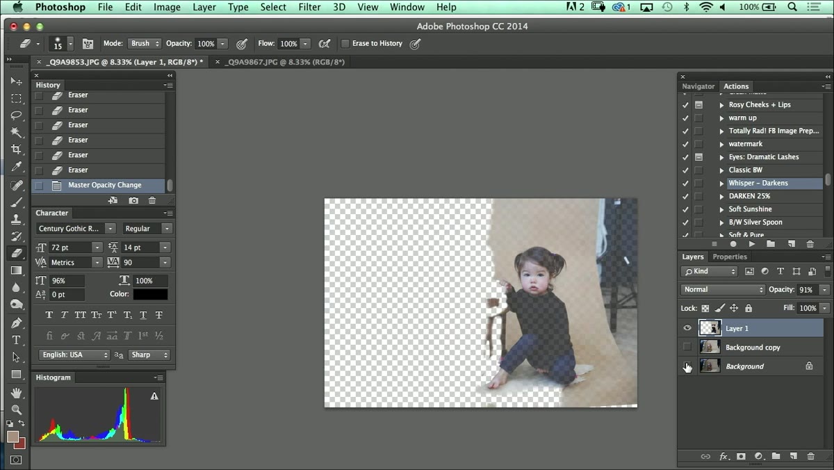
Kelly’s next move is one I’ve built into my own workflow: turn off the composite layers entirely and look at what remains. This reveals any areas where the erasure or masking is incomplete. Spots that looked fine with everything visible suddenly show hard edges, missed patches, or bleed-through from the original frame.
Layers panel with visibility toggled off to reveal gaps
Kelly’s next move is one I’ve built into my own workflow: turn off the composite layers entirely and look at what remains. This reveals any areas where the erasure or masking is incomplete. Spots that looked fine with everything visible suddenly show hard edges, missed patches, or bleed-through from the original frame.
Do this before you spend any time on fine detail work. It’s much easier to fix a rough edge at this stage than to come back to it after you’ve already colour-matched and blended the backdrop. Think of it as a quality control pass that costs you thirty seconds and saves you ten minutes.
Step 3: Choose Your Approach - Eraser or Mask
 Backslash key overlay showing mask guide on subject
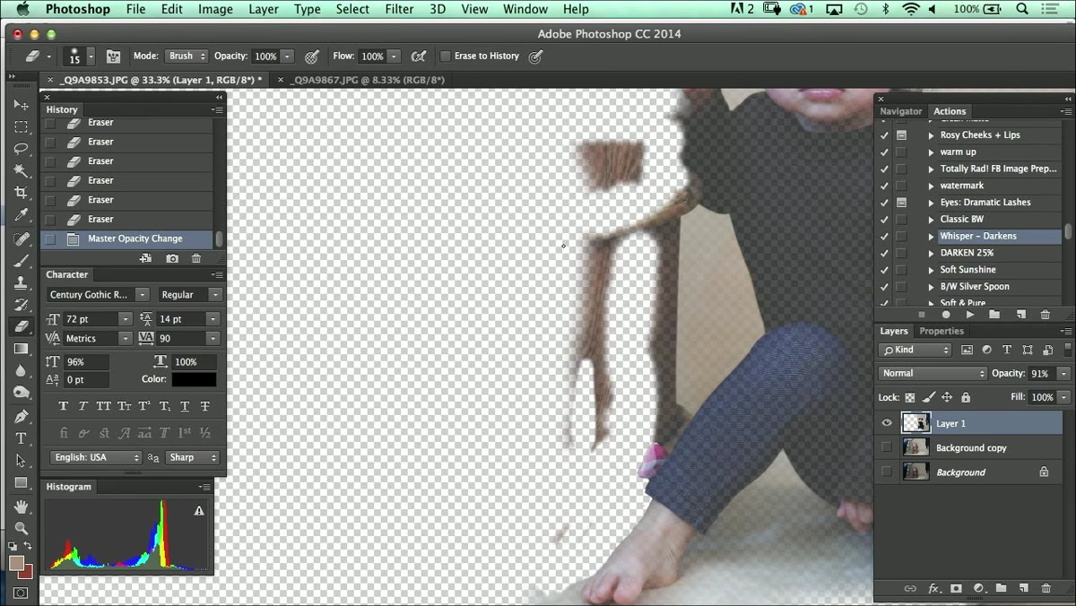
Kelly mentions two routes here: working with a layer mask and using the backslash key to bring up a guide overlay, or working directly with the eraser tool. Her point is that neither method is inherently wrong. The mask approach is more flexible and non-destructive. The eraser approach is faster for photographers who know exactly what they want and don’t need to backtrack.
Backslash key overlay showing mask guide on subject
Kelly mentions two routes here: working with a layer mask and using the backslash key to bring up a guide overlay, or working directly with the eraser tool. Her point is that neither method is inherently wrong. The mask approach is more flexible and non-destructive. The eraser approach is faster for photographers who know exactly what they want and don’t need to backtrack.
If you’re newer to compositing, the mask route is worth learning properly first. You can paint back areas you’ve accidentally hidden without any real penalty. Once you have the instincts down, you can decide whether the eraser’s directness suits your pace better. Kelly’s honest reminder here - learn the rules before you break them - is one of those pieces of advice that sounds simple but takes a few ruined files to really absorb.
Step 4: Address Remaining Shadows by Darkening, Not Removing
 Shadow beneath subject’s leg on studio background
Here’s the part of Kelly’s approach that I find most useful in practice: if a shadow can be matched to the scene’s existing tonal logic, you don’t have to erase it completely. You can darken it down slightly in post to make it read as intentional rather than accidental. A shadow that’s slightly too light looks like a mistake. A shadow that sits at the right density looks like it belongs.
Shadow beneath subject’s leg on studio background
Here’s the part of Kelly’s approach that I find most useful in practice: if a shadow can be matched to the scene’s existing tonal logic, you don’t have to erase it completely. You can darken it down slightly in post to make it read as intentional rather than accidental. A shadow that’s slightly too light looks like a mistake. A shadow that sits at the right density looks like it belongs.
This works especially well when the shadow is soft-edged and the background has some tonal variation already. Create a curves or levels adjustment clipped to that area, pull the shadows down a touch, and check it against the rest of the image. The goal isn’t to make the shadow dramatic - it’s to make it invisible as a problem.
Step 5: Correct the Horizon Line Before Final Compositing
 Canvas with rotated top layer for horizon correction
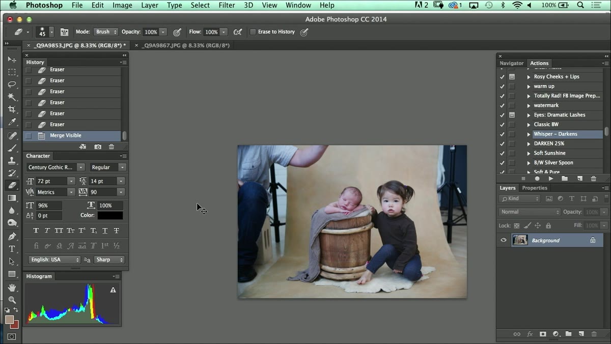
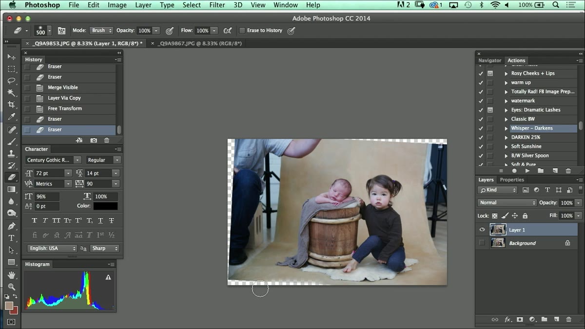
Once the shadow issues are handled, Kelly turns her attention to something that’s easy to overlook: a slightly tilted horizon line. She duplicates the layer, uses Free Transform to rotate it a few degrees, and checks alignment by dragging the layer edge to the canvas boundary. Comparing the layer edge against the canvas edge is a clean, low-tech way to eyeball a rotation without relying on guides.
Canvas with rotated top layer for horizon correction
Once the shadow issues are handled, Kelly turns her attention to something that’s easy to overlook: a slightly tilted horizon line. She duplicates the layer, uses Free Transform to rotate it a few degrees, and checks alignment by dragging the layer edge to the canvas boundary. Comparing the layer edge against the canvas edge is a clean, low-tech way to eyeball a rotation without relying on guides.
This matters more than most people account for. A tilted horizon reads as visual unease even when the viewer can’t name what’s bothering them. In children’s portraiture especially, where the background is often a seamless or a draped fabric, even a one-degree tilt can make a beautifully lit image feel slightly off.
Step 6: Use a Soft-Edge Eraser to Blend Background Seams
 Soft eraser tool blending backdrop seam at top of frame
With the horizon corrected, Kelly brings in a soft-edge eraser to clean up the seam where the two background layers meet. The key word is soft. A hard-edge eraser leaves a visible line. A soft brush at a low to medium opacity lets you feather the transition gradually, so the blend happens over a natural range of tones rather than at a single pixel boundary.
Soft eraser tool blending backdrop seam at top of frame
With the horizon corrected, Kelly brings in a soft-edge eraser to clean up the seam where the two background layers meet. The key word is soft. A hard-edge eraser leaves a visible line. A soft brush at a low to medium opacity lets you feather the transition gradually, so the blend happens over a natural range of tones rather than at a single pixel boundary.
Work at a zoom level where you can see the seam clearly, but step back to 100% or fit-in-window view regularly to check how the blend reads in context. What looks smooth at 200% can still have a visible band when you zoom out. This is one of those steps where patience matters more than technique.
A Note on Cropping From Someone Who’s Ruined a Few Prints
Kelly’s discussion of crop ratios, specifically why she chose a 10x8 over a 12x8 for this particular setup, is a good reminder that retouching decisions don’t happen in isolation. The crop you choose will determine how much negative space surrounds the subjects, which affects how shadow edges and background blends read in the final image. A shadow remnant that’s barely visible in the full uncropped file can end up sitting right in the viewer’s eyeline once the image is tightened.
I learned this the expensive way after delivering a set of composited images that looked clean on screen and had a visible patch when the client printed them at 20x24. Now I always do a final check at the intended output ratio before I sign off on a retouch. It takes an extra two minutes and has saved me from more than one awkward conversation.
The single most important thing Kelly demonstrates here isn’t a specific tool or setting. It’s the habit of pausing to evaluate before acting. Identify the shadow, audit your layers, match the tonal logic of the scene, and check your alignment before you blend. Retouching done in that order tends to hold together. Retouching done in a hurry tends to show the hurry.
Watch the full tutorial on YouTube to see Kelly’s complete compositing workflow, including how she handles the full session setup and background extension.
Comments
Leave a Comment