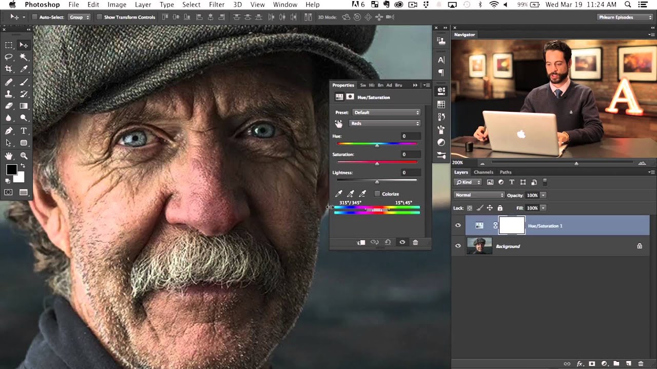
Red skin is one of those problems that clients almost never mention in the brief but always notice in the final image. Noses, cheeks, the skin just beneath the eyes – redness concentrates in exactly the places a viewer’s gaze lands first. I spent years treating it as a frequency separation problem, cloning and blending until the texture looked right, and the color still looked wrong. It wasn’t until I sat down with Watch the full tutorial on YouTube – Aaron Nace’s PHLEARN walkthrough on correcting red skin in Photoshop – that I realized I’d been solving the wrong problem entirely.
The technique Aaron demonstrates is built around a Hue/Saturation adjustment layer, but the real insight is how precisely you can isolate a specific shade of red before you ever touch a correction slider. Most of us know you can click “Reds” from the channel dropdown and nudge the hue. Fewer of us know how to narrow that selection down to, say, the particular red living in someone’s nose while leaving the warm tones in their cheeks completely untouched. That distinction is everything. A correction that’s even a few degrees too broad will leave skin looking desaturated and flat, which is the kind of edit that makes a client say the image looks “off” without being able to explain why.
Here’s how the whole process works, broken down so you can follow along in your own file.
Step 1: Add a Hue/Saturation Adjustment Layer
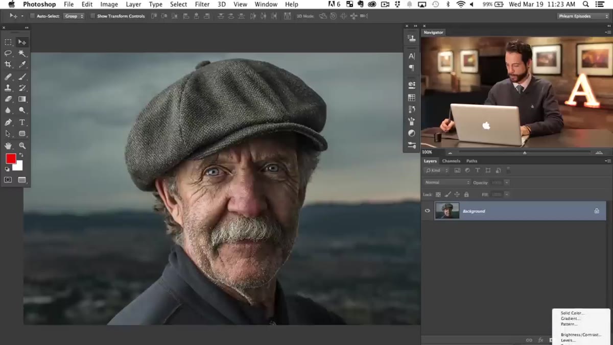 Hue Saturation adjustment layer panel open in Photoshop
Go to the Adjustments panel and add a Hue/Saturation layer. Don’t touch the Master channel. The moment you drag the Hue slider at the Master level, you shift every color in the image together, which is not what we’re after here. Keep the layer in its default state for now – we’ll do our targeting before any correction happens.
Hue Saturation adjustment layer panel open in Photoshop
Go to the Adjustments panel and add a Hue/Saturation layer. Don’t touch the Master channel. The moment you drag the Hue slider at the Master level, you shift every color in the image together, which is not what we’re after here. Keep the layer in its default state for now – we’ll do our targeting before any correction happens.
Step 2: Switch the Channel to Reds
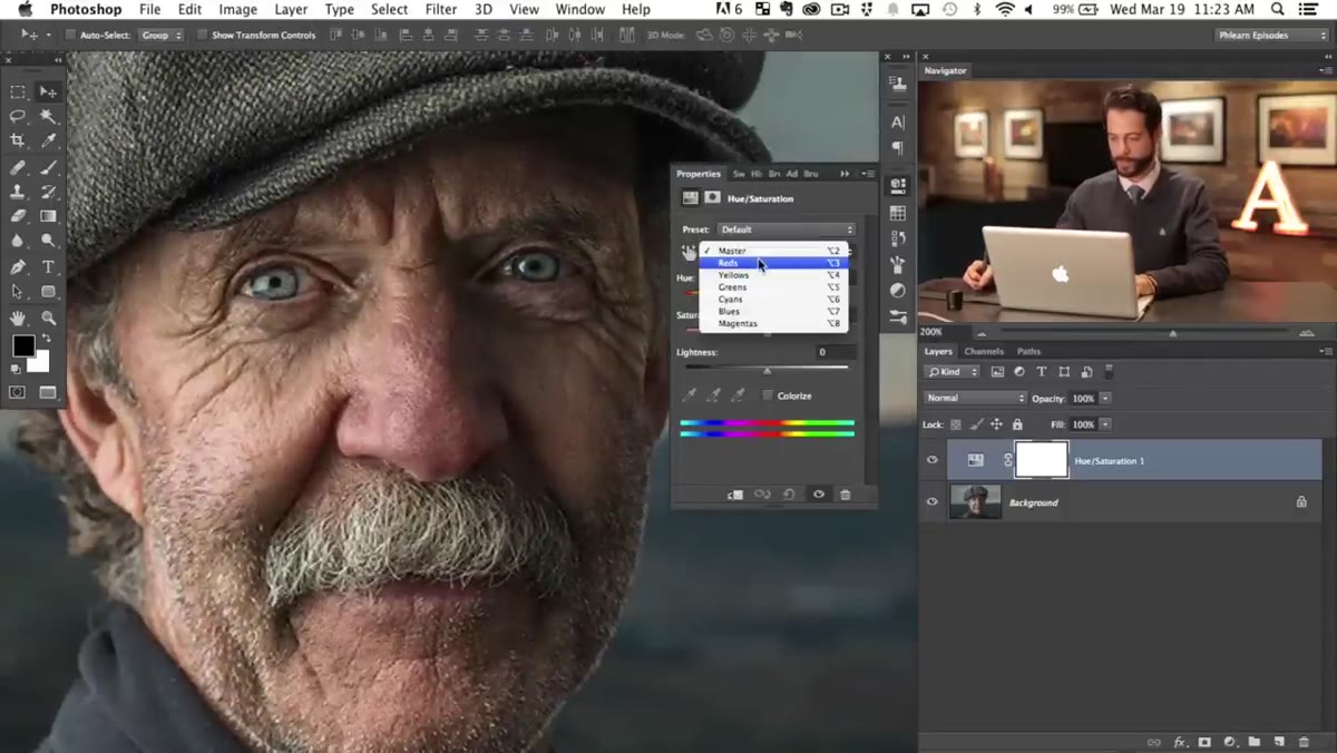 Channel dropdown showing Reds selected in Hue Saturation panel
Click the channel dropdown where it says “Master” and switch it to “Reds.” This is a reasonable starting point, but Aaron is clear that the generic Reds channel captures a wide range of red-adjacent hues. The specific red causing skin problems in a portrait is usually a narrower slice of that spectrum. Think of switching to Reds as opening the right drawer – you still have to find the exact file inside it.
Channel dropdown showing Reds selected in Hue Saturation panel
Click the channel dropdown where it says “Master” and switch it to “Reds.” This is a reasonable starting point, but Aaron is clear that the generic Reds channel captures a wide range of red-adjacent hues. The specific red causing skin problems in a portrait is usually a narrower slice of that spectrum. Think of switching to Reds as opening the right drawer – you still have to find the exact file inside it.
Step 3: Crank Saturation Way Up to See What You’re Targeting
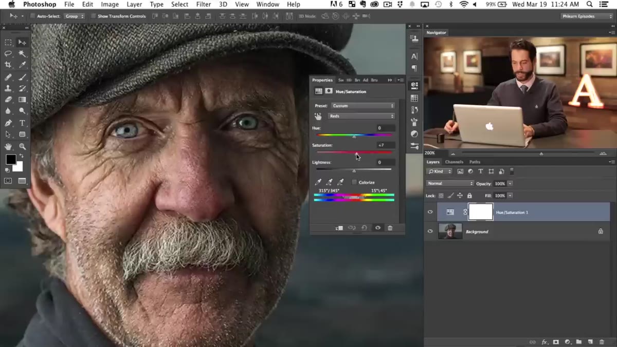 Saturation slider pushed high, showing affected red areas across the face
Here’s the move I wish someone had shown me years ago. Before correcting anything, drag the Saturation slider up dramatically – Aaron pushes it very high. This temporarily makes the image look alarming, but that’s the point. Any area that shifts to a supersaturated, almost neon version of itself is inside your current selection range. You’re using exaggerated saturation as a visual diagnostic tool, not as a correction. Once you can clearly see what’s being affected, you can sculpt the selection before you fix anything.
Saturation slider pushed high, showing affected red areas across the face
Here’s the move I wish someone had shown me years ago. Before correcting anything, drag the Saturation slider up dramatically – Aaron pushes it very high. This temporarily makes the image look alarming, but that’s the point. Any area that shifts to a supersaturated, almost neon version of itself is inside your current selection range. You’re using exaggerated saturation as a visual diagnostic tool, not as a correction. Once you can clearly see what’s being affected, you can sculpt the selection before you fix anything.
Step 4: Use the Color Range Sliders to Narrow the Selection
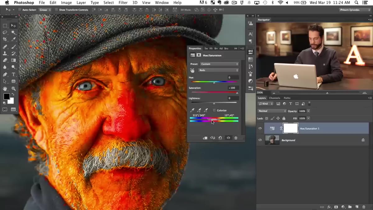 Color range bar at bottom of Hue Saturation panel with sliders being adjusted
At the bottom of the Hue/Saturation panel there’s a color bar with a set of slider handles. The outer handles control feathering – how gradually the selection fades at the edges. The inner handles define the core of the selection, the range of hues that are affected at full strength. Drag the inner handles closer together to shrink that core range. With the saturation still cranked, watch the image as you work. Areas that stop looking oversaturated have dropped out of the selection. Areas that stay vivid are still targeted. You want the nose and the problem zones lit up – and the rest of the face calm.
Color range bar at bottom of Hue Saturation panel with sliders being adjusted
At the bottom of the Hue/Saturation panel there’s a color bar with a set of slider handles. The outer handles control feathering – how gradually the selection fades at the edges. The inner handles define the core of the selection, the range of hues that are affected at full strength. Drag the inner handles closer together to shrink that core range. With the saturation still cranked, watch the image as you work. Areas that stop looking oversaturated have dropped out of the selection. Areas that stay vivid are still targeted. You want the nose and the problem zones lit up – and the rest of the face calm.
Step 5: Slide the Selection Range Left or Right to Lock Onto the Problem Color
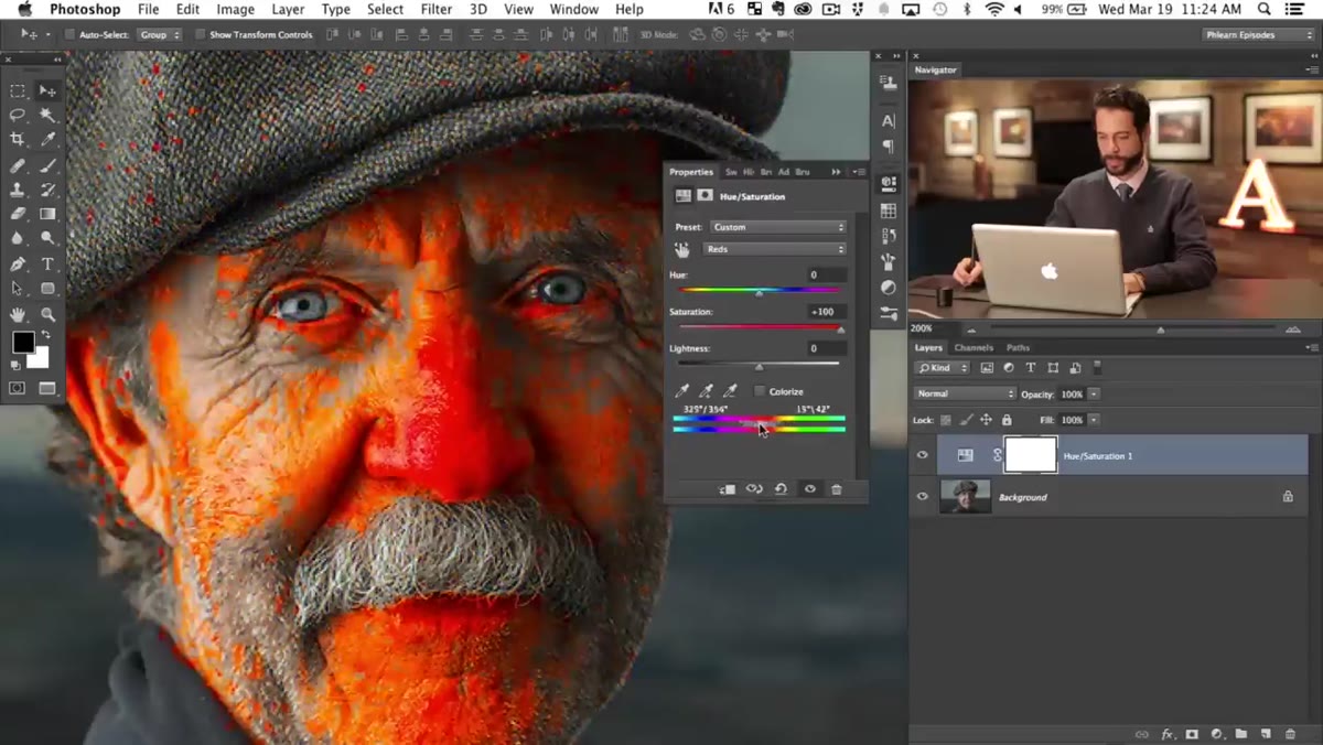 Color range selection being dragged left along the hue spectrum
Click in the middle of the color range bar and drag the entire selection band left or right along the spectrum. This repositions which exact hue you’re targeting without changing the width of the selection. Aaron slides his band to the left and watches as the affected area shifts – first catching colors around the mustache and beard areas, then settling on the specific red concentrated in the nose. This is the precision step. When the saturation preview shows only the area you want to fix lit up and nothing else, stop. You’ve isolated your problem.
Color range selection being dragged left along the hue spectrum
Click in the middle of the color range bar and drag the entire selection band left or right along the spectrum. This repositions which exact hue you’re targeting without changing the width of the selection. Aaron slides his band to the left and watches as the affected area shifts – first catching colors around the mustache and beard areas, then settling on the specific red concentrated in the nose. This is the precision step. When the saturation preview shows only the area you want to fix lit up and nothing else, stop. You’ve isolated your problem.
Step 6: Bring Saturation Back Down and Apply the Hue Correction
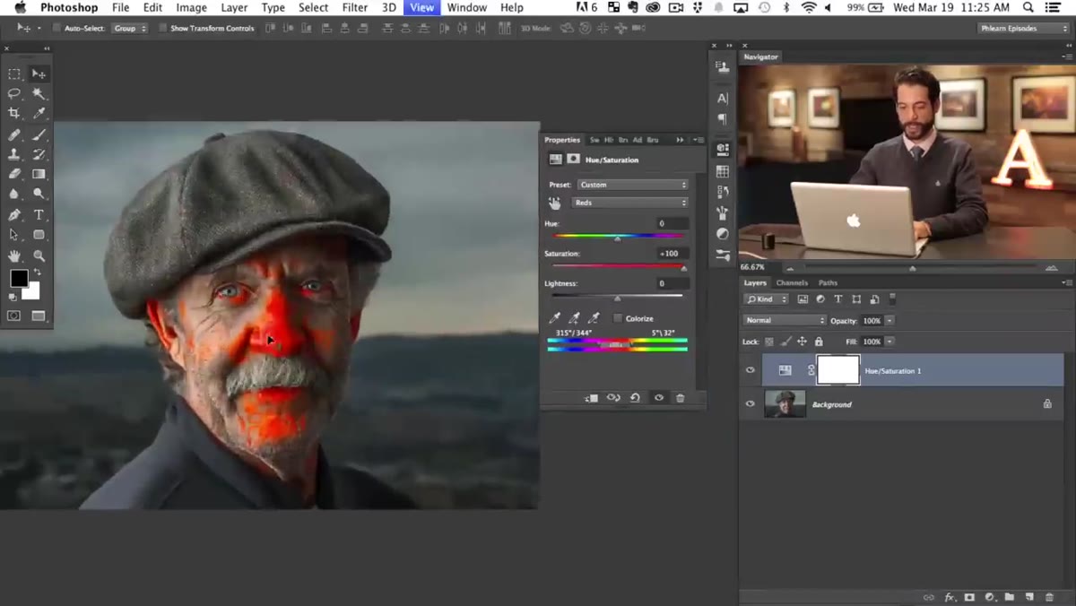 Saturation slider returned to normal, Hue slider being adjusted slightly
Reset the Saturation slider back to zero (or wherever it needs to sit for the image – usually zero or a slight negative). Now move the Hue slider in small increments. You’re not making a big dramatic shift here. A few degrees toward yellow or orange will typically neutralize a skin red without the area going muddy. Watch the nose or the target zone at full zoom. The color should move toward the surrounding skin tone rather than becoming a different problem color. Subtle is the goal.
Saturation slider returned to normal, Hue slider being adjusted slightly
Reset the Saturation slider back to zero (or wherever it needs to sit for the image – usually zero or a slight negative). Now move the Hue slider in small increments. You’re not making a big dramatic shift here. A few degrees toward yellow or orange will typically neutralize a skin red without the area going muddy. Watch the nose or the target zone at full zoom. The color should move toward the surrounding skin tone rather than becoming a different problem color. Subtle is the goal.
One Thing I’d Add: Use a Mask for Bleedover
The technique as described works beautifully for isolated areas like a nose. Where I’ve run into trouble is on images where the red is spread across large portions of the face – cheeks especially. Even with a tightly dialed selection, there are cases where desirable warm tones in adjacent skin start to cool off slightly.
My habit now is to paint the Hue/Saturation layer’s mask after I’ve built the selection. I fill the mask with black to hide the entire correction, then paint white only over the specific area I’m targeting, usually with a soft brush set to 40-50% opacity. This gives me pixel-level control over where the correction lands, independent of the color selection. The two systems – color range targeting and a painted mask – work together, and together they’re much more forgiving than either one alone. I named the action I built around this technique “The Godfather,” because it makes an offer the red tones can’t refuse.
The single most important thing Aaron’s tutorial teaches is that you don’t just select a color category. You isolate the specific instance of that color in your specific image, and you use saturation as a magnifying glass while you do it. Everything else in the technique follows from that one idea.
Watch the full tutorial on YouTube to see Aaron walk through the whole process in real time – seeing his hands on the sliders makes the color range bar much easier to understand than any written description can fully capture.
Comments (2)
Would love to see a follow-up going deeper into this topic.
The tip about how to kill red skin tones in was the missing piece for me. Thank you.
Leave a Comment