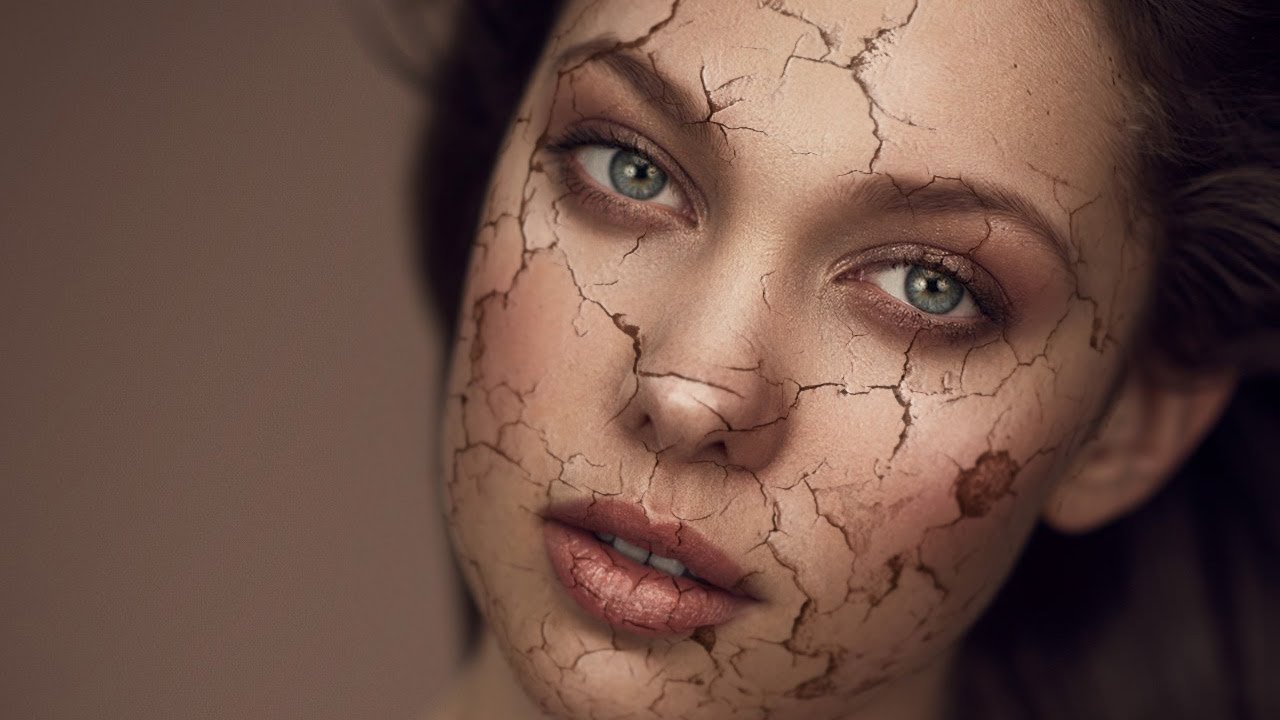
Most of my retouching work is about subtraction. Smooth this, soften that, remove the thing the client asked me to remove three times already. So when I first stumbled onto this technique, it genuinely stopped me mid-sip. A cracked paint texture mapped onto a portrait so convincingly that the skin looks like it’s splitting open and peeling away. It’s the opposite of everything I normally do, and I am completely here for it.
This is a breakdown of Aaron Nace’s tutorial over at PHLEARN, which walks through how to composite a cracked paint texture onto a portrait so it reads as part of the face rather than just sitting on top of it. Watch the full tutorial on YouTube if you want to follow along directly. This is Part 1 of a two-part series, and it covers the foundational work: getting the texture into the document, positioning it, and starting to shape it to the face. The special effects and final blending come in Part 2. Even on its own, this first part teaches a lot about how to think spatially when you’re combining textures with portraits.
One thing I want to say upfront: this isn’t a technique you’ll use on a mascara campaign. But understanding how to wrap and warp a flat texture so it conforms to a three-dimensional face? That transfers directly to all kinds of beauty work. It sharpens your instincts around Liquify, it builds your eye for how light hits curved surfaces, and it makes you a more confident compositor overall.
Step 1: Bring Both Images Into the Same Document
 Moving texture layer onto portrait using the Move tool
Start with your portrait and your cracked paint texture open as separate documents. Use the Move tool (V) to click and drag the texture directly from its window onto the portrait. This drops it in as a new layer above your subject. If you’re sourcing your own texture, look for images with deep, well-defined cracks and high contrast between the cracked areas and the base. Flat, low-contrast textures won’t read well once you start blending.
Moving texture layer onto portrait using the Move tool
Start with your portrait and your cracked paint texture open as separate documents. Use the Move tool (V) to click and drag the texture directly from its window onto the portrait. This drops it in as a new layer above your subject. If you’re sourcing your own texture, look for images with deep, well-defined cracks and high contrast between the cracked areas and the base. Flat, low-contrast textures won’t read well once you start blending.
At this stage, don’t worry about scale or position. Just get both layers into the same document so you can start working.
Step 2: Lower Opacity to See What You’re Working With
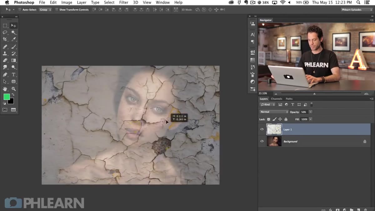 Texture layer at 50% opacity over the portrait
Before you transform anything, drop the texture layer’s opacity to around 50% so you can see both layers simultaneously. With the Move tool active, just tap the number 5 on your keyboard and Photoshop will set it to exactly 50%. This is one of those small workflow habits that saves you a lot of guessing. When you can see the face underneath while you’re positioning, you make much better decisions about where the cracks should fall.
Texture layer at 50% opacity over the portrait
Before you transform anything, drop the texture layer’s opacity to around 50% so you can see both layers simultaneously. With the Move tool active, just tap the number 5 on your keyboard and Photoshop will set it to exactly 50%. This is one of those small workflow habits that saves you a lot of guessing. When you can see the face underneath while you’re positioning, you make much better decisions about where the cracks should fall.
Think about what you want to emphasize. Do you want the largest crack running down the center of the face? Along the jaw? Avoiding the eyes entirely? These are creative decisions you need to make before you lock in the transform.
Step 3: Scale, Rotate, and Position the Texture with Free Transform
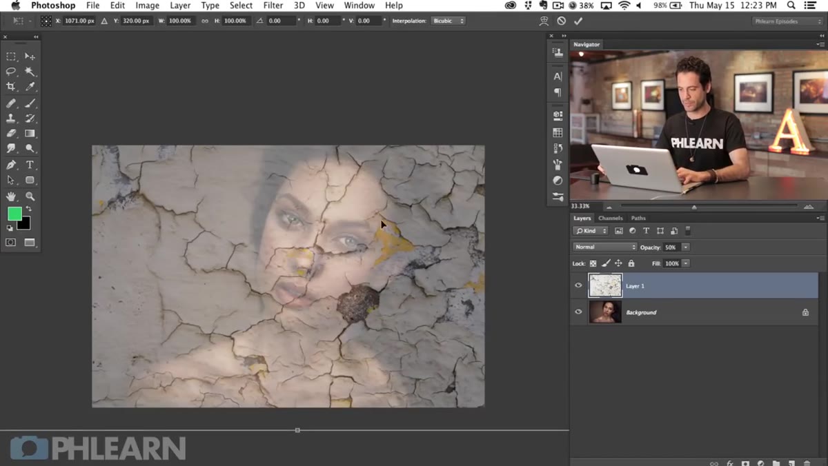 Free Transform bounding box around texture layer
Hit Command-T (Ctrl-T on Windows) to enter Free Transform. Click the chain link icon in the options bar to constrain proportions, then drag a corner handle to scale the texture up or down. Don’t just scale uniformly and call it done. Try rotating the texture a few degrees, or right-click inside the bounding box and choose Flip Horizontal to mirror it entirely. Sometimes flipping alone changes which cracks become focal points and opens up more interesting compositions.
Free Transform bounding box around texture layer
Hit Command-T (Ctrl-T on Windows) to enter Free Transform. Click the chain link icon in the options bar to constrain proportions, then drag a corner handle to scale the texture up or down. Don’t just scale uniformly and call it done. Try rotating the texture a few degrees, or right-click inside the bounding box and choose Flip Horizontal to mirror it entirely. Sometimes flipping alone changes which cracks become focal points and opens up more interesting compositions.
The goal here is to position the texture so the most visually interesting cracks land on the most expressive parts of the face, without the effect feeling too busy around the eyes and brows. Hit Enter when you’re happy with the rough position.
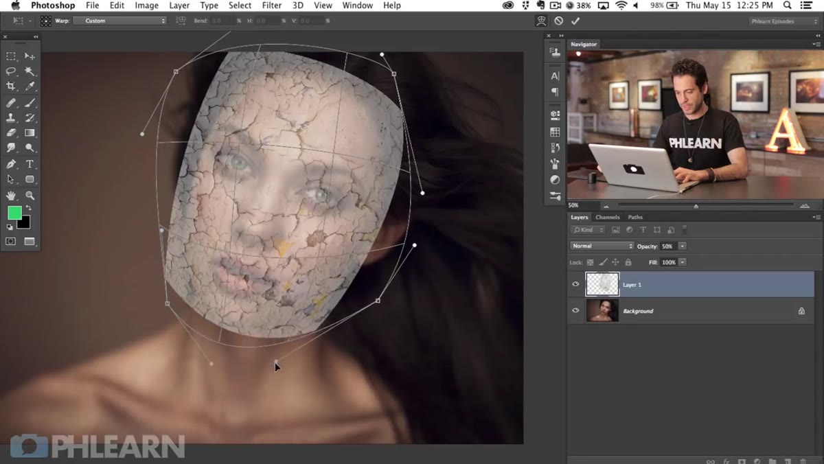
Step 4: Warp the Texture to Start Conforming It to the Face
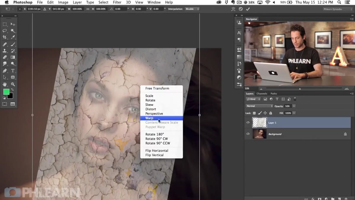 Warp grid active with corner points being pulled inward
Here’s where the work gets interesting. Re-enter Free Transform with Command-T, then right-click and choose Warp from the context menu. You’ll see a grid appear over the texture with control handles at the corners and along the edges. Pull the corners inward so the texture starts to curve, mimicking how a flat surface would wrap around a rounded face.
Warp grid active with corner points being pulled inward
Here’s where the work gets interesting. Re-enter Free Transform with Command-T, then right-click and choose Warp from the context menu. You’ll see a grid appear over the texture with control handles at the corners and along the edges. Pull the corners inward so the texture starts to curve, mimicking how a flat surface would wrap around a rounded face.
This step is less about precision and more about intuition. A face is a sphere-adjacent shape, so you want the edges of the texture to bend toward the viewer rather than lying flat. Use the anchor points along the grid lines to refine the curve further, pushing and pulling until the texture feels like it has some volume to it. You won’t get it perfect here, because Liquify is going to handle the fine-tuning in the next stage. Think of Warp as roughing in the three-dimensional form.
Step 5: Use Liquify to Fit the Texture to the Face’s Contours
 Liquify tool interface opened with texture layer active
Once the warp feels directionally correct, apply the transform and then go to Filter > Liquify. This is where the texture really starts to feel like it belongs on a face instead of a wall. Use the Forward Warp tool inside Liquify to nudge the cracked edges so they follow the specific curves of the nose, cheekbones, and brow ridge.
Liquify tool interface opened with texture layer active
Once the warp feels directionally correct, apply the transform and then go to Filter > Liquify. This is where the texture really starts to feel like it belongs on a face instead of a wall. Use the Forward Warp tool inside Liquify to nudge the cracked edges so they follow the specific curves of the nose, cheekbones, and brow ridge.
Work with a large, soft brush and apply gentle pressure. You’re not pushing pixels dramatically, you’re coaxing the texture to agree with the underlying anatomy. Pay particular attention to areas where the face changes direction sharply, like the sides of the nose and the curve of the forehead. Those are the spots where a flat texture reveals itself most obviously. Subtle adjustments here do the heavy lifting for realism.
A Note From My Own Practice
I want to add one thing Aaron doesn’t get into until Part 2, but that I’d encourage you to think about from the start: pay attention to the light direction in both images before you commit to a position.
The portrait you’re working with has its own light source. The cracked paint texture has its own light source. When those two don’t roughly agree, the composite will always feel slightly off, even if the viewer can’t articulate why. Before I finalize any texture position, I do a quick check: where is the light coming from in each image, and do the highlights on the cracks roughly match the highlights on the skin? If the skin is lit from the left but the cracks are catching light from the right, Liquify alone won’t fix that disconnect. You may need to flip the texture, or adjust it in a later step using dodge and burn to manually re-light the texture edges. Worth catching early.
The single most important thing this tutorial reinforced for me is that good compositing is really just good spatial reasoning. Getting a flat image to feel like it exists on a curved surface takes patience with Warp and Liquify, a clear understanding of where the light lives in each image, and the willingness to spend time on adjustments that feel small but matter enormously to the final read.
Watch the full tutorial on YouTube to see Aaron walk through every step in real time, and keep an eye out for Part 2, where the blending and special effects work really brings the whole effect to life.
Comments
Leave a Comment