One of the most exhausting parts of client work isn’t the shoot itself. It’s the revision spiral. You deliver a gallery, the client says something feels “off” about the color, and suddenly you’re on round three trying to decode feedback like “can you make it warmer but not too orange?” I spent years treating this as a communication problem. Turns out, a big chunk of it is actually a workflow problem, and your iPhone’s built-in editing tools might already have a fix.
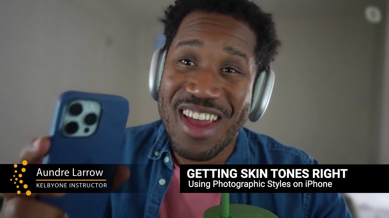
In this KelbyOne tutorial, photographer Aundre Larrow walks through Apple’s Photographic Styles feature as a practical solution for getting skin tones right, and for getting clients aligned with you before you ever open a desktop editor. Watch the full tutorial on YouTube. What I love about his approach is that it reframes Photographic Styles not as a filter toy but as a communication bridge between you and your subject. That’s a perspective shift worth sitting with.
The technique is designed for iPhones, but the thinking behind it translates across any editing context: show your client early, show them something concrete, and let them participate in the decision. When clients can point to a specific look on their own screen, “it’s not warm enough” becomes a starting point rather than a dead end.
Step 1: Open the Edit Panel and Navigate to Styles
 Edit panel open, styles option visible at bottom of screen
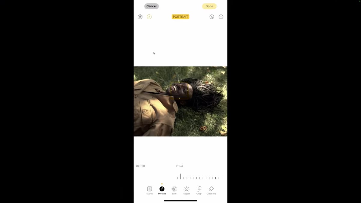
Open any portrait photo in your iPhone’s Photos app and tap Edit in the upper right corner. Along the bottom of the edit interface, you’ll see a row of tools: Clean Up, Crop, Adjust, Live, and Styles. Tap Styles. This is your starting point for everything that follows.
Edit panel open, styles option visible at bottom of screen
Open any portrait photo in your iPhone’s Photos app and tap Edit in the upper right corner. Along the bottom of the edit interface, you’ll see a row of tools: Clean Up, Crop, Adjust, Live, and Styles. Tap Styles. This is your starting point for everything that follows.
Once you’re inside the Styles panel, notice that it operates differently from the simple filter row you might expect. There are two directions to scroll. Swiping left moves you toward undertone adjustments. Swiping right takes you into Moods, which are closer to traditional filters. For skin tone work, you almost always want to be working on the left side.
Step 2: Understand the Difference Between Styles and Moods
 Side-by-side style vs mood effect on skin tone visible
Larrow makes a point of demonstrating both Moods and Photographic Styles back to back so the difference is obvious, and it’s worth doing this on your own photos before a session so it’s clear in your head. Moods apply sweeping changes across the entire image, and skin tones shift dramatically with each one. They’re not necessarily terrible, but they’re blunt instruments.
Side-by-side style vs mood effect on skin tone visible
Larrow makes a point of demonstrating both Moods and Photographic Styles back to back so the difference is obvious, and it’s worth doing this on your own photos before a session so it’s clear in your head. Moods apply sweeping changes across the entire image, and skin tones shift dramatically with each one. They’re not necessarily terrible, but they’re blunt instruments.
Photographic Styles are more targeted. As you scroll through the options, the subject’s skin isn’t lurching from warm to cool the way it does under Moods. Instead, you’re seeing refined adjustments to color highlights and undertones. The rest of the image shifts subtly, but the skin reading stays grounded. That precision is exactly what makes this useful for client-facing editing.
Step 3: Learn the Tone and Color Axes
 X and Y axis grid visible, numbers changing in top corner
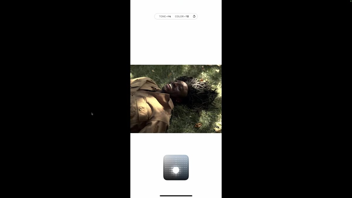
Each Photographic Style uses a two-axis grid to let you customize the look. Think of it as an X and Y system: the horizontal axis controls color intensity (more or less color), and the vertical axis controls tone (darker shadows versus lifted lights). The numbers in the top corner of the screen update in real time as you drag your finger around, so you always know exactly where you are.
X and Y axis grid visible, numbers changing in top corner
Each Photographic Style uses a two-axis grid to let you customize the look. Think of it as an X and Y system: the horizontal axis controls color intensity (more or less color), and the vertical axis controls tone (darker shadows versus lifted lights). The numbers in the top corner of the screen update in real time as you drag your finger around, so you always know exactly where you are.
This is the part of the tool that most people miss completely. They pick a style and leave it at the default, but the real power is in dragging that point around the grid to dial in exactly the warmth and brightness combination that works for your subject’s skin. A value like negative 11 Tone, positive 15 Color means something specific and repeatable, which is a game-changer for consistency across a shoot.
Step 4: Explore the Five Base Style Options
 Style names visible: Amber, Gold, Rose Gold, Neutral, Cool Rose
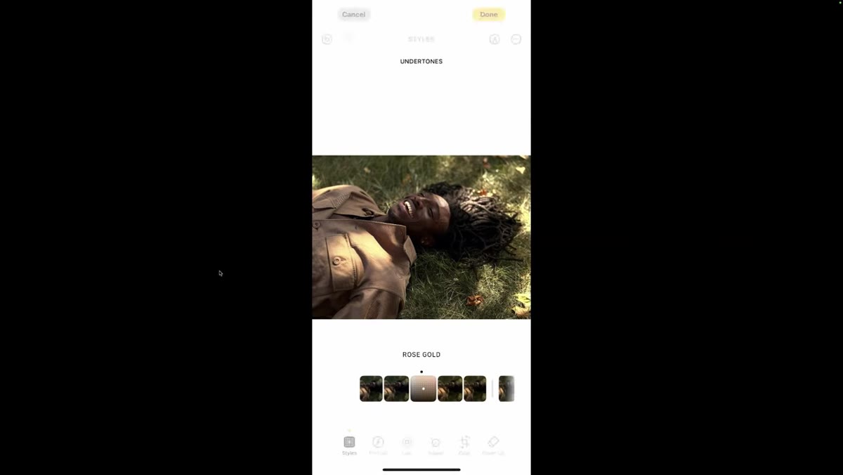
The five base Photographic Styles are Amber, Gold, Rose Gold, Neutral, and Cool Rose. Each one starts from a different undertone foundation. Amber and Gold lean warm and yellow-adjacent, which tends to be flattering for deeper and olive skin tones. Rose Gold and Cool Rose introduce pink and cooler elements, which can work beautifully for fair or pink-leaning complexions. Neutral lives in the middle and is often a good starting point if you’re unsure.
Style names visible: Amber, Gold, Rose Gold, Neutral, Cool Rose
The five base Photographic Styles are Amber, Gold, Rose Gold, Neutral, and Cool Rose. Each one starts from a different undertone foundation. Amber and Gold lean warm and yellow-adjacent, which tends to be flattering for deeper and olive skin tones. Rose Gold and Cool Rose introduce pink and cooler elements, which can work beautifully for fair or pink-leaning complexions. Neutral lives in the middle and is often a good starting point if you’re unsure.
Spend a few minutes toggling through all five on a test portrait before committing to one. What you’re looking for is which base style requires the least dramatic axis adjustment to land somewhere that reads true for that subject’s skin. The less you have to push the tone and color sliders to compensate, the more stable your result will be.
Step 5: Adjust Intensity to Control the Overall Effect
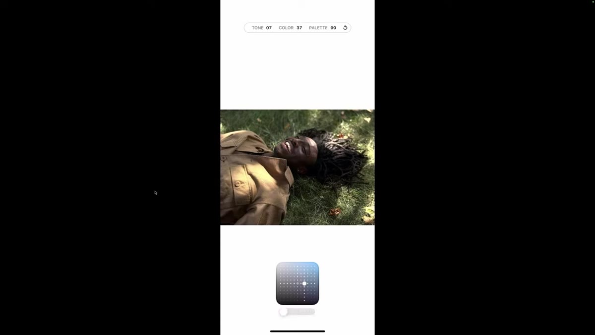 Intensity slider at bottom of screen being dragged
Below the style grid, there’s a separate intensity slider. Dragging it down softens the effect back toward the original image. Dragging it up pushes the style harder. This slider is your safety net. If a client loves the direction of a style but thinks it feels too processed, bring the intensity down rather than scrapping the style entirely.
Intensity slider at bottom of screen being dragged
Below the style grid, there’s a separate intensity slider. Dragging it down softens the effect back toward the original image. Dragging it up pushes the style harder. This slider is your safety net. If a client loves the direction of a style but thinks it feels too processed, bring the intensity down rather than scrapping the style entirely.
In practice, I’ve found that sitting somewhere between 60 and 80 percent intensity often gives you the look without the “this has clearly been edited” quality that some clients react to. Your mileage will vary by style and subject, but don’t skip this step before you show anything to a client.
Step 6: Set a Style in Camera Before the Shoot
 Camera app open in selfie mode with style applied pre-capture
Here’s the feature most photographers overlook entirely. You can apply a Photographic Style inside the Camera app before you ever take a shot. Larrow demonstrates this using the front-facing camera, essentially letting the subject preview styles on their own face in real time before the session starts.
Camera app open in selfie mode with style applied pre-capture
Here’s the feature most photographers overlook entirely. You can apply a Photographic Style inside the Camera app before you ever take a shot. Larrow demonstrates this using the front-facing camera, essentially letting the subject preview styles on their own face in real time before the session starts.
The practical application is significant. At the beginning of a portrait session, hand your client the phone in selfie mode with Styles open. Let them drag through the options themselves. When they land on something that makes them say “yes, that’s how I want to look,” you have a concrete reference point. You’ve eliminated a full round of revision before you’ve taken a single frame.
A Note From My Own Workflow
I started using this technique specifically for editorial clients who are particular about how their skin reads under different color treatments. What surprised me was how often the conversation shifted from reactive (“I don’t love that edit”) to collaborative (“I actually like this style as a starting point, can we get closer to this in the final?”). The tool gives clients a vocabulary they didn’t have before, and that vocabulary saves everyone time.
One caveat worth naming: Photographic Styles are baked into the capture on newer iPhones, which means if you’re shooting in standard JPEG mode with a style applied, you can’t fully reverse it in post the way you can with a RAW file. If you’re planning to do heavy retouching work afterward, either shoot in ProRAW or use the styles purely as a reference and communication tool rather than a capture setting.
The single most important thing Aundre Larrow demonstrates in this tutorial is that getting skin tones right is partly a technical problem and partly a communication problem, and Photographic Styles addresses both at once. Give your clients something to react to early, let them participate in the direction, and you’ll spend less time guessing and more time doing the actual work.
Watch the full tutorial on YouTube to see Larrow’s demonstrations in motion, especially the side-by-side Styles versus Moods comparison, which is clearer in video than any description I can write.
Comments
Leave a Comment