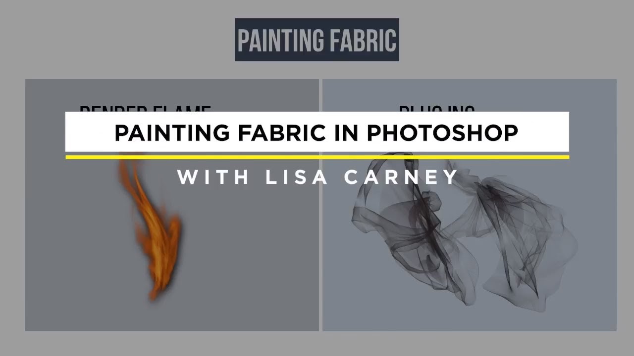
There’s a specific kind of panic that sets in when a client sends you an image and says, “We love everything except… can you do something about the top?” Early in my retouching career, “do something” meant cloning, healing, and praying. The results were usually unconvincing at best. What I’ve since learned is that sometimes the most elegant solution isn’t to fix what’s there. It’s to replace it entirely with something that looks completely intentional. That shift in thinking is exactly what this technique is about.
In this Watch the full tutorial on YouTube session from CreativeLive, the instructor walks through a real-world project, a children’s book called “Last Night I Swam with a Mermaid” featuring underwater photography by Michael Muller, where the creative team needed to add fabric coverage to an image. The solution was Photoshop’s Render Flame filter, used not as a special-effects novelty, but as a genuine fabric-painting tool. Once I saw this, I couldn’t unsee it. The logic is sound: flame renders are organic, they flow, they have variation and texture, and with the right color treatment they read convincingly as gauzy, flowing fabric.
This is the kind of technique the instructor calls “thinking outside the box,” and I’d agree, but I’d add that once you’ve done it a few times it stops feeling like a trick and starts feeling like a legitimate part of your toolkit. Here’s how to do it.
Step 1: Set Up a New Layer Before You Do Anything Else
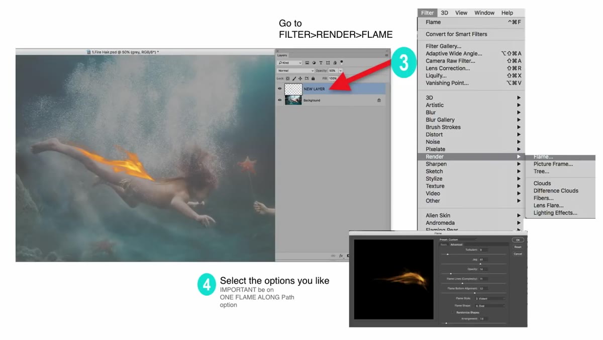 New blank layer created above subject layer in Layers panel
Do not do this on a flattened image or directly on your subject layer. Create a new empty layer above your subject and name it something useful, “flame-fabric-01” works fine, because you will generate several versions before you land on the one you want. The whole technique depends on being able to recolor, blend, and mask the flame renders independently, and none of that is possible if you’ve committed them to the wrong layer. Consider this the non-negotiable first move.
New blank layer created above subject layer in Layers panel
Do not do this on a flattened image or directly on your subject layer. Create a new empty layer above your subject and name it something useful, “flame-fabric-01” works fine, because you will generate several versions before you land on the one you want. The whole technique depends on being able to recolor, blend, and mask the flame renders independently, and none of that is possible if you’ve committed them to the wrong layer. Consider this the non-negotiable first move.
Step 2: Draw a Path with the Pen Tool Along the Coverage Area
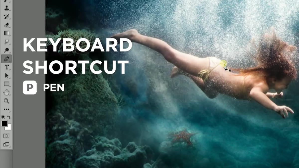 Pen tool active, path being drawn top-to-bottom over subject
Switch to the Pen tool and draw a path along the area where you want the fabric to appear. The direction matters here: start from the top and draw downward. This tells the Render Flame filter which way the flame should flow, and since you want fabric that drapes naturally, top-to-bottom is almost always the right call. The instructor is refreshingly direct about precision here: don’t overthink the path shape. The flame render is forgiving, and you’re going to run this filter many times anyway. A rough path drawn in ten seconds will give you something workable to react to, which is more useful than a perfect path that took five minutes.
Pen tool active, path being drawn top-to-bottom over subject
Switch to the Pen tool and draw a path along the area where you want the fabric to appear. The direction matters here: start from the top and draw downward. This tells the Render Flame filter which way the flame should flow, and since you want fabric that drapes naturally, top-to-bottom is almost always the right call. The instructor is refreshingly direct about precision here: don’t overthink the path shape. The flame render is forgiving, and you’re going to run this filter many times anyway. A rough path drawn in ten seconds will give you something workable to react to, which is more useful than a perfect path that took five minutes.
Step 3: Run Filter, Render, Flame on the Path
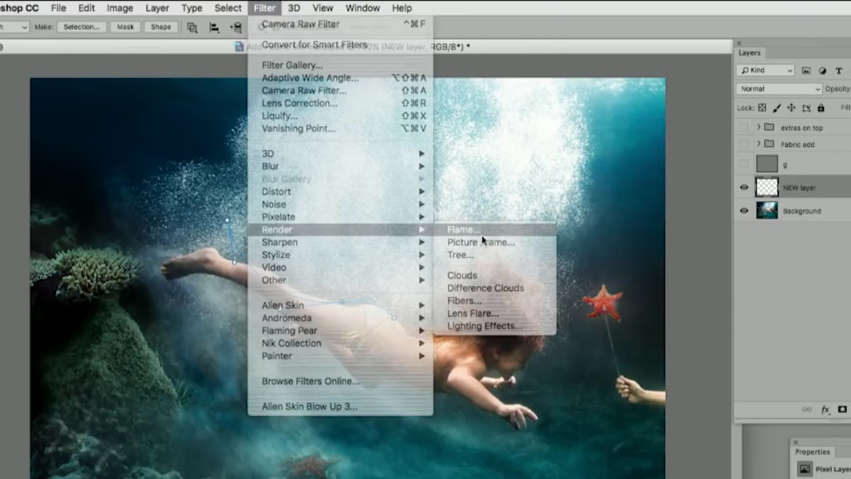 Filter menu open with Render submenu and Flame option highlighted
With your new layer selected and your path active, go to Filter, then Render, then Flame. In the dialog, the first setting to check is the flame type. You want “One Along Path,” which distributes the flame along the entire length of the path rather than clustering it at a point. From there, adjust the width slider. The instructor notes that you’ll likely want to pull this value higher than the default to get coverage that reads as fabric rather than as a literal flame. Don’t lock in anything yet.
Filter menu open with Render submenu and Flame option highlighted
With your new layer selected and your path active, go to Filter, then Render, then Flame. In the dialog, the first setting to check is the flame type. You want “One Along Path,” which distributes the flame along the entire length of the path rather than clustering it at a point. From there, adjust the width slider. The instructor notes that you’ll likely want to pull this value higher than the default to get coverage that reads as fabric rather than as a literal flame. Don’t lock in anything yet.
Step 4: Explore the Advanced Settings to Add Organic Variation
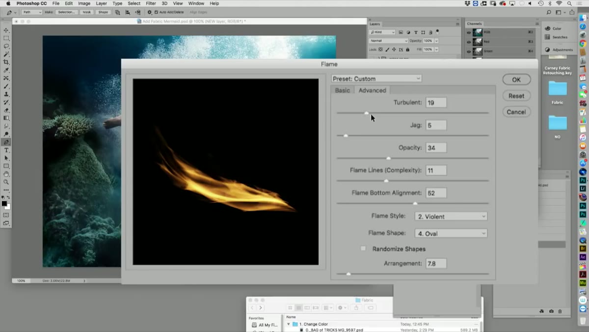 Advanced tab open in Render Flame dialog showing turbulence controls
Click into the Advanced tab inside the Flame dialog. This is where the render starts to look less like fire and more like something that could be textile. The turbulence and complexity controls let you introduce the kind of irregular, organic movement that makes flowing fabric believable. Small adjustments here make a visible difference: a little turbulence creates soft ripples, more creates dramatic movement. The instructor describes this as making it “more chaotic,” and that’s accurate, but chaotic in a natural, fabric-like way rather than a harsh one. Run the filter, evaluate the result, undo, adjust, and run it again. Expect to do this many times.
Advanced tab open in Render Flame dialog showing turbulence controls
Click into the Advanced tab inside the Flame dialog. This is where the render starts to look less like fire and more like something that could be textile. The turbulence and complexity controls let you introduce the kind of irregular, organic movement that makes flowing fabric believable. Small adjustments here make a visible difference: a little turbulence creates soft ripples, more creates dramatic movement. The instructor describes this as making it “more chaotic,” and that’s accurate, but chaotic in a natural, fabric-like way rather than a harsh one. Run the filter, evaluate the result, undo, adjust, and run it again. Expect to do this many times.
Step 5: Colorize the Flame Layer to Match Your Vision
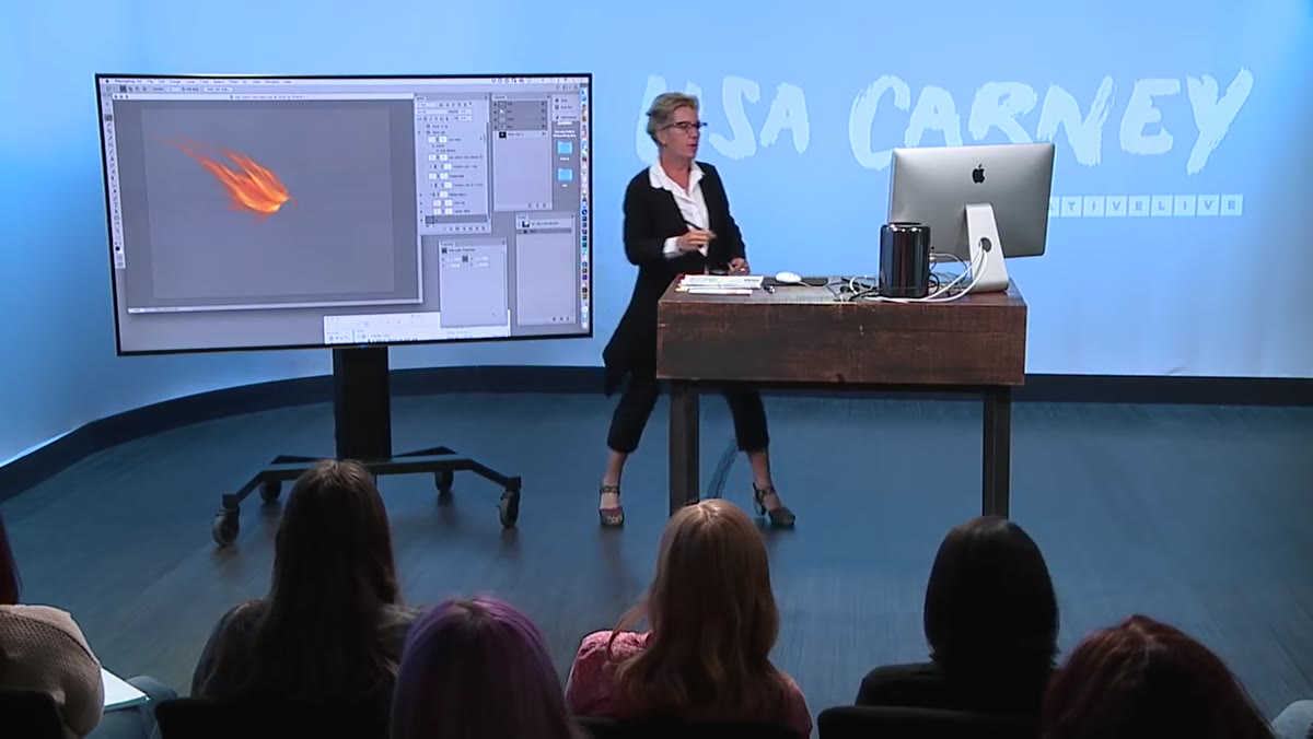 Hue/Saturation adjustment layer clipped to flame layer in panel
Once you have a flame render you’re reasonably happy with, the next step is color. A Hue/Saturation adjustment layer clipped to your flame layer is a clean way to do this, since it stays non-destructive and you can revisit it when the client inevitably asks for the fabric to be “a little more teal.” The instructor points out that color-shifting rendered flames is straightforward, partly because the underlying luminosity and texture do most of the heavy lifting. Whether you’re going for warm golden silk, cool blue chiffon, or something more dramatic, the adjustment layer approach gives you the flexibility to iterate quickly.
Hue/Saturation adjustment layer clipped to flame layer in panel
Once you have a flame render you’re reasonably happy with, the next step is color. A Hue/Saturation adjustment layer clipped to your flame layer is a clean way to do this, since it stays non-destructive and you can revisit it when the client inevitably asks for the fabric to be “a little more teal.” The instructor points out that color-shifting rendered flames is straightforward, partly because the underlying luminosity and texture do most of the heavy lifting. Whether you’re going for warm golden silk, cool blue chiffon, or something more dramatic, the adjustment layer approach gives you the flexibility to iterate quickly.
Step 6: Build Depth by Layering Multiple Renders
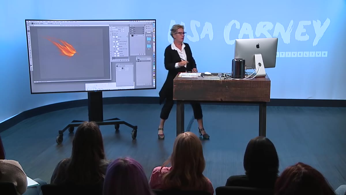 Multiple flame layers stacked in Layers panel with blend modes visible
One flame render is a starting point, not a finished result. The instructor’s workflow involves generating several flame layers at different sizes or path angles, colorizing them individually, and stacking them with adjusted opacity or blend modes. You can add a slightly darker render on top to suggest shadow and depth, and a lighter or more transparent one beneath to create a soft base. Think of it the way you’d think about painting fabric in the traditional sense: no single brushstroke makes the piece, the layering does. This is also the stage where you’d paint back in any design elements the flame covers, like a waistband or trim detail, using a small brush on a new layer above everything.
Multiple flame layers stacked in Layers panel with blend modes visible
One flame render is a starting point, not a finished result. The instructor’s workflow involves generating several flame layers at different sizes or path angles, colorizing them individually, and stacking them with adjusted opacity or blend modes. You can add a slightly darker render on top to suggest shadow and depth, and a lighter or more transparent one beneath to create a soft base. Think of it the way you’d think about painting fabric in the traditional sense: no single brushstroke makes the piece, the layering does. This is also the stage where you’d paint back in any design elements the flame covers, like a waistband or trim detail, using a small brush on a new layer above everything.
A Note from My Own Practice: Masking Is Where This Technique Lives or Dies
The tutorial covers the flame generation and colorization thoroughly, but in my own work, I’ve found that the masking stage is what separates a convincing fabric effect from an obvious composite. After building up my flame layers, I spend real time refining the mask edges so the fabric blends naturally into the subject’s skin and body. A hard mask edge will immediately read as digital. I use a low-opacity brush and work the edges gradually, and I frequently toggle the mask visibility to check my work. If you’ve come this far in the technique and the result still looks off, the mask is almost certainly where to look first.
The core lesson here is simple but easy to miss: the Render Flame filter was built for fire, but Photoshop tools don’t care what they were “meant” for. What matters is what you can make them do. Using flame renders as flowing fabric is a genuine creative problem-solving approach, one that produces results you could not easily achieve with cloning or healing tools alone.
Watch the full tutorial on YouTube to see the complete workflow in action, including how the final image comes together with bubbles and finishing details that push the composite into something that looks genuinely intentional.
Comments
Leave a Comment