
There’s a particular kind of client feedback that stays with you. Mine came early in my retouching career, when someone looked at a set of beauty portraits I’d delivered and described the skin as “plastic-looking.” She wasn’t wrong. I’d been over-smoothing, obliterating texture, and chasing a version of perfection that looked nothing like a real human face. That comment sent me down a long road of studying how working professionals actually approach skin and color, and it’s why I keep coming back to tutorials from photographers who shoot beauty and fashion at a high level.
In this Jessica Kobeissi tutorial, she walks through her personal retouch and color editing process for portrait photography. Jessica is known for her clean, luminous work, and what I appreciate about her approach is that it prioritizes skin that looks alive, not airbrushed into oblivion. Watch the full tutorial on YouTube and follow along with the breakdown below. I’ve added notes from my own freelance work where her techniques connect to problems I’ve solved the same way, or differently.
The workflow moves through several distinct phases: base corrections, skin retouching, and then color work to bring the image into its final mood. Each phase builds on the last, which is why skipping ahead tends to create problems you have to walk back anyway.
Step 1: Assess the Image Before You Touch Anything
 Tutorial opening frame showing unedited portrait
Before opening a single panel, spend sixty seconds reading the image. What is the light doing? Where is the skin uneven in tone versus texture? Are the color casts in the shadows warm or cool? This assessment shapes every decision that follows. I keep a physical notepad next to my keyboard for exactly this, jotting down the two or three things I want to fix before I start clicking. It sounds old-fashioned, but it stops me from solving problems the image doesn’t actually have.
Tutorial opening frame showing unedited portrait
Before opening a single panel, spend sixty seconds reading the image. What is the light doing? Where is the skin uneven in tone versus texture? Are the color casts in the shadows warm or cool? This assessment shapes every decision that follows. I keep a physical notepad next to my keyboard for exactly this, jotting down the two or three things I want to fix before I start clicking. It sounds old-fashioned, but it stops me from solving problems the image doesn’t actually have.
Jessica’s workflow reflects this kind of intentionality. She’s not applying a preset and calling it done. The editing has a logic to it, and that logic starts with understanding what the photograph already does well.
Step 2: Establish Base Exposure and Tone
 Initial exposure and tone adjustments in editing panel
Start with your global corrections: exposure, highlights, shadows, and whites. The goal here is not to make the image look finished. The goal is to get the tonal range into a workable place so that your skin retouching happens on a well-lit face, not a muddy or blown-out one. Push highlights down enough to recover detail in bright skin areas, and lift shadows just enough to open up depth without flattening contrast.
Initial exposure and tone adjustments in editing panel
Start with your global corrections: exposure, highlights, shadows, and whites. The goal here is not to make the image look finished. The goal is to get the tonal range into a workable place so that your skin retouching happens on a well-lit face, not a muddy or blown-out one. Push highlights down enough to recover detail in bright skin areas, and lift shadows just enough to open up depth without flattening contrast.
One thing I’ve learned from working on beauty campaigns: err on the side of slightly underexposed at this stage. It’s much easier to add luminosity back in a targeted way later than to claw back detail you’ve already blown out. Think of this step as setting the table, not serving the meal.
Step 3: Correct Color Balance and Remove Unwanted Casts
 Color temperature and tint sliders being adjusted
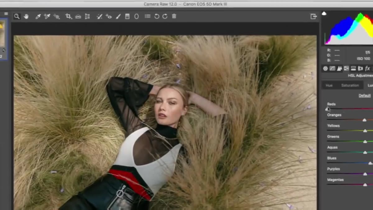
Skin tones are unforgiving of color casts. A slight green or magenta shift that would be invisible in a landscape will look immediately wrong on a face. Use your white balance sliders to neutralize the overall cast first, then use the HSL panel or a selective color tool to fine-tune specific hue ranges. Pay close attention to the reds and oranges, which control most Caucasian and medium skin tones, and the yellows, which affect warmth without shifting into orange territory.
Color temperature and tint sliders being adjusted
Skin tones are unforgiving of color casts. A slight green or magenta shift that would be invisible in a landscape will look immediately wrong on a face. Use your white balance sliders to neutralize the overall cast first, then use the HSL panel or a selective color tool to fine-tune specific hue ranges. Pay close attention to the reds and oranges, which control most Caucasian and medium skin tones, and the yellows, which affect warmth without shifting into orange territory.
I often use a grey card reference shot from the same session to set a neutral baseline, then drift the white balance slightly warmer or cooler depending on the mood we’re after. It gives me an objective starting point instead of guessing.
Step 4: Address Skin Texture and Blemish Cleanup
 Close-up skin retouching with healing or clone tools
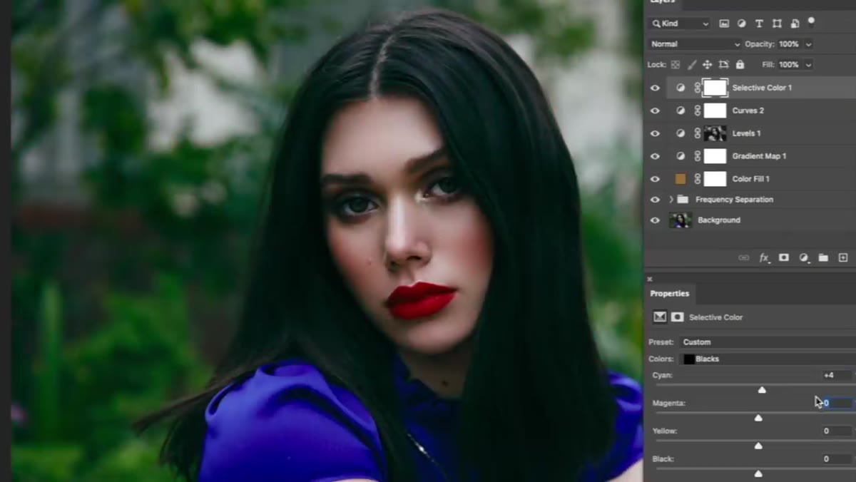
This is the step where most retouchers either save or ruin an image. The instinct is to smooth everything, but what we actually want is to remove temporary distractions while keeping the underlying texture intact. Blemishes, redness, and visible stray hairs fall into the “remove” category. Pores, fine skin texture, and natural shadows under the eyes do not.
Close-up skin retouching with healing or clone tools
This is the step where most retouchers either save or ruin an image. The instinct is to smooth everything, but what we actually want is to remove temporary distractions while keeping the underlying texture intact. Blemishes, redness, and visible stray hairs fall into the “remove” category. Pores, fine skin texture, and natural shadows under the eyes do not.
Use a healing brush set to a low opacity for areas of general redness, and switch to a clone stamp or spot healing tool for distinct blemishes. Work at 100% zoom and take frequent breaks to zoom back out to 25% or 50%. Our eyes adapt to whatever scale we’re working at, and what looks subtle at 100% can look overdone at print size. I named my frequency separation action “Interstellar” years ago, and every time I open it I’m reminded that the whole point is to separate what’s happening on the surface from what’s happening underneath.
Step 5: Dodging and Burning for Dimension
 Dodge and burn layer adding depth to facial features
Once the skin is clean, we use dodge and burn to sculpt. This is where a flat retouch becomes a dimensional one. Create a 50% grey layer set to Overlay and use a soft brush at very low opacity, around 3 to 5 percent, to lighten the high planes of the face and deepen the shadows slightly. The cheekbones, brow bone, the bridge of the nose, and the cupid’s bow all benefit from a subtle lift. The hollows of the cheeks, the sides of the nose, and the under-chin area can be gently deepened.
Dodge and burn layer adding depth to facial features
Once the skin is clean, we use dodge and burn to sculpt. This is where a flat retouch becomes a dimensional one. Create a 50% grey layer set to Overlay and use a soft brush at very low opacity, around 3 to 5 percent, to lighten the high planes of the face and deepen the shadows slightly. The cheekbones, brow bone, the bridge of the nose, and the cupid’s bow all benefit from a subtle lift. The hollows of the cheeks, the sides of the nose, and the under-chin area can be gently deepened.
The key word is subtle. If you can clearly see what you’ve done, you’ve likely done too much.
Step 6: Color Grade for Mood and Cohesion
 Color grading curves or tone adjustments applied
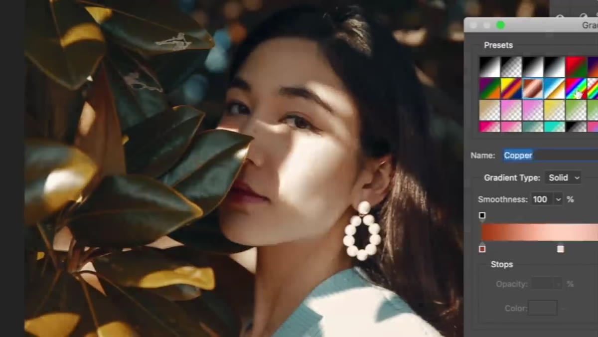
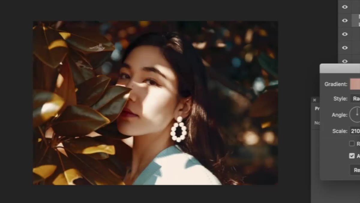
Color grading is where the image gets its personality. Jessica’s work tends toward clean, slightly cool highlights with warm, rich midtones, a combination that reads as modern and polished without feeling clinical. In Lightroom or Camera Raw, use the tone curve to introduce this split: add a touch of warmth in the shadows by pulling the blue channel down slightly in the low end of the curve, and cool the highlights by pulling blue up just a hair in the high end.
Color grading curves or tone adjustments applied
Color grading is where the image gets its personality. Jessica’s work tends toward clean, slightly cool highlights with warm, rich midtones, a combination that reads as modern and polished without feeling clinical. In Lightroom or Camera Raw, use the tone curve to introduce this split: add a touch of warmth in the shadows by pulling the blue channel down slightly in the low end of the curve, and cool the highlights by pulling blue up just a hair in the high end.
In Photoshop, a Color Lookup adjustment layer with a subtle film-style LUT can add cohesion across a set. Keep the opacity below 40% and always check the skin tones in your histogram to make sure you haven’t pushed anything into unnatural territory.
My Caveat: Calibrate for Your Output
One thing the tutorial doesn’t address, and it matters enormously in commercial work, is calibrating your final export for where the image is actually going. Skin that looks perfect on a calibrated monitor can look orange and over-saturated on an uncalibrated client display, or go muddy in print. I always export a test file at the intended output size and profile and check it on at least two screens before final delivery. It’s added time, but it’s saved me from awkward revision conversations more than once.
The single most important thing I took from Jessica’s approach is that good retouching is about restraint and intention, not about how many tools you use. Every adjustment should answer a specific question about what the image needs. When you’re moving sliders because you’re not sure what else to do, that’s the moment to stop and go back to step one.
Watch the full tutorial on YouTube to see Jessica’s complete process in action. Watching her work through the decisions in real time adds context that no written breakdown can fully replace.
Comments
Leave a Comment