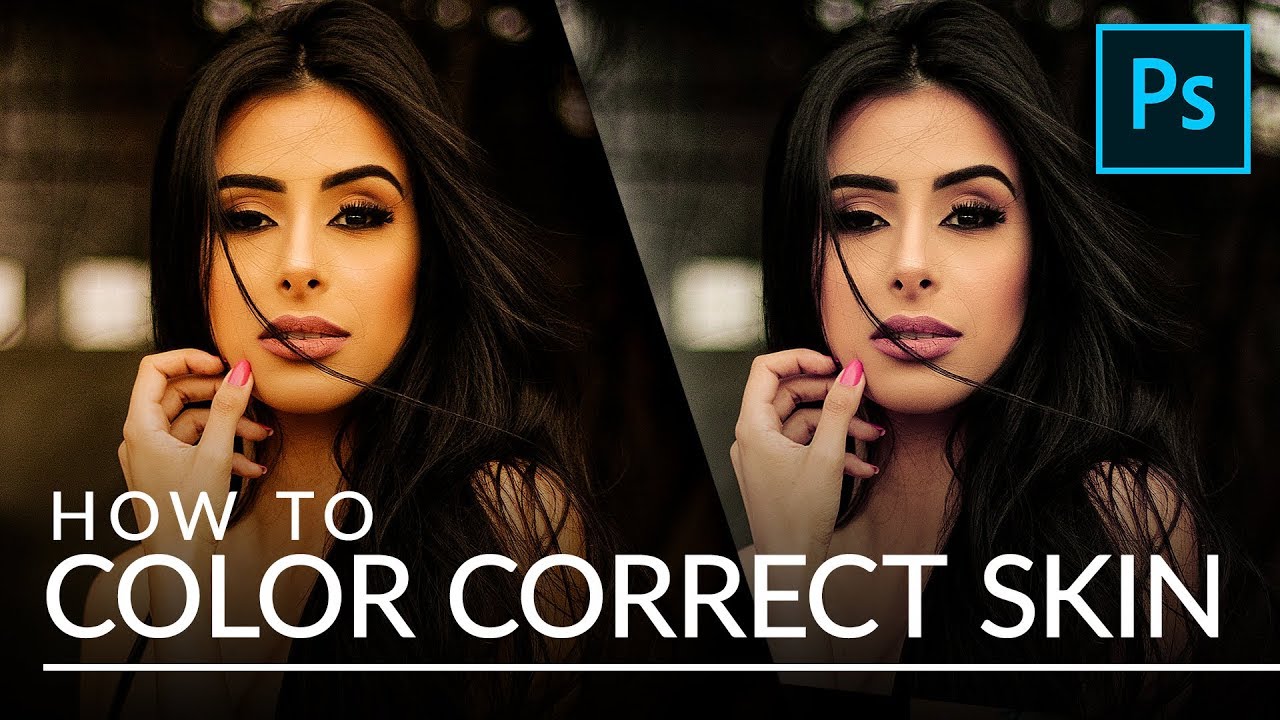
Skin color correction is one of those things that looks simple until you’re forty minutes into a job, your client is waiting, and the model’s complexion has somehow turned the color of old guacamole. I spent the first two years of my retouching career relying on intuition and a lot of undoing, nudging curves until something felt right. It worked, sort of, but it was slow and inconsistent. The technique I’m walking through today changed that completely.
In this Aaron Nace (PHLEARN) tutorial on color correcting skin in Photoshop, the approach is built around two things working together: a reference image with accurate skin tone, and the Selective Color adjustment layer as your primary tool. Watch the full tutorial on YouTube and follow along here with the step-by-step breakdown below. What I love about this method is that it removes the guesswork. Instead of asking “does this look right?” you’re asking “does this match?” That’s a much easier question to answer.
The technique works across a wide range of common problems, including mixed lighting, incorrect white balance, or shooting under color-casted artificial light. Whether your image is running too red, too green, or too yellow, the workflow is the same. Here’s how to do it.
Step 1: Open Your Problem Image and a Reference Image Side by Side
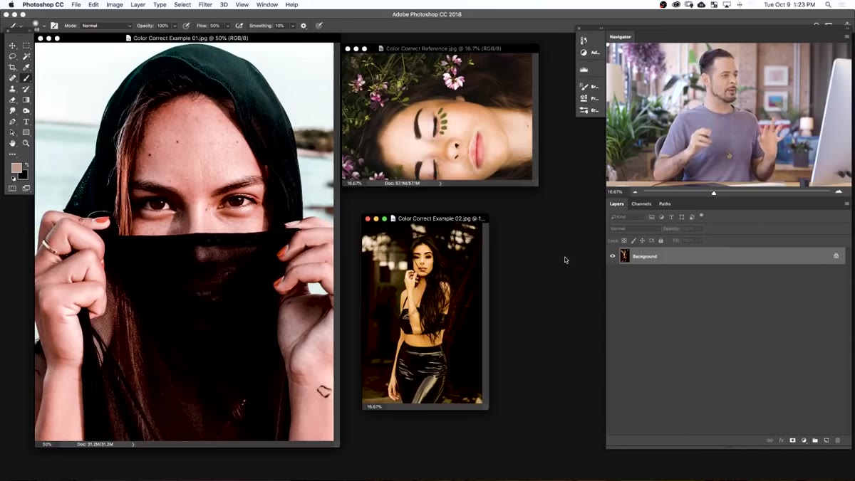 Two portrait images open alongside a reference image in Photoshop
Start by opening both your image that needs correction and a reference photo in Photoshop. The reference should show skin tone that looks accurate and natural, ideally pulled from a reputable stock library where color is well-managed. Critically, your reference should match the skin tone range of your subject. If you’re retouching someone with deep brown skin, find a reference with deep brown skin. The pigment ratios are different, and a reference that doesn’t match will steer you in the wrong direction.
Two portrait images open alongside a reference image in Photoshop
Start by opening both your image that needs correction and a reference photo in Photoshop. The reference should show skin tone that looks accurate and natural, ideally pulled from a reputable stock library where color is well-managed. Critically, your reference should match the skin tone range of your subject. If you’re retouching someone with deep brown skin, find a reference with deep brown skin. The pigment ratios are different, and a reference that doesn’t match will steer you in the wrong direction.
Once both images are open, use the Move tool to drag a copy of the reference image onto your working document. Scale it down with Command/Ctrl + T until it sits comfortably next to your subject’s skin without taking over the canvas. You just need enough of the reference to do a side-by-side comparison while you work.
Step 2: Create a Selective Color Adjustment Layer
 Selective Color adjustment layer being created from the Layer menu
Go to Layer, then New Adjustment Layer, then Selective Color. Click OK. This adjustment layer will affect everything stacked below it in the layers panel, so make sure your reference image layer sits above it. That way your reference stays untouched and true while you make corrections to the problem photo underneath.
Selective Color adjustment layer being created from the Layer menu
Go to Layer, then New Adjustment Layer, then Selective Color. Click OK. This adjustment layer will affect everything stacked below it in the layers panel, so make sure your reference image layer sits above it. That way your reference stays untouched and true while you make corrections to the problem photo underneath.
Selective Color is the right tool here because it lets you target a specific color range rather than shifting the entire image. Skin, regardless of tone, is predominantly built from reds, so that’s where we focus our adjustments.
Step 3: Set Your Target Color to Reds
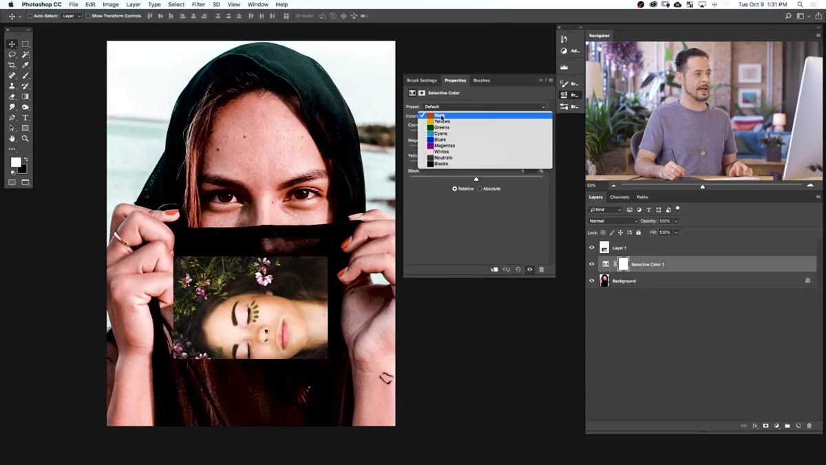 Selective Color panel open with Reds selected in the color dropdown
In the Selective Color panel, open the color dropdown and choose Reds. This scopes every slider in the panel so that your adjustments only influence the red channel in your image, which corresponds closely to skin. You won’t blow out a blue sky or shift someone’s hair color. The precision here is exactly why this tool earns its place in a beauty workflow.
Selective Color panel open with Reds selected in the color dropdown
In the Selective Color panel, open the color dropdown and choose Reds. This scopes every slider in the panel so that your adjustments only influence the red channel in your image, which corresponds closely to skin. You won’t blow out a blue sky or shift someone’s hair color. The precision here is exactly why this tool earns its place in a beauty workflow.
You’ll see four sliders: Cyan, Magenta, Yellow, and Black. Each one operates on an opposite-color axis. Cyan adds cyan when pushed right, adds red when pulled left. Magenta adds magenta when pushed right, adds green when pushed left. Yellow adds yellow when pushed right, adds blue when pushed left. Black darkens the reds when pushed right, lightens when pulled left. Keep these relationships in your head as you work through the next steps.
Step 4: Adjust the Black Slider for Overall Luminosity
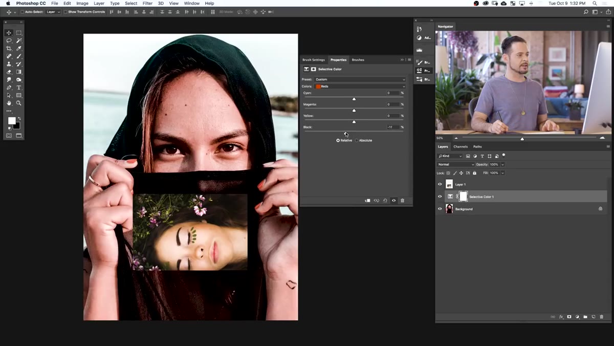 Black slider being pulled left to lighten skin tone
Before touching color, look at the overall brightness of your skin relative to your reference. If your subject’s skin looks heavier or darker than the reference, pull the Black slider gently to the left. Small moves here go a long way. Think in increments of five to ten. You’re not trying to overexpose the skin, just bring the value into the same neighborhood as your reference so color comparisons are accurate.
Black slider being pulled left to lighten skin tone
Before touching color, look at the overall brightness of your skin relative to your reference. If your subject’s skin looks heavier or darker than the reference, pull the Black slider gently to the left. Small moves here go a long way. Think in increments of five to ten. You’re not trying to overexpose the skin, just bring the value into the same neighborhood as your reference so color comparisons are accurate.
This step is easy to skip, but matching luminosity first gives you a cleaner baseline. Color reads differently at different brightness levels, and correcting hue on skin that’s still too dark or too light will produce results that fall apart when you normalize the exposure later.
Step 5: Reduce Magenta to Correct Redness or Unnatural Warmth
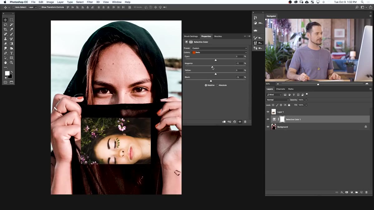 Magenta slider being dragged left to reduce red cast in skin
This is often the highest-impact adjustment in the entire workflow. Skin that reads as too red or too flushed usually has an excess of magenta, not just excess red. Pull the Magenta slider to the left in small, deliberate increments and watch the skin as you go. Your reference image is your anchor. Stop when the two skin tones start to feel like they belong in the same photograph.
Magenta slider being dragged left to reduce red cast in skin
This is often the highest-impact adjustment in the entire workflow. Skin that reads as too red or too flushed usually has an excess of magenta, not just excess red. Pull the Magenta slider to the left in small, deliberate increments and watch the skin as you go. Your reference image is your anchor. Stop when the two skin tones start to feel like they belong in the same photograph.
The temptation is to push too far. Overcorrecting magenta gives skin a greenish, unwell look that’s harder to recover from than where you started. Keep glancing back at the reference and err on the side of doing less. You can always come back and nudge further.
Step 6: Fine-Tune with Cyan and Yellow as Needed
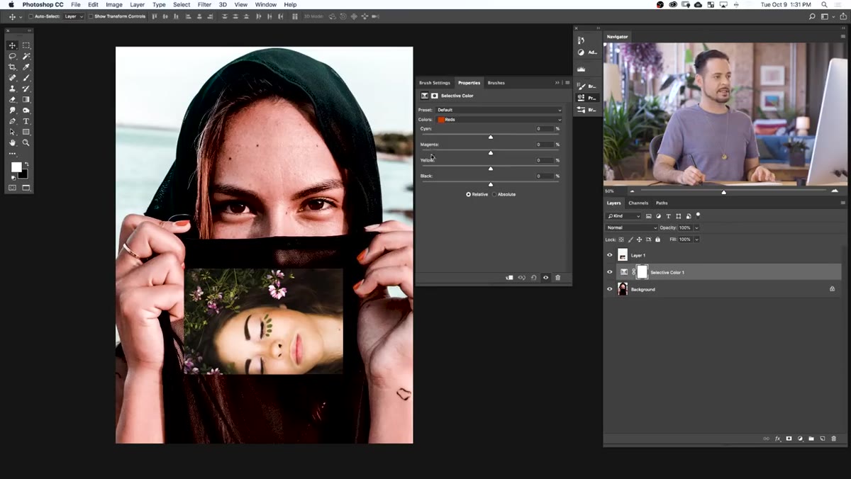 Cyan and Yellow sliders shown in the Selective Color panel
After addressing magenta, take stock of what’s left. If the skin still reads too warm and orange, a very slight push of the Cyan slider to the right will cool it down. If it’s looking sallow or jaundiced, you may need to reduce Yellow slightly by pulling that slider left. Work one slider at a time and keep your changes small. The goal is convergence with your reference, not a dramatic swing in any direction.
Cyan and Yellow sliders shown in the Selective Color panel
After addressing magenta, take stock of what’s left. If the skin still reads too warm and orange, a very slight push of the Cyan slider to the right will cool it down. If it’s looking sallow or jaundiced, you may need to reduce Yellow slightly by pulling that slider left. Work one slider at a time and keep your changes small. The goal is convergence with your reference, not a dramatic swing in any direction.
At every adjustment, step back visually and compare. Zoom out to the full image. Trust what you see next to the reference more than what the numbers say.
What I Layer On Top of This Technique
The Selective Color approach works beautifully as a starting point, but in my commercial work I almost always clip a Hue/Saturation adjustment layer directly above the Selective Color layer and target the Reds channel there as well. This lets me bump or reduce overall saturation in the skin independently from the hue correction I’ve already done. Sometimes a client’s skin is hue-accurate but still looks washed out or oversaturated in a way the Black slider alone doesn’t fully fix. That extra Hue/Saturation layer, clipped to the same mask, closes the gap cleanly.
I also use a Curves layer at the very end to bring the overall image back into balance, since heavy Selective Color corrections can sometimes shift the tonal range in subtle ways. Treat Selective Color as your color correction engine and Curves as your final balance check.
The single most important idea in this whole technique is the reference image. Every other step is just mechanics. The reference gives you something objective to measure against, and that changes color correction from an art into a process. That shift, from “I think this looks right” to “this now matches a known good,” is what makes your work consistent across jobs and clients.
Watch the full tutorial on YouTube to see Aaron walk through the full correction in real time, including his handling of a green-and-yellow cast on a second image that’s worth studying on its own.
Comments (1)
Been doing this wrong for years apparently. Thanks for the wake-up call.
Leave a Comment