There’s a specific client email I dread. Not the “can you fix the lighting” email, and not even the “can you make me look thinner” email. The one that gets me is the “the skin looks a little… plastic?” message. I spent the early part of my retouching career chasing smoothness so aggressively that I’d sand all the life right out of a face. What I actually wanted, and what clients actually respond to, is softness. That creamy, slightly luminous quality that reads as healthy skin rather than a wax figure.
That’s why I keep coming back to this particular CreativeLive tutorial on achieving soft, milky-looking skin in Lightroom. Watch the full tutorial on YouTube. The instructor breaks down a specific combination of tone curve adjustments, grain, and saturation tweaks that recreate that analog film quality everyone’s chasing. It’s deceptively simple once you understand the logic, but the logic isn’t immediately obvious from the sliders alone. Let me walk you through what’s actually happening and why each piece matters.
Step 1: Understand the “Milky” Principle Before You Touch a Slider
 Tone curve pulled to compress highlights and shadows
Before anything else, get clear on the goal. The milky look is not about brightness, and it’s not about adding a filter on top of your image. It’s about compressing the tonal range in a specific way: pulling the highlights down and lifting the shadows up so they crowd toward the middle, and then stretching the midtones outward to compensate. The result is an image that can never go fully black and never goes fully white. That lifted shadow floor is the whole secret. Once you understand that you’re engineering a compressed, film-like tonal range rather than chasing a vibe, the adjustments start to make intuitive sense.
Tone curve pulled to compress highlights and shadows
Before anything else, get clear on the goal. The milky look is not about brightness, and it’s not about adding a filter on top of your image. It’s about compressing the tonal range in a specific way: pulling the highlights down and lifting the shadows up so they crowd toward the middle, and then stretching the midtones outward to compensate. The result is an image that can never go fully black and never goes fully white. That lifted shadow floor is the whole secret. Once you understand that you’re engineering a compressed, film-like tonal range rather than chasing a vibe, the adjustments start to make intuitive sense.
Step 2: Reshape the Point Curve to Kill True Black
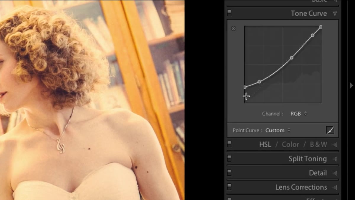 Point curve with lifted shadow anchor, blacks clipped off
Open your Tone Curve panel and switch to the Point Curve view so you have full control over individual anchor points. Pull the bottom-left anchor point, the pure black point, upward along the left edge of the curve. You’re not moving it horizontally, just lifting it vertically. This tells Lightroom that the darkest tone in your image is no longer true black. It’s a dark gray. The instructor is explicit that this is non-negotiable for the look: once you do this, you cannot get black out of your image, and that’s exactly the point. Start with the black anchor sitting roughly 15 to 25 percent of the way up the left axis and adjust to taste.
Point curve with lifted shadow anchor, blacks clipped off
Open your Tone Curve panel and switch to the Point Curve view so you have full control over individual anchor points. Pull the bottom-left anchor point, the pure black point, upward along the left edge of the curve. You’re not moving it horizontally, just lifting it vertically. This tells Lightroom that the darkest tone in your image is no longer true black. It’s a dark gray. The instructor is explicit that this is non-negotiable for the look: once you do this, you cannot get black out of your image, and that’s exactly the point. Start with the black anchor sitting roughly 15 to 25 percent of the way up the left axis and adjust to taste.
Step 3: Adjust the Individual RGB Channels Inside the Curve
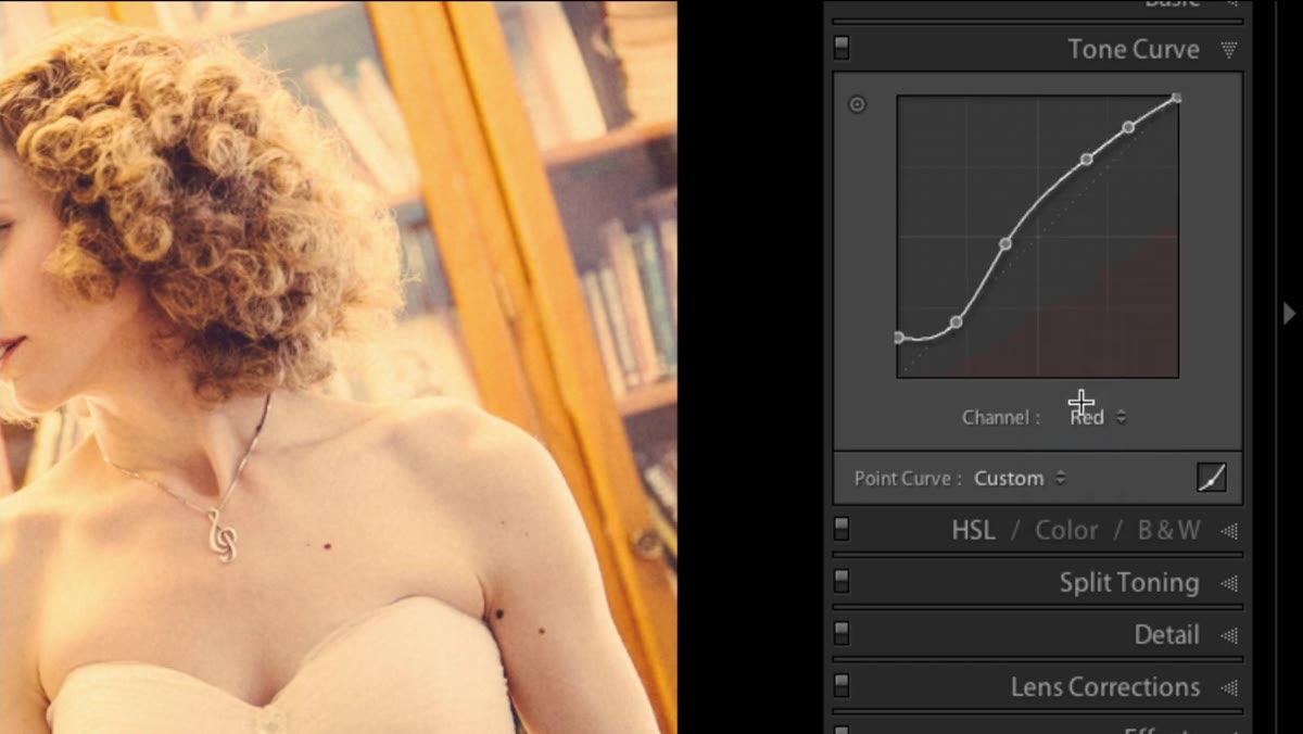 Red channel curve with slight upward bow in midtones
This is where the warmth and the slightly organic color quality come from, and most people skip it entirely. Inside the tone curve panel, switch from the composite RGB curve to the individual channel curves: Red, Green, and Blue, one at a time. Each channel should have a slight, gentle S-shape or upward bow applied, but they don’t need to be identical. The red channel gets a subtle lift in the midtones to warm the skin. The green and blue channels each get their own gentle curves to keep the overall palette from going muddy or too orange. These aren’t dramatic adjustments. A small nudge in each channel contributes to the color complexity that makes the image feel like it was shot on film rather than edited in software.
Red channel curve with slight upward bow in midtones
This is where the warmth and the slightly organic color quality come from, and most people skip it entirely. Inside the tone curve panel, switch from the composite RGB curve to the individual channel curves: Red, Green, and Blue, one at a time. Each channel should have a slight, gentle S-shape or upward bow applied, but they don’t need to be identical. The red channel gets a subtle lift in the midtones to warm the skin. The green and blue channels each get their own gentle curves to keep the overall palette from going muddy or too orange. These aren’t dramatic adjustments. A small nudge in each channel contributes to the color complexity that makes the image feel like it was shot on film rather than edited in software.
Step 4: Pull Saturation Down Slightly, Especially to Protect Orange Tones
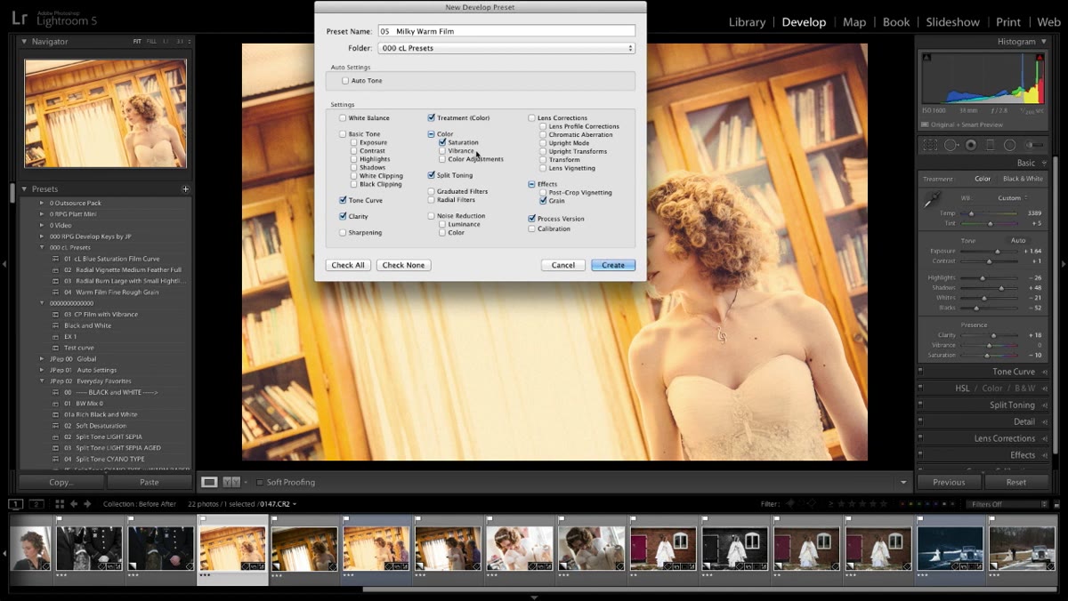 HSL or basic panel with saturation slider reduced
Once the curve work is done, bring your overall saturation down by a modest amount, roughly 5 to 15 points depending on the image. This is less about desaturating the image and more about protecting the orange and red tones in skin from getting aggressive. Warm skin tones in particular can tip into an ugly, almost radioactive orange if saturation sits too high after you’ve introduced warmth through the channel curves. A gentle reduction keeps everything looking like real skin rather than a tanning bed ad. You’re not going for muted or faded here, just restrained.
HSL or basic panel with saturation slider reduced
Once the curve work is done, bring your overall saturation down by a modest amount, roughly 5 to 15 points depending on the image. This is less about desaturating the image and more about protecting the orange and red tones in skin from getting aggressive. Warm skin tones in particular can tip into an ugly, almost radioactive orange if saturation sits too high after you’ve introduced warmth through the channel curves. A gentle reduction keeps everything looking like real skin rather than a tanning bed ad. You’re not going for muted or faded here, just restrained.
Step 5: Add Grain to Sell the Analog Quality
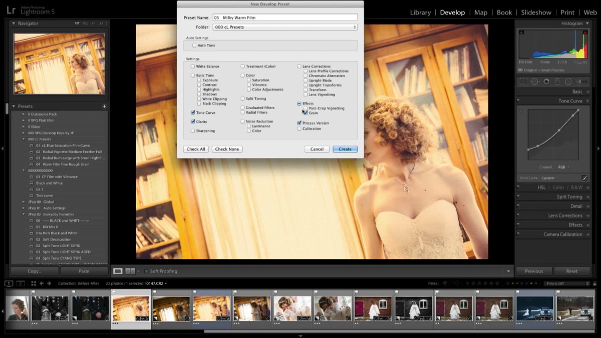 Grain settings panel with amount and size visible
Go to your Effects panel and dial in some grain. The amount and size will depend on your output size and the resolution of your file, but this is a critical ingredient. Grain does two things simultaneously: it adds the texture that makes skin feel three-dimensional rather than smoothed-over, and it helps unify all the tonal adjustments you’ve made into something that reads as cohesive rather than processed. A smooth, noiseless image after all these curve adjustments will look like it was made in software. A little grain makes it look like it came out of a camera. Start around 20-25 for amount and keep the size relatively fine.
Grain settings panel with amount and size visible
Go to your Effects panel and dial in some grain. The amount and size will depend on your output size and the resolution of your file, but this is a critical ingredient. Grain does two things simultaneously: it adds the texture that makes skin feel three-dimensional rather than smoothed-over, and it helps unify all the tonal adjustments you’ve made into something that reads as cohesive rather than processed. A smooth, noiseless image after all these curve adjustments will look like it was made in software. A little grain makes it look like it came out of a camera. Start around 20-25 for amount and keep the size relatively fine.
Step 6: Save Everything as a Preset - But Leave Exposure Out
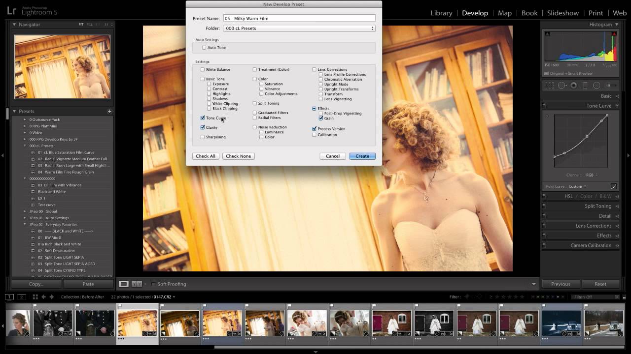
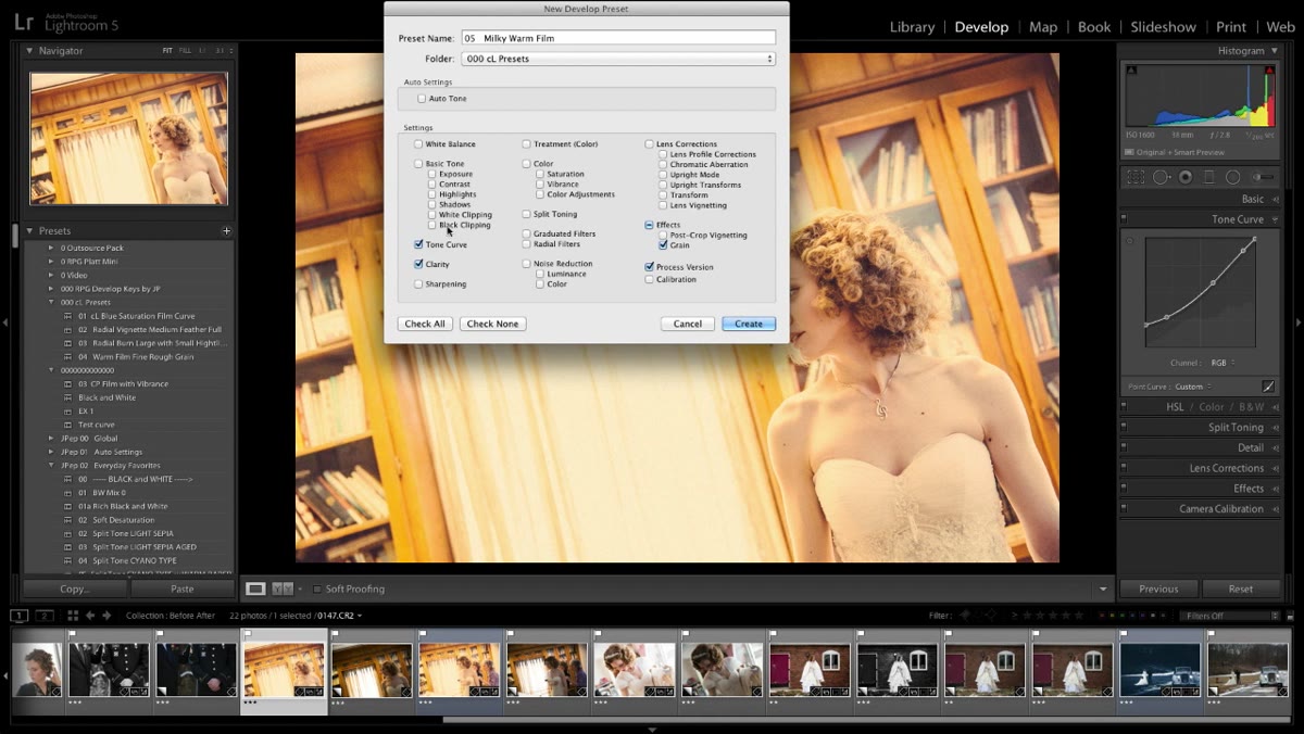 New preset dialog with specific settings checked and unchecked
Once you’re happy with the combination, save it as a Lightroom preset but be deliberate about what you include. Check the boxes for tone curve, grain, clarity, and saturation. Do not include exposure, highlights, shadows, whites, or blacks as part of the preset. Those settings are too specific to each individual image. If you bake a particular exposure into the preset, you’ll apply it to a photo that needs completely different exposure treatment and wonder why the preset isn’t working. The preset should give you the underlying aesthetic foundation, the curve shape, the color character, the grain, and then you manually adjust the tonal controls per image on top of it.
New preset dialog with specific settings checked and unchecked
Once you’re happy with the combination, save it as a Lightroom preset but be deliberate about what you include. Check the boxes for tone curve, grain, clarity, and saturation. Do not include exposure, highlights, shadows, whites, or blacks as part of the preset. Those settings are too specific to each individual image. If you bake a particular exposure into the preset, you’ll apply it to a photo that needs completely different exposure treatment and wonder why the preset isn’t working. The preset should give you the underlying aesthetic foundation, the curve shape, the color character, the grain, and then you manually adjust the tonal controls per image on top of it.
What I’d Add From My Own Workflow
The instructor focuses on Lightroom’s global adjustments, which is the right starting point. But in my beauty work, I often combine this preset foundation with a light pass of Clarity reduction on skin specifically, using a radial or brush mask rather than the global Clarity slider. The milky curve already reduces contrast, but pulling Clarity down on skin by about -15 to -25 using a targeted brush adds another layer of softness without touching the rest of the image. Eyes and hair stay sharp. Skin picks up that extra creaminess. It’s a subtle addition that takes the preset from “nice” to “that’s exactly the look I wanted.”
Also: this approach works best when your base exposure is already clean. If you’re fighting blown highlights or crushed shadows before applying the preset, the curve adjustments will fight your corrections and the result will feel muddy. Get the exposure in the right neighborhood first, then let the preset do its job.
The single most important thing this tutorial teaches isn’t a specific slider value. It’s the underlying logic: softness in skin comes from how you shape tonal contrast, not from how much smoothing you apply. Lift the blacks, compress the range, add just enough grain to keep it feeling real. That’s it. Build that principle into a preset so it becomes a consistent starting point rather than something you have to reconstruct from memory every session.
Watch the full tutorial on YouTube to see the curve adjustments applied in real time, which makes the before-and-after logic much easier to internalize.
Comments (3)
This should be required reading for anyone starting out.
Quality content like this is rare. Keep it up.
This is fantastic. I've been recommending this approach to my readers too.
Leave a Comment