I’ve been retouching portraits for over a decade, and I’ve learned that certain editing mistakes are absolutely impossible to hide—no matter how skilled you are with your tools. After working with hundreds of clients, I’ve identified three specific colors that our brains are wired to scrutinize more carefully than anything else in a photograph.
The Three Colors That Give Us Away
When we edit a jacket color or shift the tone of a background wall, most viewers won’t catch the change. Their brains don’t have a fixed expectation for those elements. But three colors are different entirely: skin, sky, and foliage.
These are what I call “memory colors”—the hues we’ve seen countless times throughout our lives. Our brains have built-in expectations for how they should look. Push them even slightly off their natural range, and something immediately feels wrong to viewers, even if they can’t articulate why.
Why Skin Tone Is the Biggest Challenge
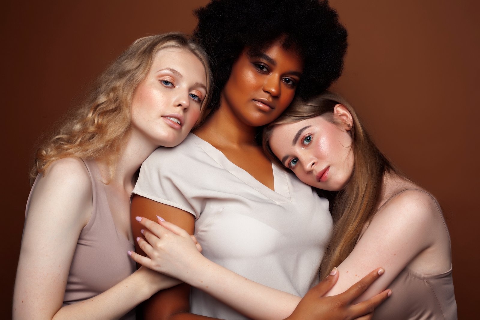
In portrait retouching specifically, skin tone accuracy is absolutely critical. I’ve watched clients react with visible discomfort to images where the complexion looks even slightly unnatural—too orange, too pink, too gray, or too saturated. The eye catches these shifts instantly because we see human skin every single day.
This is why I approach skin editing with extreme caution. Rather than making bold color shifts, we should make subtle, thoughtful adjustments that enhance without fundamentally changing how someone looks. The goal is always to make skin appear more like the best version of itself—not a different version entirely.
What This Means for Our Retouching Practice
Understanding these memory colors has transformed how I work. Instead of pushing colors aggressively, I now:
- Make smaller, more intentional adjustments to skin tones
- Test my edits by stepping back and viewing them at different sizes
- Ask myself whether the color feels authentic, not just aesthetically pleasing
- Remember that viewers are experts in recognizing natural skin, sky, and plants
The Bottom Line
The most impressive edits are the ones people don’t notice. When a portrait looks polished yet completely natural, that’s when we’ve truly succeeded. By respecting these three memory colors and editing them conservatively, we create images that feel authentic while still bringing out our clients’ best features.
The skill isn’t in pushing boundaries—it’s in knowing exactly where they are.
Comments (3)
Would love to see a follow-up going deeper into this topic.
Tried this technique this morning. Game changer for real.
Couldn't agree more. I've seen this make a huge difference in business work specifically.
Leave a Comment