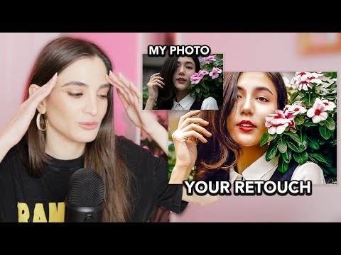
There’s a particular kind of learning that only happens when you see the same raw file interpreted fifty different ways. You stop asking “is this edit good?” and start asking “why does this one feel alive while that one feels flat?” That question is worth more than any single tutorial, which is why Watch the full tutorial on YouTube and study what Jessica Kobeissi does in this video before you read another word of this breakdown.
In this Jessica Kobeissi video, she runs an editing competition where she sends out one of her own portrait photos to hundreds of subscribers and asks them to retouch it however they see fit. The winner takes home $250, the runner-up gets $150, and the rest of us get something arguably more valuable: a side-by-side look at how different editors interpret the same source material. For anyone who has ever handed a shoot to a retoucher and felt vaguely disappointed without being able to articulate why, watching this collection of edits is genuinely clarifying.
I started thinking about this kind of comparative analysis years ago, after a client told me my retouching looked “plastic.” That word stung because I knew exactly what she meant and had no idea how to fix it. Watching a dozen people work the same image teaches you to see the decisions you’re making unconsciously, the ones that add up to either a living photograph or a wax figure. Here’s what the standout edits in this video actually do, broken down into the moves you can bring into your own workflow.
Step 1: Establish Your Color Story Before You Touch the Skin
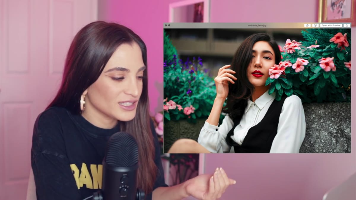
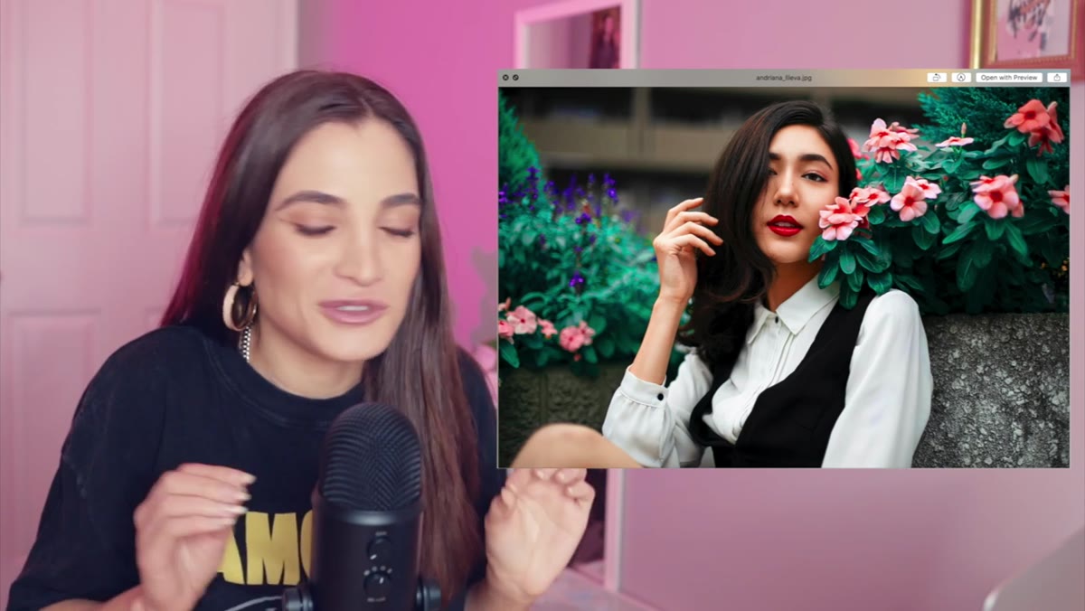 Andriana’s vibrant edit with saturated leaves and flowers
The edit from Andriana Li Ava is the first one that made Jessica stop and genuinely react. What sets it apart is not the retouching itself but the color commitment. The leaves in the background are pulled into a richer, more saturated green, the flowers are pushed toward a warmer, more vibrant tone, and the subject’s lipstick is brightened to match that energy. Every element reinforces the same emotional direction.
Andriana’s vibrant edit with saturated leaves and flowers
The edit from Andriana Li Ava is the first one that made Jessica stop and genuinely react. What sets it apart is not the retouching itself but the color commitment. The leaves in the background are pulled into a richer, more saturated green, the flowers are pushed toward a warmer, more vibrant tone, and the subject’s lipstick is brightened to match that energy. Every element reinforces the same emotional direction.
The lesson here is sequence. Before opening your healing brush or reaching for frequency separation, decide what the image is emotionally about. Pick two or three colors that will anchor the whole edit and make sure every adjustment you make serves those colors. In Lightroom, I do this with a quick HSL pass before I touch anything else, just to get the palette locked in. Everything after that becomes easier because you have a north star.
Step 2: Use Texture Overlays to Add Dimension, Not Decoration
 Zoom-in on textured overlay detail in first editor’s submission
The very first edit Jessica reviews includes a texture overlay that she responds to immediately, specifically the way it adds a tactile, almost painterly quality to what was already a strong image. Texture overlays get misused constantly, dropped on top of a photo at 100% opacity in Multiply mode and called a “film look.” That’s decoration. What works here is restraint.
Zoom-in on textured overlay detail in first editor’s submission
The very first edit Jessica reviews includes a texture overlay that she responds to immediately, specifically the way it adds a tactile, almost painterly quality to what was already a strong image. Texture overlays get misused constantly, dropped on top of a photo at 100% opacity in Multiply mode and called a “film look.” That’s decoration. What works here is restraint.
When you apply a texture overlay, bring it in as a separate layer, set the blend mode to Soft Light or Overlay, and pull the opacity down to somewhere between 15% and 35%. Then add a luminosity mask so the texture only affects the midtones, not the highlights or shadows where it will muddy the image. The goal is that the viewer feels the texture before they see it.
Step 3: Composite Intentionally, With Environmental Logic
 Brandon’s edit showing butterflies added to background scene
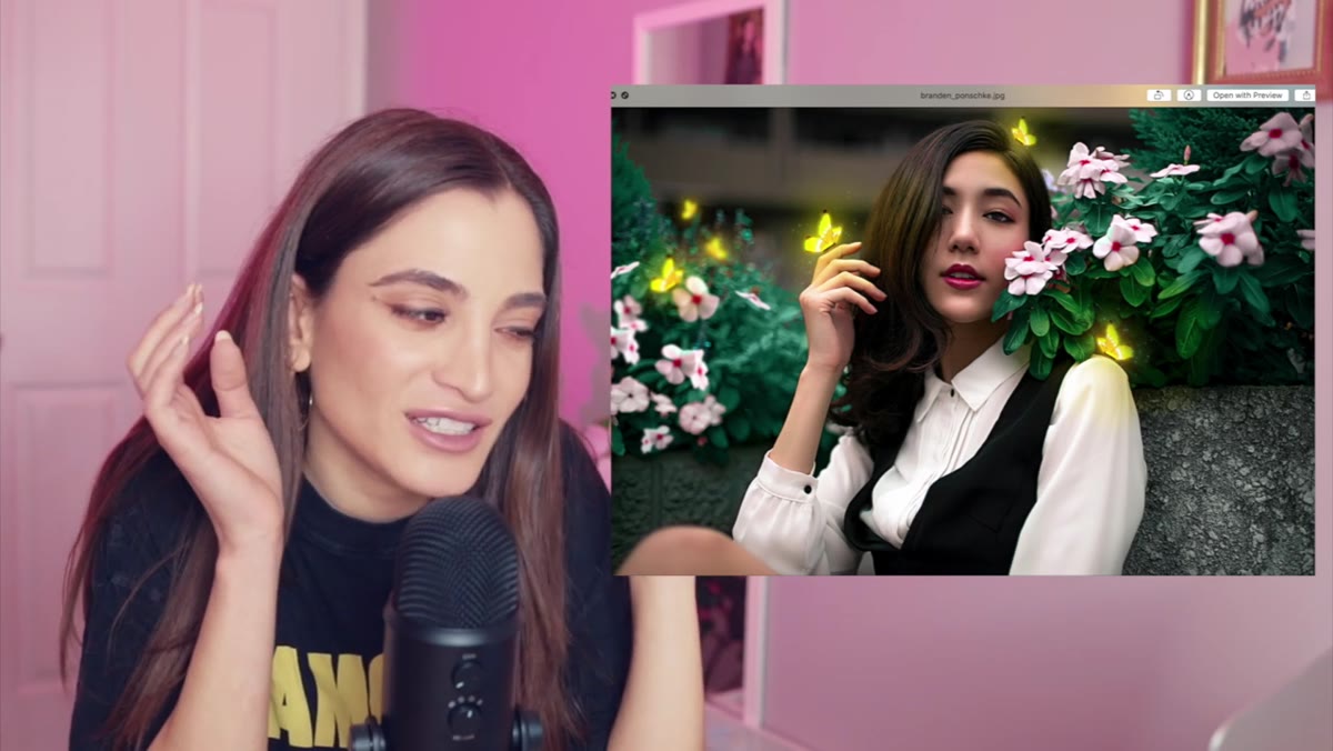
Brandon Paunchy’s edit adds butterflies to the background, and Jessica’s reaction is worth noting: her first instinct is delight, not skepticism. That tells you something. The composite works because it follows the logic of the existing environment. The image already has a soft, natural, slightly magical quality, and butterflies belong in that world. Nothing is fighting the original light or the depth of field.
Brandon’s edit showing butterflies added to background scene
Brandon Paunchy’s edit adds butterflies to the background, and Jessica’s reaction is worth noting: her first instinct is delight, not skepticism. That tells you something. The composite works because it follows the logic of the existing environment. The image already has a soft, natural, slightly magical quality, and butterflies belong in that world. Nothing is fighting the original light or the depth of field.
When you’re adding elements to a portrait, ask whether the addition could physically exist in the space where the photo was taken, in that light, at that distance from the lens. If the answer is yes, you’re working with the image. If the answer is no, you’re working against it and the viewer will feel that discomfort even if they can’t name it. Match the blur of your added element to the background blur in the original. Match the color temperature. Then reduce the opacity slightly so the element feels embedded rather than pasted.
Step 4: Retouch the Subject to Complement the Color Grade, Not Before It
 Close-up of subject’s skin in Andriana’s finished edit
One thing the strongest edits in this video share is that the skin retouching and the color grade feel unified. The skin doesn’t look like it was retouched in a vacuum and then dropped into a color-graded scene. This is a sequencing problem that trips up a lot of retouchers, myself included for longer than I’d like to admit.
Close-up of subject’s skin in Andriana’s finished edit
One thing the strongest edits in this video share is that the skin retouching and the color grade feel unified. The skin doesn’t look like it was retouched in a vacuum and then dropped into a color-graded scene. This is a sequencing problem that trips up a lot of retouchers, myself included for longer than I’d like to admit.
The practical fix is to do your global color grade first, or at least block it in, before you finalize your skin work. Skin that reads as clean and natural under a warm golden grade looks completely different under a cool, desaturated one. If you retouch for a neutral grade and then apply a heavy cool tone on top, you may find the skin looks gray and flat even though the retouching itself is technically flawless. Build the world first, then fit the subject into it.
Step 5: Let the Edit Have a Point of View
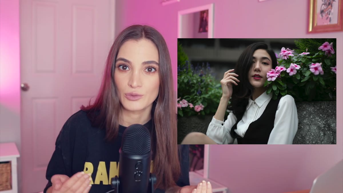 Jessica reacting to variety of subscriber edits side by side
The edits Jessica selects as her favorites all have something in common beyond technical skill: they make a choice. They’re not trying to be everything at once. One goes maximalist with color. One goes quiet and textural. One transforms the scene entirely with compositing. Each one has a clear perspective on what the image should feel like.
Jessica reacting to variety of subscriber edits side by side
The edits Jessica selects as her favorites all have something in common beyond technical skill: they make a choice. They’re not trying to be everything at once. One goes maximalist with color. One goes quiet and textural. One transforms the scene entirely with compositing. Each one has a clear perspective on what the image should feel like.
This is the hardest thing to teach and the easiest thing to lose when you’re working under deadline or trying to please a client. But even within client constraints, there’s almost always room to have a point of view about one thing: the warmth of the light, the clarity of the background, the mood of the skin tone. Pick your thing and commit to it.
What I’d Add From My Own Experience
The one gap I notice in most editing competitions, including this one, is that we only ever see the final output. We don’t see the moments where someone tried something, hated it, and pulled back. In my workshops, I’ve started asking students to save versions at each major decision point, not as a backup strategy but as a diagnostic tool. When you look at the version where you went too far, you can usually see exactly where the image stopped feeling like a photograph and started feeling like an edit. That inflection point is where your real education lives.
The single most important thing this video demonstrates is that technical retouching skill is table stakes. What separates the edits that made Jessica stop and lean in from the ones she moved past quickly is intentionality: color story, environmental logic, a clear emotional direction. You can develop that intentionality by studying other people’s edits with the same curiosity Jessica brings to this video.
Watch the full tutorial on YouTube and pay attention not just to the winning edit but to the moment Jessica’s body language shifts on each one. That reaction is a masterclass in what it means to read an image.
Comments (3)
Love how you break down complex stuff into manageable steps.
This saved me so much time on my last edit. Wish I'd found this sooner.
Well explained. I think my audience would really benefit from this — mind if I link to it?
Leave a Comment