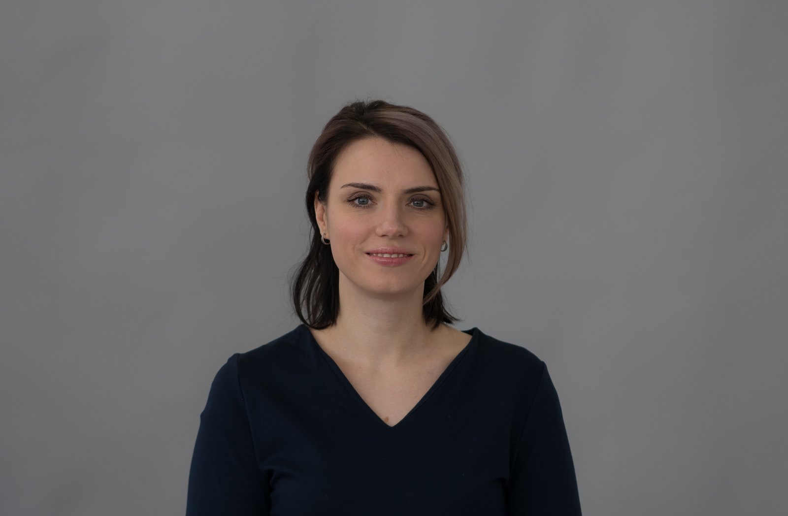
A client once told me my retouching looked “plastic.” She wasn’t wrong.
This was early in my retouching career, before I understood that skin is not a surface problem. I had been approaching every face the same way I’d approached everything before it: fix what I could see, smooth what looked rough, brighten what looked dull. The results were technically clean and emotionally empty. The client’s face looked like it had been ironed. She hired someone else, and I kept that file on my desktop for two years as a reminder.
The irony is that most headshot editing mistakes don’t come from doing too little. They come from doing the right things in the wrong order, at the wrong strength, without understanding why the face looked the way it did in the first place.
Why Skin Looks Flat After Editing (The Physics, Not the Philosophy)
Skin has three distinct visual layers happening at once: color variation, texture, and overall tone. When you retouch with a single tool, say a healing brush dragged across a cheek, you’re collapsing all three into one move. That’s what creates the plastic effect. You solved a color problem but destroyed the texture in the same stroke.
Frequency separation is the technique that changed how I work. The idea is that you separate the high-frequency information (texture, pores, fine lines) from the low-frequency information (color, shading, uneven tone) onto two different layers. Then you correct each one independently. High frequency gets its own targeted fixes. Low frequency gets color and tone work without touching a single pore.
In Photoshop, here’s how to build it: duplicate your base layer twice. Name the bottom copy “Low Freq” and the top one “High Freq.” On the Low Freq layer, run Gaussian Blur at somewhere between 4 and 7 pixels, depending on your resolution. For a standard headshot at 300 dpi, I usually land on 5.5. On the High Freq layer, go to Image > Apply Image. Set the layer to your Low Freq layer, blending to Subtract, Scale 2, Offset 128. Change the High Freq blend mode to Linear Light. Now you can clone-stamp on the High Freq layer without affecting color, and paint on the Low Freq layer without flattening texture. It takes about four minutes to set up once you’ve done it ten times. I have a Photoshop action called “The Godfather” that does it in one click.
The Dodge and Burn Pass That Most Tutorials Skip
After frequency separation, the next thing I do is a 50% gray layer set to Overlay mode, dedicated entirely to sculpting light. I paint in soft light using a brush with about 8-12% opacity, lifting the bridge of the nose, the cupid’s bow, the browbone, and the cheekbone catchlight. I darken the shadow side of the jaw and the depth around the eyes.
This pass isn’t about fixing anything. It’s about reinforcing what the photographer already captured. If the lighting on set was good, your dodge and burn job should be nearly invisible. If you can point to your dodge and burn layer and immediately see where you painted, you painted too hard.
For headshots specifically, I keep this layer’s opacity between 60% and 75% at the end. Full strength almost always reads as sculpted rather than natural, and in a headshot context, the face needs to look like a person, not a contour tutorial.
Eye Sharpening Without the Uncanny Valley
Eyes are where headshots get ruined most often, usually by oversharpening. The trick is to sharpen only the iris and the lash line, never the whites. I use a High Pass filter at 1.8 pixels on a merged stamp layer, set to Soft Light at around 50% opacity, then mask it to just the iris. That radius sounds tiny, but at print resolution it’s enough to make the eyes read as alive without making them look like they’ve been Photoshopped onto the face.
If a client’s eyes are slightly different sizes (nearly everyone’s are), I’ll use Liquify very conservatively, 20 pixels brush size, Pucker or Bloat at a pressure of 10. One or two strokes maximum. The goal is not symmetry. The goal is to remove the distortion that sometimes happens with certain lens focal lengths, usually anything wider than 85mm.
Color Grading a Headshot Is Not the Same as Color Grading a Portrait
Headshots live in professional contexts: LinkedIn, agency websites, company pages. They need to look consistent under different screen calibrations. I add a Color Lookup adjustment layer using the Kodak 5218 Kodak 2395 LUT from Photoshop’s built-in library, dropped to between 10% and 18% opacity. This adds a very slight warmth to skin tones without pushing the image into editorial territory. For actors’ headshots or musicians, I’ll go a little more stylized, but for corporate or business headshots, the LUT is just a finisher, not a statement.
Exporting for web, I use sRGB, quality 85 in JPEG, and I always save a layered PSD at the full resolution before flattening. That PSD is your insurance policy. I’ve had clients come back two years later to request a variation, and being able to open the original file with every layer intact has saved me hours of rebuilding.
The Standard Nobody Talks About Enough
The best headshot retouching is the kind the subject doesn’t notice. When someone looks at their finished headshot and says “I look great,” that’s the goal. When they say “you smoothed my skin” or “you changed my eyes,” something went too far.
Restraint is a skill, and it takes longer to learn than any technique in this list. But once you stop chasing invisible and start chasing believable, the work gets easier and so does keeping clients.
Comments
Leave a Comment