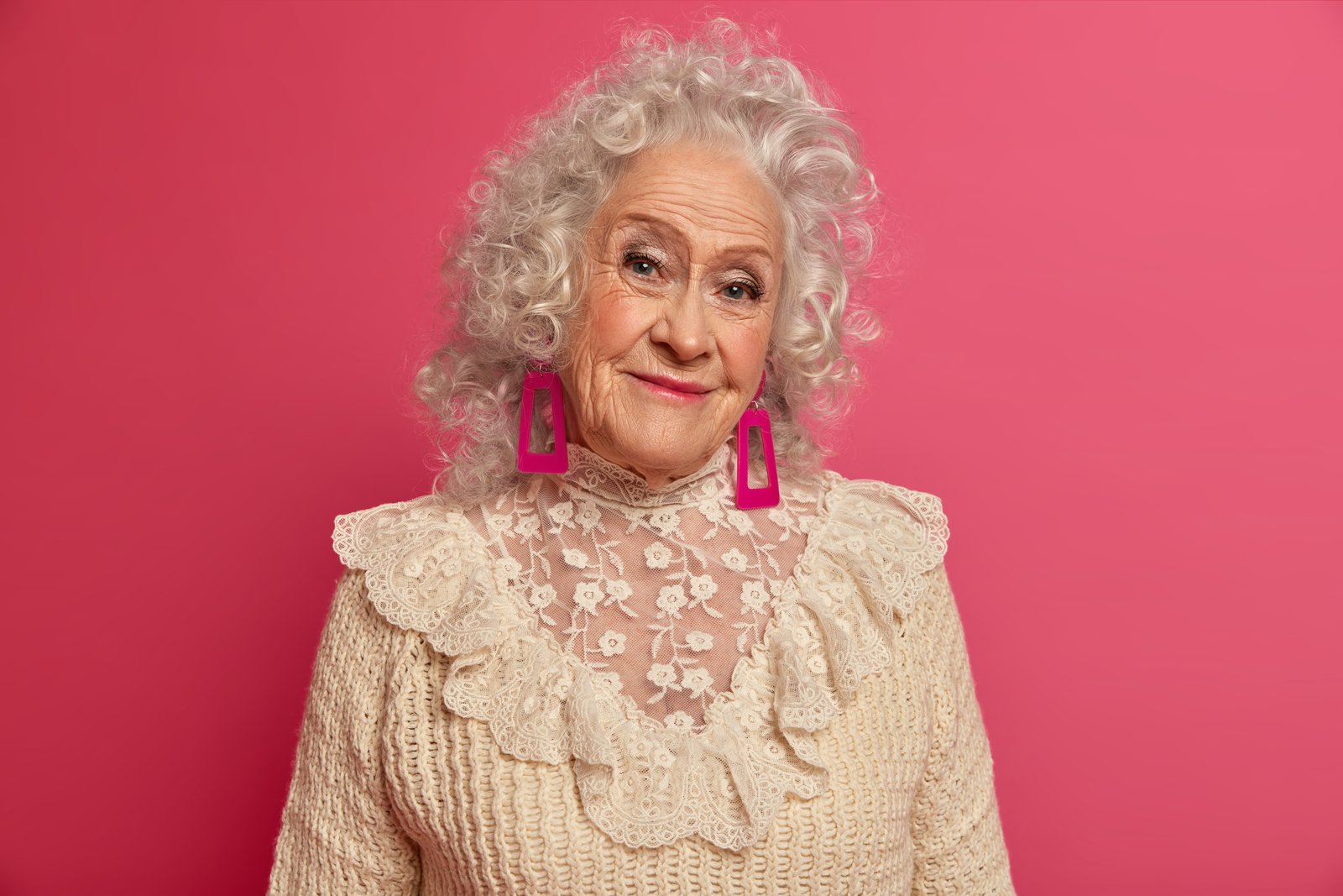
There’s a before-and-after I still think about. Early in my retouching career, I handed off a set of portraits to a client and felt genuinely proud of the work. Smooth skin, clean tones, everything looking polished. She emailed back the next morning and said the images looked “a little plastic, like a video game character.” I wanted to disappear into my standing desk. What I had done was chase imperfections surface by surface, smoothing and blurring, without ever asking myself why the skin looked off in the first place. I had treated symptoms instead of the actual problem.
That problem, almost always, is light.
What the Camera Actually Records (And Why It Lies)
Camera sensors flatten dimensional light into a two-dimensional plane. A real human face has curves, planes, and micro-shadows that your eyes process in real time as your brain constantly adjusts. A photograph freezes one moment of that light, and sometimes that frozen moment is unflattering. The cheekbone reads as a blob instead of a curve. The nose catches a highlight that makes it look wider. The under-eye area goes muddy instead of clean.
Dodge and burn doesn’t add texture or remove blemishes. What it does is restore the story that light was trying to tell. You’re sculpting luminosity directly, making the skin read as three-dimensional again, guiding the viewer’s eye toward the parts of the face that matter most.
The Setup That Keeps You Non-Destructive
Before touching a single pixel, I set up a clean workspace that I can walk back from at any point. Open your image, then create a new layer above everything else. Fill it with 50% gray: go to Edit, Fill, and choose 50% Gray from the Contents dropdown. Set that layer’s blend mode to Soft Light. At 50% gray, this layer is completely invisible, but anything lighter than 50% will brighten the pixels below, and anything darker will darken them.
Name this layer something that means something to you. I name mine after movies, so this one might be “Rear Window” for a classic portrait, or “Mad Max” when I know the skin needs serious work. It’s a small thing, but finding a file labeled that way six months later makes me smile.
Now grab your Burn tool, but ignore it. Instead, use a soft round brush set to white, with Opacity at 3% to 5% and Flow at around 10%. This is your dodge brush. A black brush at the same low settings becomes your burn brush. Working this slowly feels painful at first, but it is the reason your results look like light instead of smudging.
Reading the Face Before You Paint
This is where most tutorials skip ahead too fast. Before you do anything, flip the image to black and white temporarily, either by adding a Black and White adjustment layer above your gray layer, or using Cmd+Shift+Alt+B as a preview. In black and white, you can see the actual tonal values without color tricking your eye. Look for the lightest planes: the center of the forehead, the tops of the cheekbones, the bridge of the nose, the cupid’s bow, the chin. Look for the naturally darker areas: the temples, the sides of the nose, the hollows under the cheekbones, the perimeter of the forehead.
These are the areas you’re going to enhance, not invent. You are following the light that already exists and giving it slightly more intention. Turn your Black and White layer off, and start painting.
The Technique I Wish Someone Had Told Me Earlier
Work in passes, not in one area at a time. Paint a few strokes of white in one highlight zone, then move to another, then another, rotating around the face before you go back to deepen any of them. This keeps the overall tonal balance moving together instead of one cheekbone suddenly glowing like a lamp while the rest of the face hasn’t caught up.
For skin texture areas like the T-zone or the forehead, keep your brush larger, around 200 to 400 pixels depending on your resolution, and stay light. For detailed zones like the under-eye area or the sides of the nose, drop down to 50 to 100 pixels and use even less opacity, closer to 2%. The goal is that someone looks at the finished image and sees a beautifully lit face, not a face that was worked on.
Zoom out to 25% or 33% view regularly. This is the view that tells the truth. At 100%, you are always going to overpaint. The actual viewer is never looking at your image at 100%.
The Before That Lives in My Files Folder
I still keep my first retouching attempt in a folder on my hard drive labeled “Do Not Forget.” It’s a portrait of a friend I practiced on before I had any clients, and the dodge and burn is so heavy that it looks like she’s wearing theatrical stage makeup. The highlights are white blobs. The shadows are muddy smears. There was no reading of the light, no restraint, no rotating between zones. Just enthusiasm without a framework.
I keep it because it’s honest. Every working retoucher has a version of that file, and the gap between that file and your current work is the whole job.
Dodge and burn done well is invisible. Nobody looks at a portrait and thinks about the gray layer underneath, the 3% opacity brush, the rotational passes. They just feel like the person in the photograph is actually present, lit by something real. That feeling is the entire point, and it’s worth taking the time to earn it.
Comments (7)
The before and after really sells it. Incredible difference.
This is the kind of content that keeps me coming back.
Solid advice. Especially the part about taking your time with it.
Wow, I had no idea you could do this. Mind blown.
Bookmarked. Coming back to this one for sure.
This is going in my reference folder. Incredibly useful.
This is fantastic. I've been recommending this approach to my readers too.
Leave a Comment