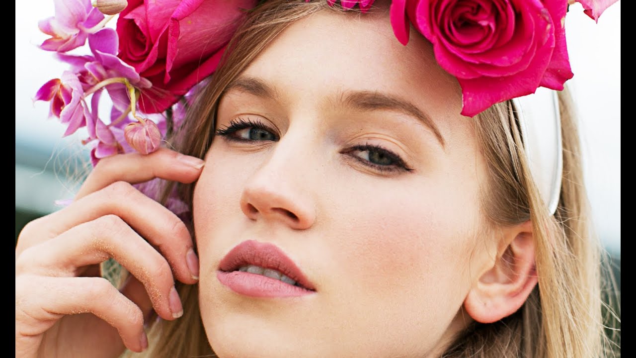
There’s a specific kind of dread that comes with opening a fashion portrait where the skin is doing everything at once: uneven color patches on the forehead, texture that catches the light wrong, a general choppiness that no single tool seems to fix cleanly. Early in my retouching career, I kept reaching for the spot healing brush and hoping for the best. The results looked exactly like what they were: heavy-handed, plastic, and unconvincing. What changed everything was learning to separate the problem into two distinct layers before touching a single pixel.
In this Jessica Kobeissi tutorial on fashion portrait retouching in Photoshop, Jessica walks through exactly that approach. She keeps the edit clean and intentional, and what I appreciate most is that her philosophy matches mine: subtle is almost always right. She’s not chasing perfection. She’s chasing believable. Watch the full tutorial on YouTube alongside this breakdown, especially if you want to see her hand movements on the brush work.
This is a retouching-focused walkthrough. Jessica notes in the video that a second part covers color grading the same image, so think of what follows as the foundation you need before any color work begins.
Step 1: Set Up Frequency Separation Layers
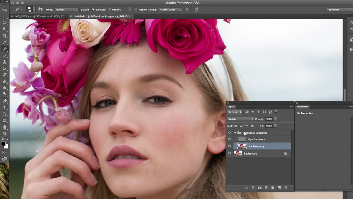 Frequency separation layers visible in the Photoshop layers panel
Frequency separation splits your image into two components: a low-frequency layer that holds color and tone, and a high-frequency layer that holds texture and fine detail. Working on these separately means you can smooth out blotchy skin color without destroying pore texture, and you can clean up texture without smearing color across the face.
Frequency separation layers visible in the Photoshop layers panel
Frequency separation splits your image into two components: a low-frequency layer that holds color and tone, and a high-frequency layer that holds texture and fine detail. Working on these separately means you can smooth out blotchy skin color without destroying pore texture, and you can clean up texture without smearing color across the face.
If you’ve never set up frequency separation before, Jessica points out that she has a dedicated tutorial covering the full setup process in depth. Get that foundation first. For this walkthrough, assume both layers are already created and labeled before you pick up any tool.
Step 2: Retouch Texture on the High-Frequency Layer
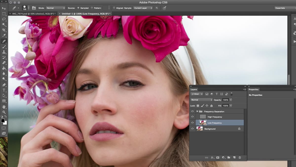 Healing brush active on the high-frequency texture layer
With your high-frequency layer selected, reach for the Healing Brush (not the Spot Healing Brush). The distinction matters. The Healing Brush lets you manually define your sample point, which gives you control over where Photoshop pulls texture from when it blends. On a high-frequency layer, you’re only moving texture information, so the risk of smearing color is eliminated entirely.
Healing brush active on the high-frequency texture layer
With your high-frequency layer selected, reach for the Healing Brush (not the Spot Healing Brush). The distinction matters. The Healing Brush lets you manually define your sample point, which gives you control over where Photoshop pulls texture from when it blends. On a high-frequency layer, you’re only moving texture information, so the risk of smearing color is eliminated entirely.
Work in small, deliberate strokes. Sample from an area close to the problem spot so the texture grain matches. Jessica keeps her corrections subtle here, which is the right call. Over-retouching the texture layer creates a smooth, mannequin-like result that reads as obviously edited.
Step 3: Even Out Skin Color on the Low-Frequency Layer
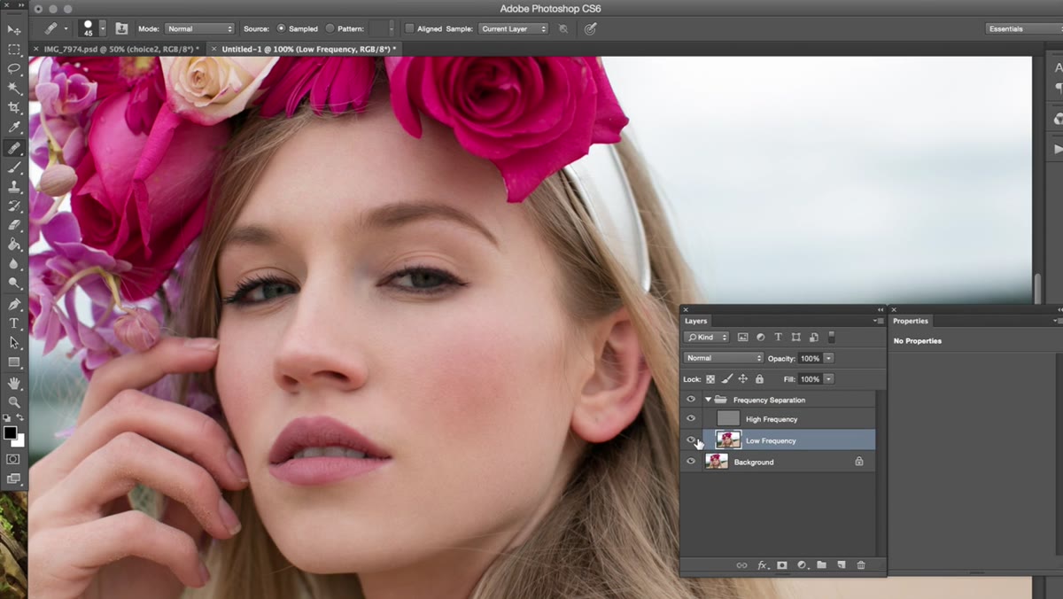 Painting over skin tones on the low-frequency layer with soft brush
Switch to your low-frequency layer. This is where color and tonal unevenness live. Jessica’s method here is one I’ve used in my own work for a while: create a new layer directly above the low-frequency layer, sample a color from the skin using the eyedropper, and paint gently over the patchy areas with a soft brush at low opacity.
Painting over skin tones on the low-frequency layer with soft brush
Switch to your low-frequency layer. This is where color and tonal unevenness live. Jessica’s method here is one I’ve used in my own work for a while: create a new layer directly above the low-frequency layer, sample a color from the skin using the eyedropper, and paint gently over the patchy areas with a soft brush at low opacity.
The goal is gradual blending, not coverage. Think of it less like painting and more like glazing. Build the correction in two or three passes rather than committing to full opacity in one stroke. The result should look like the skin was always that even, not like someone filled in a gap.
Step 4: Set the Paint Layer to Color Blend Mode
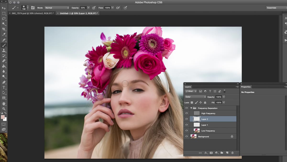 Layer blend mode dropdown set to Color in the layers panel
This is the step that keeps the technique from going wrong. Once you’ve painted your skin color corrections, set that layer’s blend mode to Color. This tells Photoshop to apply only the hue and saturation from your painted strokes while completely ignoring the luminosity values underneath.
Layer blend mode dropdown set to Color in the layers panel
This is the step that keeps the technique from going wrong. Once you’ve painted your skin color corrections, set that layer’s blend mode to Color. This tells Photoshop to apply only the hue and saturation from your painted strokes while completely ignoring the luminosity values underneath.
What that means in practice: you’re not lightening or darkening the skin, only shifting its color. Tonal variation stays intact, which is what makes the correction look three-dimensional rather than flat. Jessica flags a specific area on the forehead where a slightly different color is coming from reflected light off nearby flowers in the shot. She leaves it alone, which is the right instinct. Not every variation is a flaw.
Step 5: Add a Subtle Eye Highlight
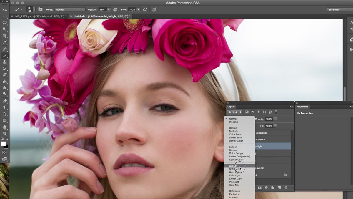 White brush stroke on overlay layer adding highlight to the eye
Create a new blank layer above everything else. Set your foreground color to white and change the layer blend mode to Overlay. With a small, soft brush, paint a gentle highlight directly over the iris and catchlight area of the eye.
White brush stroke on overlay layer adding highlight to the eye
Create a new blank layer above everything else. Set your foreground color to white and change the layer blend mode to Overlay. With a small, soft brush, paint a gentle highlight directly over the iris and catchlight area of the eye.
The critical setting here is opacity. Jessica brings this down to around 33%, and I’d say that’s close to the ceiling for most portraits. Push past 50% and the eyes start looking digitally lit in a way that feels disconnected from the rest of the face. At 33%, you get a brightness boost that reads as natural. The eye catches attention without announcing that it was touched.
Step 6: Evaluate the Full Edit at Reduced Opacity
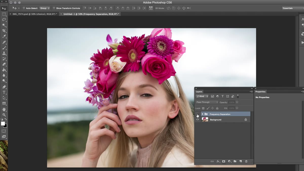 Before and after comparison of the retouched portrait in Photoshop
Before you call it done, toggle your retouch layers on and off and compare at 50% zoom. Zoomed in, it’s easy to convince yourself that every correction was necessary. Zoomed out at a more natural viewing distance, some of those corrections either disappear or reveal themselves as slightly overdone.
Before and after comparison of the retouched portrait in Photoshop
Before you call it done, toggle your retouch layers on and off and compare at 50% zoom. Zoomed in, it’s easy to convince yourself that every correction was necessary. Zoomed out at a more natural viewing distance, some of those corrections either disappear or reveal themselves as slightly overdone.
Jessica’s overall approach here is what she describes as clean and basic, which is not a limitation but a deliberate style. Dodging and burning, contouring, heavy skin sculpting - none of that appears in this workflow. The retouching serves the image rather than replacing it.
What I’d Add From My Own Experience
One thing the video doesn’t dig into, but that I’ve found makes a real difference, is building a consistent opacity rhythm before you start. I keep my healing brush at 85% and my painting layers at 20-25% opacity throughout, and I never adjust mid-correction unless something has clearly gone wrong. Constantly tweaking opacity while you work introduces inconsistency that shows up in the final image as subtle patchiness, which is the exact problem frequency separation is supposed to solve.
I also keep a flattened snapshot of the original image in a separate document and flip between the two every fifteen minutes or so. It’s easy to drift, especially on longer retouches. That comparison reset catches me before I’ve gone too far in any direction.
The single most important thing to take from Jessica’s workflow is this: separate the problem before you solve it. Texture and color are different issues that respond to different tools, and conflating them is where most over-retouching begins. Get comfortable with frequency separation as a setup, keep your opacity low, and trust that subtle corrections accumulate into something significant.
Watch the full tutorial on YouTube to see the color grading portion of this workflow and watch the healing brush corrections in real time, which is genuinely easier to absorb by watching than by reading.
Comments (1)
Tried this technique this morning. Game changer for real.
Leave a Comment