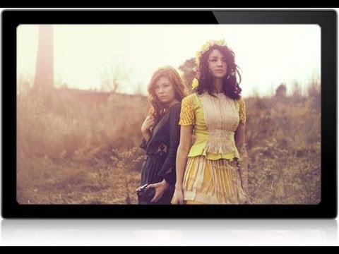
There’s a specific kind of frustration I know well from my early retouching days: an image that is technically good in almost every way, except the subject’s skin looks slightly blue, slightly flat, slightly wrong. The background reads beautifully. The composition is strong. But the skin tone pulls you out of the photo entirely, and no amount of staring at it tells you exactly what to fix. I spent an embarrassing amount of time in my first retouching years just dragging sliders around hoping something would click. What I was missing was a systematic approach, one that treats skin tone correction and stylizing as two separate, sequential problems.
That’s exactly what Aaron Nace walks through in this tutorial from PHLEARN. Watch the full tutorial on YouTube - it’s one of the cleaner end-to-end color correction workflows I’ve seen, and it translated directly into how I now approach portrait edits for beauty clients. The image he’s working with has a cooler color temperature that flatters the environment but drains the warmth right out of the skin. Sound familiar? Here’s how he fixes it, step by step.
Step 1: Read the Problem Before You Touch a Slider
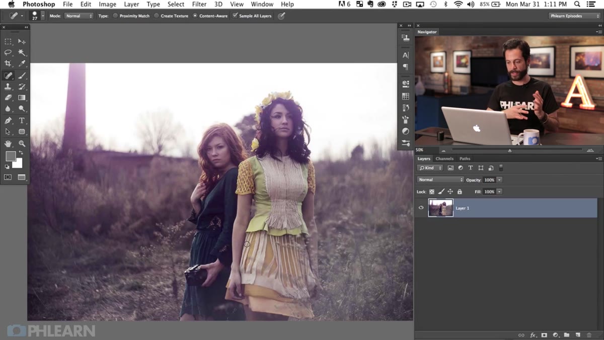 Host pointing out bluish, desaturated skin tones on subject
Before opening a single adjustment layer, take a beat to actually diagnose what’s wrong. In this image, the skin tones read as slightly bluish and desaturated, likely the result of a cooler white balance that worked well for the scene’s mood but didn’t serve the subject. Aaron flags this distinction early: the background can carry a cool, atmospheric look, but skin tone needs warmth to read as natural. Knowing that the fix is about adding red and yellow into the skin, rather than just “warming things up globally,” is what keeps the correction surgical instead of sloppy.
Host pointing out bluish, desaturated skin tones on subject
Before opening a single adjustment layer, take a beat to actually diagnose what’s wrong. In this image, the skin tones read as slightly bluish and desaturated, likely the result of a cooler white balance that worked well for the scene’s mood but didn’t serve the subject. Aaron flags this distinction early: the background can carry a cool, atmospheric look, but skin tone needs warmth to read as natural. Knowing that the fix is about adding red and yellow into the skin, rather than just “warming things up globally,” is what keeps the correction surgical instead of sloppy.
Step 2: Use Color Balance to Warm the Midtones and Shadows
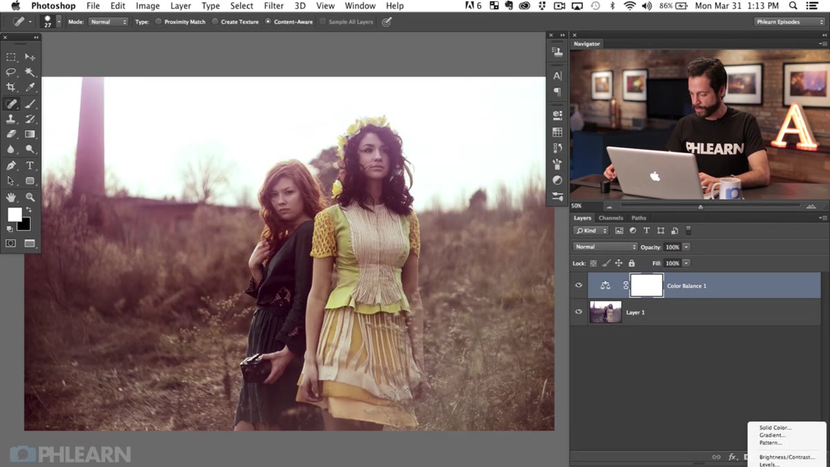
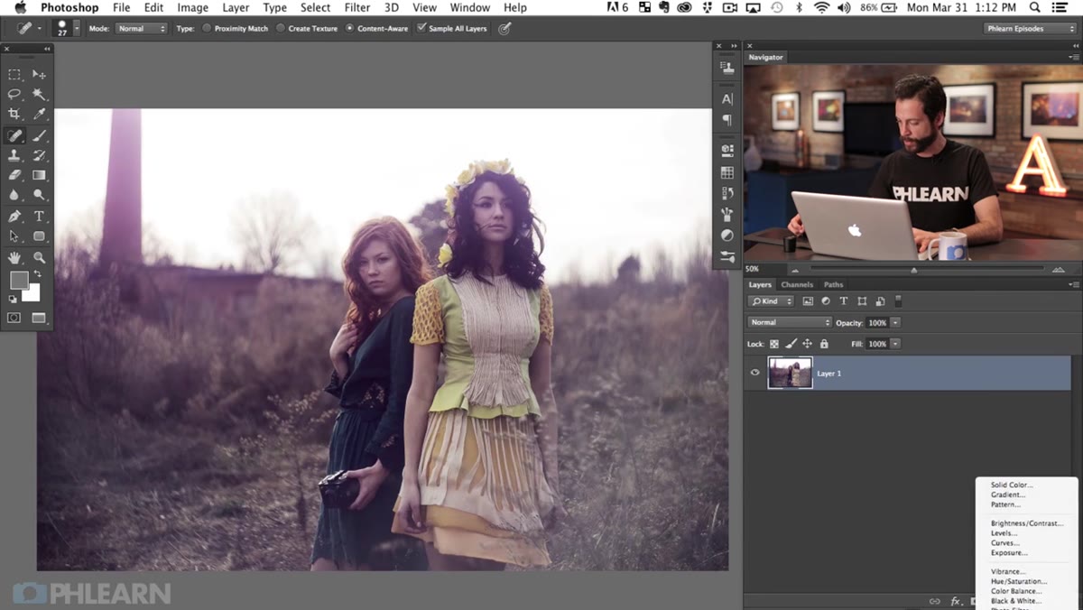 Color Balance adjustment layer panel open, Midtones selected
Add a Color Balance adjustment layer. This tool is genuinely underused for skin correction, and Aaron makes a strong case for it here: it lets you address highlights, midtones, and shadows independently, which matters because skin doesn’t respond the same way across its tonal range. Start with the midtones, since that’s where the most readable skin information lives. Slide the color sliders toward red and toward yellow. Human skin, across a wide range of tones, is essentially a variation of orange, so you’re not guessing when you add warmth here. You’re correcting toward something the eye already expects.
Color Balance adjustment layer panel open, Midtones selected
Add a Color Balance adjustment layer. This tool is genuinely underused for skin correction, and Aaron makes a strong case for it here: it lets you address highlights, midtones, and shadows independently, which matters because skin doesn’t respond the same way across its tonal range. Start with the midtones, since that’s where the most readable skin information lives. Slide the color sliders toward red and toward yellow. Human skin, across a wide range of tones, is essentially a variation of orange, so you’re not guessing when you add warmth here. You’re correcting toward something the eye already expects.
Next, move to the shadows. A small push toward red and orange in the shadow tones reinforces the warmth without making the image look over-processed. The key word is small. A value of 5-10 on each slider is usually enough. Overcorrect and the shadows start reading as muddy.
Step 3: Cool the Highlights to Keep Them Believable
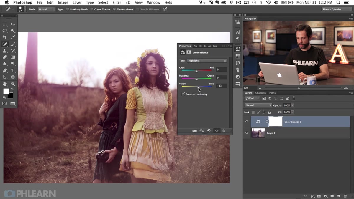 Color Balance panel on Highlights tab, sliders pushed toward cyan and blue
Switch to the Highlights tab inside Color Balance. This is the counterintuitive part, and it’s one of the moves that separates a correction that looks natural from one that looks like you applied a filter. Highlights on skin aren’t really showing you skin color at all. They’re showing you reflected light from the environment. So if the environment has a cool, ambient quality to it, a slight push toward cyan and blue in the highlights actually makes the image feel more cohesive, not less warm. It preserves the atmosphere of the scene while the midtones and shadows do the work of grounding the subject in warm, healthy-looking skin.
Color Balance panel on Highlights tab, sliders pushed toward cyan and blue
Switch to the Highlights tab inside Color Balance. This is the counterintuitive part, and it’s one of the moves that separates a correction that looks natural from one that looks like you applied a filter. Highlights on skin aren’t really showing you skin color at all. They’re showing you reflected light from the environment. So if the environment has a cool, ambient quality to it, a slight push toward cyan and blue in the highlights actually makes the image feel more cohesive, not less warm. It preserves the atmosphere of the scene while the midtones and shadows do the work of grounding the subject in warm, healthy-looking skin.
Step 4: Pop Specific Colors with Hue Saturation
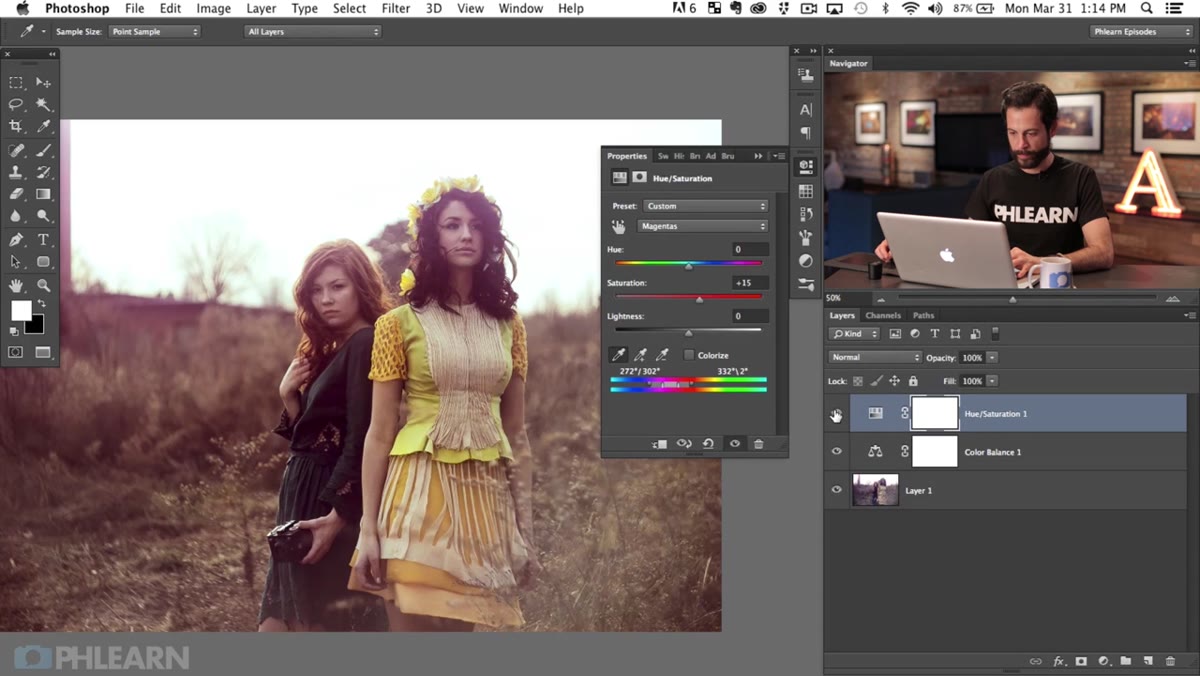
 Hue Saturation panel open, Yellows channel selected from dropdown
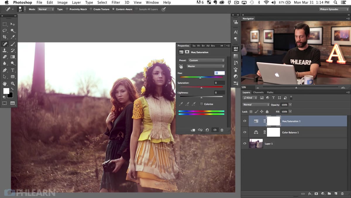
Once the skin tones are corrected, Aaron shifts into stylizing mode. He adds a Hue Saturation adjustment layer and targets the yellow channel specifically, using the eyedropper to sample directly from the subject’s yellow dress. This is a detail worth pausing on. Instead of selecting “Yellows” from the dropdown and hoping it catches the right hue range, he clicks directly on the fabric. Photoshop adjusts the range selector at the bottom of the panel to match exactly what he clicked. You can see it shift. That precision is the difference between a targeted color pop and an adjustment that bleeds into skin tones or other elements nearby.
Hue Saturation panel open, Yellows channel selected from dropdown
Once the skin tones are corrected, Aaron shifts into stylizing mode. He adds a Hue Saturation adjustment layer and targets the yellow channel specifically, using the eyedropper to sample directly from the subject’s yellow dress. This is a detail worth pausing on. Instead of selecting “Yellows” from the dropdown and hoping it catches the right hue range, he clicks directly on the fabric. Photoshop adjusts the range selector at the bottom of the panel to match exactly what he clicked. You can see it shift. That precision is the difference between a targeted color pop and an adjustment that bleeds into skin tones or other elements nearby.
With the correct yellow range isolated, he nudges the Saturation slider up. Not aggressively, just enough for the color to feel intentional rather than incidental. The dress becomes a design element in the image instead of background noise.
Step 5: Mask Your Corrections to the Subject
 Layer mask being painted with black brush over background areas
Global adjustments almost never stay where you want them. The Color Balance warm-up that fixes the skin will also shift the background, which Aaron specifically wanted to keep cool. The solution is layer masking, and the workflow here is straightforward: fill the mask with black to hide the adjustment entirely, then paint white over the subject with a soft brush to reveal the correction only where you need it. Work at a medium-to-low brush opacity, especially around the edges of the subject, so the transition doesn’t look like a cutout. This is the step most beginners skip, and it’s also the step that makes the difference between a correction that looks retouched and one that looks like the photo was always this way.
Layer mask being painted with black brush over background areas
Global adjustments almost never stay where you want them. The Color Balance warm-up that fixes the skin will also shift the background, which Aaron specifically wanted to keep cool. The solution is layer masking, and the workflow here is straightforward: fill the mask with black to hide the adjustment entirely, then paint white over the subject with a soft brush to reveal the correction only where you need it. Work at a medium-to-low brush opacity, especially around the edges of the subject, so the transition doesn’t look like a cutout. This is the step most beginners skip, and it’s also the step that makes the difference between a correction that looks retouched and one that looks like the photo was always this way.
Step 6: Add a Color Grade to Unify the Image
 Curves adjustment layer open with blue channel pulled into shadows
With the subject corrected and masked, Aaron brings the stylized cool tone back into the image as a deliberate color grade rather than a mistake. A Curves adjustment layer applied to the overall image, with a slight lift in the blue channel in the shadows, reintroduces that atmospheric quality to the scene without touching the skin tones underneath. This is the value of doing the correction first and the grade second: you protect what matters, then paint the mood on top.
Curves adjustment layer open with blue channel pulled into shadows
With the subject corrected and masked, Aaron brings the stylized cool tone back into the image as a deliberate color grade rather than a mistake. A Curves adjustment layer applied to the overall image, with a slight lift in the blue channel in the shadows, reintroduces that atmospheric quality to the scene without touching the skin tones underneath. This is the value of doing the correction first and the grade second: you protect what matters, then paint the mood on top.
What I’d Add From My Own Practice
The masking step Aaron demonstrates works beautifully for images where the subject and background have clear separation. In my beauty work, I frequently deal with images where hair, flyaways, or soft focus edges make a simple painted mask too crude. My go-to addition to this workflow is running Select and Mask after the initial rough mask to refine hair edges, or using a luminosity mask when the subject and background share similar tonal values. The Color Balance approach holds up regardless. It’s the masking that needs to flex based on the complexity of your specific image.
The core takeaway here is the sequencing: correct the skin tone problem first using Color Balance across the tonal ranges, stylize specific colors second with targeted Hue Saturation, and then apply your color grade on top last. That order prevents you from color-grading a problem into permanence rather than solving it. It’s a workflow I come back to regularly, and seeing Aaron lay it out this cleanly was a genuine “oh, that’s how to do it properly” moment for me.
Watch the full tutorial on YouTube to see Aaron walk through every adjustment in real time. Watching the sliders move alongside his explanation makes the color balance logic especially easy to internalize.
Comments
Leave a Comment