There’s a specific kind of portrait that used to make me nervous to retouch – the ones where the subject’s skin is blotchy, the lighting is a little flat, and the whole image feels like it needs something you can’t quite name. For a long time, I’d throw frequency separation at it, or get heavy-handed with the HSL panel, and the result would look corrected rather than beautiful. What was missing, more often than not, was intentional light shaping directly on the face.
That’s why I keep coming back to dodge and burn, and specifically to how Kelvin walks through it in this tutorial. Watch the full tutorial on YouTube – it’s only a few minutes long, but the thinking behind it applies to almost every portrait sitting in your queue. What I want to do here is slow it down, fill in the reasoning behind each move, and give you something you can actually follow along with in your own workspace.
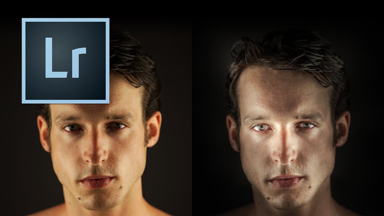
The photo Kelvin works with is a strong one – good bone structure, decent exposure – but it has the exact problems I see constantly: oversaturated skin, too-warm color temperature, and no real sense of depth or drama. By the end of the edit, the same image looks like it was shot with a completely different intention. Here’s how he gets there.
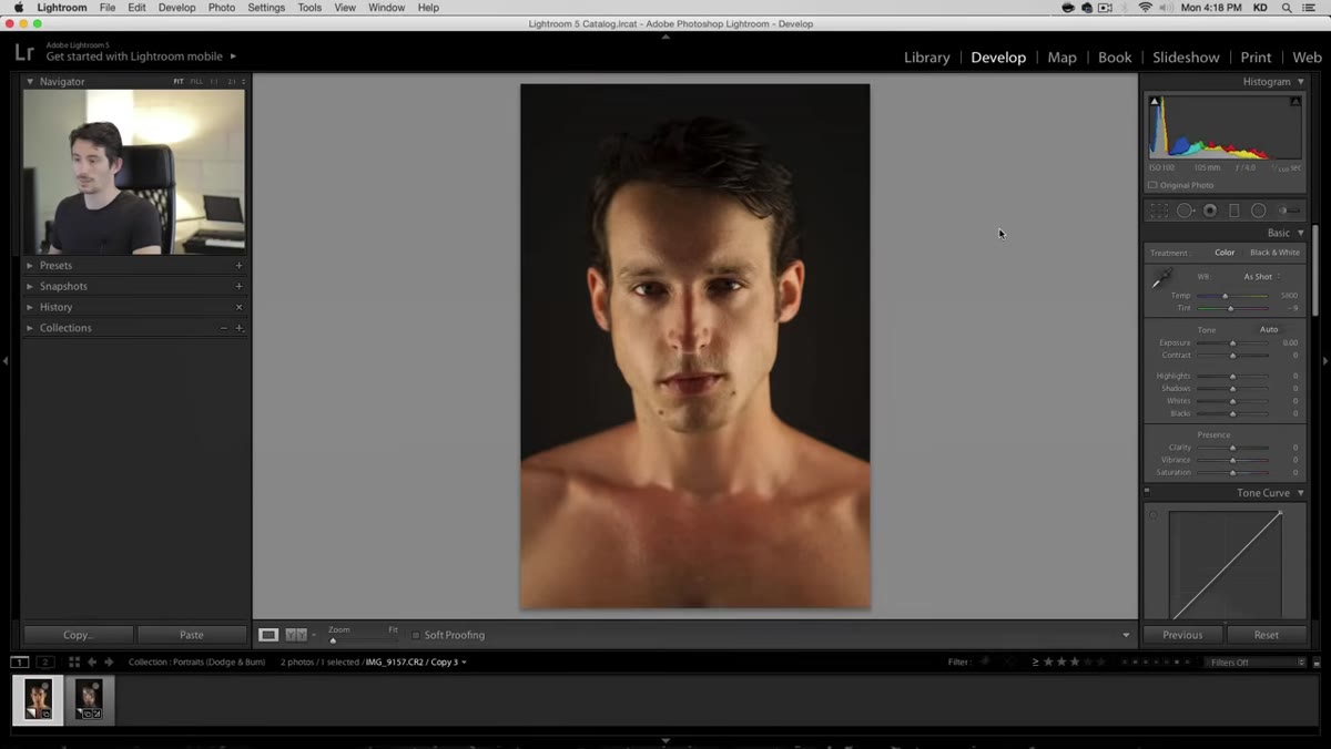
Step 1: Create a Virtual Copy Before You Touch Anything
 Creating a virtual copy in Lightroom’s Library module
Before making a single adjustment, right-click your image in Lightroom and choose “Create Virtual Copy.” This gives you a parallel version of the file that shares the same raw data but holds its own edit history. You can toggle between your original and your edit without any destructive changes or duplicate files eating your storage. I do this on every portrait I retouch professionally – it takes three seconds and saves the “wait, what did it look like before?” panic later.
Creating a virtual copy in Lightroom’s Library module
Before making a single adjustment, right-click your image in Lightroom and choose “Create Virtual Copy.” This gives you a parallel version of the file that shares the same raw data but holds its own edit history. You can toggle between your original and your edit without any destructive changes or duplicate files eating your storage. I do this on every portrait I retouch professionally – it takes three seconds and saves the “wait, what did it look like before?” panic later.
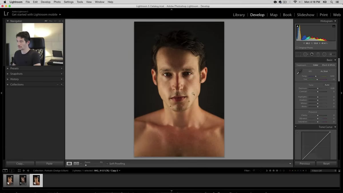
Step 2: Cool Down the Temperature and Open the Tonal Range
 Basic panel with temperature slider being pulled left
The starting image reads too warm and a little muddy. Pull the temperature slider slightly to the left – not a dramatic shift, just enough to cut that excess yellow out of the skin. Leave the tint where it is. Then bring your highlights down and lift your shadows up, but stay well away from the extremes on both. Pushing those sliders to 100 in either direction creates that crunchy, over-processed HDR look that reads immediately as artificial. A moderate pull on each gives the image breathing room without flattening it.
Basic panel with temperature slider being pulled left
The starting image reads too warm and a little muddy. Pull the temperature slider slightly to the left – not a dramatic shift, just enough to cut that excess yellow out of the skin. Leave the tint where it is. Then bring your highlights down and lift your shadows up, but stay well away from the extremes on both. Pushing those sliders to 100 in either direction creates that crunchy, over-processed HDR look that reads immediately as artificial. A moderate pull on each gives the image breathing room without flattening it.
Add a small amount of clarity – again, restrained. Clarity on portraits is a tool you want to whisper with, not shout.
Step 3: Drop the Vibrance to Calm the Skin
 Vibrance slider pulled to minus 30 in Basic panel
Here’s the move that surprised me the first time I saw it: pull the Vibrance down to around -30. The skin will look a little gray and desaturated, and your instinct will be to pull it back. Don’t. This is temporary. What you’re doing is clearing out the blotchy, over-red color cast that makes skin look reactive and uneven. The color will come back to life once you apply the dodge and burn layer. Think of this step as clearing the canvas before you paint.
Vibrance slider pulled to minus 30 in Basic panel
Here’s the move that surprised me the first time I saw it: pull the Vibrance down to around -30. The skin will look a little gray and desaturated, and your instinct will be to pull it back. Don’t. This is temporary. What you’re doing is clearing out the blotchy, over-red color cast that makes skin look reactive and uneven. The color will come back to life once you apply the dodge and burn layer. Think of this step as clearing the canvas before you paint.
Step 4: Use the Brush Tool to Burn the Perimeter of the Face
 Adjustment brush active, painting dark exposure around face edges
Switch to the Adjustment Brush (the keyboard shortcut is K). Reset everything to zero. Then pull the Exposure slider down significantly – Kelvin exaggerates this at first so he can clearly see where the brush is hitting, which is a smart working habit. Use a medium-sized, feathered brush and paint around the outside of the face: the temples, the sides of the forehead, the area framing the cheeks. You’re dimming the periphery to push the viewer’s eye toward the center of the frame.
Adjustment brush active, painting dark exposure around face edges
Switch to the Adjustment Brush (the keyboard shortcut is K). Reset everything to zero. Then pull the Exposure slider down significantly – Kelvin exaggerates this at first so he can clearly see where the brush is hitting, which is a smart working habit. Use a medium-sized, feathered brush and paint around the outside of the face: the temples, the sides of the forehead, the area framing the cheeks. You’re dimming the periphery to push the viewer’s eye toward the center of the frame.
Keep your Density around 50 and Flow at 100. Density controls the ceiling of the effect; Flow controls how quickly you build up to that ceiling. This combination lets you be deliberate without committing too hard on each stroke.
Step 5: Create a Second Brush Node to Burn the Chest and Jaw
 New brush node placed on chest area below chin
Click “New” in the brush panel to start a fresh adjustment node – this keeps your facial darkening separate from what you’re about to do on the body. Paint down across the chest and the area just beneath the chin. Darkening the chest draws the eye upward toward the face. Near the jawline, switch to a smaller brush and work carefully along the edge of the jaw itself. When you darken just below a strong jawline, the jaw reads as even sharper and more defined. It’s a subtle sculpting trick that works on almost any face shape.
New brush node placed on chest area below chin
Click “New” in the brush panel to start a fresh adjustment node – this keeps your facial darkening separate from what you’re about to do on the body. Paint down across the chest and the area just beneath the chin. Darkening the chest draws the eye upward toward the face. Near the jawline, switch to a smaller brush and work carefully along the edge of the jaw itself. When you darken just below a strong jawline, the jaw reads as even sharper and more defined. It’s a subtle sculpting trick that works on almost any face shape.
If the transition looks abrupt, feather a soft stroke along the border to blend it out. You want the eye to travel through the darkness, not bump into it.
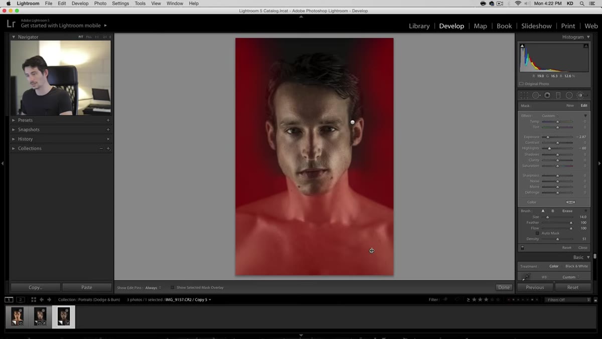
Step 6: Hover to Audit Your Brush Placement
 Mouse hovering over pin showing painted mask overlay
Once you have a few brush nodes down, hover over each pin to see the red overlay mask that shows exactly where your adjustments are landing. This is the step most people skip, and it’s where a lot of retouching goes wrong. Masks drift. You think you painted along the jaw and you actually hit the neck or the ear. Rolling over the pins to audit your coverage takes thirty seconds and keeps your edit honest.
Mouse hovering over pin showing painted mask overlay
Once you have a few brush nodes down, hover over each pin to see the red overlay mask that shows exactly where your adjustments are landing. This is the step most people skip, and it’s where a lot of retouching goes wrong. Masks drift. You think you painted along the jaw and you actually hit the neck or the ear. Rolling over the pins to audit your coverage takes thirty seconds and keeps your edit honest.
What I’d Add From My Own Workflow
The technique Kelvin demonstrates here is Lightroom-native, which makes it fast and accessible. But in my own work on beauty clients, I often take the same dodge and burn logic into Photoshop on a gray overlay layer set to Soft Light – the 50% gray layer method – when I need finer control over micro-shadows on skin texture. The principle is identical: darken what you want to recede, lighten what you want to advance. Lightroom’s brush tool is the right tool when you’re working quickly or teaching the concept for the first time. Once the logic is in your hands, you can apply it anywhere.
The other thing I’d flag: this workflow depends heavily on that Vibrance reduction in Step 3. If you skip it and try to dodge and burn on oversaturated skin, you’ll be fighting the color the entire time. Let the desaturation do its job first.
The single most important idea in this tutorial is that Lightroom’s Adjustment Brush isn’t just for exposure corrections – it’s a light-shaping tool, and portrait photographers who treat it that way start making images that feel deliberate rather than processed. Kelvin makes the whole thing approachable without dumbing it down, and the before-and-after in the video is genuinely convincing.
Watch the full tutorial on YouTube and follow along with your own portrait. A few minutes in, you’ll start seeing faces differently.
Comments
Leave a Comment