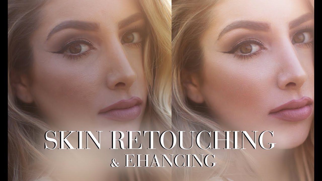
Early in my retouching career, a client told me my edits looked “plastic.” She wasn’t wrong. I had been smoothing everything, flattening pores, obliterating the tiny imperfections that make a face look like a face. It took a long time, a lot of ruined portraits, and eventually a deep dive into frequency separation to understand that good skin retouching is about evening tone and preserving texture, not erasing humanity. That shift in thinking changed everything about how I work.
In this Jessica Kobeissi tutorial, she walks through exactly that philosophy on a real portrait, using frequency separation as her primary technique. This is Part 1 of a two-part series covering retouching alone, before any color grading happens. What I appreciate about her approach is how undramatic it is. She’s not transforming anyone. She’s tidying. And that restraint is worth studying as closely as the technique itself.
Frequency separation splits an image into two layers: one that holds color and tone information (low frequency), and one that holds texture and fine detail (high frequency). Working on each independently means you can smooth uneven skin tone without softening pores, and vice versa. It’s a cleaner, faster approach than dodge and burn for most portrait work, which is why it’s become the backbone of my own retouching workflow.
Step 1: Set Up Your Frequency Separation Layers and Duplicate Before Touching Anything
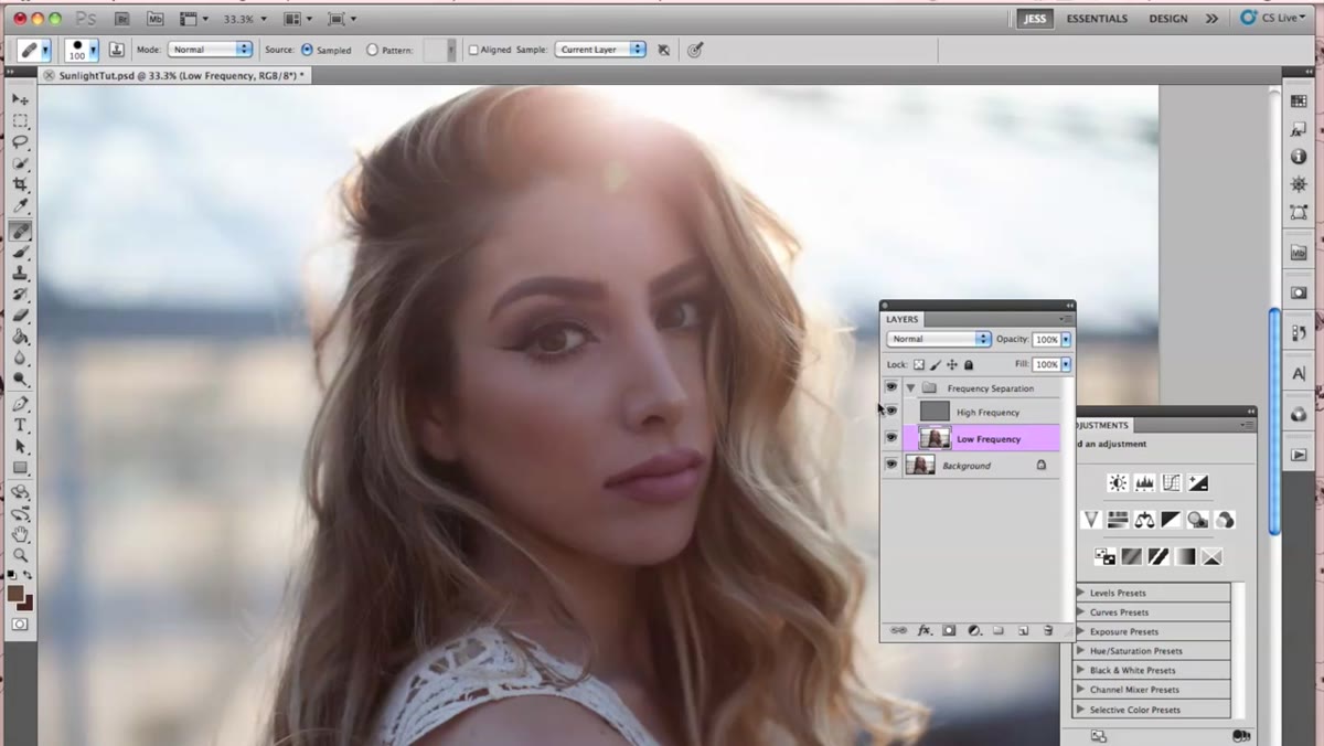 Low and high frequency folders visible in the Photoshop layers panel
Before a single pixel gets changed, the image should already be organized into low frequency and high frequency layers. If you haven’t run frequency separation on your file yet, Jessica has a separate tutorial dedicated to that setup process alone. Once those layers exist, the first move is to duplicate whichever layer you’re about to work on. She uses Command+J to duplicate the low frequency layer and keeps the original underneath as a safety net. This is a habit worth building immediately. Retouching on a duplicate means you can toggle back to the original at any point to compare, or simply throw away the working copy if things go sideways.
Low and high frequency folders visible in the Photoshop layers panel
Before a single pixel gets changed, the image should already be organized into low frequency and high frequency layers. If you haven’t run frequency separation on your file yet, Jessica has a separate tutorial dedicated to that setup process alone. Once those layers exist, the first move is to duplicate whichever layer you’re about to work on. She uses Command+J to duplicate the low frequency layer and keeps the original underneath as a safety net. This is a habit worth building immediately. Retouching on a duplicate means you can toggle back to the original at any point to compare, or simply throw away the working copy if things go sideways.
Step 2: Use the Healing Brush on the Low Frequency Layer to Even Skin Tone
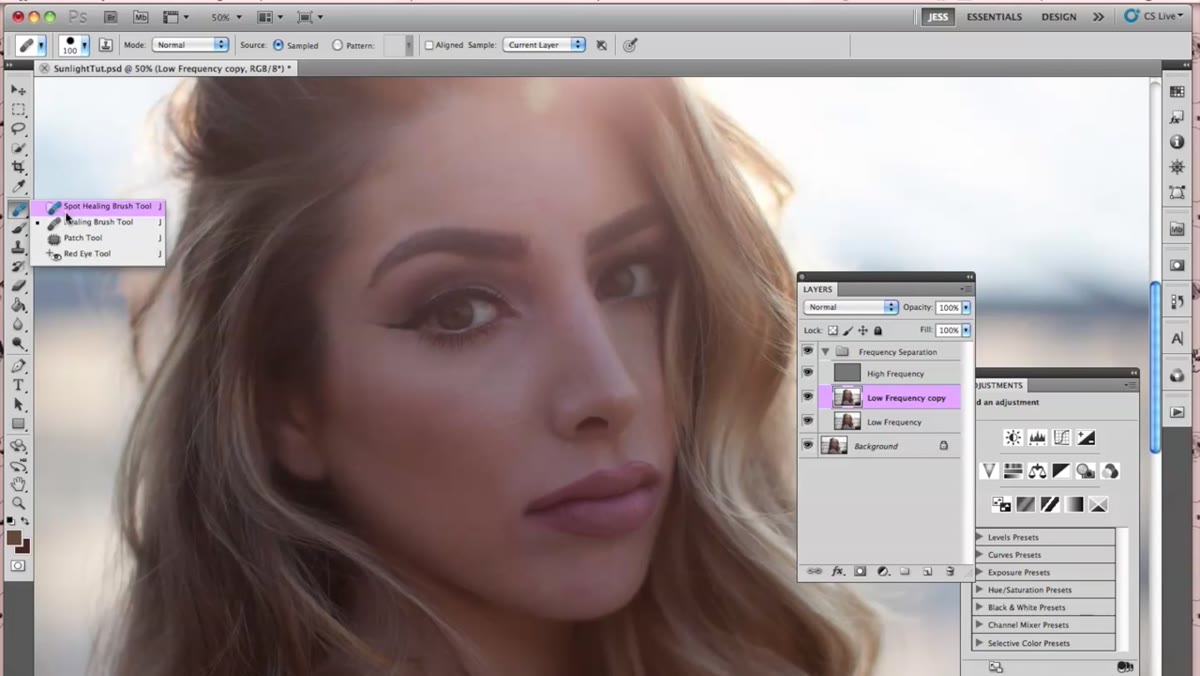 Healing brush tool selected, cursor near the subject’s under-eye area
With the duplicated low frequency layer active, Jessica switches to the Healing Brush tool (not the Spot Healing Brush). The key distinction matters here: the regular Healing Brush lets you manually define your sample point by holding Alt and clicking the area you want to borrow from. She samples from neighboring skin regions, keeping the source close to the target area so the color and tone match naturally. Think of it as borrowing from the same neighborhood rather than reaching across town.
Healing brush tool selected, cursor near the subject’s under-eye area
With the duplicated low frequency layer active, Jessica switches to the Healing Brush tool (not the Spot Healing Brush). The key distinction matters here: the regular Healing Brush lets you manually define your sample point by holding Alt and clicking the area you want to borrow from. She samples from neighboring skin regions, keeping the source close to the target area so the color and tone match naturally. Think of it as borrowing from the same neighborhood rather than reaching across town.
Her approach is deliberately light-handed in the under-eye area. Lines and slight texture are left alone. She’s targeting uneven blotches and discoloration, not erasing any sign that the subject is a living person. This is where a graphics tablet earns its keep: pressure sensitivity gives you much finer control over how much correction gets applied with each stroke.
Step 3: Duplicate and Work the High Frequency Layer for Spot Cleanup
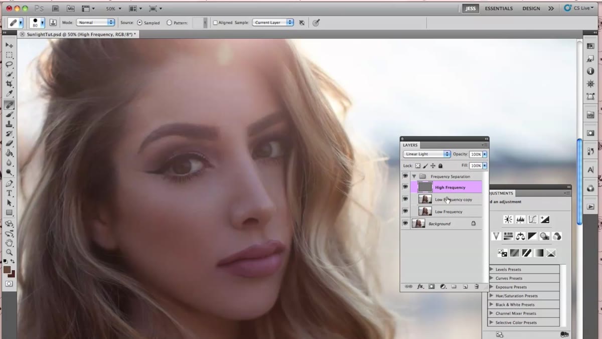 High frequency layer duplicated, original layer turned off in layers panel
Once the tone work is done on the low frequency layer, Jessica moves up to the high frequency layer and duplicates it the same way. The original gets turned off, and all edits happen on the copy. This layer holds the skin’s texture, so the retouching here is different in character. Rather than smoothing broad patches of color, she’s looking for specific textural anomalies: a blemish edge, an area where pores look disrupted, anything that reads as visually out of place.
High frequency layer duplicated, original layer turned off in layers panel
Once the tone work is done on the low frequency layer, Jessica moves up to the high frequency layer and duplicates it the same way. The original gets turned off, and all edits happen on the copy. This layer holds the skin’s texture, so the retouching here is different in character. Rather than smoothing broad patches of color, she’s looking for specific textural anomalies: a blemish edge, an area where pores look disrupted, anything that reads as visually out of place.
The Healing Brush works here too, still sampling from nearby areas. The goal is to blend irregular texture into the surrounding skin grain without flattening it. If the texture disappears, you’ve gone too far.
Step 4: Toggle Off the High Frequency Layer to Diagnose Color Patches
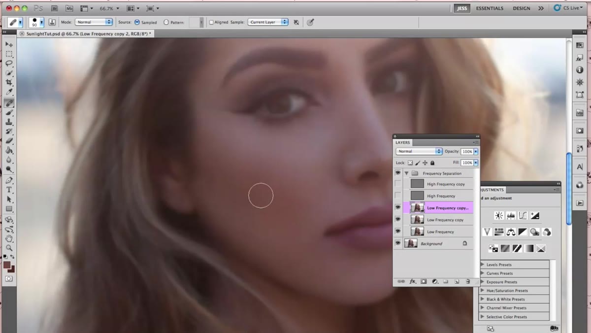 High frequency layer hidden, revealing uneven color patches on cheek area
Here’s a diagnostic move I now use constantly in my own work. By turning the high frequency layer’s visibility off, you strip away the texture and see only the underlying tone map. Patches of color that seemed subtle suddenly become obvious. Jessica uses this view specifically to identify an uneven area on the subject’s cheek that needed attention.
High frequency layer hidden, revealing uneven color patches on cheek area
Here’s a diagnostic move I now use constantly in my own work. By turning the high frequency layer’s visibility off, you strip away the texture and see only the underlying tone map. Patches of color that seemed subtle suddenly become obvious. Jessica uses this view specifically to identify an uneven area on the subject’s cheek that needed attention.
This toggle is especially useful after you’ve been staring at a portrait for a while, because your eyes start to adapt to the problem areas and stop registering them. Hiding the texture layer essentially resets your perception and shows you where the real work still needs to happen.
Step 5: Paint a Color Blend Layer at Ultra-Low Opacity to Smooth Transitions
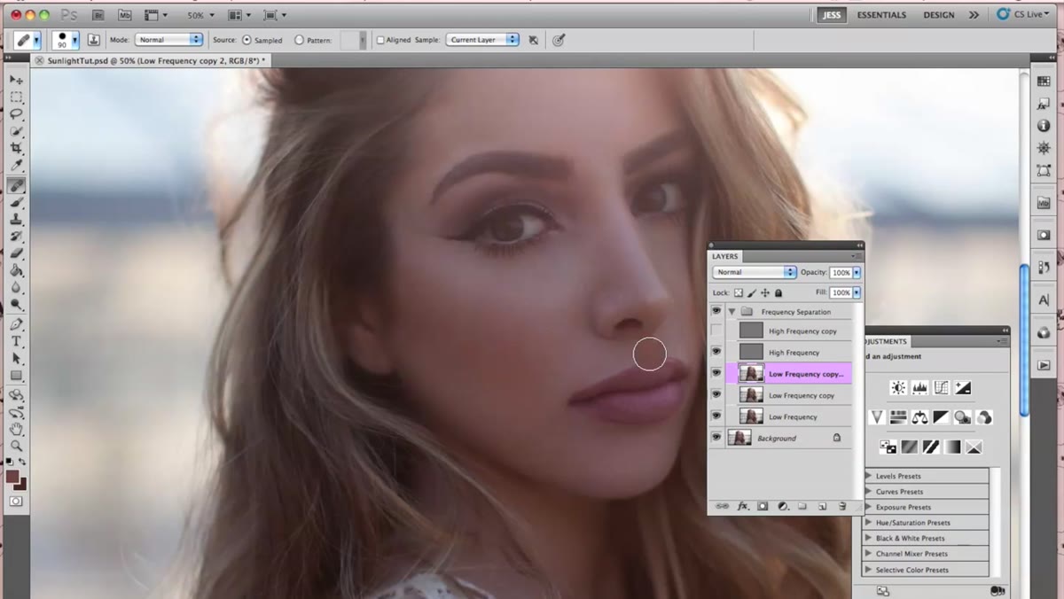 New layer created, brush tool active, opacity set to 11% in the toolbar
For the cheek area specifically, Jessica creates a brand new empty layer above the low frequency work using Command+Shift+N. She samples a color directly from the skin using the eyedropper, then paints over the uneven patch with a soft brush set to Normal blend mode at just 11% opacity. The goal is not to fill in the area, but to deposit a whisper of color that nudges the transition toward smoothness.
New layer created, brush tool active, opacity set to 11% in the toolbar
For the cheek area specifically, Jessica creates a brand new empty layer above the low frequency work using Command+Shift+N. She samples a color directly from the skin using the eyedropper, then paints over the uneven patch with a soft brush set to Normal blend mode at just 11% opacity. The goal is not to fill in the area, but to deposit a whisper of color that nudges the transition toward smoothness.
This is the step most beginners either skip or overdo. The temptation is to bump the opacity up to actually see what you’re doing, but anything above 15 to 20 percent starts to look painted. Multiple light passes at low opacity give you far more control than a single heavy stroke. She keeps the blend mode at Normal rather than Lighten or Darken so the result blends into whatever tone is underneath without biasing toward one end of the range.
Step 6: Compare Before and After by Toggling Layers
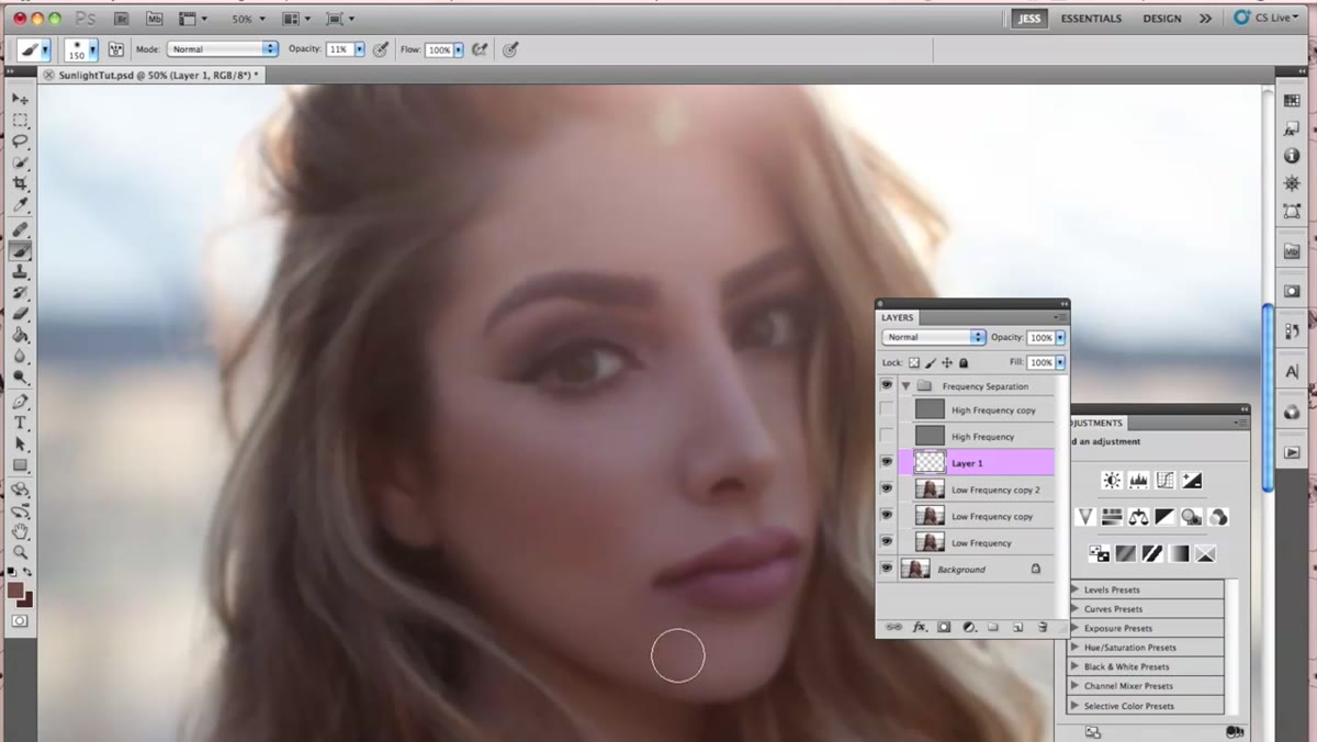 Layer visibility toggled off to show before state of the cheek correction
The final check is simple: toggle the correction layers on and off to evaluate the difference. Jessica does this to show how much the color blend layer actually contributed to the cheek area. The before/after comparison is your quality control. If the retouched version reads as different at a glance, you’ve probably pushed too far. The goal is that the “after” view simply looks like the subject on a better skin day.
Layer visibility toggled off to show before state of the cheek correction
The final check is simple: toggle the correction layers on and off to evaluate the difference. Jessica does this to show how much the color blend layer actually contributed to the cheek area. The before/after comparison is your quality control. If the retouched version reads as different at a glance, you’ve probably pushed too far. The goal is that the “after” view simply looks like the subject on a better skin day.
What I’d Add From My Own Practice
One thing the tutorial doesn’t cover in depth is zoom discipline, and it matters a lot. It’s easy to do technically clean work at 100 or 200 percent zoom and then zoom out to discover the corrections are visible or the skin looks patchy at normal viewing distance. I check my work at the actual output size every few minutes. I also name my correction layers as I go (I’ve been known to name them after film titles, which is a habit my workshop students find baffling but it beats “Layer copy 3”). Good layer organization isn’t glamorous, but it saves you when a client requests revisions three weeks later and you can’t remember what you did.
The deeper principle Jessica’s tutorial reinforces is one I return to constantly: work in the least invasive way possible, and stop before you think you’re done. The best retouching is the kind nobody notices.
Watch the full tutorial on YouTube to see Jessica’s technique in motion, and keep an eye out for Part 2, where she covers editing and color grading the finished retouch.
Comments
Leave a Comment