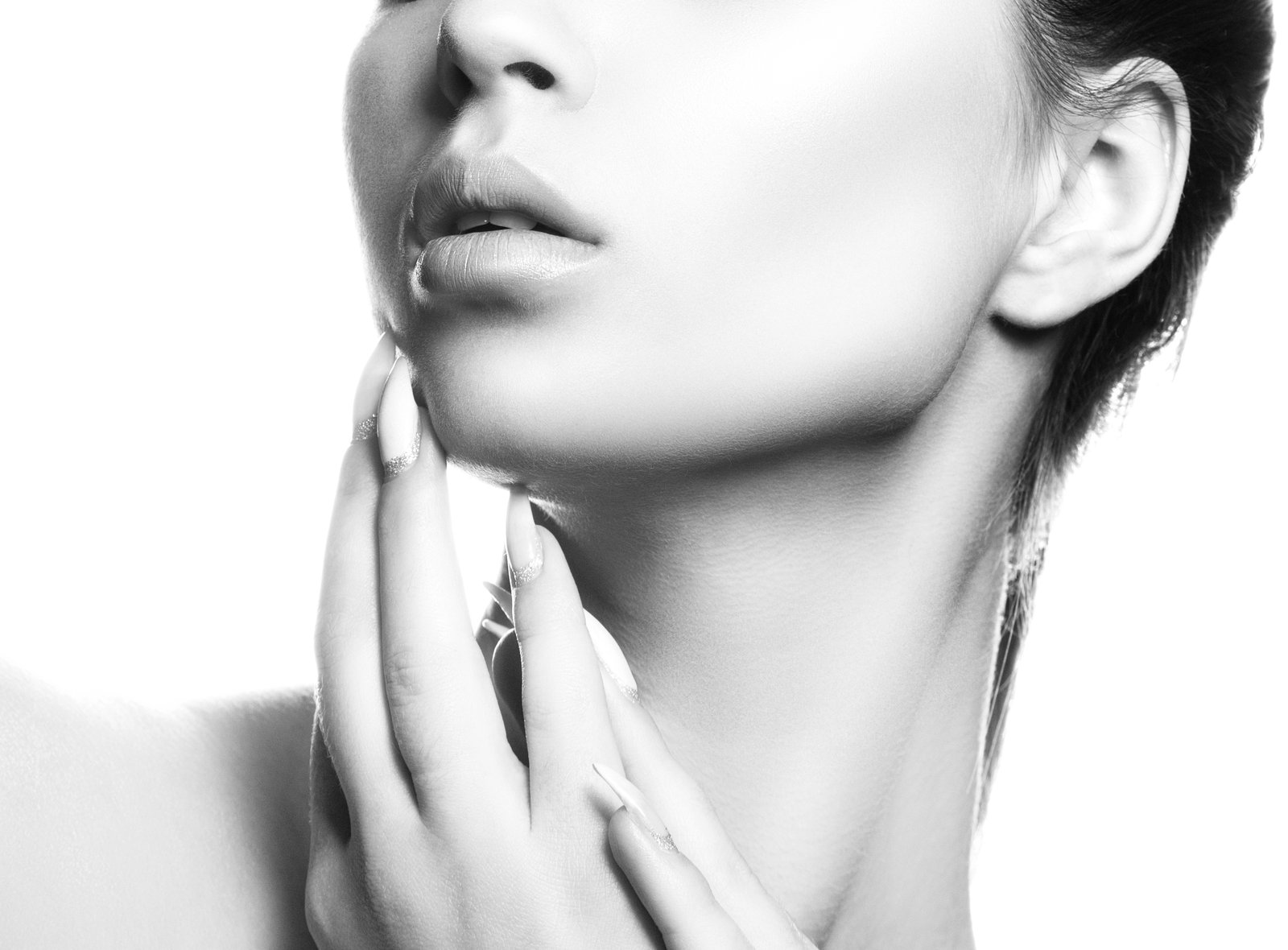
A few years into my retouching work, a beauty client sent back a batch of images with three words in the subject line: “too plastic, sorry.” No further notes. Just that, and a request to redo the whole set.
I had been smoothing skin the way I learned from YouTube tutorials, painting directly on a softened duplicate layer and calling it done. The edits looked fine to me on screen at 50%. The client was looking at them for a billboard. Every pore was gone. The models looked like they’d been coated in matte latex. It was one of those moments where you want to close your laptop and go do something else entirely, but instead I made a cup of green tea and figured out what I’d done wrong.
What I’d done wrong was conflate two separate things: skin tone and skin texture. Fixing that confusion is exactly what frequency separation is for.
Why Skin Has Two Layers Worth Caring About
When you look at a portrait, your eye is processing two distinct kinds of information at the same time. There’s the color and tone layer, meaning the blush across a cheekbone, the uneven redness around a nose, the slight shadow under an eye. And then there’s the texture layer: pores, fine lines, peach fuzz, the actual physical surface of a person’s skin.
The problem with traditional smoothing methods like Gaussian blur or dodge and burn applied to a merged layer is that they affect both of those layers simultaneously. You fix the redness and you also soften the pores. You lighten a shadow and you also flatten the surface. Do that aggressively enough and you get my billboard situation.
Frequency separation works by splitting those two layers apart so you can edit them independently. Low spatial frequencies (broad areas of tone and color) go on one layer. High spatial frequencies (fine detail and texture) go on another. You paint on the color layer without touching the texture, and your subject keeps their skin looking like skin.
The Exact Setup, Step by Step
I do all of this in Photoshop. Open your file, duplicate your background layer twice, and name them “LF” (low frequency) and “HF” (high frequency). LF goes on the bottom, HF on top.
Select the LF layer and apply a Gaussian Blur. For a portrait shot at medium resolution, around 2000 to 2500 pixels on the long edge, I use a radius of 4 pixels. For a high-res file at 4000 pixels or above, I go up to 6 or 7. The blur radius needs to be just enough to remove texture but not so much that you lose the basic shape of facial features. If the eyes start looking melted, you’ve gone too far.
Now select the HF layer. Go to Image, then Apply Image. In the dialog: set Layer to your LF layer, Blending to Subtract, Scale to 2, Offset to 128. Click OK. Then change the HF layer’s blend mode to Linear Light. At this point your image should look exactly as it did before you touched anything. That’s how you know it’s working. The two layers are mathematically complementary, and when they sit on top of each other they reconstruct the original.
Group both layers and add a group mask if you want to limit your work to the skin area. I call this action “Casablanca” because it felt cinematic the first time I saw it work.
How to Actually Retouch Each Layer
On the LF layer, use a soft round brush set to around 20% opacity, sampling from nearby clean skin. You’re painting out discoloration, evening out blotchy redness, softening the transition between shadow and highlight. Keep your brush large, around 150 to 200 pixels for a mid-res file, and work in gentle passes. The texture will stay completely intact on the HF layer above.
On the HF layer, use the Clone Stamp or Healing Brush to address specific texture problems: a blemish that has both a bump and a dark color, a scar, anything where the physical surface itself needs work. Sample nearby texture and stamp lightly. Because you’ve already separated the tone, you won’t accidentally drag color from one area of the face to another, which is the thing that usually makes healing brushwork look patchy.
Zoom to 100% the whole time. Retouching at 50% on a beauty job is how you end up redoing a set of twenty images on a Tuesday night.
When Frequency Separation Is the Wrong Tool
I want to be honest about this because every technique gets oversold. Frequency separation is not faster than dodge and burn for most basic portrait work. It adds setup time and layer complexity, and for a wedding portrait where the skin looks good to begin with, it’s often unnecessary overhead.
Where it earns its place is in high-end beauty, cosmetic campaigns, and any image that will be printed large or scrutinized closely. When a makeup brand is using an image to sell foundation, the skin has to read as beautiful and real at the same time. That’s a hard target, and frequency separation is the most reliable way I’ve found to hit it.
I also find it useful when working with skin tones that have a lot of natural variation, deeper skin especially, where aggressive smoothing can look particularly artificial and where preserving the actual texture of the skin matters enormously for an accurate, respectful representation.
Keeping the Result Looking Like a Person
Before you flatten, zoom out to 25% and look at the image fresh. The question isn’t whether it’s technically clean. The question is whether you’d believe it was a photograph of a real human being if you saw it in a magazine.
Texture is what sells that. If you can still see the individual hairs along the hairline, the natural variation in the lip surface, the faint lines around the eyes, you’re probably in good shape. If the face reads as one smooth gradient, you’ve crossed the line, and the fix is to reduce opacity on your LF edits or selectively erase some of the work on the HF layer.
Frequency separation isn’t magic, it’s just a smarter way of seeing what’s already in the image. Once you understand that skin tone and skin texture are two separate problems, you can solve each one without making the other worse, and that’s the skill that actually makes retouching look invisible.
Comments (1)
Tried this technique this morning. Game changer for real.
Leave a Comment